
Carol Biazin’s tattoos are easiest to understand as a changing visual collection rather than a single catalogue photograph. The inspected record moves from a mirror selfie to an ELLE Brasil cover, a Folha de S.Paulo gallery, a close casual selfie and two different Steal the Look lifestyle frames. Each original exposes a different part of the ink, and together they show why her arm tattoos have become part of the singer’s recognisable style.
There is also a direct documentary anchor. In its tattoo-focused interview, Capricho reports that Biazin has a tattoo connected with the album No Escuro, Quem É Você?, a red middle-finger design made spontaneously at a party and a video-game-controller tattoo linked to her more playful side. Those details are the strongest evidence for meaning. The photographs do a different job: they establish where the designs sit, how dense the arm coverage is and how the linework changes between everyday and editorial settings.
This guide keeps those two kinds of evidence separate. The tattoo-bearing originals carry visual claims, while the featured portrait is a face-visible identity image shown outside the inline tattoo sequence. Small symbols are described only when the inspected frames make them clear. Where a design is too small or partly covered, the article leaves the detail open rather than turning an uncertain outline into a fictional explanation.
The red-haired mirror portrait and arm flash
The mirror selfie is the clearest starting point because it shows Biazin in an un-staged setting while exposing a large portion of one arm. The raised forearm contains several separate black-ink forms, including a prominent figure near the wrist and a darker cluster closer to the elbow. Additional linework appears across the shoulder and at the lower edge of the image, suggesting that the collection continues beyond the single area viewers notice first.
The image also illustrates how a tattoo reads when the body is not arranged for a magazine. Her phone blocks part of the face and the arm is bent, so some designs compress against the skin. That limitation is useful rather than inconvenient. It shows the relationship between tattoo placement and ordinary posture, while the close resolution allows the larger motifs to be distinguished from smaller marks. Capricho’s reported album, red-finger and controller tattoos provide context for this kind of personal, mixed collection.

The mirror frame makes the arm feel lived-in rather than staged. It is a group of independent designs with different weights, not a single sleeve that was planned to read as one uninterrupted block. The open skin between motifs keeps the smaller drawings readable, while the heavier shapes near the forearm create a visual anchor. For design study, the photograph suggests that spacing can create cohesion even when the subjects of the tattoos are unrelated.
The image should not be used to assign a name to every visible symbol. A tattoo guide can confidently map the arm, identify the prominent forms and connect the image to Biazin’s documented tattoo comments, but it should avoid claiming that an indistinct mark is the album title or the game controller. Those meanings belong to the reported interview, not to guesswork from a compressed phone photograph.
The ELLE Brasil cover composition
The ELLE Brasil cover supplies a completely different view of Biazin’s ink. She crosses her arms in front of her torso, creating overlapping planes that bring the forearms into the centre of the composition. Several tattoos can be read along the near arm, while a separate design sits lower on the side of the body. The pose turns body art into part of the cover’s geometry: the crossed arms form a frame for the face and draw attention to the linework without requiring a full sleeve.
Editorial styling changes the tattoo evidence. The plain gray backdrop, white top and silver bangles give the arm designs clean contrast, but the magazine crop also hides portions of the limbs. This is why the cover works best alongside the mirror and Folha images. It reveals how the designs look when the arm is bent and photographed under controlled light, yet it is not a complete inventory. The inspected frame supports placement and visual character, not a definitive count.
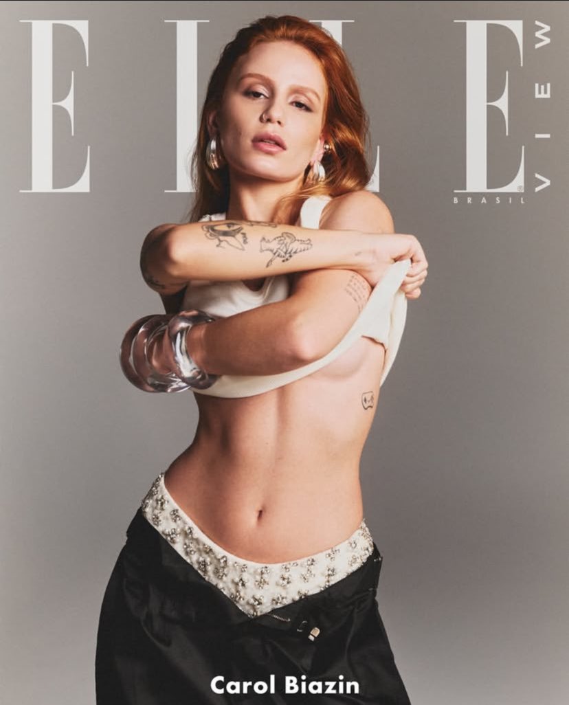
The strongest design lesson is the way thin black linework holds its own against accessories. The bracelets add shine and volume, while the tattoos remain legible because their silhouettes are distinct. Contrast does not have to mean heavy saturation. A collection can include delicate marks, open skin and a few darker motifs, then still read as a coherent visual signature when the surrounding styling is busy.
Capricho’s reporting makes the collection more personal. The album-linked tattoo gives the body a direct connection to a creative era, while the spontaneous red design supplies an element of humor and impulse. The ELLE cover does not prove which visible mark corresponds to which story, so it is safest to let the interview establish meaning and let the cover establish the visual balance of the body art.
The close selfie with lettering and symbols
The close selfie in a green shirt gives the page a more intimate tattoo reference. Sunglasses cover much of the face, but the arm is near the lens and the tattoo group is visible along the sleeve edge. The frame shows lettering, angular symbols and separate small motifs arranged across the upper arm and forearm. The designs look denser than they do in the Folha photograph because the camera is closer and the crop removes much of the surrounding skin.
This distance is helpful for studying texture. Some marks appear to be built from simple outlines, while others carry heavier black fills or multiple parallel strokes. The combination gives the arm a collage-like quality. Rather than forcing every image into a single style, Biazin’s collection allows small graphic pieces, text and illustrative forms to coexist. That variety is part of why different photographs are necessary: one wide portrait cannot show the same surface detail as a close selfie.

The selfie also demonstrates the importance of honest alt text. It is accurate to describe the visible upper-arm lettering and symbols, but not to invent a translation or assign a symbolic meaning that the source does not publish. Visible form and confirmed story are different layers. The article keeps them separate so that readers can use the photograph for placement while turning to Capricho for the documented meaning of selected tattoos.
The casual setting changes the emotional tone of the collection. The green-and-yellow shirt, sunglasses and indoor background feel like a personal social post rather than a formal campaign. That everyday context makes the tattoos look like part of Biazin’s routine identity, not merely accessories for an album rollout. It also makes the image a useful comparison with the polished ELLE cover and the carefully lit Folha portrait.
The warm Steal the Look arm portrait
The first Steal the Look frame places Biazin in a warm interior with her body angled toward the camera. Her tattooed arm extends across the lower left of the photograph, revealing a series of linework motifs at a different scale from the mirror selfie. The camera is lower and farther away, so the marks read as a connected band of black shapes rather than isolated close-ups. That change in distance helps establish how the collection appears during a normal fashion portrait.
The light is part of the evidence. Amber tones soften the skin and turn the hair into a strong orange mass, while the tattoos remain dark enough to separate from the background. This is an example of visual hierarchy: the arm is not the only subject, but its ink still supplies a graphic counterweight to the hair and room. The photograph works because the tattoos are allowed to remain visible without dominating every other element of the frame.

Steal the Look’s accompanying interview describes Biazin’s preference for practical, personal clothes during the No Escuro era and notes that her tattoos are visible in the styling images. That context supports a reading of the arm tattoos as part of her everyday visual language. The styling and the ink are working together rather than competing. A custom design inspired by this mood could use an open, wearable arrangement instead of filling the full limb at once.
The frame should be compared with the Folha image rather than treated as a replacement. The two photographs show distinct poses and different visual conditions. The Folha view isolates both forearms against white; the Steal the Look view places one arm in a warm lifestyle scene. Together they show how linework can stay recognizable when the body moves from a clean editorial study to a lived-in interior portrait.
The hammock portrait and shoulder linework
The second Steal the Look photograph changes the body map again. Biazin sits in a hammock wearing a cap and scarf, and one upper arm turns toward the camera. The tattoos sit along the shoulder and upper-arm plane, partly wrapped by the angle of the pose. Compared with the warm interior frame, this image is darker and more atmospheric, which makes the ink read as a set of strong silhouettes against skin and fabric.
The seated position shows how body art follows movement. The shoulder rounds forward, the arm bends and the skin plane narrows toward the elbow. Some shapes remain clear because their outlines are bold, while smaller details recede into shadow. That difference matters for a tattoo concept. A design that looks perfectly legible with the arm hanging straight may need more breathing room or heavier contour when the shoulder rotates.
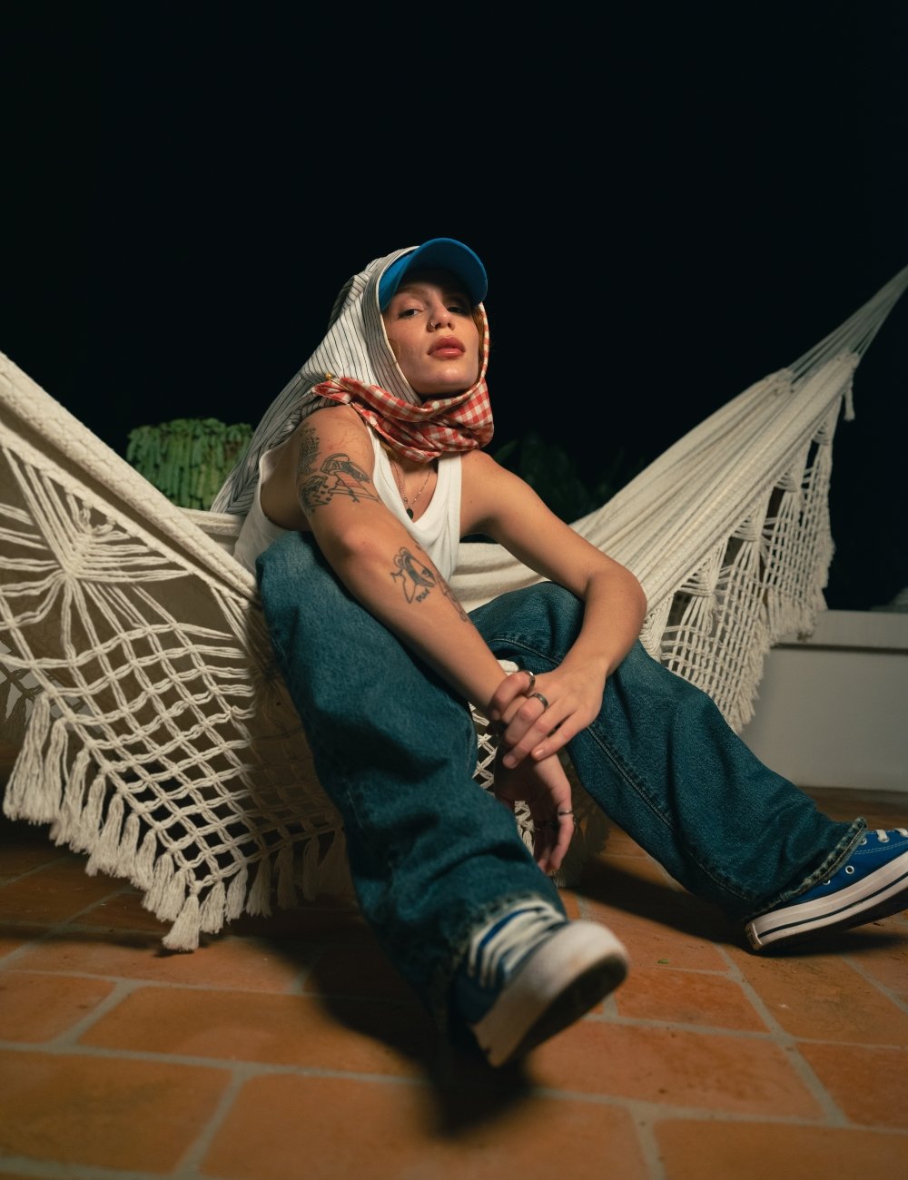
The image also rounds out the coverage record. The mirror selfie concentrates on the lower and outer arm, the ELLE cover emphasises the forearms and side, and the close selfie brings lettering and symbols near the camera. The hammock frame contributes the shoulder line. Five different originals create a body map instead of a repeated gallery.
There is no need to pretend that every visible design has a published explanation. The strongest confirmed stories remain the ones Capricho reports: the album title, the spontaneous red middle-finger tattoo and the controller. The remaining marks are best described as observed linework and symbols unless Biazin or a reliable interview names them directly.
What the documented interview adds
Capricho’s tattoo interview gives the collection a clear personal thread. Biazin connected one tattoo to the album No Escuro, Quem É Você?, described a red middle-finger tattoo made spontaneously at a party and pointed to a video-game-controller design as an expression of her more playful side. Those comments are useful because they show that the tattoos are not only decorative. They are also markers of a creative period, a joke, a memory and a piece of personality.
The reporting does not provide a complete diagram matching every visible tattoo to one of those stories. That boundary matters. The photographs show more than the three designs described in the interview, including botanical forms, triangles, lettering and additional arm symbols. It would be misleading to assign the album meaning to every mark or to claim that a small shape has a specific reference simply because it appears near another tattoo.
Steal the Look adds a complementary style context. In the interview about her visual era, Biazin discusses comfort, practicality and clothing that feels close to her real life. The tattoo-bearing photographs fit that approach: the ink appears in a mirror selfie, a casual close portrait, a magazine cover and relaxed lifestyle scenes. The designs are part of a wardrobe and a body language, but they are not reducible to a fashion accessory.
How the five photographs differ
The inline set is intentionally varied. The mirror image documents a personal close view of the arm. The ELLE cover shows the forearms in a controlled editorial pose. The casual selfie brings lettering and symbols close to the lens. The first Steal the Look frame gives a warm, wider arm portrait, while the hammock image maps the shoulder in a different posture. Five originals make the visual record more useful than one image repeated five times.
The separate featured portrait has a different job. It shows Biazin’s face clearly in a warm close-up before the reader reaches the tattoo sections. It is not used to prove a tattoo, and its alt text does not claim that it shows body art. This separation protects the evidence chain: the identity portrait identifies the person, while the inline sources carry the tattoo-specific observations.
It also improves accessibility. Readers who cannot inspect the images still receive a concise description of the arm, shoulder, forearm, lettering or geometric design that each source contributes. The page becomes a visual guide with a documented structure rather than a pile of generic celebrity pictures with tattoo language attached to them.
What remains uncertain
The public sources do not publish a complete tattoo map for Carol Biazin. Some smaller motifs are partly covered by hair, clothing, a phone or the crop of an editorial frame. The photographs also come from different periods and settings, so the collection may have changed between the dates represented here. The responsible approach is to describe the visible forms and retain uncertainty around details that cannot be checked.
A triangle, botanical cluster or lettering fragment can be visually useful without having a confirmed public meaning. Readers considering a related design should verify the original source, speak with the wearer when possible and use a tattoo artist for placement and scale. A celebrity image can provide inspiration, but it cannot replace an informed consultation or a stencil review on an individual body.
The same caution applies to colour and line weight. The inspected photographs show mostly black-ink work under white editorial light, amber indoor light and darker casual settings. That does not establish a single official palette. It does show that the designs remain legible through different conditions, which is a more defensible observation for someone studying the collection.
Final thoughts on style
Design lessons from the collection. Biazin’s tattoos suggest a useful approach to a multi-piece arm: mix small personal symbols with a few stronger anchors, then preserve enough skin for each design to breathe. The editorial frames demonstrate the value of asymmetry, with different visual weights on the two arms. The mirror and selfie frames show how text and symbols can sit among illustrative marks without becoming one undifferentiated sleeve.
Biazin’s tattoos suggest a useful approach to a multi-piece arm: mix small personal symbols with a few stronger anchors, then preserve enough skin for each design to breathe. The editorial frames demonstrate the value of asymmetry, with different visual weights on the two arms. The mirror and selfie frames show how text and symbols can sit among illustrative marks without becoming one undifferentiated sleeve.
For a custom concept, begin with a body map rather than a list of celebrity motifs. Decide whether the main emphasis belongs on the forearm, upper arm or shoulder. Then test the design while the arm hangs, bends and turns. The hammock photograph is a reminder that shoulder tattoos change shape as the body moves. A clean reference image is a starting point, not the only position that matters.
Finally, keep meaning personal. The most compelling documented tattoos in this dossier connect to Biazin’s own album, humor and interests. That is the part worth borrowing: the idea that a tattoo can carry a creative chapter or a private joke while still looking visually coherent. Copying an outline without that personal connection would reproduce the surface and lose the reason the design matters.