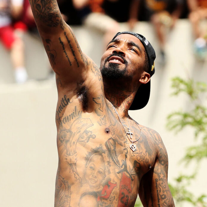
J.R. Smith has one of the biggest and most recognisable tattoo collections in basketball. He has said he lost count somewhere around seventy pieces, and the photographs back that up: portraits, chest lettering, neck words, basketball symbols, stars and dense arm work all sit together. This guide breaks the main designs into sections and keeps the descriptions close to what Smith has said or what the photographs clearly show.
The collection was built over years rather than in one giant session. That matters because an older picture may show a gap that later got filled, while a jersey photo can hide half the arm or chest. The images below are different photographs, not the same shot zoomed in five times, so readers can see the layout from more than one angle.
Mama’s Boy and Black Jesus sit at the centre of his chest
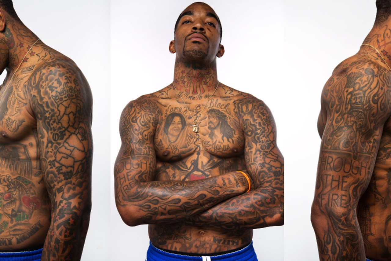
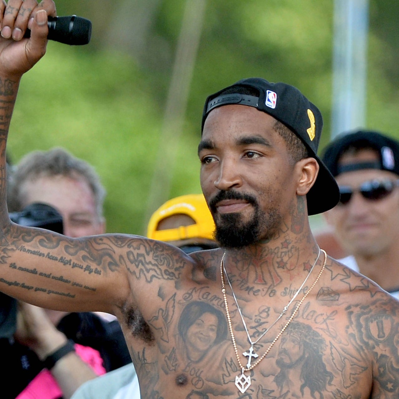
J.R. Smith’s chest is the first place to start because it carries the pieces people remember from the famous shirtless photographs. The words “Mama’s Boy” sit around a portrait of his mother, and the design is big enough to read without needing a perfect close-up. It is not a tiny private mark hidden under a shirt. It is one of the main visual anchors of his whole tattooed torso.
Beside that family portrait is the image commonly described as Black Jesus. The religious portrait gives the chest a very different mood from the basketball wording around it. The two designs sit close together, so a wide photograph can make them look like one huge block of ink, while a sharper image lets you see that they are separate subjects with their own shading and lettering.
The family meaning is one of the clearer stories attached to Smith’s tattoos. He has talked about his mother’s reaction to seeing her portrait, and that gives the design context without needing a dramatic theory added on top. The useful detail is simply that his mother is represented on his chest and that the words around her make the tribute obvious.
Other chest lettering fills the spaces around the portraits, including words connected with faith, family and the way Smith talks about himself. Some lines are easy to read in a studio photograph and some fade into the shading. That is why the image matters here: it shows the relationship between the portrait, the text and the surrounding black-and-grey work rather than reducing everything to a generic shirtless picture.
His first tattoo was a basketball tribute that started the whole collection
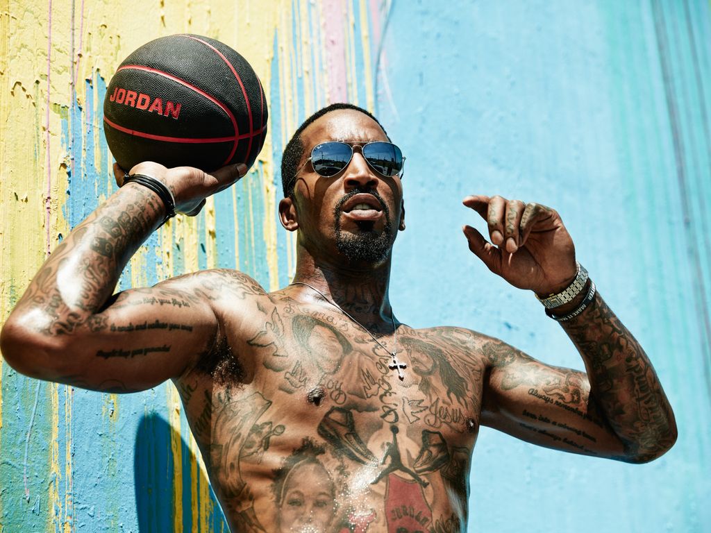
Smith has said his first tattoo came when he was about fifteen. The early piece was based on a basketball player dunking, and the design was personalised with his own name and number. It is a very different starting point from the later chest portraits and dense sleeves. The first tattoo was about the sport he wanted to play, and the rest of the collection grew outward from that beginning.
The phrase “Through the Fire” is another important part of the story. It appears with basketball imagery and has often been connected with the hard parts of Smith’s life and career. The wording is clear enough to report, but the exact meaning should not be stretched into a biography for every other tattoo on his body.
A close look at the arms shows how the original sports idea became surrounded by other designs. There are basketball references, script, stars and heavy filler patterns, all placed over different sessions. The arm does not look like one perfectly planned sleeve. It looks like a player kept adding pieces until the gaps became part of the style.
That loose development is part of what makes Smith’s tattoos interesting. He has described choosing designs fairly spontaneously, sometimes deciding what he wanted after arriving at the shop. The result is busy, but it also feels personal. A neat catalogue of symbols misses the slightly chaotic way the collection was built.
Young Money and Swish give the neck its own basketball-era lettering
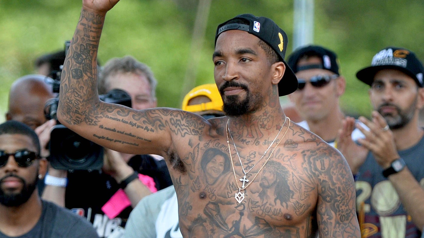
The neck tattoos are impossible to miss in photographs where Smith is wearing a jersey or a low T-shirt. Young Money sits high on the neck, and Swish was added above it in a later session. The lettering is tied to his nickname and basketball identity, so these pieces read more like personal branding than decoration.
There is also a New York Yankees logo in the neck area, along with smaller stars and marks around the ears. Not every line is equally clear in every photograph, especially when a chain, collar or shadow cuts across the skin. The safest description names the designs that are visible and leaves the soft edges alone instead of guessing at unreadable script.
The placement changes the feel of the words. A phrase on the forearm can disappear under a sleeve, but neck lettering follows Smith into every public appearance. It is part of the reason his tattoos became such a recognisable part of his image during the NBA years. The designs are close to the face, so even a short word has a lot of visual weight.
These tattoos also show how the collection changed over time. The early lettering and later additions do not always match perfectly in size or style, which is normal when a body is being tattooed over many years. Smith’s neck is better understood as a timeline than as one single finished logo.
The arms and shoulders carry the basketball symbols and smaller filler work
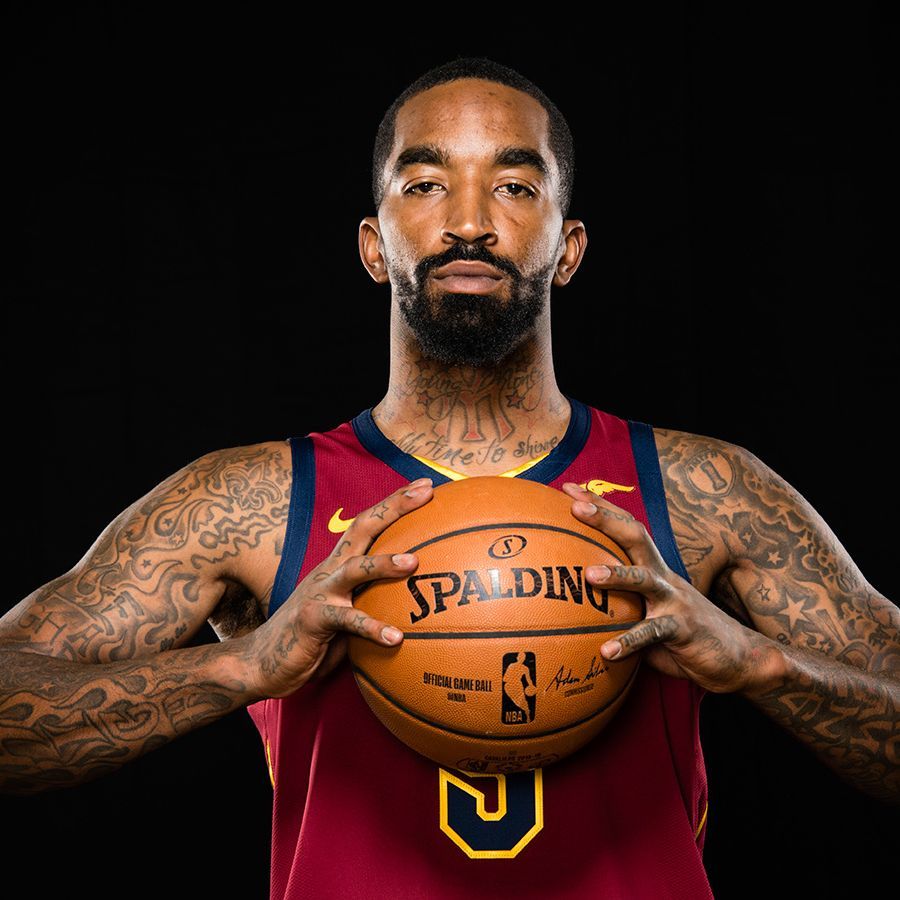
Smith’s arms are packed with the kind of details that disappear when he is playing. There are stars around the shoulders, script along the arms, basketball imagery and darker filler that links larger pieces together. A straight-on portrait gives the general idea, but an angled image is more useful for showing how the designs wrap around the biceps and forearms.
The basketball references are not all identical. Some are direct sports images, while others are numbers or words that only make sense alongside the rest of the collection. His own number appears in reported descriptions of the work, and other designs point to the teams and places that have shaped his career. The arm tattoos feel like a scrapbook of that period rather than a single logo sleeve.
There are also smaller symbols near the hands and ears. Smith has had work added around the fingers and behind the ears, and those areas can look completely different depending on the photograph. A close portrait can show the neck and ear designs, while a full-body image is needed to understand their relationship with the larger arm pieces.
The sheer amount of ink is why five different photographs are useful here. One picture can show the chest, another can show the shoulder, and a jersey portrait can reveal what remains visible when clothing covers most of the torso. Reusing one photograph would make the collection look flatter than it really is.
Death Before Dishonor and the leg tattoos add a tougher note
The phrase Death Before Dishonor is usually placed on Smith’s thigh in tattoo coverage, away from the chest portraits and basketball lettering. It has a harder tone than the family tribute, but that contrast is typical of his collection. The body art moves between sentimental portraits, faith imagery, sports references and blunt phrases without trying to make every part sound gentle.
Smith has also had tribute work connected with people he admired, including a reported Nipsey Hussle tattoo. That kind of piece should be dated because the collection keeps changing and photographs from different periods do not show the same amount of leg or torso coverage. A current guide can mention the tribute while staying clear about which image actually proves the design.
The lower-body work is easier to miss because most famous photographs focus on the chest and arms. Shirtless parade pictures show the overall coverage, but they are not always sharp enough to identify every mark below the waist. That is a good reason to separate confirmed lettering from smaller shapes that are only visible as dark patches.
Taken together, Smith’s tattoos tell a pretty direct story about family, faith, basketball and his own taste for adding another piece whenever he felt like it. He once said he had lost count and had around seventy tattoos, which explains why no single photograph can act as a complete inventory. The best view comes from several distinct pictures, each showing a different part of the work clearly.
There are plenty of smaller marks that are hard to name with confidence, especially around the ears, hands and lower arms. That is not a problem with the collection; it is just what happens when so much skin is covered. A useful tattoo guide should show the clear designs and avoid turning every shadow into a new symbol.
What makes Smith’s ink stand out is the mix. The family portrait sits next to religious imagery, sports references sit beside blunt phrases, and newer pieces fill spaces left by older tattoos. It is busy, but it is not random. The choices point back to the people, teams and ideas Smith has kept close for most of his adult life.
His tattoos also became part of his public personality. The famous shirtless celebrations made the chest and arms impossible to miss, while league rules later brought attention to designs such as the Supreme logo. That attention does not explain every tattoo, but it shows how closely the ink is tied to the way Smith presents himself.
The safest way to read the collection is to start with the pieces that are easiest to prove: Mama’s Boy, Black Jesus, Through the Fire, Young Money, Swish, the stars, the basketball imagery and Death Before Dishonor. Everything else needs a sharp photograph or a direct explanation before it should be treated as certain.