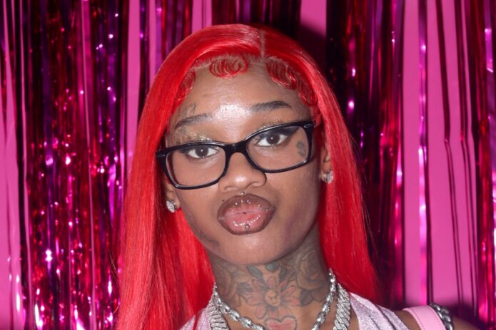
Sexyy Red has a tattoo style that is hard to miss. The face ink, bright hair, bold outfits and large jewellery all sit in the same visual world, but the tattoos themselves are not one single design. She has small facial marks, neck and chest work, repeated lettering, roses and leg tattoos that show up differently depending on the outfit.
Her GQ tattoo tour is especially useful because she talks about parts of the collection herself. She mentions flames, roses and the fact that she likes certain ideas in threes. The photos add the placement. Where the story is not clear, this guide sticks to what can actually be seen.
The neck and chest ink is part of her whole look
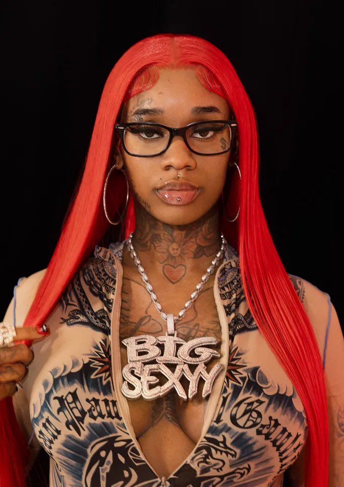
Sexyy Red’s tattoos are tied closely to the way she presents herself. The bright hair, big glasses, jewellery and face ink all arrive together, so the neck and chest pieces never feel like an afterthought. In clear photos, you can see several small marks around the neck and upper chest, with larger shapes sitting lower down and disappearing under tops or chains.
That placement matters. A tattoo on the neck is going to show up in a red-carpet photo, a music video or a quick social post. It becomes part of the look even when the photo was not taken to show the ink. Some of the marks are sharp enough to describe, while others blend into the lighting and should not be turned into made-up names.
Her chest tattoos also change depending on the outfit. A sheer top can reveal a lot more than a cropped hoodie, while a huge pendant can cover the centre of the chest completely. The best photographs are the ones where the hair, glasses and jewellery do not hide the edges of the designs.
Sexyy has also played with the idea of repetition. Her GQ tattoo tour talks about sets of three, including three different “Sexyy” tattoos and three groups of roses. That repeated number gives the collection a fun running theme without making every design look the same.
Her face tattoos are small, bold and impossible to miss
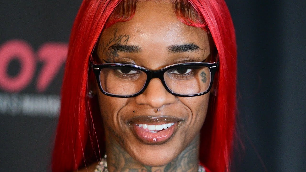
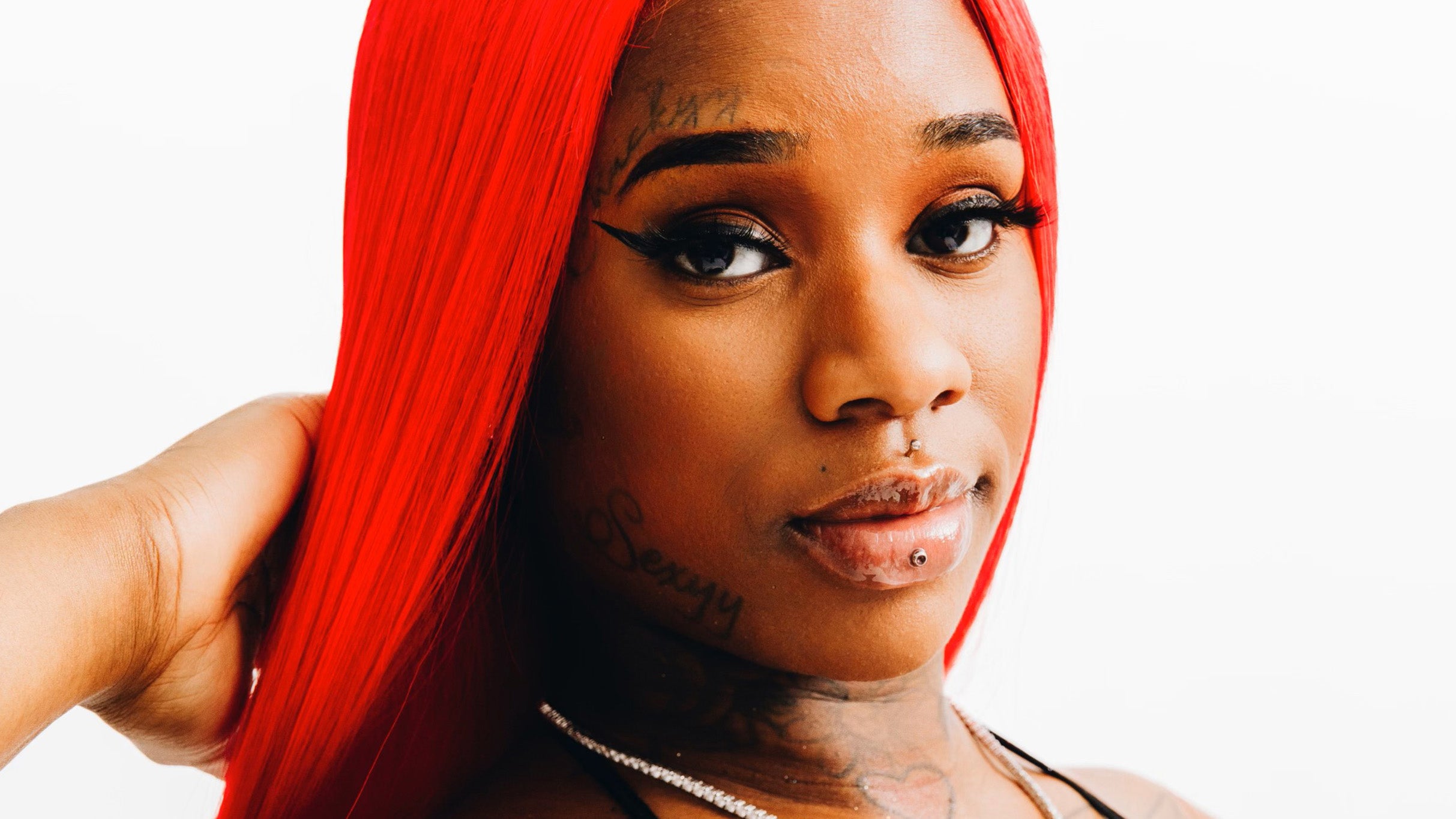
The face work is probably the first thing people notice. A small dollar sign sits beneath one eye in close-up photographs, while script appears above the brow. The marks are not huge, but the face is a tight canvas, so even a few lines change the whole expression.
The dollar sign fits the money-heavy visual language around Sexyy Red, but the photograph alone cannot tell us every reason she chose it. It is fair to connect the design with the way money and success show up in her public image. It is not fair to claim a private story unless she has actually given one.
The script above the brow is easier to see in a close frame than in a concert photograph. Makeup, glasses and hair can cover it in seconds. That is why the close-up belongs here rather than being used as a generic portrait at the top of the page.
Face tattoos also change over time. Lines soften, new work appears beside old work, and makeup can make a mark look lighter than it really is. A careful guide should date the picture where possible and avoid pretending that one photograph is a permanent, complete count.
The thigh tattoo brings flames and bigger leg imagery into the mix
Sexyy Red has spoken about getting flames on her leg because she liked the look. That is one of the clearest pieces of context attached to her ink. The design is easy to connect with her loud stage style, but it still works as a simple tattoo idea on its own: hot shapes, strong movement and a placement that shows when she wears shorts or a short skirt.
Stage pictures make the thigh tattoo easier to notice because the leg is usually uncovered and the lighting catches the outline. The same design can look softer in a backstage photo or under different colour lights. The tattoo has not necessarily changed just because the photograph feels warmer or darker.
The leg work also gives her collection a different rhythm from the small face marks. The face tattoos are tight and graphic. The flames have more space to move, so they read from farther away. That contrast keeps the collection from becoming one flat wall of ink.
There are other small leg designs reported in fan and entertainment coverage, but the strong point is the visible flame work and the way Sexyy talks about it. The article does not need to guess at every faint mark to explain why the leg tattoo stands out.
The wider body shots show how the tattoos sit with her stage style
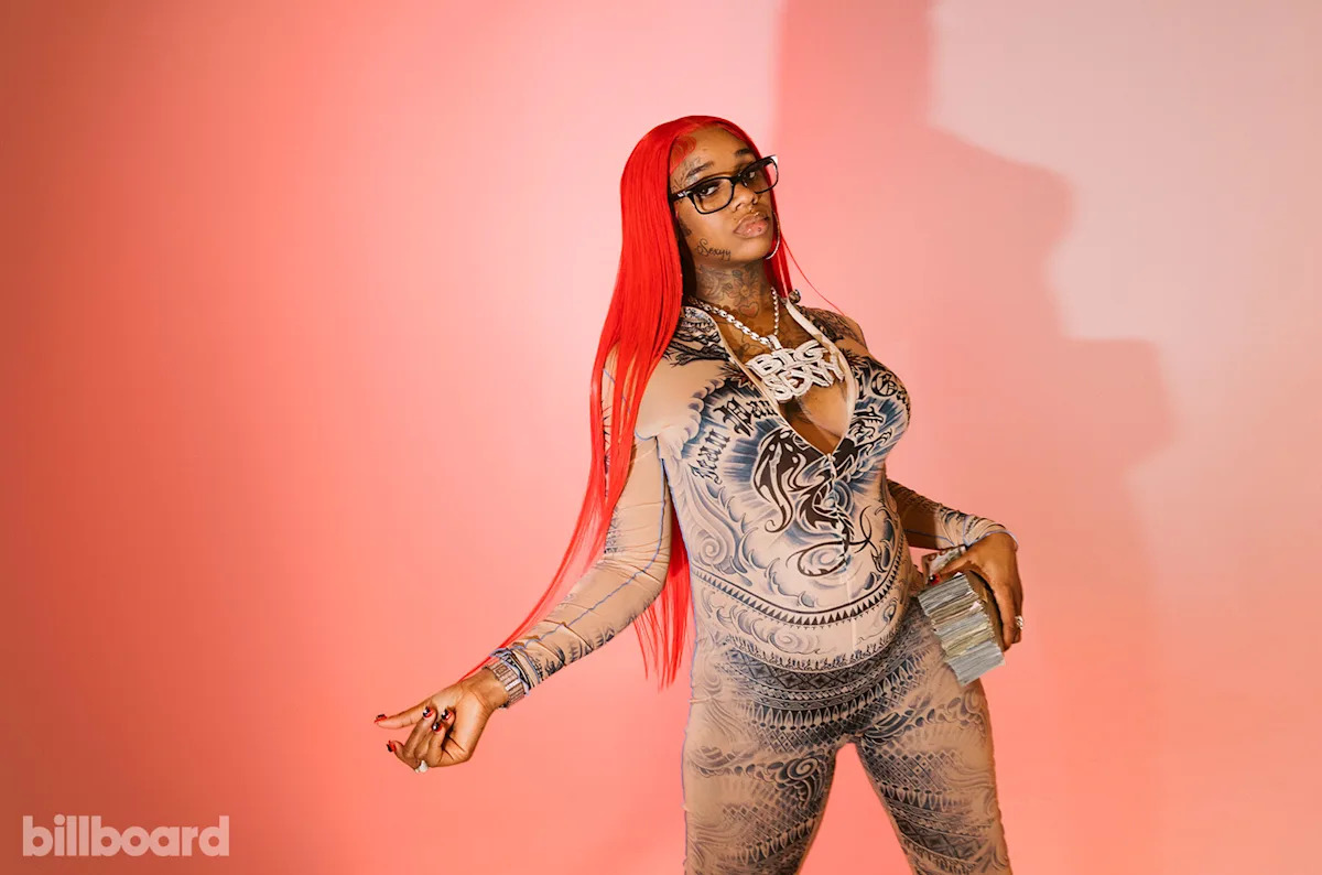
A wider studio image shows the relationship between the tattoos and the rest of Sexyy Red’s styling. The ink does not sit in isolation. It works alongside patterned clothing, oversized chains, bright hair and the deliberately playful attitude she brings to photoshoots.
The GQ tattoo tour gives more detail than a normal press photo. Sexyy talks about roses, repeated “Sexyy” lettering and the way she likes certain ideas to come in threes. That makes the article much stronger than a basic list because the meaning comes from her own comments rather than a random caption written years later.
The roses are a good example of how her tattoos balance decoration and identity. Flowers can be soft, but repeated roses across different areas make them feel like part of a personal pattern. The photos show the shapes and placement. Her interview supplies the part about repetition. Anything beyond that should stay clearly marked as interpretation.
The clothing can make some body tattoos look like prints, especially in a bright photoshoot. Close images are still needed to separate real ink from fabric design, shadows and jewellery. That is also why this image is used for the wider composition, not as proof of a specific face or thigh tattoo.
The stage photos show how the ink changes from one outfit to the next
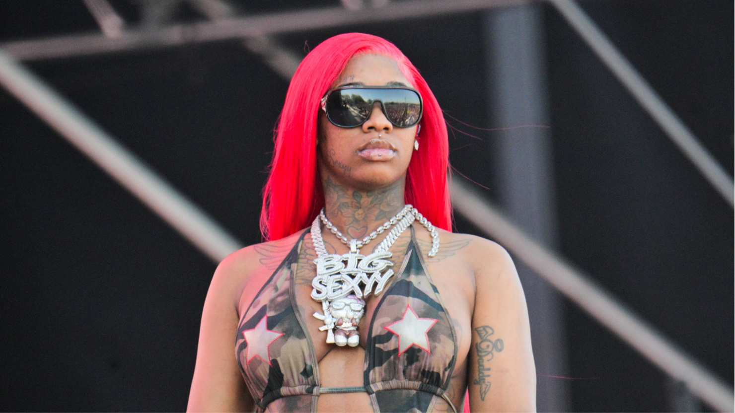
Sexyy Red’s stage clothes reveal different pieces at different moments. A crop top can show the neck and chest, while shorts bring the leg work forward. A jacket may hide almost everything except the face. The tattoos stay the same, but the reader’s view of them changes with every outfit.
The stage image also shows how much movement matters. A still frame can catch the tattoo on the neck clearly, then a turn or a microphone can cover it. That is normal with public photographs and not a reason to count the same mark as a new tattoo each time it appears from another angle.
Her collection has a playful side as well as a bold one. The repeated “Sexyy” pieces, the roses and the flames all fit the confident persona she brings to music and live shows. They do not need a serious symbolic explanation to be interesting. Sometimes the point is simply that the design looks good and belongs to the person wearing it.
The cleanest summary is that Sexyy Red has a mix of face tattoos, neck and chest marks, repeated lettering, roses and visible leg work. Some pieces have a clear story from her own tattoo tour. Others are best described by what the photographs show. Keeping those two levels separate makes the guide feel honest while still giving readers plenty to look at.
The fun part of Sexyy Red’s tattoos is the mix of scale. A tiny mark under the eye can have as much impact as a larger leg piece because it sits on the face. The roses and repeated words give the collection a pattern, while the flames bring movement and a clear flash of colour in stage photos.
There is no reason to invent a hidden meaning for every line. Her own comments explain some designs, and the photographs explain the rest. Put together, they show an artist who treats tattoos as part of her style, not as something that needs to be separated from the hair, clothes, music and attitude around them.
The small marks deserve just as much care as the big ones. A face tattoo can be only a few lines wide, but it changes the way a close-up reads. The dollar sign sits in a place where people will spot it straight away, while the brow script can disappear when her glasses or hair move. That is why the close-up photographs are useful. They show the ink without asking a distant stage shot to do a job it cannot do.
The same thing applies to the leg and body designs. A flame can look obvious in a full stage frame, but the edges and nearby marks are easier to judge when the picture is bright and large. The roses and repeated words also work better when they are treated as separate ideas. One image can show the overall style, but it should not be used as proof for every tattoo on the page.