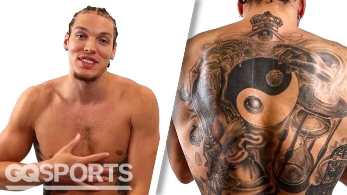
Aaron Gordon didn’t jump into tattoos as a teenager just because everyone around him had one. In his GQ tattoo tour, he says his first piece came after he was already in the NBA and people kept asking when he was finally going to get ink. That late start says a lot about the collection. The designs feel chosen, not rushed, and most of them connect to ideas he was already carrying around: justice, balance, strategy, humility and staying grounded.
He also hasn’t tried to cover every inch of skin. Gordon has talked about keeping his face off limits and leaving some open space around his chest and stomach. That means the tattoos seen in the photographs are a snapshot of a collection that can still grow. The main pieces are easy to identify, though, and they have enough personality to fill a proper guide without pretending every blurry mark is a secret symbol.
The big themes are pretty clear. There’s a black power fist holding a scale across the abdomen, chess pieces on the leg, a yin-yang on the back, a crown and all-seeing eye high on the neck, and a calf rose marked “LOVE” and “WAR.” There’s also a smaller drippy design that Gordon has described in much simpler terms: he liked the way it looked.
The black power fist and scales put justice at the centre
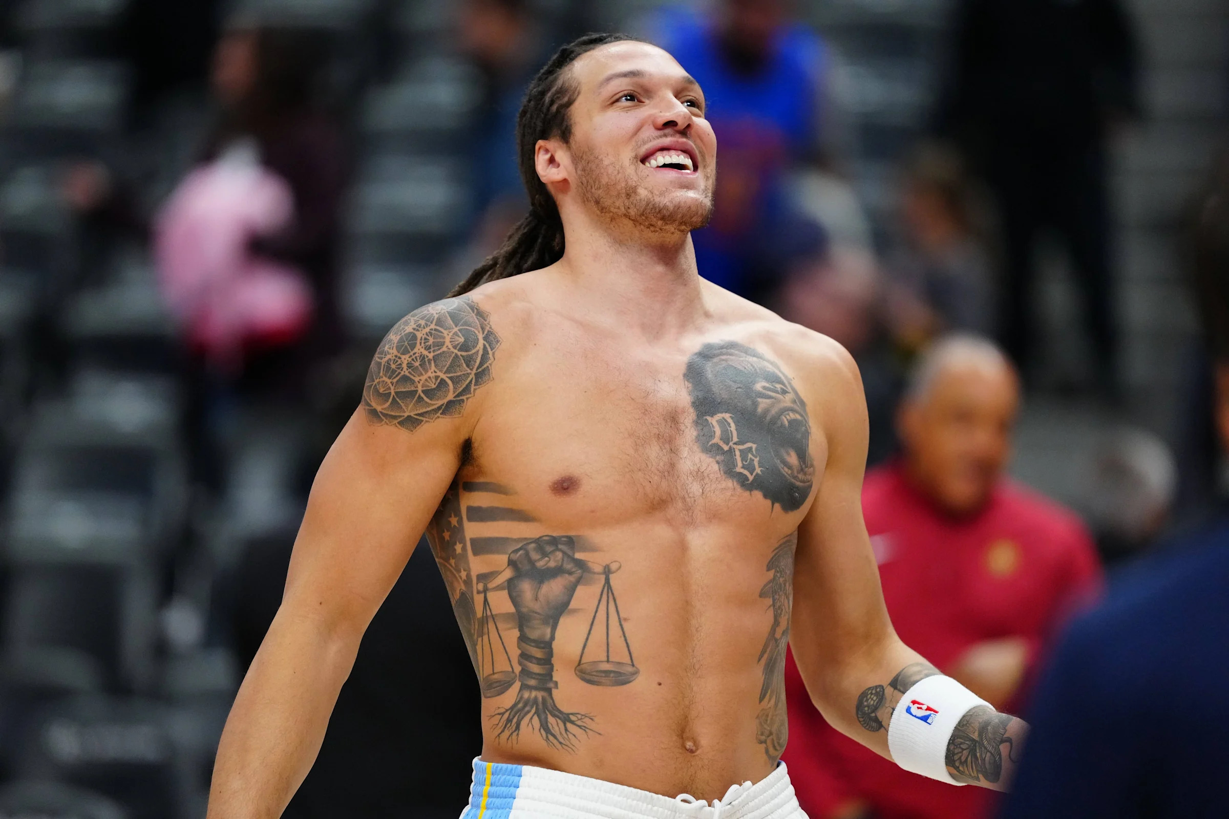
The most direct tattoo in Gordon’s collection is the black power fist holding a scale. The fist connects the design to Black equality and activism, while the scale brings in justice and balance. Roots run down from the image, which gives the piece a grounded feel and helps tie the political idea to something physical and personal.
Gordon has explained this one more clearly than most of his other tattoos. He talks about the need for more activists and the need to create justice and equality. That makes the meaning unusually well supported. The photo shows the fist, scale and roots, and his own explanation gives the design its context. There’s no need to add a made-up backstory on top.
The placement on the abdomen changes how the tattoo appears in photographs. A full shirtless frame shows the size and the way the roots drop below the main image. A basketball uniform hides it completely during games, and even a warm-up photo can reveal only the top half. That’s why this full view is useful: it shows the tattoo as a piece of body artwork rather than as a cropped black shape.
The fist is also visually strong before you know anything about the interview. The hand is easy to recognise, the scale gives the centre a clear focal point and the roots stop the design from floating on the stomach. It’s a fairly bold composition, but it doesn’t look like random decoration. The parts work together.
Gordon’s wording keeps the tattoo tied to activism instead of turning it into a vague “inspirational” image. The scale isn’t just there because it looks cool. He connects it with justice and balance. The raised fist carries the equality message. Those ideas belong together, but they don’t need to be stretched into a claim about every other tattoo on his body.
The black ink also makes the tattoo stand out in studio portraits. The surrounding skin stays relatively open, so the design reads quickly. Gordon has left room around it rather than building a full stomach-to-chest wall of ink. That open space is part of the current look and helps the fist and scale keep their weight.
It’s worth keeping this piece separate from the more playful designs. Gordon’s calf rose and drippy tattoo may have been chosen for visual reasons, but he gives the fist and scale a clear social meaning. A crown or chess piece might sit nearby in a wider photograph, yet that doesn’t mean every design is making the same political statement.
The chess pieces turn the thigh into a strategy lesson
Chess is another big idea in Gordon’s tattoo collection. He has described a king, pawn and knight on his thigh and connected them with the lessons he takes from the game. Protect a move, think several steps ahead, understand that a game has a beginning, middle and end. The pieces work as literal chess images, but they also act as small reminders about how he wants to approach life and basketball.
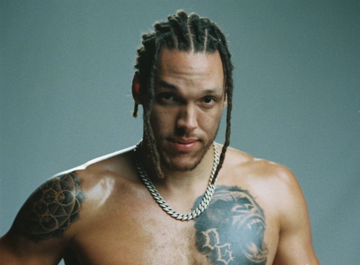
Those tattoos are harder to see than the abdomen piece because shorts and training gear cover the leg. Even when the thigh is visible, the pieces can look like small dark shapes in a wide photograph. A closer studio view is useful because it shows how the lower-body work fits into the rest of Gordon’s still fairly open tattoo layout.
The chess pieces also give the collection a different mood. The fist and scale are public and political. The chess designs feel more private, even though they’re visible when he shows the leg. A king, pawn and knight don’t need to be explained as one giant metaphor. Gordon’s own comments are enough: they’re reminders to plan, protect the next move and understand the stages of a game.
That connection to basketball feels natural without needing to force it. Gordon is an athlete whose work depends on reading space, reacting quickly and thinking ahead. The tattoos don’t prove that every move on court comes from chess, of course. They show that the game’s ideas matter to him and that he wanted those ideas on his skin.
The pieces also sit comfortably beside the more symbolic designs. A scale suggests balance, a yin-yang suggests opposing forces and chess suggests planning. Those themes overlap, but they aren’t identical. Keeping them separate makes the article more accurate and gives each tattoo its own personality.
In a heavily tattooed collection, the chess work might disappear into a sleeve or a full leg composition. Gordon’s body doesn’t seem to be covered that way yet. The open skin makes the individual pieces easier to notice, especially when a photograph gives the leg enough room. It also leaves space for future designs if he decides to continue the idea.
The useful detail here is the combination of specific pieces and a specific lesson. It isn’t just “Aaron Gordon has chess tattoos.” The king, pawn and knight are named, their placement is on the thigh, and Gordon has explained why the game matters to him. That’s enough detail to make the section worthwhile without padding it with guesses.
The LOVE WAR rose is a sharp little calf tattoo
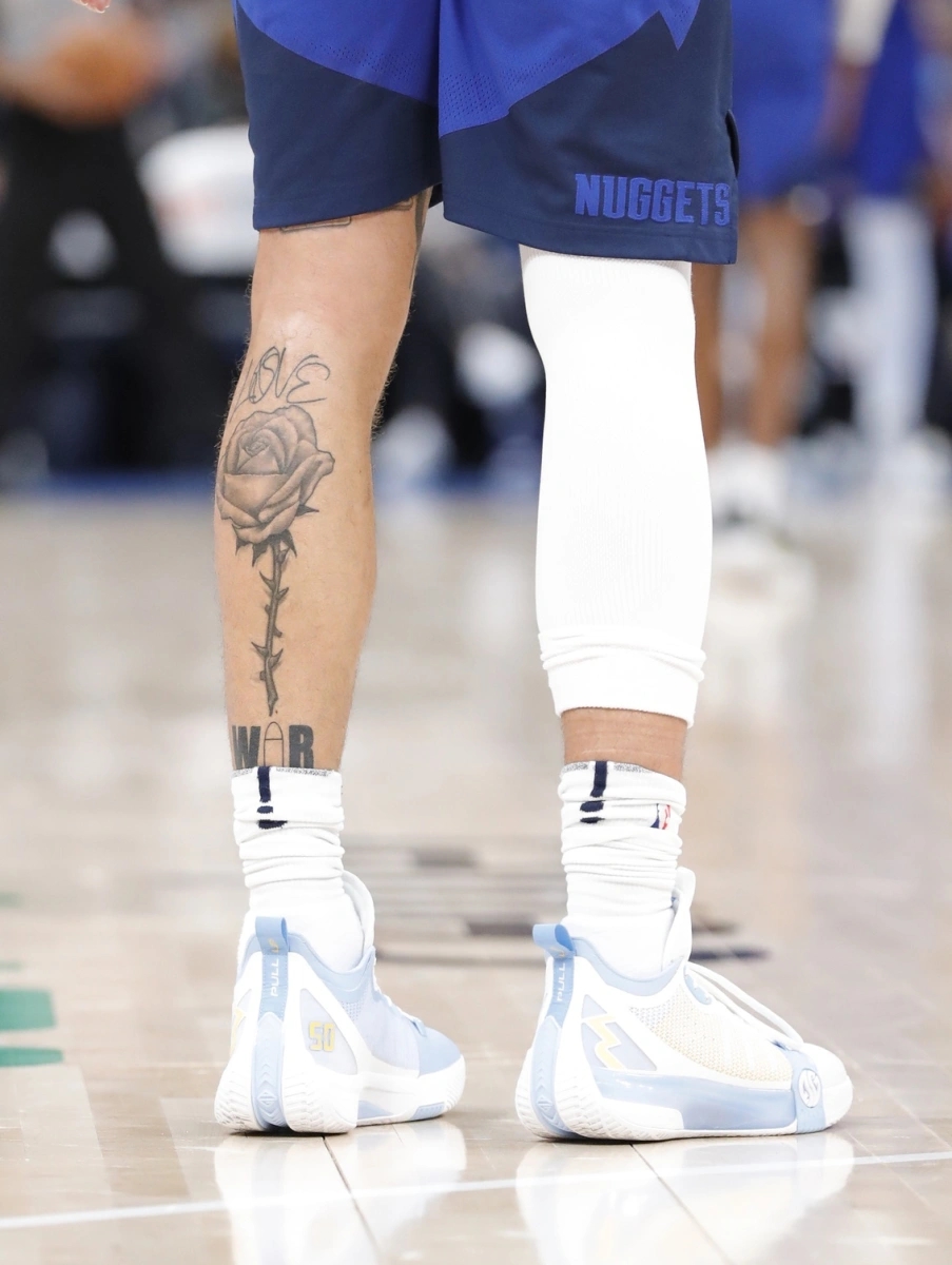
On Gordon’s calf, a rose is paired with the words “LOVE” and “WAR.” It’s one of the easiest smaller pieces to identify because the lettering gives the image a clear label. The two words create the tension in the design. They sit on opposite sides of the same flower, turning a familiar tattoo subject into a compact contrast.
The rose is visually different from the fist and scale. It doesn’t need a wide photograph to make sense, but it does need a sharp leg image. In a basketball setting, the calf can be hidden by socks, shorts or the angle of the shot. A closer view lets readers see the lettering and understand that this isn’t simply another flower tattoo.
Gordon hasn’t needed to build a huge biography around the rose. The design already gives readers its main idea: love and war placed beside each other. That could connect to wider ideas about conflict, relationships or human nature, but the safest description stays with the contrast he chose. The tattoo speaks through the words without needing a dramatic explanation added from the outside.
The placement makes it feel a little more casual than the abdomen piece too. The calf is a practical spot for a design that can be shown or covered depending on what he’s wearing. It also keeps the rose away from the heavier political imagery on the stomach, so the two pieces don’t blur into one message.
The lettering is the detail that matters most in this photograph. A soft image might show the flower and miss the words, which would remove the part that makes the design specific. This is exactly why a tattoo article needs more than one general portrait. A full torso frame can show the collection’s overall look, but it won’t do the calf tattoo justice.
The rose also shows that Gordon is comfortable with simple, readable ideas. Some of his tattoos use layered symbols, like the fist, scale and roots. This one is much more direct. The flower gives it the classic tattoo base, while the two words make it his own.
Placed next to the chess pieces in the wider story of his collection, the rose adds another kind of balance. Chess is about decisions and planning. The scale is about justice. LOVE and WAR are a more emotional pair. The themes sit near each other, but they don’t need to be treated as one single concept.
The yin-yang on his back is about balance, not a mystery code
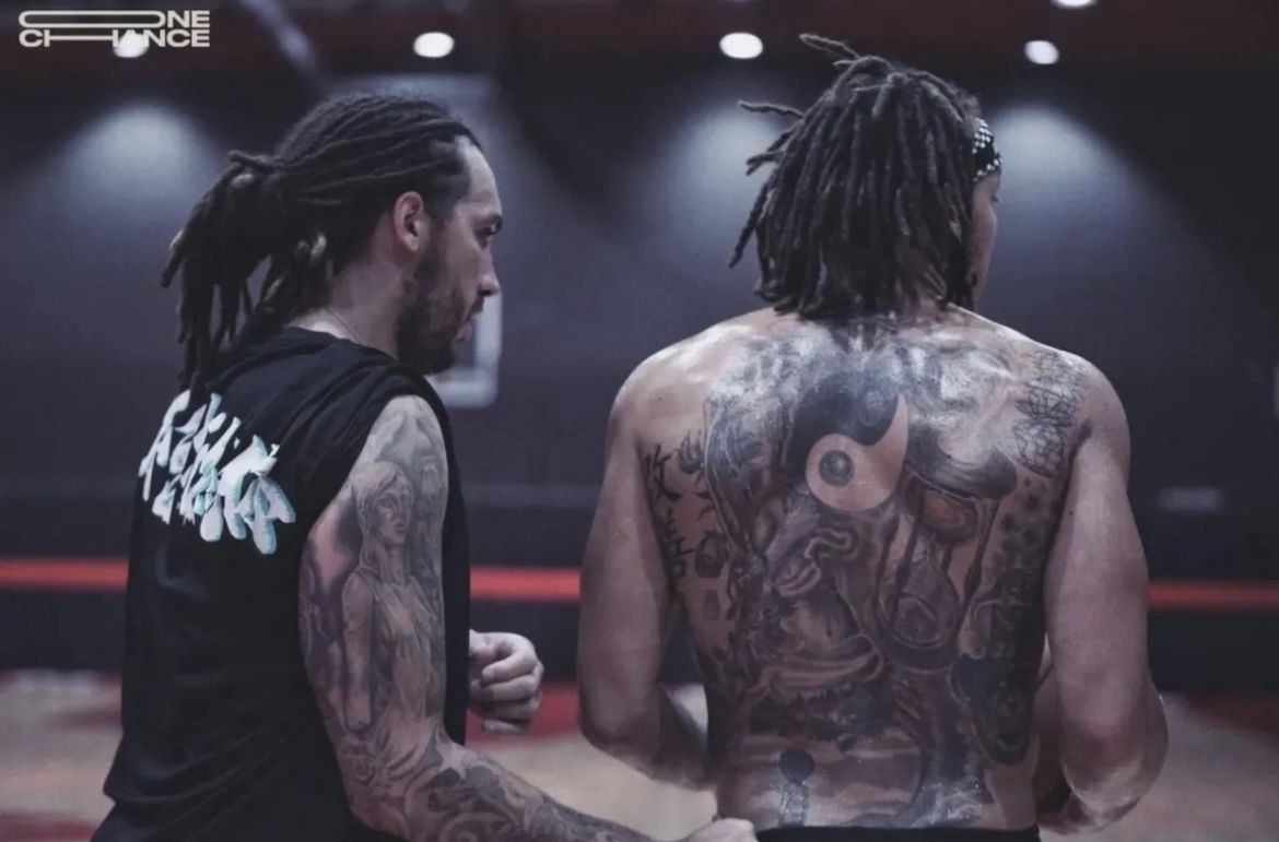
The yin-yang tattoo on Gordon’s back gives the collection a quieter centre. In the GQ tour, he connects the symbol with Daoist pacifism and the idea of balance. The design is familiar, but his explanation gives it a personal setting. It isn’t just there because the shape looks good. He has a reason for choosing it.
Back tattoos are easy to miss when the subject is a basketball player. Most game photographs show the front of the body, and a training image may reveal only the shoulders. The yin-yang can therefore seem absent if you only look at court photos. A proper rear view changes that immediately.
The yin-yang also works as a visual counterpoint to the scale on the abdomen. Both designs involve balance, but the scale points toward justice and equality while the yin-yang points toward harmony and opposing forces. They can sit in the same article without being treated as two versions of one tattoo.
There’s a calm quality to the back piece that isn’t as obvious in the fist. The black-and-white shape is compact and easy to read, while the back gives it room to sit on its own. It doesn’t need surrounding lettering or a big frame to make the point.
Gordon’s explanation should still be kept in proportion. A yin-yang symbol can carry a lot of cultural associations, but his comments are the evidence for this particular tattoo. It’s fair to say he connects it to pacifism and balance. It would be a stretch to claim that the image proves a complete personal philosophy or explains every other design he wears.
The photograph also helps with placement. A front-facing studio shot can show the neck and torso while leaving the back completely hidden. The rear view proves where the yin-yang sits and stops readers from assuming that the tattoo is part of the chest layout. It’s a separate piece with its own space.
That separation is useful because Gordon’s collection includes several designs that can look similar from a distance. The fist, scale and yin-yang are all strong graphic shapes, but the body areas and meanings are different. Good images keep those differences visible.
The crown, all-seeing eye and drippy design show his more playful side
High on Gordon’s neck are a crown and an all-seeing eye. He says the crown reminds him that nothing is higher than the all-seeing and all-being idea he believes in. That gives the two designs a clear relationship, even if the photograph doesn’t prove a separate meaning for every nearby line.
The placement makes the tattoo easy to notice in a studio interview but harder to read in sports photography. Hair, sweat, collars and arena lighting can soften the edges. A GQ tattoo-tour frame is more useful because the camera is actually looking at the ink instead of catching it by accident during a game.
The crown and eye also use a more traditional tattoo language than the LOVE WAR rose. Crowns, eyes and symbols like these are familiar subjects, but Gordon’s explanation gives this version a personal angle. It isn’t enough to call it a generic eye tattoo and move on. The important detail is how he connects the crown with the idea above it.
He has also talked about a drippy tattoo that he chose simply because he liked the look. That comment is refreshing because it keeps the collection from sounding overly serious. Some pieces are about justice, some are about balance and strategy, and some are there because the artwork caught his eye.
That mix makes the collection feel more believable. People don’t always get tattoos after writing a full personal manifesto. Sometimes they like a shape, a reference or a bit of lettering. Gordon’s drippy design gives the article a useful reminder that not every mark needs a heavy explanation attached to it.
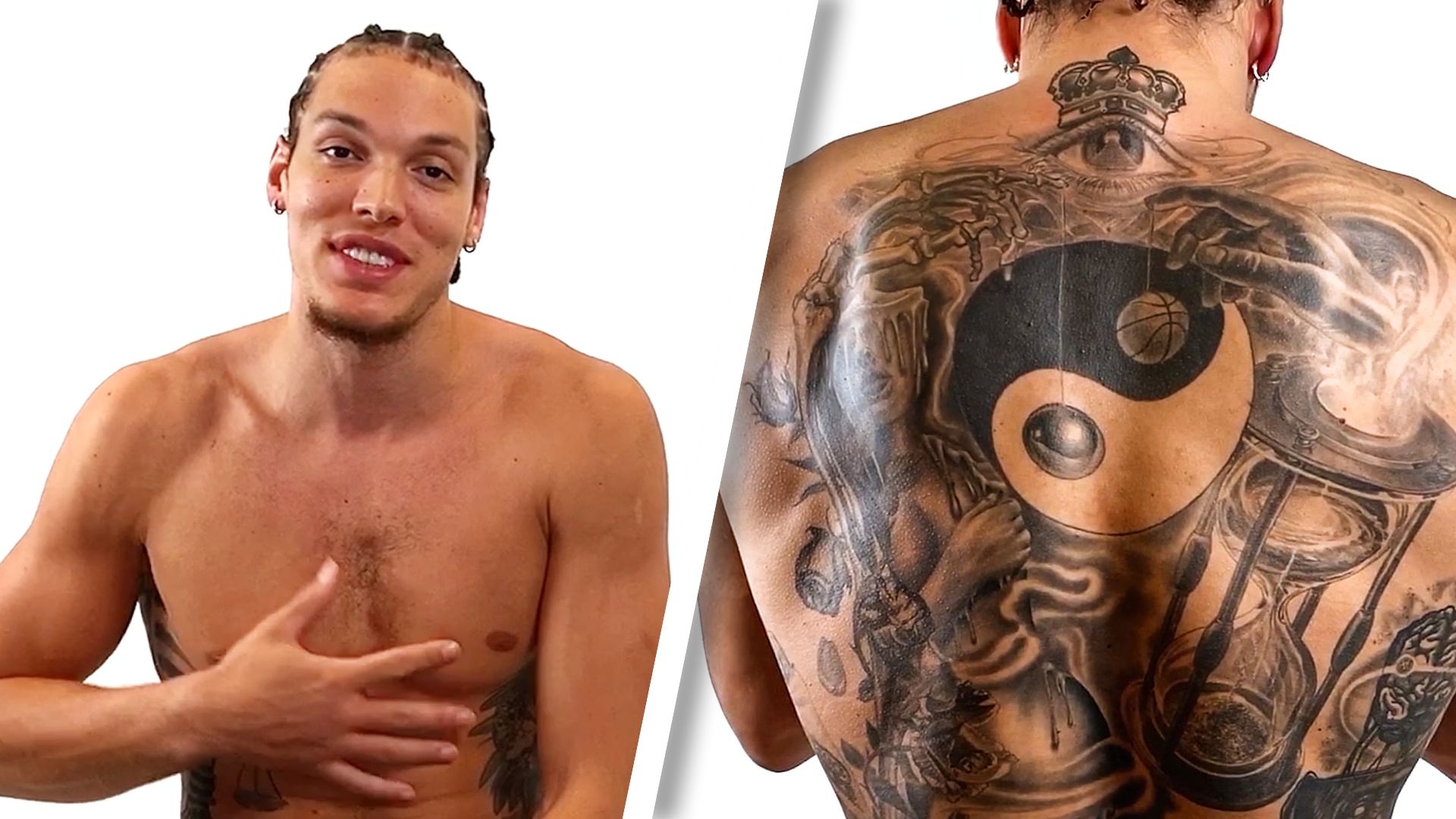
The studio and GQ images together show how the neck work sits above the torso designs. The crown and eye are higher and more compact, while the fist and scale occupy a much wider area. Their sizes and placements are different, even when they appear in the same frame.
Gordon’s tattoos don’t follow one strict style. The fist uses political imagery, chess uses small figurative pieces, the yin-yang is spare, the rose uses bold words and the neck work leans into familiar symbolic shapes. The link between them comes from the ideas he has explained, not from every tattoo sharing the same line weight or visual treatment.
He was already an NBA player when he started getting tattooed, and that helps explain why the collection feels considered. He had time to decide what he wanted and what he didn’t want. He has said his face is off limits for now, and the open areas around the chest and stomach show that he isn’t trying to turn the body into one solid block of ink.
The clearest reading of Aaron Gordon’s tattoos is therefore pretty simple. The fist and scale carry the strongest public message. The chess pieces are reminders about planning and the stages of a game. The yin-yang is tied to balance and pacifism. The crown and eye carry his spiritual explanation, while the LOVE WAR rose and drippy mark show a lighter side.
The title should reflect those actual designs, not hide behind a generic “tattoos and more” formula. The collection has enough specific details to earn a more natural headline, and the images make it possible to move through the body from abdomen to leg, back and neck without cramming everything into one long block.
That’s also why the photographs matter so much here. A full torso image shows scale. A calf image shows the lettering. A rear view proves the yin-yang. A neck-and-torso frame separates the crown and eye from the chest. Each picture does a different job, and none needs to pretend it covers the whole collection.
Gordon’s ink is still a work in progress, but the documented pieces already tell a clear story. He waited until he was ready, picked designs that meant something to him, left room for the collection to grow and kept at least one tattoo just because he liked the way it looked. That’s a much more interesting picture than a list of symbols with a grand meaning pasted onto every one.