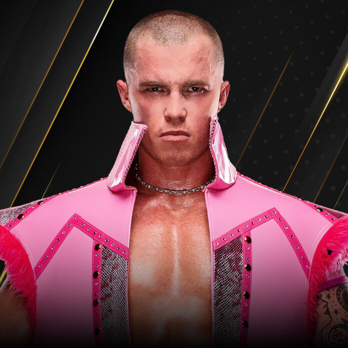
Kyle Fletcher’s tattoos are easy to miss when the Australian wrestler is dressed for television, but they become part of the story as soon as his arm is exposed. The visible work is not a single logo or a one-off piece. It is a growing collection that moves from compact lettering to dense illustrated coverage, with the arm acting as a visual record of a career that accelerated quickly.
Why Kyle Fletcher’s tattoos stand out
The most clearly documented phrase is Pressure is a privilege. Fletcher has explained the words in several interviews, connecting them to the demanding position he now occupies in All Elite Wrestling. That explanation matters because it gives the ink a precise emotional center. The phrase is not decorative filler. It is a reminder that stress can also signal that a long-held ambition is becoming real.
The available photography shows how the phrase sits inside a much larger arrangement. On the upper arm, lettering is surrounded by black and grey shapes, with the composition turning the shoulder into a strong visual anchor. Lower down, the linework becomes busier and more illustrative. A still photograph cannot reveal every turn of the sleeve, but it can show the contrast between readable text and packed image-making.
Kyle Fletcher’s tattooed arm
That contrast is one reason Fletcher’s collection reads well from a distance. The larger areas create a dark outline around the arm, while smaller marks reward a closer look. The arm is not treated like a flat poster. It has separate zones, and the changes in scale help the pieces remain visible while he moves through a match, raises a championship, or leans into a post-match pose.
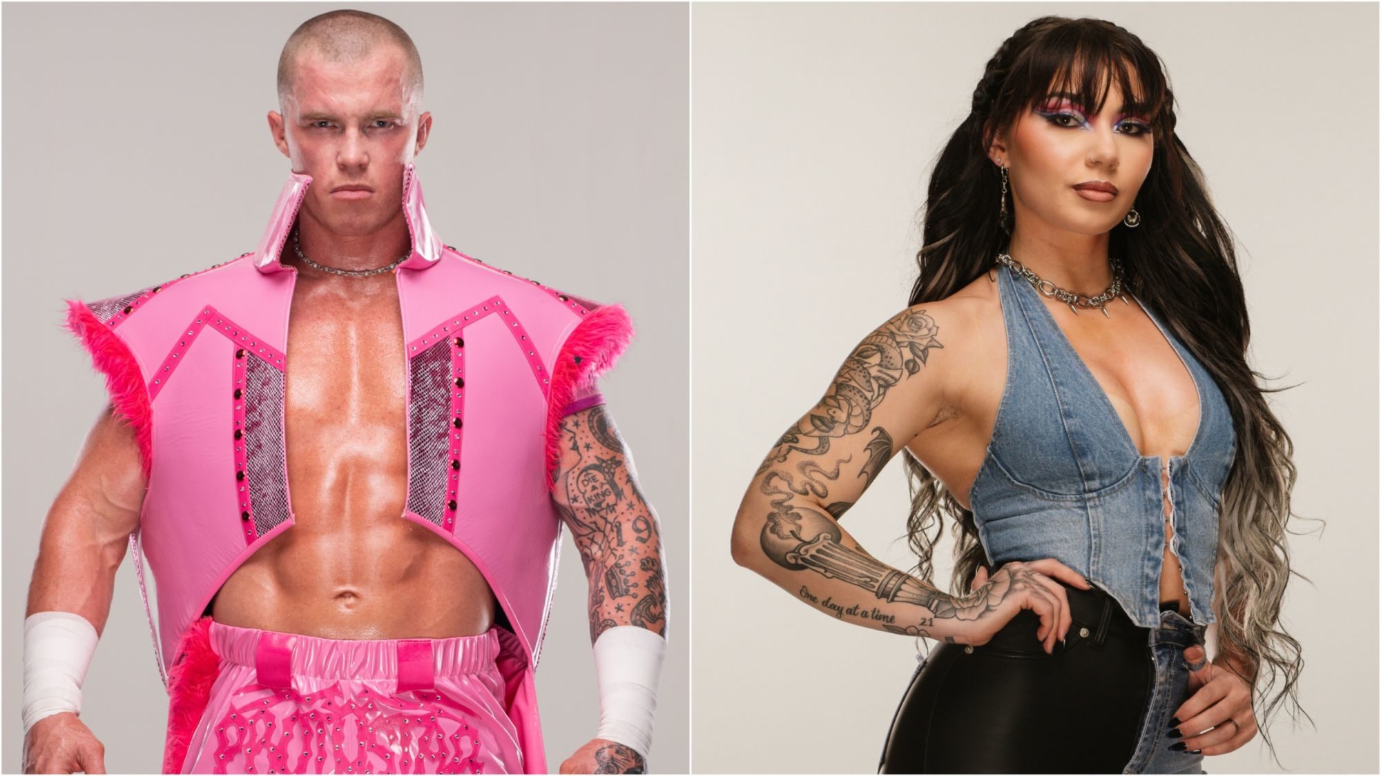
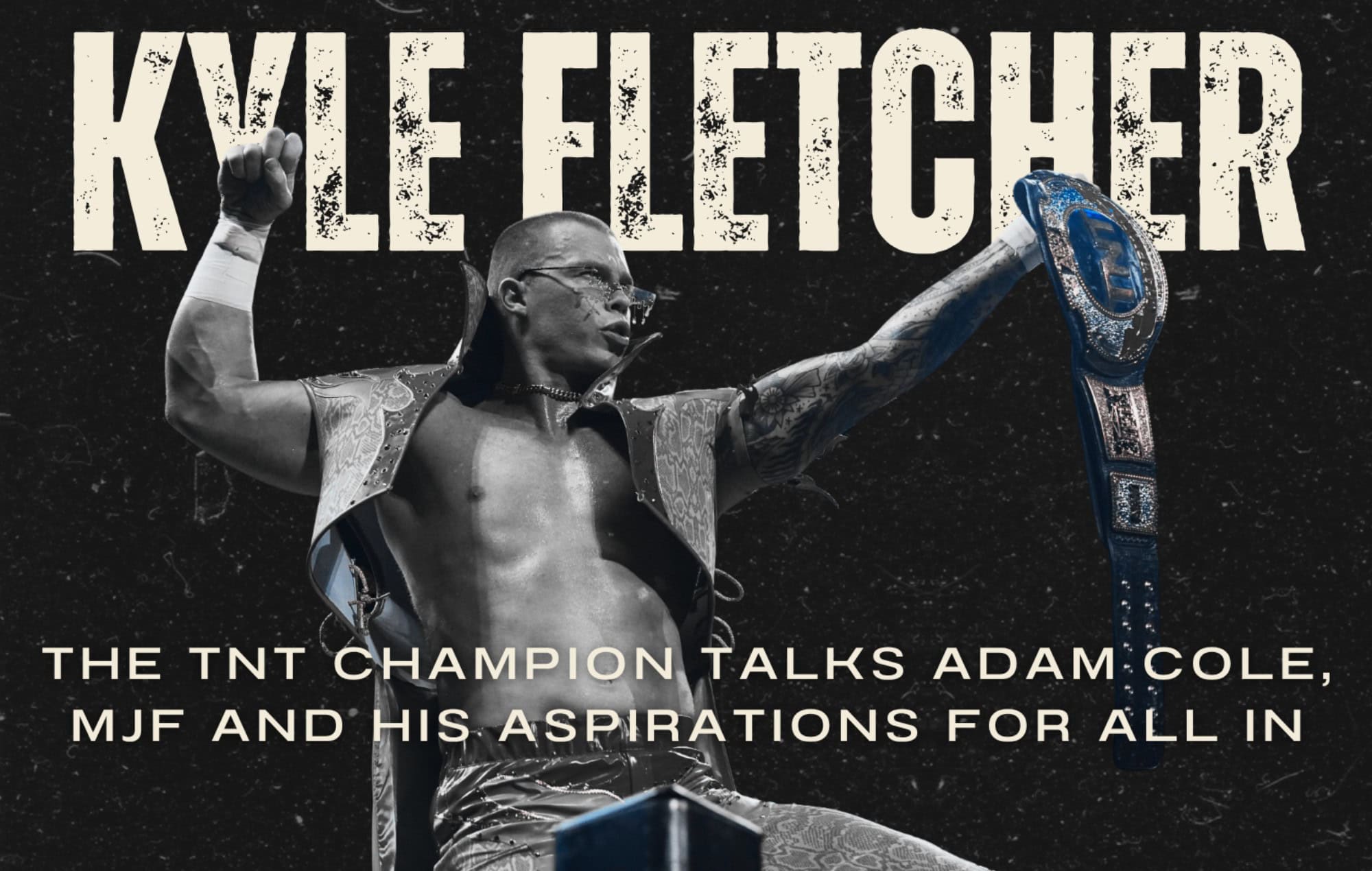
The first visual lesson comes from the way the work follows the body. A raised arm reveals different details from a relaxed arm, and the photographs make that change obvious. The upper arm carries the phrase and broader shapes. The forearm contains denser marks. The hand and wrist are smaller, more exposed details that appear briefly, often when Fletcher grips a rope or lifts a belt.
In the Soundsphere interview, Fletcher described tattooing as part of the larger creative current around him. He has spoken about feeling pressure, purpose, and the need to keep improving, and the arm phrase condenses those ideas into a short statement. The surrounding designs do not erase the words. Instead, they give the lettering a setting, almost like a title placed inside a moving visual sequence.
Pressure is a privilege lettering
The wording also fits Fletcher’s public presentation. His wrestling persona is intense, but the phrase is unusually direct. It names the difficult part of success without pretending that difficulty is glamorous. That makes the tattoo legible even to someone who does not know the match history behind it. The design communicates first through language, then through placement and scale.
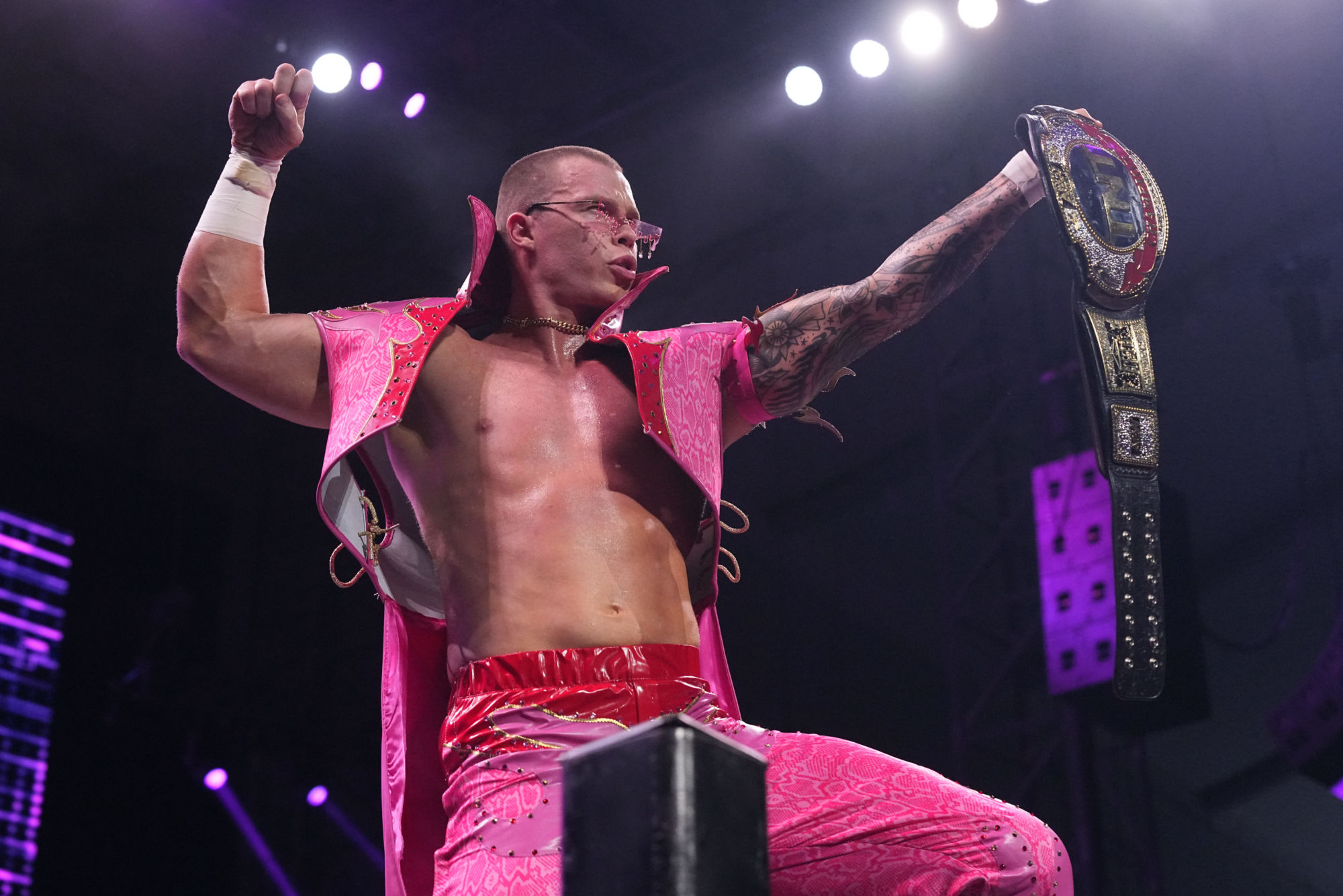
The shoulder photograph is especially useful because it shows how the script sits beside larger blackwork. The lettering is readable, yet it does not float alone on bare skin. Lines and shaded forms give it weight. That relationship between statement and surrounding texture is a recurring feature of the collection. The tattoo feels assembled over time rather than purchased as a single visual package.
Fletcher’s other visible marks are less fully explained in published interviews, so the safest description stays visual. The inspected frames show a combination of bold black outlines, compact symbols, and smaller illustrative details. They also show why an image-by-image reading is necessary. One frame can reveal the shoulder, while another catches the hand, and a third makes the sleeve’s density easier to read.
The wrist advice tattoo
The wrist and hand details add a different rhythm. They are smaller than the shoulder work and do not dominate every photograph, but they appear at natural points of movement. A hand tattoo can become a punctuation mark when the fingers close around a rope or championship belt. It can also disappear under tape or gloves, which is why match photography should be treated as a partial record rather than a complete inventory.
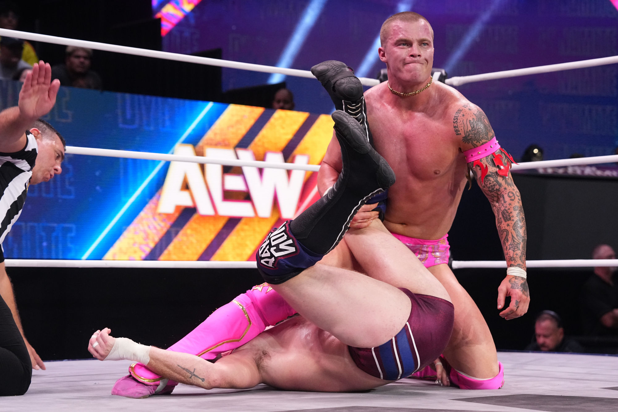
That partial quality is important when looking at sports tattoos. Ring gear, wrist tape, lighting, and motion can change what is visible from one night to the next. Fletcher’s collection is documented through interviews and photographs that complement one another. The interview supplies the meaning of the phrase. The action frames supply placement and scale. Together they describe the arm with more accuracy than either type of source could provide alone.
The tattooed arm also helps connect Fletcher’s current image to his career path. He has described wrestling as the purpose he kept returning to, even as the opportunities became larger and the expectations became heavier. The phrase on his arm makes that idea permanent. It is a compact line, but its position means it travels with him through the work that created the pressure in the first place.
The shoulder and bicep work
The visual style remains more personal than promotional. The lettering is not presented as a sponsor mark, and the surrounding designs do not imitate the clean geometry of a team logo. The photographs show irregular edges, layered shading, and changes in density. That gives the sleeve a lived-in quality. It looks like a collection shaped by decisions made at different moments, not a costume designed for one entrance.

A close reading of the upper arm shows three useful qualities. First, the phrase has enough negative space around it to stay readable. Second, the surrounding ink creates a darker frame that makes the text stand out. Third, the design remains visible while Fletcher’s arm changes angle. Those qualities explain why the tattoo works in both editorial portraits and fast-moving wrestling images.
The smaller hand-side work performs a different job. It is intimate and fleeting, visible in a grip or a gesture rather than across a full pose. That makes it a useful counterpoint to the shoulder lettering. One part of the collection speaks in a sentence. Another appears as a fragment. Both belong to the same broader record of how Fletcher uses his body as part of his public and private identity.
Hand and forearm details
The published record does not support assigning a definitive meaning to every shape in the sleeve, and it is better to keep that boundary clear. What can be said with confidence is that the phrase has been explained directly, the arm coverage is repeatedly visible, and the designs are distinct across multiple photographs. The uncertainty around some smaller marks does not weaken the story. It keeps the description tied to evidence rather than guesswork.
Seen together, the five photographs also show progression. The collage establishes the scale of the arm. The raised-belt frame makes the lettering easy to locate. The in-ring image catches the lower details during movement. The editorial graphic isolates the tattooed side in a cleaner setting. The later portrait adds a different angle. None of these frames is a substitute for the others, which is why the collection works as a sequence rather than a single hero shot.
Kyle Fletcher’s ink is therefore best understood as a combination of statement and accumulation. The statement is the arm phrase, a plain reminder that opportunity and pressure can arrive together. The accumulation is the surrounding sleeve, with its denser forms, smaller marks, and changing visibility. The result is visually forceful without needing a single grand symbol to explain everything.
How the collection has developed
For a wrestler whose career is still moving quickly, that unfinished quality feels appropriate. The arm already carries a clear line of thought, but the surrounding work leaves room for the collection to keep developing. The photographs preserve different moments in that process. Read together, they show a tattoo story built from purpose, performance, and the ordinary fact that a meaningful idea can become part of someone’s body one decision at a time.
The sequence also explains why the best account of the tattoos is layered. A direct interview can establish meaning, while a clean portrait clarifies the body map and match photography reveals how the ink behaves in motion. The sources do not all show the same angle, and that is useful rather than inconvenient. Each image contributes a different piece of the record.
What the photographs preserve
Taken as a whole, Fletcher’s arm is a visible companion to his wrestling story. The phrase gives the collection a sentence, the surrounding work supplies texture, and the smaller details keep it personal. It remains an evolving set of choices, documented through different moments rather than frozen in a single promotional pose. The collection is also unusually well suited to comparison because it appears in both editorial and performance settings. In one frame the arm is posed for a camera; in another it is working through a hold or lifting a title. The design remains recognizable across those changes, which gives the documented phrase and the visible sleeve a strong continuity.
That continuity is the clearest way to understand the collection without assigning meanings that Fletcher has not publicly supplied. The photographs resist a simplified reading. The arm can look almost graphic when the lettering is isolated, then become heavily textured when the camera catches the forearm at a different angle.
Tape, costume, sweat, and colored arena light alter the surface, but they do not change the basic relationship between text and image. That is why the strongest account keeps both the personal explanation and the visual record in view. Fletcher has given the phrase a meaning in his own words, while the photographs show how the surrounding work has grown around it. Neither side needs to be exaggerated for the tattoo story to feel specific, current, and connected to the wrestler who wears it.