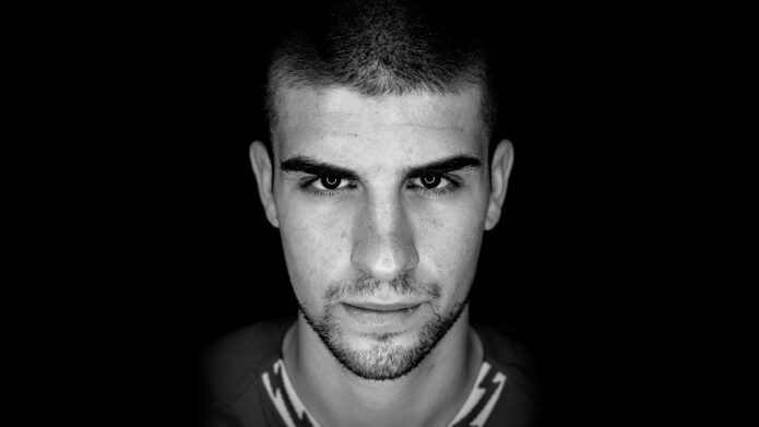
Gianluca Mancini’s tattoos tell a story about competition, memory and belonging. The Roma defender’s collection is not a random scatter of small marks. It includes a large animal composition on his left leg, dense black-and-grey work on his arms, and lettering connected with the people and places that shaped his career. Reading the photographs in sequence makes the collection feel personal, even when the exact meaning of every symbol has not been explained.
The strongest documented thread is Mancini’s long relationship with tattoo artist Valentino Russo. In a 2023 report, the artist’s work on Mancini’s leg was described as a scene of animals, including a wolf, a bear and a gorilla. Earlier, Mancini told AS Roma that one of his tattoos was connected with his idol Marco Materazzi. A later interview also linked his SPQR lettering to his affection for Rome. Those details give the images a useful structure: the designs can be discussed as visible work first, while the interpretations stay tied to what Mancini or credible reporting has actually established.
The left-leg tattoo composition
The most dramatic piece is the full-leg composition shown in the 2023 reports. The close-up photographs reveal a wolf near the upper section, a bear lower down and additional animal imagery arranged between them. The shading is heavy and deliberate, with dark backgrounds allowing the faces and eyes to hold the viewer’s attention. Leaves and angular negative-space shapes keep the separate portraits from reading as isolated stickers.
This is also a good example of why placement matters. A large leg project can be designed as a visual route rather than a single emblem. The eye moves vertically, from the wolf’s alert expression through the central foliage toward the bear below. The animal faces are realistic, but the surrounding geometry adds a harder, almost armor-like edge. That mix suits a centre-back whose public image is built around physical duels and intensity.
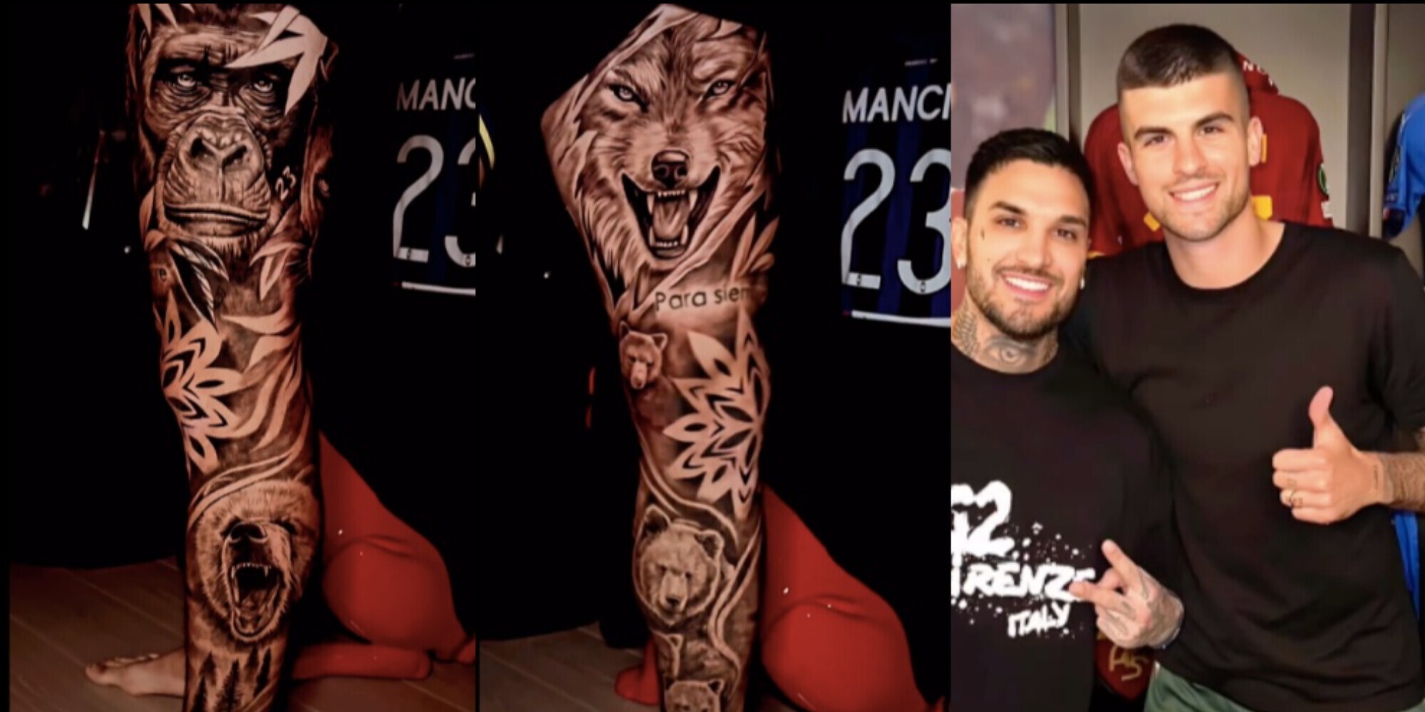
The left leg is especially useful for tattoo readers because the design remains legible at two distances. From across a room, the dark composition reads as one powerful sleeve-like field. Up close, the animal faces, lettering and leaf shapes become separate points of interest. The design works through continuity: each section fills a different part of the leg, but the shading makes the whole project feel planned as one surface.
The wolf, bear and gorilla leg tattoo
Reports from Siamo la Roma, Il Romanista and Corriere dello Sport agree on the central animal subject, while the photographs supply the visual detail. The wolf is the clearest focal point in the close-up, with a forward-facing expression and pointed ears. The bear appears lower on the leg, giving the composition a heavier, grounded counterweight. A gorilla is also described in the coverage, adding another layer of power to the animal group.
It would be too strong to assign a fixed meaning to each animal without a direct explanation from Mancini. Still, the arrangement creates an understandable visual rhythm. The wolf brings alertness, the bear brings mass and the gorilla brings force. They are not presented as cute mascots. Their faces use shadow and dense linework, and the surrounding black areas make the collection feel closer to a portrait study than to decorative flash.
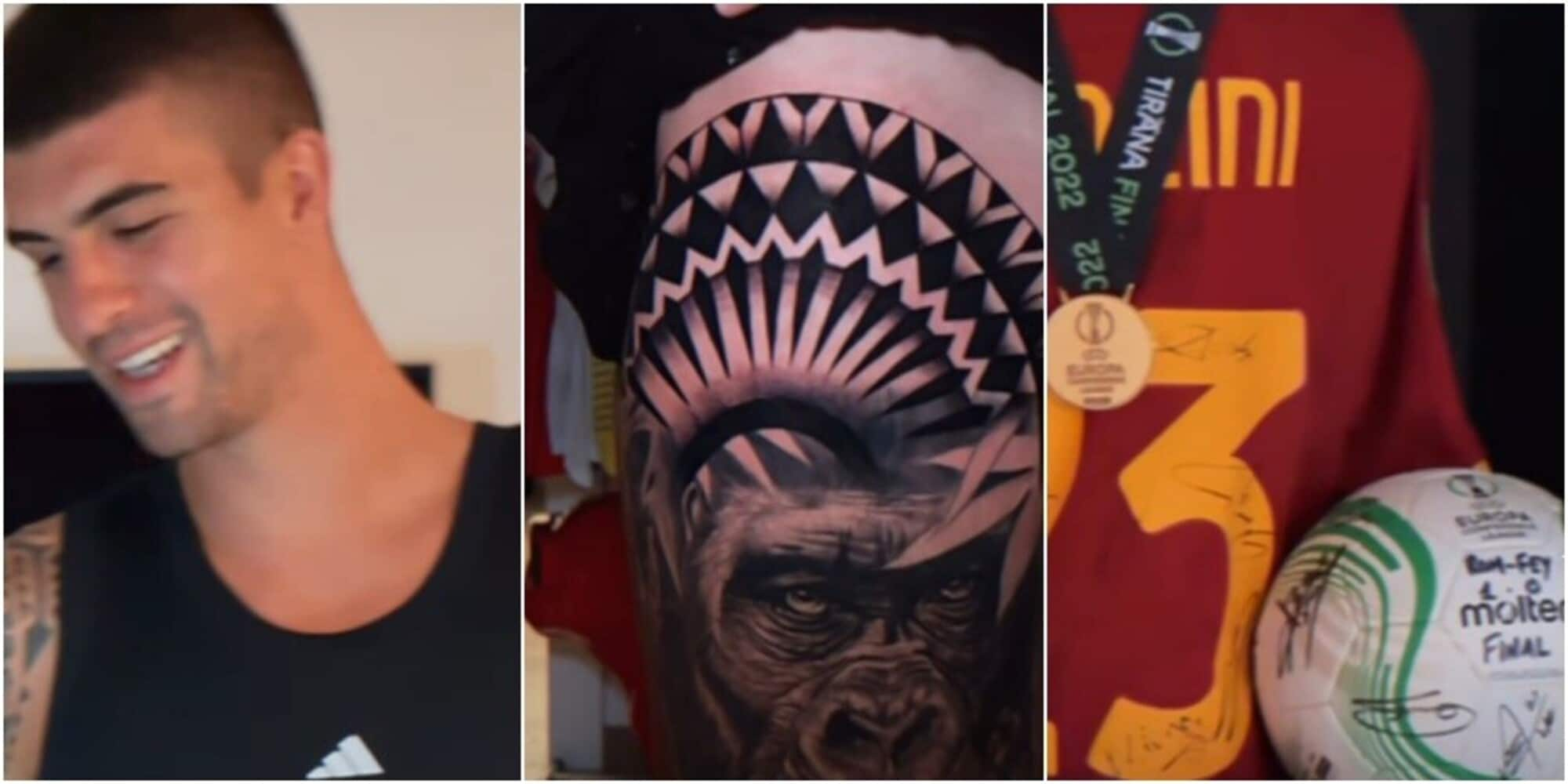
Valentino Russo’s role matters here because the reports identify him as both the artist and a friend of Mancini. That relationship places the design inside a continuing collaboration, not a one-off commission chosen from a catalogue. Always a pleasure to tattoo you, my friend was the artist’s message quoted by Corriere dello Sport, a line that helps explain the sense of trust visible in the finished work.
The forearm sleeve and geometric bands
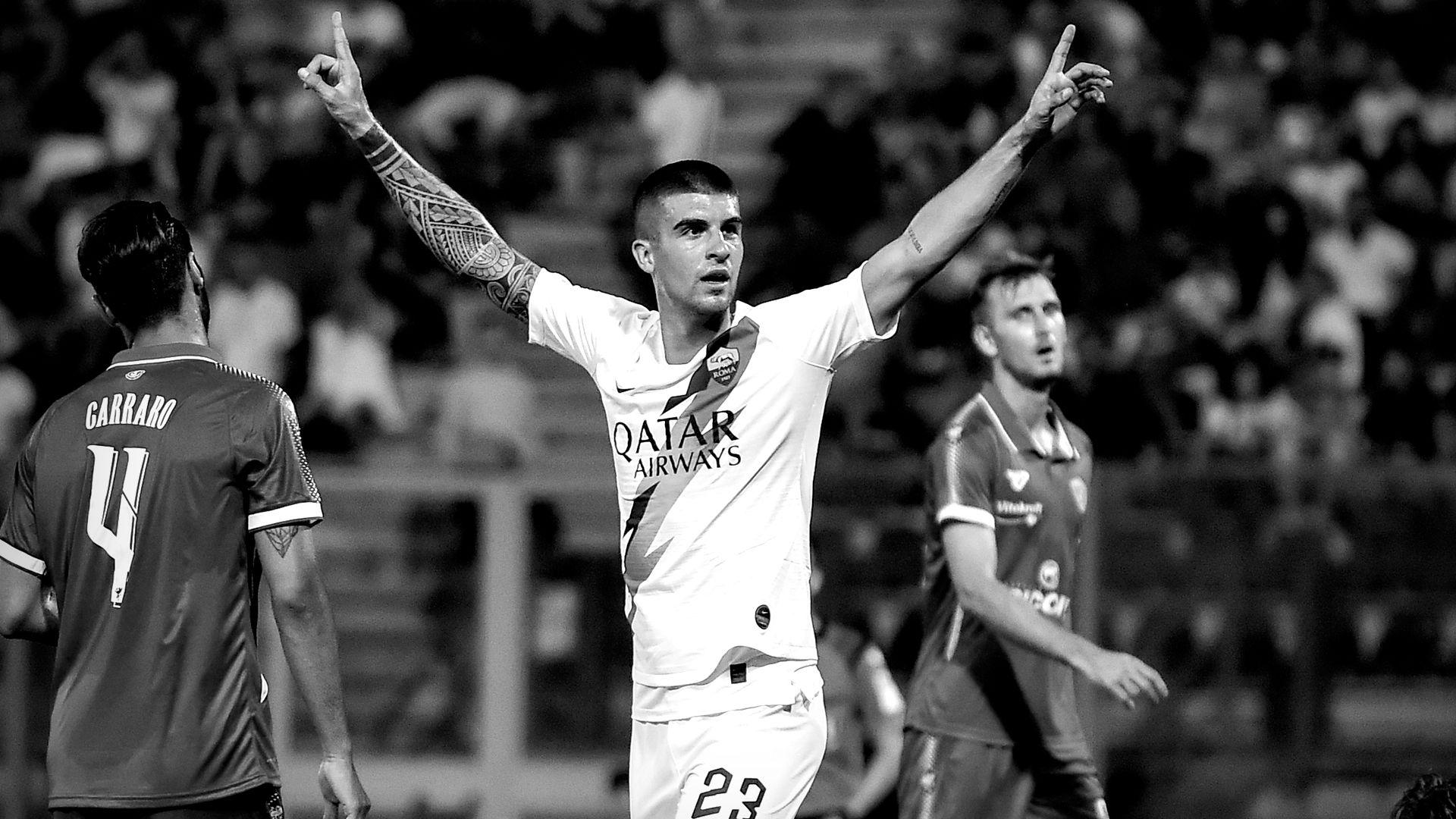
Mancini’s arm work has a different visual language. In the AS Roma training photograph, his left forearm is covered by a dense black-and-grey sleeve with repeating curves, panels and banded geometry. The pattern is more architectural than the animal piece. It wraps around the arm and uses contrast to create an almost textile-like surface, with open skin acting as a deliberate break between dark sections.
That sleeve also shows how an athlete’s movement changes the reading of a tattoo. A still portrait reveals the pattern as a mapped surface, while a match image shows the lines bending as the arm reaches, braces or celebrates. The design does not depend on one front-facing angle. Its rhythm survives movement, which is a valuable quality in a placement that is often visible only for a second during play.
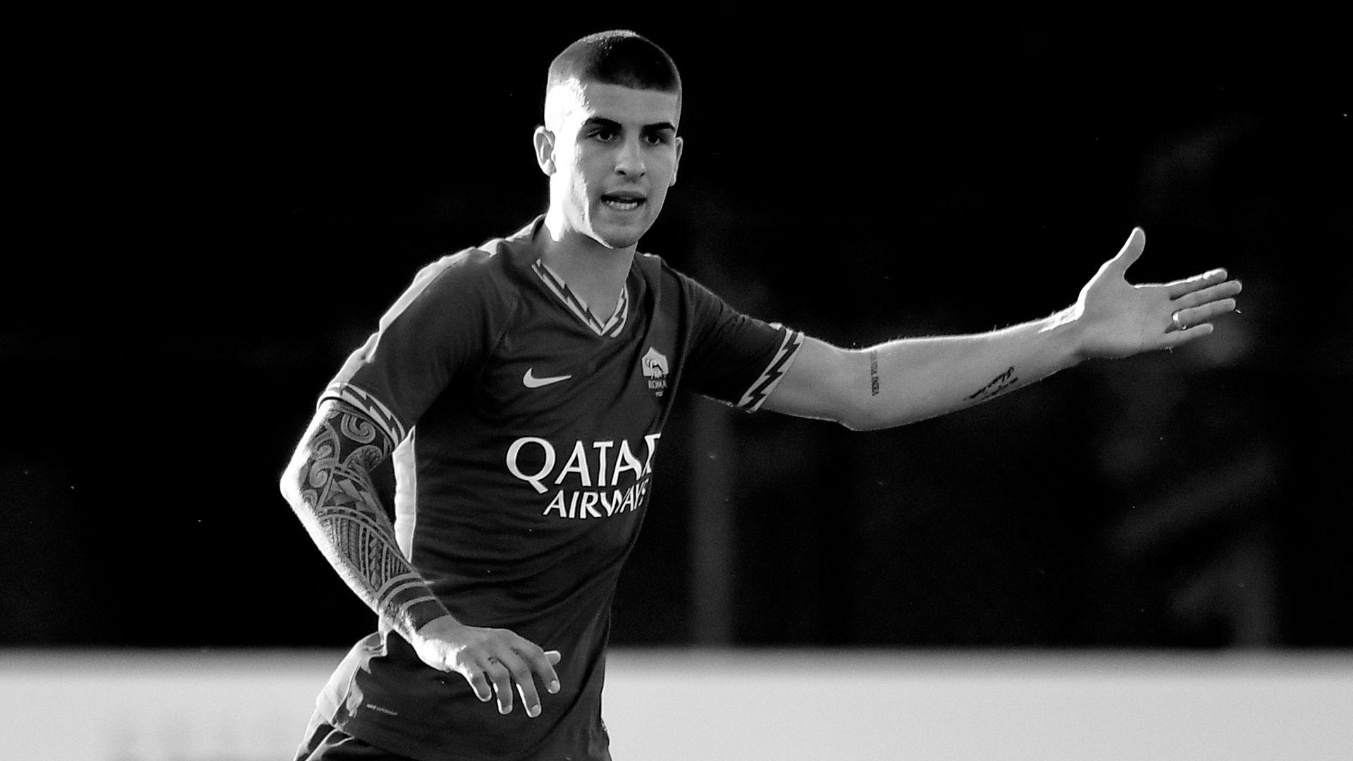
The geometric bands provide a bridge between Mancini’s older and newer work. They are less literal than the animals, yet they use the same preference for strong contrast and large coverage. Black structure gives the collection its visual backbone. Even when a small word or personal reference is harder to read, the overall balance remains clear because the sleeve has a firm silhouette.
Hand, wrist and lettering details
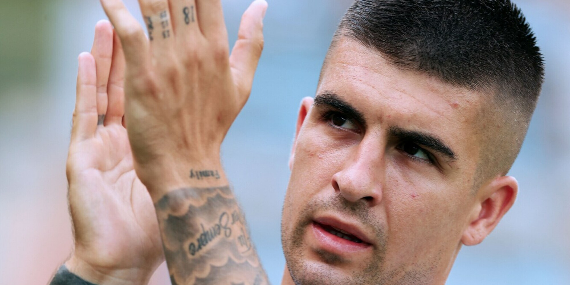
Close-up reporting from Corriere dello Sport shows smaller tattoos on Mancini’s hands and wrist, including lettering and compact marks that sit outside the large sleeve. These details are easy to miss in a full-body sports photograph. The face-and-hand image is valuable because it places the ink beside Mancini’s expression, making the scale of the lettering easier to understand and showing that his collection is not limited to one large project.
The writing also adds a quieter tone. Mancini’s collection includes personal marks that do not need the same visual volume as the animal leg. A short word on the wrist can function like a private reminder, while a larger composition announces itself. That contrast keeps a heavily tattooed athlete from being reduced to one signature image. The smaller pieces are part of the day-to-day collection, visible when he gestures, signs or speaks.
In 2026 reporting on his Roma renewal, Mancini explained that his SPQR tattoo represents how the city and club have entered his heart and blood. That is a documented interpretation, not a guess based on a photograph. SPQR is the clearest bridge between lettering and place, turning a short inscription into a statement of identity tied to Rome.
The Materazzi connection in Mancini’s tattoo collection
AS Roma’s 2019 interview gives the collection an older personal thread. Mancini said that one of his tattoos was connected with Marco Materazzi, an idol he met during his early professional years. The story is unusually specific: a Perugia masseur noticed the tattoo, sent Materazzi a photograph and helped create the possibility of a meeting. Mancini’s account makes the mark important even though the interview does not provide a detailed visual catalogue of every design.
This is why responsible tattoo coverage should separate confirmed meaning from visual interpretation. A photograph can show the placement, scale and style. Mancini’s own words can add the connection to Materazzi. The two forms of evidence work together, but neither should be stretched beyond what it says. For readers, that approach is more useful than inventing a story for every line.
The wider collection therefore has two kinds of memory. Some designs are large public statements, such as the animals covering the leg. Others are personal links to a football idol, a city or a career milestone. One of my tattoos is related to him is a modest sentence, but it gives the collection emotional weight because it links body art with the relationships that shaped Mancini before he became a Roma leader.
How the collection fits Mancini’s football identity
Mancini’s football is built on contact, anticipation and visible commitment. His tattoos echo that energy through heavy shading, strong animal faces and patterns that occupy large areas of skin. The match photographs are not a complete catalogue, yet they show how the tattoos move with him rather than sit apart from his sporting identity. A sleeve appears when he raises an arm, a wrist mark appears during a close-up and the leg project becomes visible when shorts or celebration angles allow it.
There is also a useful difference between the symbolism and the styling. The animals suggest force, but the workmanship depends on controlled transitions, layered shadows and careful spacing. The geometric sleeve supplies order, while the animal leg supplies narrative. Together they create a collection that is bold without becoming visually chaotic. The contrast between portrait realism and geometric structure keeps the designs readable even as the coverage grows.
For a tattoo enthusiast, Mancini’s approach offers several design lessons. Large projects benefit from a clear visual route. Sleeves need negative space and a repeatable rhythm. Lettering becomes stronger when it has a personal reason, rather than being added only to fill a gap. Above all, different tattoos can share a palette and still preserve their own identity. His collection shows how black-and-grey work can connect several placements without making every design look identical.
What the photographs confirm, and what remains open
The photographs confirm that Mancini has substantial tattoos on his arms, smaller lettering and marks around the hand and wrist, and an extensive left-leg composition featuring animal portraits. Credible reporting identifies Valentino Russo as the artist behind the large leg work. Mancini’s own interviews connect one tattoo to Materazzi and explain the meaning of SPQR. Those are strong foundations for a careful guide.
Other details should remain open. The exact date of every earlier tattoo is not consistently published, and a single match photograph cannot establish the full inventory. Some areas are covered by kit sleeves, body position or the crop of the image. It is better to describe the visible evidence precisely than to turn an incomplete view into a definitive list.
That restraint does not make the collection less interesting. It makes the documented pieces easier to appreciate. The animal leg can be read as a long-form project, the forearm sleeve as a study in geometry and the lettering as a set of personal anchors. Careful sourcing lets the designs speak at full strength without adding meanings Mancini has never claimed.
Why the collection stays memorable
Mancini’s tattoos stay memorable because they combine scale with recognizable details. The wolf and bear faces are immediately legible, the forearm sleeve has a clear pattern language and SPQR compresses a relationship with Rome into four letters. The collection also benefits from variety. A viewer can move from a full-leg animal scene to a wrist close-up and then to a black-and-white match image without losing the sense that these are parts of one person’s visual history.
The work is personal, but it is also practical to study. It shows how a large tattoo can be built through connected subjects, how a sleeve can use bands to organize coverage and how lettering can carry meaning without dominating the body. Mancini’s collection offers a useful reminder that symbolism is strongest when it comes from a real relationship, place or promise.
Seen together, the photographs suggest an evolving collection rather than a finished checklist. The animals, geometric sleeve, wrist details, Materazzi connection and Roma lettering all occupy different roles. Their common thread is intention. Roma mi è entrata nel cuore e nel sangue is Mancini’s explanation of the city connection, and it captures the central idea behind the collection: the tattoos turn important people, places and moments into marks he carries with him.