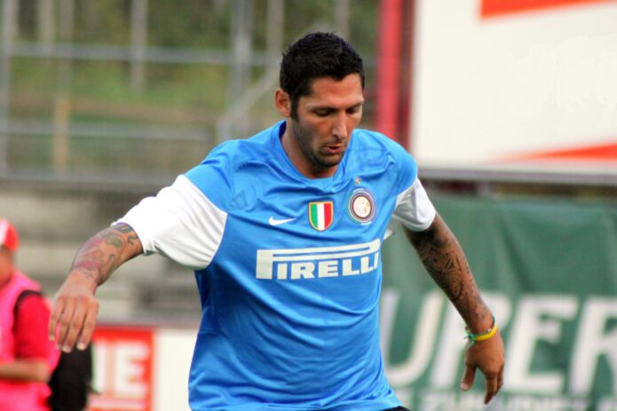
Marco Materazzi has never treated tattoos like quiet little footnotes. Even in old football photographs, the ink is hard to miss: color on the forearms, script running along the arms, lettering on the legs, and a huge winged design across his back. The former Italy and Inter defender’s collection looks built over time, with each piece keeping its own shape instead of being forced into one tidy theme.
Some details are well documented. Materazzi has spoken about tattoos dedicated to people close to him, including names such as Marco and Davide, and he once said he wanted a Japanese geisha drawn by his friend John Richmond. Other details are best left as visual descriptions. A photograph can show a flower, a diamond, a skull, or a line of script without proving the private reason behind it.
Marco Materazzi’s tattoo collection in one look
The first thing that jumps out is the amount of color. Materazzi’s arms aren’t covered in one flat block of black ink. They have red and orange flowers, green shapes, blue details, script, stars, and darker outlines that keep the separate pieces readable. From a distance, the tattoos form a sleeve-like mass. Up close, they break into smaller images and phrases.
That mixture gives the collection a slightly old-school feel, although it isn’t limited to one traditional style. There are bright motifs that look at home in a classic flash book, alongside large lettering and more personal designs. The sleeves also leave enough skin showing that the tattoos don’t melt into one dark surface. You can still follow the edges of individual pieces when the light is good.
His back is a different kind of statement. A widely circulated shirtless photograph shows large wings spreading across the upper back, with additional work running down the sides. The wings create a clear centre even though the rest of the body carries plenty of competing detail. It’s the sort of placement that only really makes sense when the wearer is comfortable with a tattoo being seen from behind.
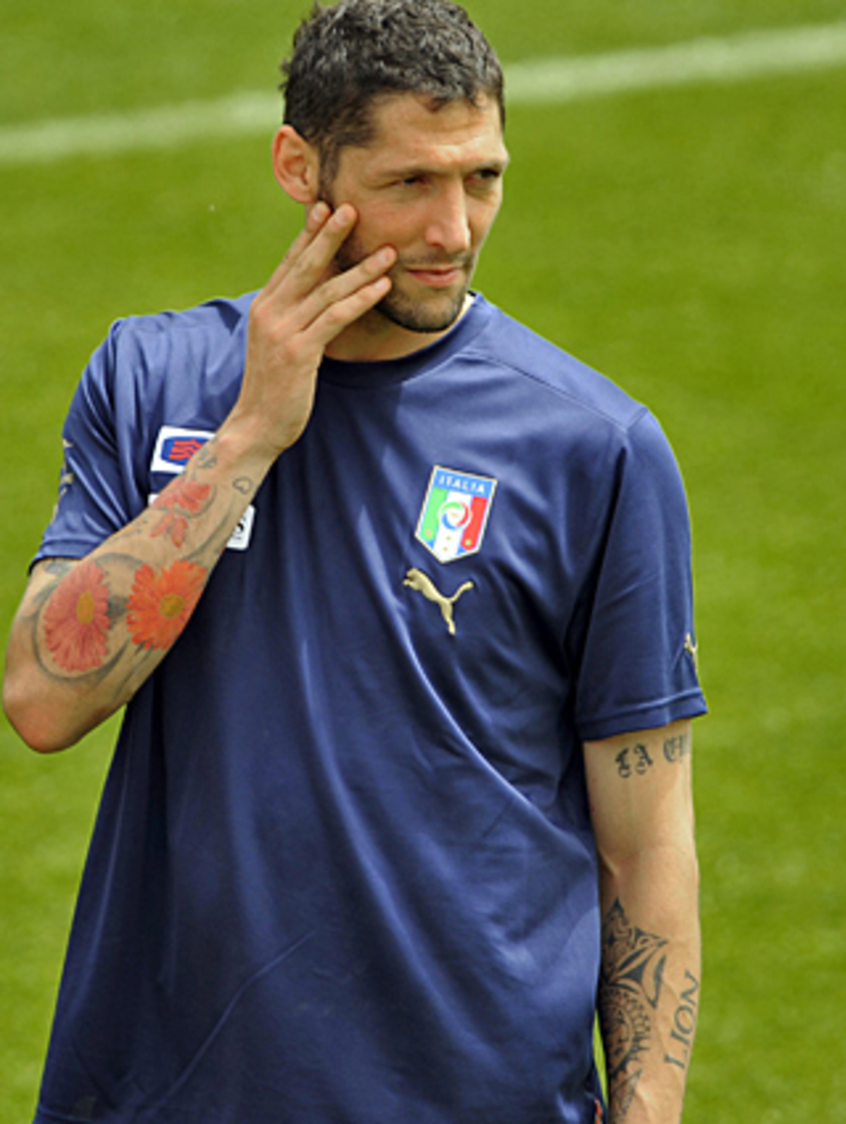
This photograph is a genuine tattoo view of Materazzi during an Italy training session. The colorful flowers and dense arm work are clear, while the face and national-team shirt keep the image in football context.
The forearms carry the loudest visual weight
Materazzi’s forearms do most of the talking in the photographs. One training image catches a large orange flower near the elbow, smaller colored shapes lower down, and a long line of writing running beside them. On the other arm, darker lettering and outlined pieces fill the space in a different way. The two sleeves feel related because they have similar density, but they aren’t mirror images.
The word “LION” is visible on the inner arm in one of the better-known football tattoo photographs. It sits among other pieces rather than floating on its own, which is part of what makes the sleeve work. The eye has a large readable word to grab first, then smaller symbols and color patches to explore around it.
Another close view shows a row of diamond shapes surrounded by little rays. The diamonds are bright and geometric, so they stand apart from the softer flowers and the more complicated script. They also give the arm a repeated rhythm without turning the whole sleeve into a rigid pattern.
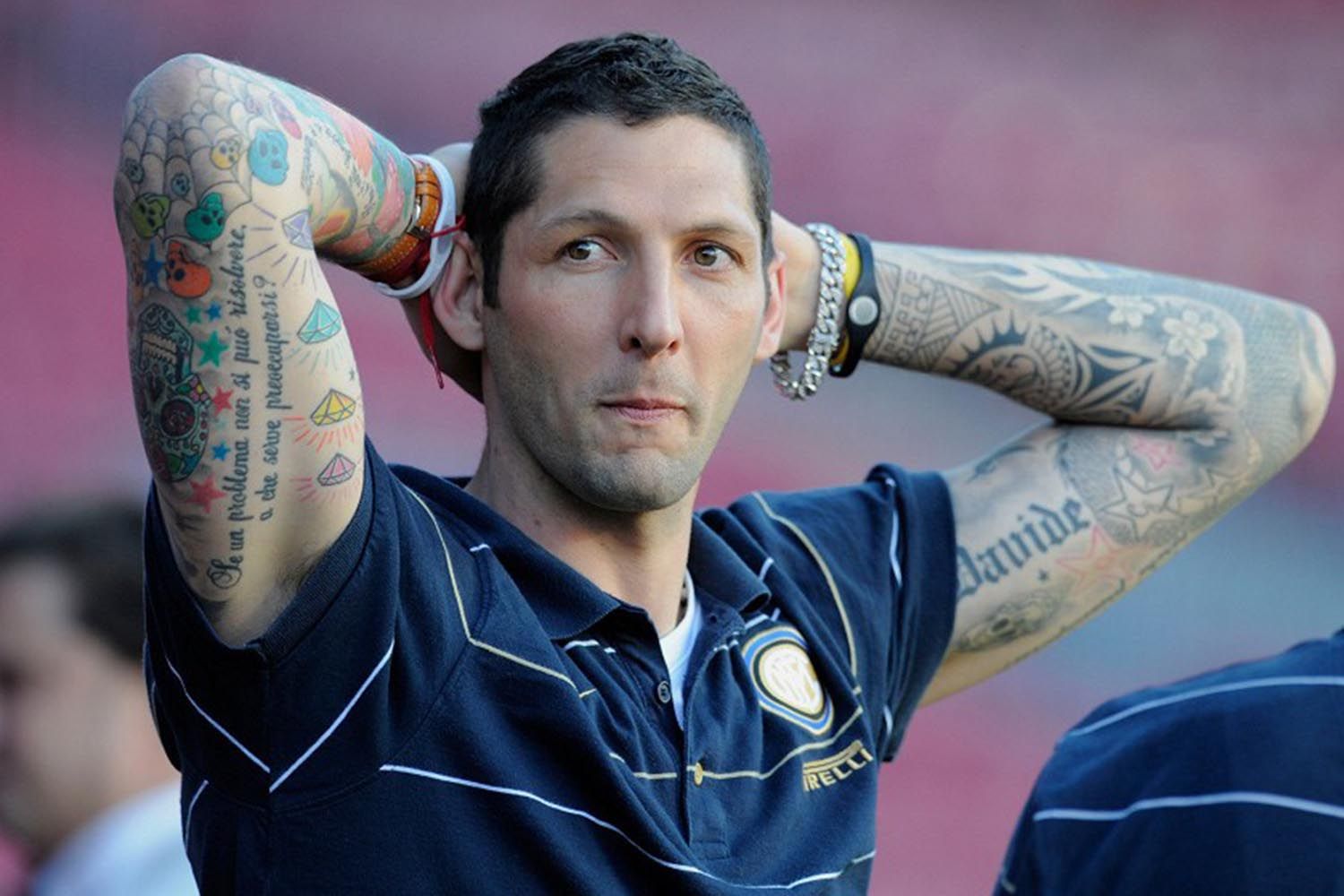
Here the camera catches both forearms at once. The image is useful because it shows the balance of the collection: one side leans into colorful symbols and script, while the other has heavier shading and larger lettering.
The personal side of the collection
Materazzi has talked about his tattoos as moments from his life, and that fits what the photographs show. Some pieces are easy to read as names or dates. Others are only partly visible, covered by a sleeve, turned away from the lens, or softened by the quality of an older photograph.
Reports have identified “Marco” above the right knee and “Davide” on the right calf. Those are simple pieces compared with the flowers and diamonds, but simple doesn’t mean less important. A name can be the tattoo someone notices most, even when a much larger image sits nearby. The meaning is in the reference, not the amount of ink.
His FourFourTwo interview also gives a useful glimpse into how he thinks about new work. Materazzi mentioned having a Japanese geisha drawn by his close friend John Richmond, alongside tattoos connected to friends, music, Valentino Rossi, José Mourinho and Michael Jordan. That mix explains why the collection doesn’t look like it came from a single catalogue. The choices come from different parts of his life.
It’s also a reminder not to turn every visible mark into a dramatic explanation. Published reporting gives us a few names, dates and references. For everything else, the honest read is the visual one: what the design looks like, where it sits, and how it joins the surrounding work.
The back piece changes the scale completely
Arm tattoos are the pieces people usually notice first because they appear in match photographs. The back piece needs a different kind of picture. When Materazzi lifts his shirt or poses without it, the large wings become the main subject. They stretch across the shoulder blades and give the collection a much bigger frame than the sleeves alone.
Wings are common tattoo ideas, but the placement still matters. On the back, they can be designed as a pair of symmetrical shapes, a loose set of feathers, or something that wraps toward the ribs. Materazzi’s version reads as a broad pair of wings, with other tattoos sitting around them rather than being hidden underneath the same dark fill.
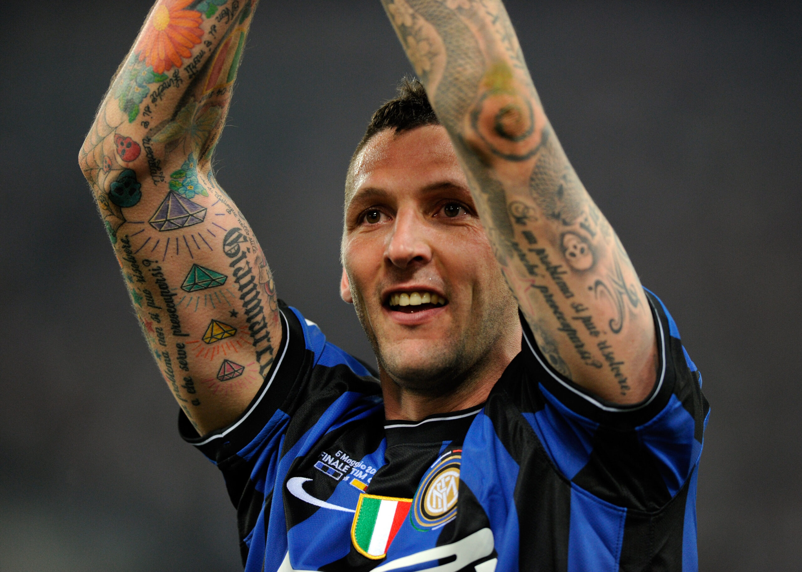
This close celebration photograph shows the tattooed arms in motion. It isn’t a studio tattoo shot, but the raised-arm angle gives a clear view of the forearm lettering, diamond motifs and the way the sleeve bends at the elbow.
Why different photographs show different tattoos
Materazzi’s collection is a good example of why one photograph is never enough. A close portrait makes the forearms look enormous because they fill the frame. A full-body image makes the same tattoos seem smaller. A rear view brings out the wings. A training shot can reveal a piece that disappears under a match shirt.
Clothing changes the evidence too. Football shirts cover the chest and upper back. Shorts and socks hide most of the legs. A celebration can show both arms while blocking the torso with teammates or a trophy. That doesn’t mean a new tattoo appeared between two photographs. It can simply mean the earlier image didn’t show the right angle.
Light matters as well. Color looks stronger in bright outdoor photographs, while a darker indoor image can make several pieces read as blackwork. Older pictures may soften the edges, and compression can turn small lettering into a dark line. Comparing photographs is useful, but it only works when the pictures are genuinely different views and not the same frame cropped several ways.
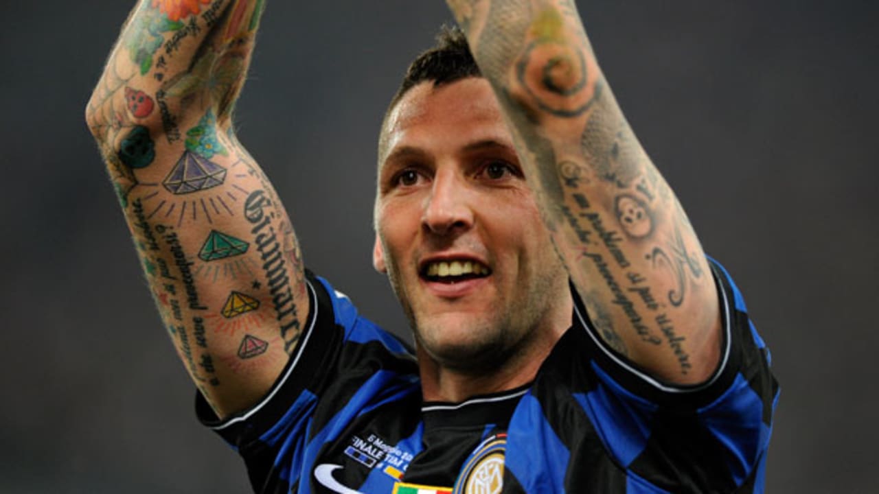
This wider match photograph is contextual rather than a close-up tattoo study. It still provides genuine visual evidence of Materazzi’s identity and the visible arm coverage, while the wider frame shows how the tattoos sit against the Inter shirt and stadium setting.
The collection mixes color, script and heavy outlines
The easiest way to describe Materazzi’s style is as a busy collection with strong outlines and plenty of color. The flowers are the softest-looking pieces because the petals create rounded shapes. The diamonds are sharper. Script runs through the gaps and gives the eye a direction to follow. Darker motifs near the elbow and upper arm stop the sleeve from becoming too light.
That mix works for a practical reason: every piece doesn’t compete in the same way. A flower catches attention through color. A word catches attention through shape. A wing catches attention through size. Smaller symbols then fill the spaces between them. If all of the tattoos were the same size and tone, the arm would be much harder to read.
There’s a lesson here for anyone planning a large sleeve. Start with the body’s movement and the distance between the important pieces. A forearm tattoo should still make sense when the wrist turns. A large upper-arm image needs room around it. Script should have enough breathing space that it doesn’t become a dark stripe after the skin settles.
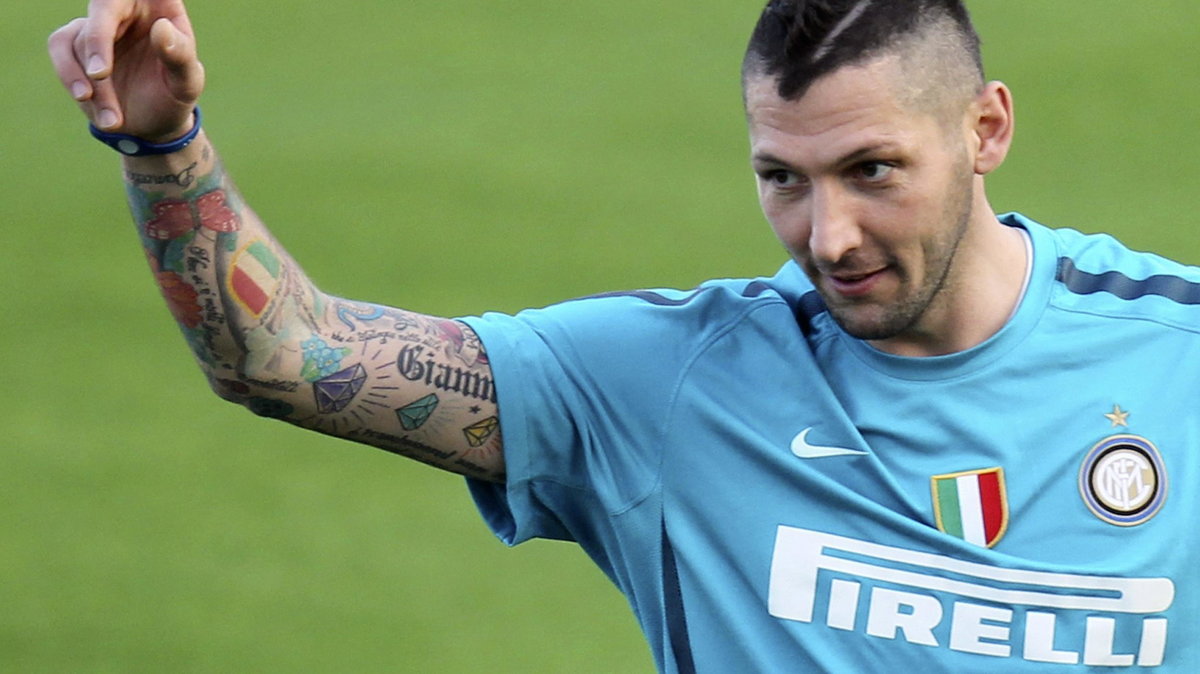
The side-on view shows how the arm coverage wraps around the limb. Details disappear toward the back of the arm, then return as the player turns. That changing view is part of the tattoo, not a flaw in the photograph.
The lower-body work is easy to miss
The lower-body work is easier to miss in football coverage, but it adds another layer to the collection. The leg photographs and written reports point to names and personal references, while older images also show large designs around the calves and thighs. The scale changes again. The arms are packed with many smaller pieces; the legs give some of the larger images more room.
Names on the leg can look very different from the colourful forearm work. They read quickly and sit closer to the body’s natural vertical lines. A calf name follows the shape of the muscle. A thigh piece can stay readable even when the leg bends. These placements also explain why the tattoos appear in some photographs but not others.
There’s no need to invent a story for every design. A visible name can be described as a name. A wing can be described as a wing. A flower can be described by its color and placement. That approach is more useful than guessing at private memories the wearer hasn’t explained publicly.
Three layout ideas worth keeping
The first idea is to build around contrast. Materazzi’s sleeves use color next to darker linework, broad images next to small symbols, and clear words beside details that need a closer look. That gives the eye somewhere to land instead of making every part shout at once.
The second is to let a collection grow. The tattoos don’t look like one matching set, and that’s part of their character. Personal names, football references, friends, music and visual designs can share the same body without using one single theme. Consistency can come from the artist’s line quality, the placement and the way the pieces leave room for one another.
The third is to plan for photographs from more than one direction. A sleeve can look complete from the front and unfinished from the side. A back piece can disappear entirely under a shirt. Before choosing a design, think about how it will look with the arm down, bent, raised and turned.
Materazzi’s tattoos are interesting because they don’t need a perfect inventory to make an impression. The photographs show the broad facts clearly: colorful forearms, readable names and script, a large winged back piece, and a collection that grew alongside the rest of his life. The rest is better left to the person wearing it.