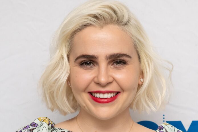
Mae Whitman has the kind of tattoo collection that can disappear under a sleeve and then suddenly take over the whole look when her arms are bare. The pieces are small, mostly black, and spread out rather than packed into one giant sleeve. That makes them easy to miss in a red-carpet photo, but it also gives the collection a really approachable feel.
She has talked about one especially personal design: a little sheep looking up at a star, inspired by a favorite children’s book. More recently, photos shared while she was promoting Up Here showed that this isn’t a one-tattoo situation. Allure’s close look at the images picked out several tiny black marks, including cursive lettering around her wrist and a small face that resembles an alien. Some details are hard to make out, which is part of the appeal. The tattoos feel lived-in instead of arranged for a single reveal.
That makes Mae’s ink a good reference point if you like tattoos that stay personal without becoming the first thing people notice. The best ideas here aren’t about copying one exact mark. They’re about scale, spacing, and leaving enough skin around each little piece for the collection to breathe.
The tiny tattoos are easy to miss until you see the arm photos

The clearest view of Mae Whitman’s tattoo style comes from the arm photos she shared during a TV appearance. Her dress sleeves stopped above the elbow, giving the camera a proper look at both arms. Instead of one oversized centerpiece, there are lots of small black tattoos sitting apart from one another.
That spacing matters. When tiny designs are pushed too close together, they can blur into one dark patch over time. Mae’s collection has room between the pieces, so each mark still reads as its own little thought. You can see how this works even when the photo isn’t close enough to identify every shape. The overall rhythm is clear: small design, open skin, another small design, then a little more space.
There is also a nice lack of visual uniformity. The tattoos don’t look like they were all chosen from the same flash sheet. Some are more like symbols, some look like lettering, and some have the loose, slightly odd character of a doodle. That mix makes the arm feel collected over time rather than planned in one afternoon.
If you’re considering a similar layout, start by thinking about the empty space. A fine-line tattoo doesn’t need to be tiny just for the sake of being tiny. It needs enough breathing room to stay legible and enough contrast to hold its shape. A good artist can help you map out a group that feels relaxed instead of crowded.
A personal detail behind the collection

The most specific story attached to Mae’s tattoos is the little sheep looking up at a star. She described it in a Glamour interview as a design connected to a favorite children’s book. That detail gives the tattoo a sweet, slightly private quality. It isn’t a slogan or a trend reference. It’s a small image tied to something she loved long before it became body art.
The design also explains why a tiny tattoo can carry more weight than a much larger one. A sheep and a star are simple shapes, but the meaning lives in the connection behind them. Someone else might only see a small animal and a dot of light. Mae sees a piece of a book, a memory, and the person who understood why that image mattered to her.
That is a useful lesson if you’re planning your own first or next tattoo. You don’t have to turn the full explanation into the design. Sometimes the best version is the quietest one: a small animal, an object, or a single symbol that only needs to make complete sense to you.
For a tattoo like this, line weight makes a big difference. A sheep needs enough detail to suggest the animal without becoming a fuzzy blob. The star needs to be clear enough that it still reads as a star when the ink softens with age. Keeping the composition simple gives the artist more room to make those few lines clean.
The details that give the collection personality

Allure’s look at Mae’s arm photos notes cursive lettering around her wrist and a tiny face that appears to have an alien-like expression. The face is partly blocked by a bracelet in the photo, so it would be a mistake to claim more detail than the image supports. What is clear is the attitude: these are small, playful marks that don’t seem interested in looking overly polished.
Wrist lettering is one of those choices that can look delicate in a fresh tattoo photo and much heavier after a few years. The best versions use short words, generous spacing, and a line weight that matches the size of the design. If the script is too fine or the letters are packed together, the writing can lose its shape as the skin changes.
The tiny face brings a different energy. It doesn’t need to be perfectly realistic. In fact, a simple expression or a strange little set of eyes can make the design feel more like a personal doodle than a formal illustration. That works nicely beside the more meaningful sheep and star idea because the collection isn’t locked into one mood.
Mae’s mix is a reminder that a tattoo collection can hold both sentimental and silly pieces. You don’t have to choose between deep meaning and something you simply enjoy looking at. A few serious symbols can sit next to a weird little character and make the whole arm feel more like a real person.
Why camera angles change the read

Small tattoos are heavily affected by the photograph around them. A close arm shot can reveal a line that disappears when the subject turns sideways. Sleeves, bracelets, shadows, and even the color of a jacket can change what you notice first. That is why one photo rarely tells the whole story of a scattered collection like Mae’s.
It also helps explain why different people describe the same tattoo differently. One person may catch the cursive mark on the wrist while another notices the tiny face. Neither view has to be wrong. They’re simply paying attention to different pieces of a busy arm.
For anyone collecting reference images, save photos that show the scale and placement as well as photos that show the design close up. A tight crop is useful for line work. A wider portrait is better for seeing how a new piece fits beside everything else. You want both kinds before handing an idea to your artist.
The same rule applies when you’re deciding where to place your own tattoo. A mark that looks perfect in a straight-on mirror view may twist when your arm hangs naturally. Move around, bend the elbow, and check the design in ordinary positions. Tiny ink is still permanent ink, so the way it sits in daily life matters more than one flattering picture.
A scattered look can still feel intentional
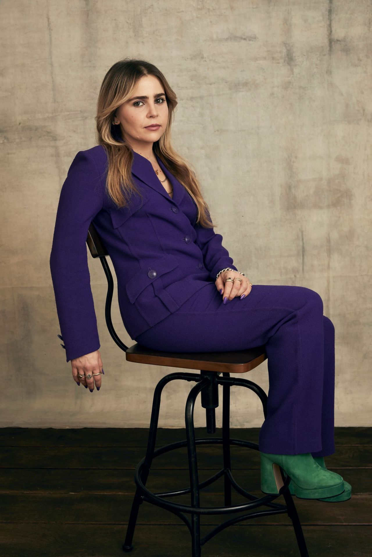
Mae’s tattoos don’t look like a single matching set, but they don’t feel random either. The collection is held together by scale and restraint. Most of the visible pieces are small enough to sit quietly on the arms, and the black line work gives the group a loose visual connection without forcing every design to share the same subject.
This is a good approach for anyone who wants several tattoos but isn’t ready to commit to a full sleeve. Leave space for future pieces. You can always add another small design later, but you can’t easily recreate open skin once every gap has been filled.
It can help to choose a few anchor areas first. Maybe one mark belongs near the wrist, another sits higher on the forearm, and a third balances the opposite arm. After that, let the smaller ideas find their own places. The result feels more natural than lining everything up with a ruler.
Spacing doesn’t mean every gap has to be identical. Perfectly even gaps can make a collection look like a pattern. Slight changes in distance make the tattoos feel more organic, especially when the designs were added at different times. Mae’s arms have that collected quality, which is exactly what makes them interesting.
Why restraint suits Mae’s style
There is a quiet confidence to small tattoos. They don’t need to dominate an outfit or announce a new era. They can sit under a sleeve for months and then reappear when the person wearing them feels like showing them off. Mae’s collection fits that mood perfectly.
The designs also leave room for the rest of her style. A colorful dress, a sharp suit, or a simple T-shirt can all sit beside the tattoos without competing with them. The ink becomes one detail among many rather than a costume that has to control every look.
That doesn’t mean the tattoos are boring. The sheep and star have a specific story. The wrist lettering has its own texture. The tiny face adds a wink. The collection has personality because the marks are small enough to feel chosen for personal reasons instead of audience reaction.
If you like this kind of tattooing, ask yourself what you want the ink to do when nobody else is looking. A quiet reference, a favorite character, or a tiny drawing from a notebook can all be stronger than a design picked only because it photographs well.
Planning a collection with room to grow
Start with one design you can explain in a sentence, even if you never plan to explain it out loud. The sheep looking at a star works because the image is simple and the meaning is personal. Your version might be a small object, an animal, a piece of handwriting, or a symbol from a story that has stayed with you.
Next, decide whether the tattoo needs to be visible every day. The wrist is easy to see but gets a lot of movement and sun. The forearm gives you more room and tends to photograph clearly. A spot under the upper arm can feel more private. Placement should follow the relationship you want with the design.
Keep the design readable at its actual size. Don’t judge it only on a phone screen where you can zoom in forever. Ask your artist to show you a stencil at the size they recommend. If the lettering looks cramped or the face loses its expression, make it bigger or simplify it before the needle starts.
Finally, plan the empty space as carefully as the ink. You don’t need a complete map for the next ten years, but you should know whether you want room for more. A scattered collection works best when the gaps are part of the design, not an accident left over after everything else has been placed.
Mae Whitman’s tattoos are a nice reminder that a collection doesn’t have to be loud to be memorable. A few tiny black marks, a story from a favorite book, and a little room between each piece can be enough to make an arm feel completely personal.