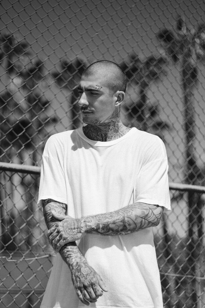
Daniel Bamdad’s tattoos are easy to spot, but there’s a lot to take in once you look past the overall coverage. Huge chest lettering sits above a carefully shaded eye. Music lines wrap around his throat. His sleeves mix faces, figures, script and a bold elbow web, then carry right down onto his hands. It’s a busy collection with a few very clear landmarks.
The German model has appeared in campaigns for DKNY and boohooMAN, and his ink is a big part of his recognizable look. Still, you don’t need to follow fashion to enjoy the designs. The contrast between his large flowing letters and smaller illustrated pieces gives you plenty to look at. Some tattoos fill a whole area; others catch your eye only when he turns or lifts a hand.
There’s also the small This is Art tattoo above his eyebrow. Those three words fit his look pretty well: his face stays mostly open, while his neck and arms are densely worked. Here’s a closer look at the chest, throat, sleeves and hands, with the visible details kept separate from any personal meaning he hasn’t explained.
Hope chest lettering and the eye below it
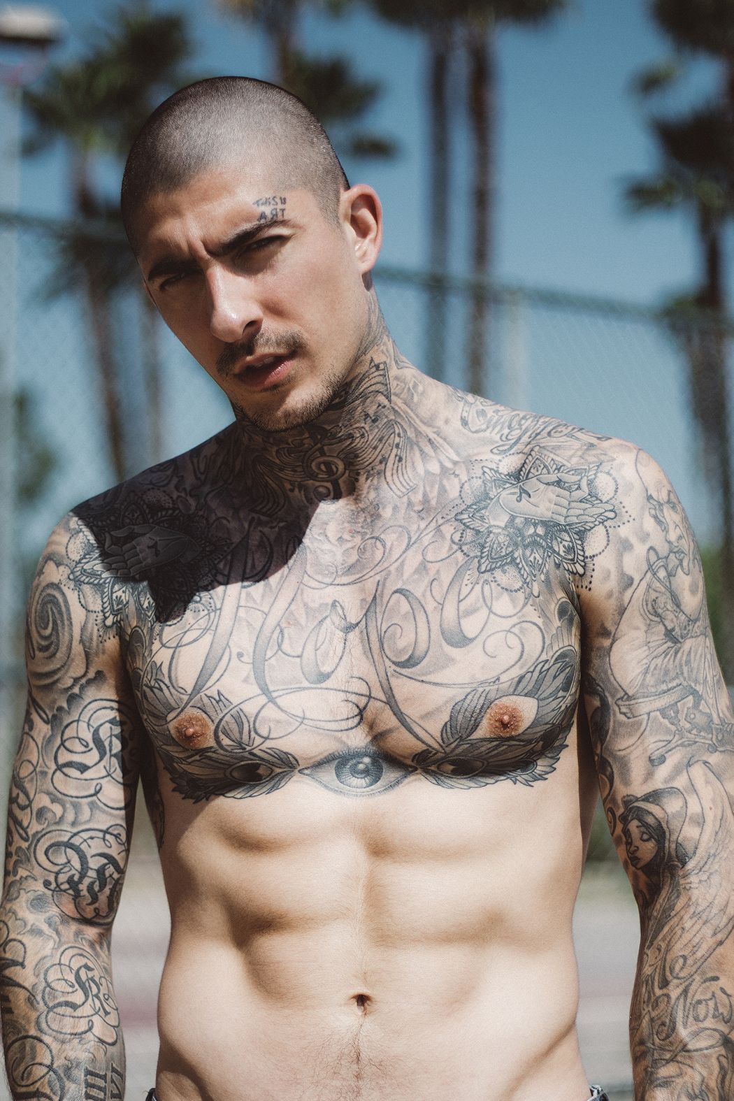
Hope is the main word across Bamdad’s chest. It’s written in large cursive letters, with thin sweeping strokes and bigger loops stretching across the front of his body. The capital H starts the design with a long curve, and the other letters keep that loose, flowing feel. It’s broad enough to read as a chest piece from a distance, rather than a small quote tucked between other tattoos.
The lettering leaves quite a bit of skin showing through. That matters because the surrounding work is much denser. Up near the shoulders, a pair of illustrated open hands sit inside decorative shapes with pointed edges and dotted details. Lower down, a realistic eye sits near the center of his chest, with long feather shapes spreading to either side. The open spaces inside the script stop all those separate parts from turning into one dark patch.
The eye has a dark pupil and a shaded iris, so it feels very different from the loose linework above it. The feathers fan outward across the lower chest and help frame the eye. They’re a useful detail to notice if you’ve only seen Bamdad in a T-shirt: the exposed throat and sleeves don’t tell you how carefully the front of his torso is arranged.
As a word, Hope is straightforward and positive. Its personal reason belongs to him, though. A big optimistic word doesn’t automatically reveal a difficult chapter, a particular person or a specific event. The design can be appreciated without attaching a story to it that he hasn’t told.
If you’re drawn to this piece, the balance is probably as interesting as the word itself. There are three distinct levels: the small illustrated designs high on the chest, the broad lettering in the middle, and the eye with feathers underneath. Your gaze has somewhere to go at each level. That layout gives a heavily tattooed torso a center, even with sleeves continuing right beside it.
Treble clef and music lines on his neck
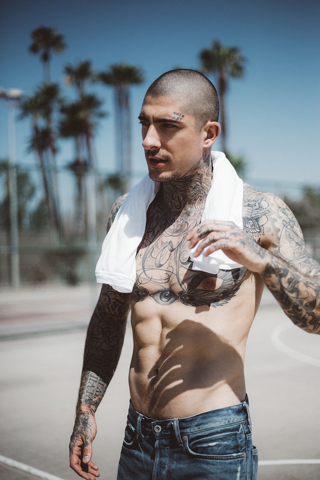
The treble clef at the front of his throat is one of his clearest neck details. Curving musical staff lines spread around it and follow the shape of the neck. The clef is heavier than the lines behind it, which makes it stand out even when the area is in shadow. It’s a recognizable music symbol in a spot that rarely disappears completely under an ordinary shirt.
This isn’t a little note floating on empty skin. The surrounding neck is filled with additional lines and shaded work, and the music design runs into that larger arrangement. When Bamdad turns his head, you see how the curves travel around the side. From the front, the central clef is the part that gives the design its shape.
There’s a nice difference between the throat and the chest here. Both use long curves, but the chest script has room to spread out. The neck lines have to fit a much narrower surface. They bend around the throat instead of sitting like a flat illustration on a page. That change in scale keeps the two areas connected without making them look identical.
The small words above his eyebrow add another contrast. They sit in a compact two-line arrangement, with plenty of bare skin around them. You can pick them out quickly, even while the neck work takes longer to untangle. A face tattoo doesn’t have to be large to become one of the details people remember.
It’s fair to describe the throat piece as music-themed. It’s harder to say whether it marks a particular song, performer or moment in his life. The staff lines alone aren’t a reason to name a tune. If you like this kind of neck design, pay attention to the way the symbol stays readable amid the surrounding ink. The strongest part of the composition is that simple clef, backed by thinner lines that give it movement.
Left sleeve figures and the elbow spiderweb
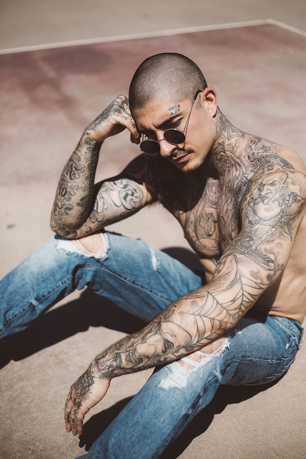
Bamdad’s left sleeve has several different kinds of drawing sitting close together. A bald, robed figure holding a long staff occupies the upper arm. Farther down, a shaded female face appears among the forearm work. Between those areas, a large spiderweb spreads across the elbow, with dark curved spokes and thinner lines linking them.
The upper-arm figure has a loose, illustrated feel. You can make out the head, bent arms, clothing and staff without needing to assign the character a name. There’s no need to turn it into a specific religious figure or a character from a particular story. The visible pose is interesting on its own, especially beside the softer portrait work farther down the arm.
The web changes shape with his elbow. With the arm bent, the curves fan across the outside of the joint and pull your eye around it. That’s part of why this placement works so well visually. A web can follow an awkward curved area without needing to stay perfectly square or straight. Here, it also gives the sleeve a bold section between several more detailed drawings.
His forearm portrait brings a different texture into the mix. The face uses shading rather than the heavy open pattern of the web. Looking from shoulder to wrist, you move from a figure to a graphic pattern to smaller shaded details. It’s a sleeve you can read in pieces, rather than one continuous scene with a single setting.
People sometimes try to attach one fixed meaning to every spiderweb tattoo. That shortcut doesn’t tell you why this particular person chose one. On Bamdad’s arm, the visible role is clear: it fills the elbow and gives the sleeve a strong pattern. For another approach to a model’s mix of separate designs, Ricki Hall’s tattoos make a useful comparison. The fun is in how each collection fits together, rather than expecting every sleeve to follow the same plan.
God Bless My Family on his right arm
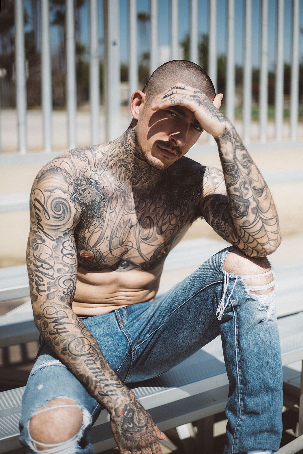
God Bless My Family runs along Bamdad’s right arm in ornate lettering. The words are spread over the arm rather than squeezed into a small horizontal line. Tall letters, curls and extended strokes give the phrase a strong presence among the surrounding designs. You follow it down the arm, instead of reading it all at once like a sentence on a chest.
There’s a large shaded rose near the shoulder, and the lettering sits below and around other parts of the sleeve. That combination gives this arm a different feel from the left. The left has the obvious elbow web and illustrated figure; the right puts more attention on words and broad curves. Both are busy, but they don’t need to match design for design.
The phrase itself makes a family connection explicit. It asks for a blessing for his family, without listing names or explaining which relatives it refers to. That’s as far as the wording takes us. You don’t have to guess at a family history to understand why a phrase like this can feel personal.
The typography deserves a look of its own. Some strokes are heavier and darker, while thin flourishes stretch into the spaces around them. That variation gives the script depth. It also means the words can be harder to read at an angle, especially when his arm is bent. The letters wrap around a moving surface, so different parts come into view as he changes position.
Next to the large Hope on his chest, this phrase shows two different ways he uses lettering. The chest gives one short word a wide, open space. The arm gives a longer message a winding route through existing ink. If you’re comparing script placements, that’s a useful distinction. A design that looks relaxed across a flat sketch can become much tighter on an arm, and the extra curls need room as well as the actual words.
Hand tattoos and the mechanical face
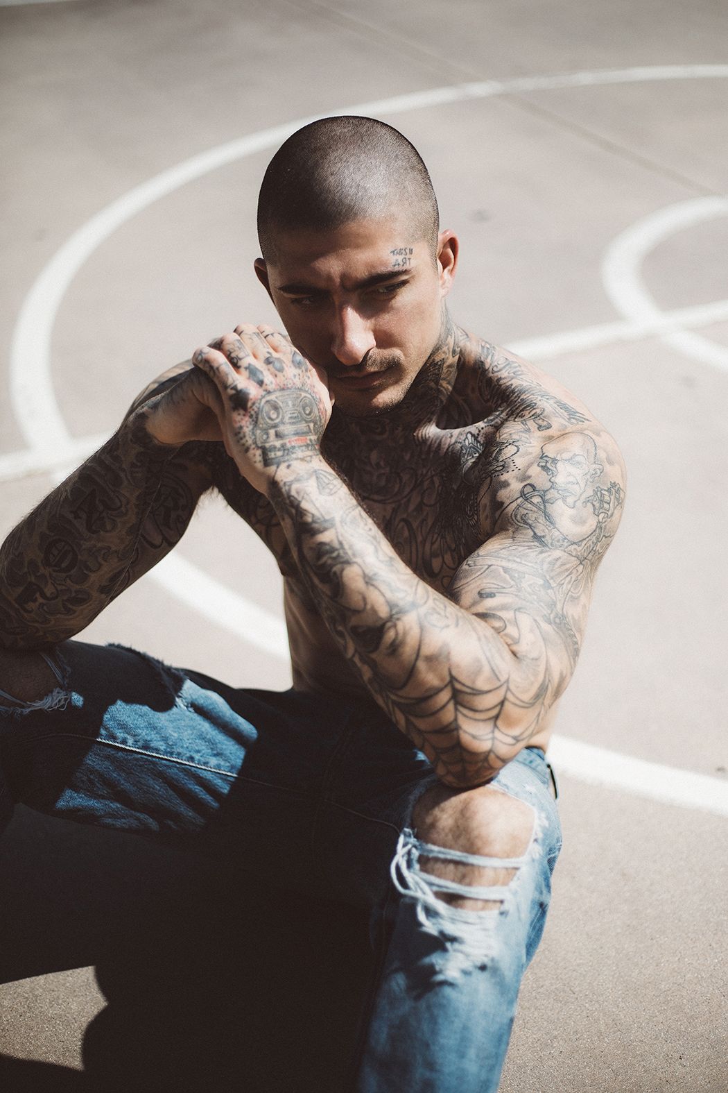
The back of Bamdad’s left hand carries a small mechanical-looking face. Two round eyes sit above horizontal lines that resemble a mouth grille, all inside a fairly compact outline. It’s a playful detail at the end of a heavily worked sleeve. The shape feels more like a little robot face than the shaded human faces higher up his arm.
That description is about its appearance, rather than a claim that it comes from a particular film, game or artist. The circular eyes and striped lower section are the details that make it recognizable. Around the main shape, smaller marks and dotted work fill parts of the hand, while little symbols continue toward the fingers.
Hands are such a noticeable place for tattoos because they move into view constantly. Bamdad’s hand design stands out when he brings his hands together near his face. In that position, you can see the mechanical face, the elbow web and the small eyebrow lettering in the same view. Those three areas have very different amounts of detail, but each has a shape you can pick out quickly.
The hand also shows how far the collection extends. The sleeves don’t end with a clean border at the wrist; the ink continues onto the backs of the hands and fingers. That makes the overall look feel continuous when he’s wearing short sleeves or holding his arms across his chest. The smaller hand pieces still have their own character, rather than simply repeating the bigger arm designs at a reduced size.
You don’t have to copy that amount of coverage to enjoy the idea. The part worth studying is how a simple face can hold its own beside complex surrounding tattoos. Two circles and a few horizontal lines give the eye something easy to recognize. Across Bamdad’s collection, that same balance keeps showing up: large words beside fine shading, a clear music symbol amid curving lines, and an open web between more detailed figures. There’s a lot of ink, but there are still plenty of individual designs to remember.
For a different view of Bamdad in motion, here’s the fashion film REVOLT, featuring him in Tom Rebl’s designs.