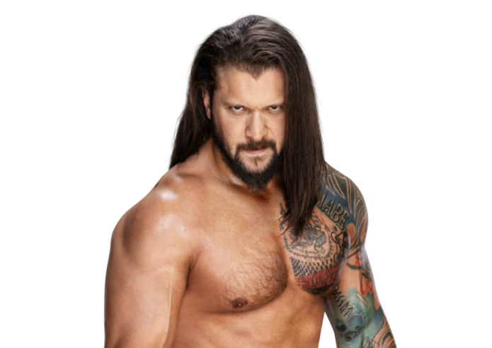
Karrion Kross’s tattoos are part of the look he brings to the ring, but they come from different points in his life. A large sleeve covers his right arm and shoulder, lettering follows his chest, and smaller symbols fill gaps around the bigger pieces. The collection combines dark shading, color, text, and traditional shapes; it has grown over time rather than following one neat template.
Kross has spoken about a few of the tattoos and why he got them. His first was a small tribal band, inked in Montreal when he was sixteen. He later got a Buddhist temple tattoo in Chiang Mai, which he has called one of his most meaningful pieces. He also joined other WWE wrestlers in getting a moth logo in tribute to Bray Wyatt.
The portraits make the placement easier to see, while Kross’s comments give some of the pieces a backstory. Here is a closer look at the shoulder sleeve, chest lettering, and the smaller work around them.
Karrion Kross’s right shoulder sleeve sets the tone
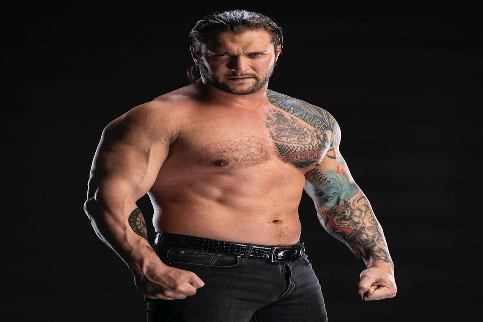
In the studio portrait, the sleeve runs from the shoulder down to the forearm. Sweeping tribal shapes cover the upper arm, and lettering angles toward the collarbone. Lower on the arm, faces, geometric filler, and smaller marks sit among the heavier outlines. The shift in detail makes the sleeve feel as if it grew in stages.
The shoulder gives those large shapes space to curve around the muscle. Their lines also lead toward the chest, so the upper-arm work reads as part of the same composition. The placement follows the shape of the shoulder, which helps the tattoo feel settled on the body instead of laid over it.
Red and green details break up the black shading. They give the designs clearer edges when the arm moves and keep the sleeve from reading as one dark block. That matters in a ring, where the lighting can be harsh and the tattoos are rarely seen in a still pose.
The pieces do not need to match exactly to sit together. Repeated line weight, similar shading, and the way the larger images share space help hold the sleeve together. That leaves room for different subjects without making the whole arm look disconnected.
The chest lettering gives the collection a personal anchor

The close portrait shows the chest lettering beside the upper-arm work. The words follow the shoulder and upper chest, with another detailed piece beneath them. Kross lets the text sit along the outline of his torso. It is easy to see in the ring, while the surrounding images keep it from looking like a separate nameplate.
Text across the chest has to account for skin that stretches and moves in more than one direction. Here, the shoulder line sets the angle, so the lettering follows the top of the torso instead of cutting straight across it. Start with the body’s shape when planning the angle; the font comes after that.
Darker images and patches of color sit around the words. They frame the lettering without putting it inside a literal border, and link it to the rest of the sleeve. That gives the text its own space while keeping the larger composition connected.
The lettering looks crisp in some photos and softer in others. Light and heavy shading can change how clearly a large tattoo reads, especially from farther away. The close view shows the details; a wider view gives a better sense of how the words sit with the rest of the chest work.
The first tribal band became the start of a full sleeve
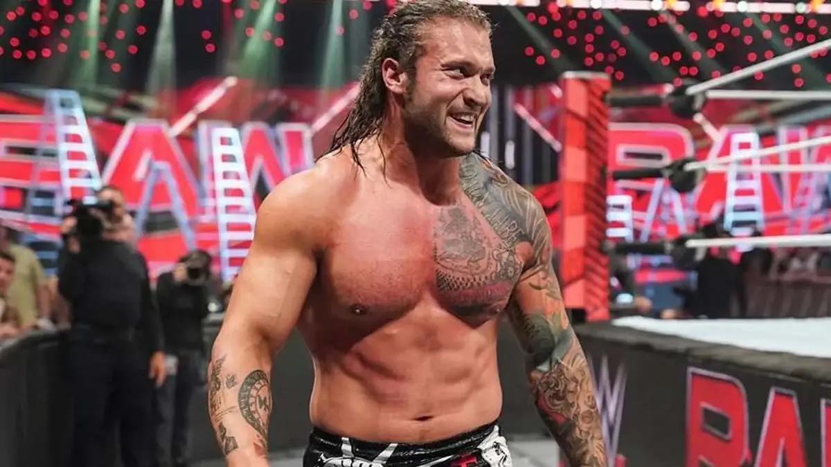
Kross has said that his first tattoo was a small tribal band on his left arm. He got it with friends in Montreal at sixteen. Later tattoos grew around that early piece, even though it is no longer the part of his collection that catches the eye first. The band gives the sleeve a starting point and marks when the collection began.
A finished sleeve can look as if it was planned all at once, even when it took shape over several appointments. In Kross’s case, the band came first and the other work followed. Seeing those layers makes the arm feel like a record of choices made over time.
The ring photo shows the sleeve from another angle. His arm is turned, and the ink follows it from shoulder toward wrist. Some shapes are clearer from the front; others emerge as the arm turns. A sleeve changes with the body’s movement, so a single pose will never show every detail.
Someone starting with a small tattoo does not have to plan the entire sleeve in advance. It can help to leave room around the first design. Kross’s arm shows one way a simple band can later become part of a larger arrangement.
The arm lettering and symbols bring a softer contrast
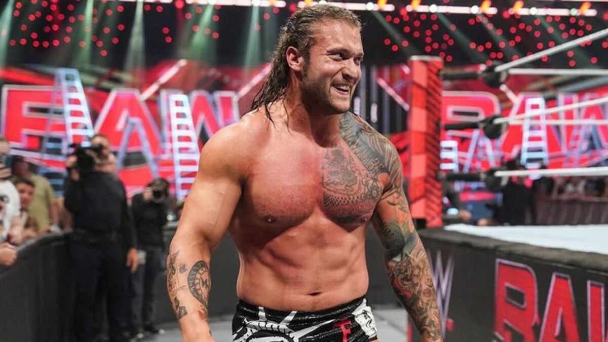
The squared portrait brings the smaller details into view. The main sleeve is still bold, but writing and symbols on the forearm sit at a different scale. They add breaks between the larger, darker pieces and give the arm a more personal feel without competing with the shoulder design.
A sleeve made only of large images can become visually heavy. Smaller lettering gives the eye somewhere else to go and leaves pockets where more work could fit. Kross’s arm has a lot going on, but the changes in scale keep it from reading as one solid mass.
The hand and wrist are areas that move constantly, so small marks there need clear lines and enough space. Fine lettering may soften over time. Giving it a little more weight and room can help it stay readable as the skin moves and ages.
The writing on Kross’s arm sits within a larger design. The same approach can work for a small personal phrase, date, or symbol: give it room, then let it fit beside the main image instead of making every part compete for attention.
Karrion Kross’s full torso tattoo view shows how the pieces work together
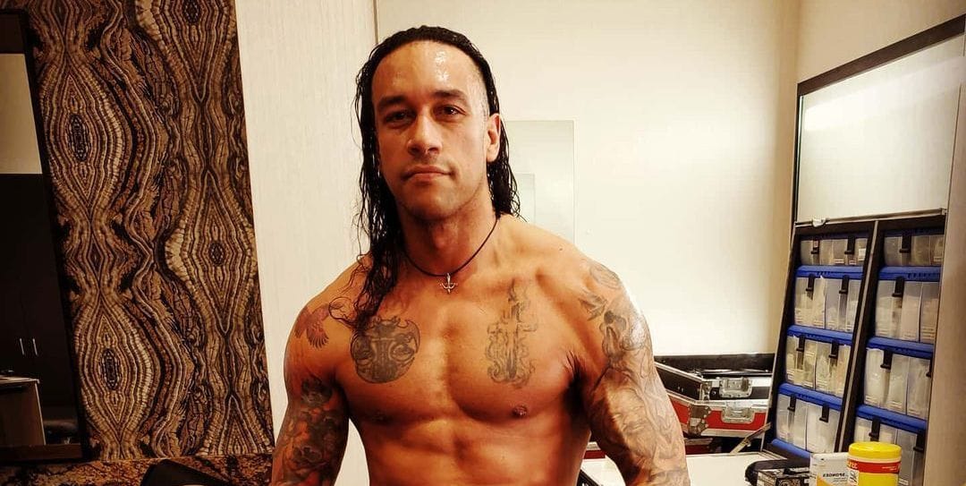
The locker-room portrait puts Kross’s chest, shoulders, and arms in one frame. He is standing at ease, making the tattoos easier to read than during a match. The chest lettering, shoulder work, and smaller marks on both arms are visible together. The larger areas draw the eye first; more detail appears as you look lower down.
A close-up can show the detail in one symbol, but a full torso shot makes the spacing clearer. Kross does not use the same treatment everywhere. The larger pieces have strong contrast, while smaller sections rely more on texture and text.
The studio portrait has a black background that makes the skin and ink stand out. In the warmer backstage light, the same tattoos look less stark. Photos can change a tattoo’s appearance, so it helps to consider how the work reads outside a studio setup too.
For a larger tattoo project, the shoulder and chest offer a clear starting point in these portraits. The arm work fills in around them, and the changes in scale give the eye more to follow without making every area equally busy.
Why the collection holds together
Kross’s tattoos keep a similar mood even though the subjects and styles change. Tribal lines, lettering, colorful sleeve work, and smaller symbols all sit within a dark, theatrical look. The layout has structure, but the different layers also make it feel like a collection that developed over time.
The stories behind the tattoos are not all alike. The Montreal band dates to his teenage years; the Chiang Mai temple piece is tied to a spiritual experience and what he has described as the best trip of his life. The moth logo honors Bray Wyatt. Each has its own reason for being there.
For inspiration, the useful part is how the work is arranged. A strong shoulder piece sets the direction, the line weight stays readable, and smaller marks fill spaces without crowding the larger designs. Color helps separate some of the shapes, while the open areas leave room for more work.
The sleeve reads from a distance in the ring, while close portraits show the lettering and smaller symbols. That combination comes from the way the pieces are placed and scaled, not from making every tattoo the same. The collection feels personal because its parts come from different moments in Kross’s life.
In the interview below, Kross talks about his first tattoo and the sleeve that followed. It adds his own account to what the photographs show.