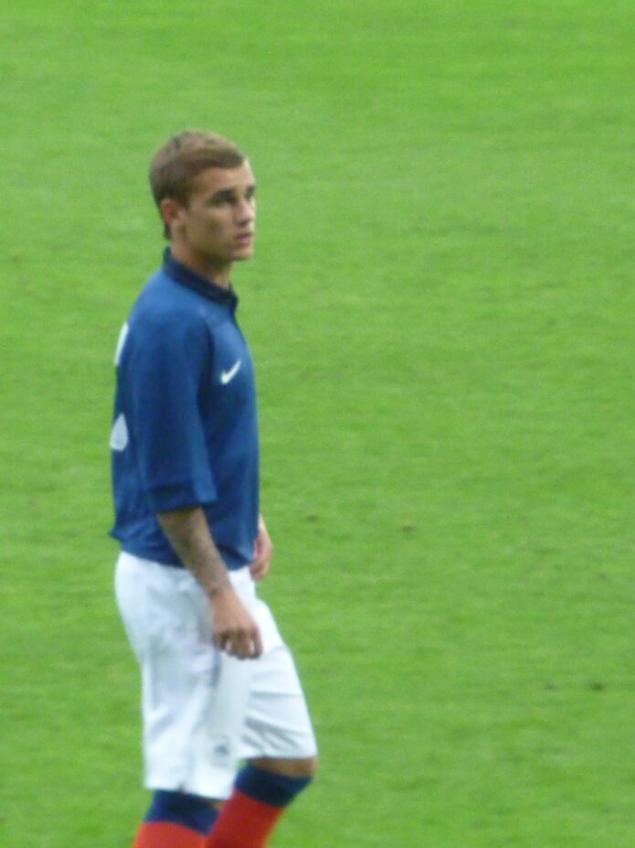
Antoine Griezmann’s tattoos mix religious portraits, lettering, symbols, and dark shading across his arms, with smaller graphic marks on his hands. The designs are detailed but still easy to make out, and most of the ink sits where it can be seen during a match or training.
The collection feels personal without relying on one huge back piece. Portraits draw the eye; words and small symbols add a quieter layer. Hand tattoos sharpen the look, while softer shading and darker bands keep the larger sleeve from feeling static.
Some pieces have been linked to family, faith, and music; others may simply be choices he likes visually. A tattoo collection can hold meaningful images and favorite references alongside designs chosen for their look. Not every piece needs a long explanation.
The religious portraits give the arm collection its emotional center
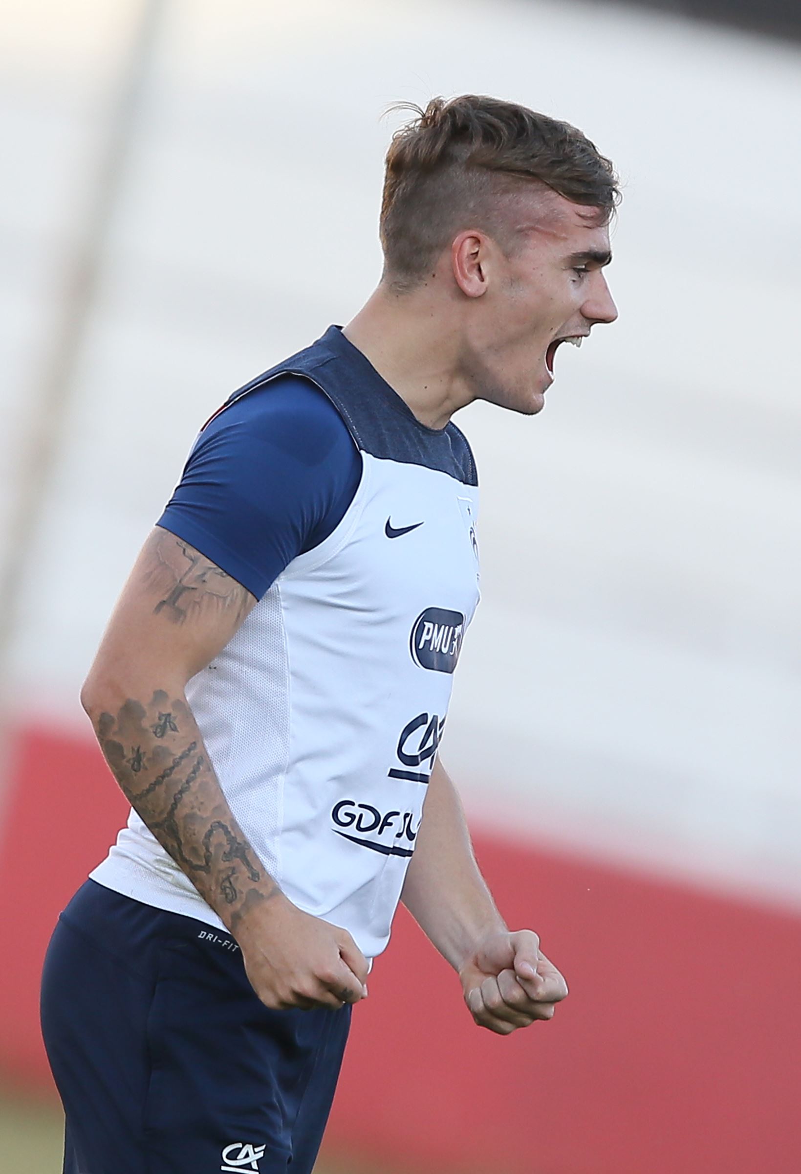
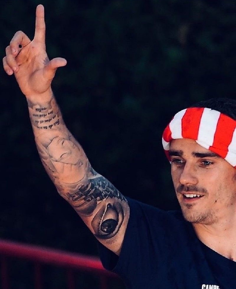
The religious portraits give Griezmann’s arm tattoos much of their emotional weight. The faces are large enough to read, with softer shading around the eyes, cheeks, and hair. Rather than disappearing into the sleeve, each portrait has room to hold its shape and anchor the upper arm.
A face makes an arm tattoo feel different from a rose or geometric symbol. Its expression, shadows, and gaze ask for a closer look. The upper arm gives the artist space to keep the features clear and work the surrounding ink around them.
The religious imagery also has a different feel from the sports references often seen in athletes’ tattoos. The softer faces give the sleeve a reflective note, while darker lines elsewhere keep it from feeling too gentle. That shift in tone gives the arm some depth.
If you’re considering a portrait, size is an important decision. If it’s too small, the expression may blur as the ink settles. Ask how it will read from a normal distance, not only in a phone close-up, and bring a clear reference photo with simple lighting and an unobstructed face.
The arm sleeve is built from layers instead of one flat block
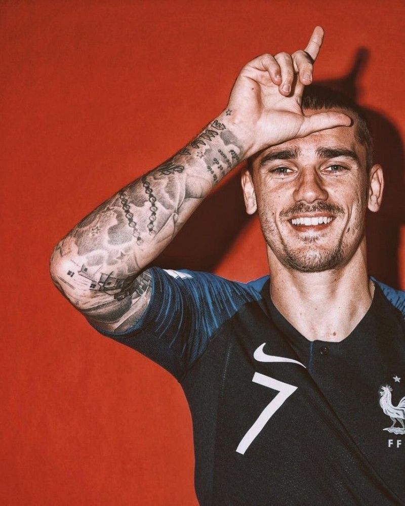
The full-arm view shows how the smaller pieces sit around the portraits. The sleeve is layered, not uniform. Script, small icons, shaded areas, and larger images share the space, but they don’t all compete for attention. Some sections are dark and dense; others leave skin open between designs.
An arm bends, turns, and changes shape, so the tattoo needs to work from more than one angle. Griezmann’s designs use the length of the limb, with larger images on broader areas and smaller marks around the elbow and forearm. They remain legible with the arm relaxed or raised.
To keep a sleeve from looking crowded, give the images a clear order. Choose a main portrait or symbol, then let the lettering and smaller marks support it. Shading can connect sections without filling every gap in black.
Plan the spacing before the first session. Leave room for movement and possible additions. Griezmann’s sleeve feels connected because its pieces share a black-and-gray palette, even though the subjects differ.
The portrait work depends on scale and clean facial detail
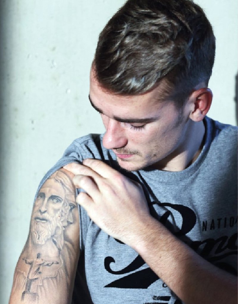
The close-up shows the patience that realism needs. Shifts in tone define the nose, eyes, cheeks, and hair; darker ink around the face frames it. Those small changes keep the portrait from looking flat.
A portrait can carry meaning without spelling it out, but it still has to work as an image. Griezmann’s pieces sit beside lettering and other marks without losing their own shape. The portrait catches your attention first, then your eye moves around the arm.
Upper arms and shoulders usually give portrait work more width and steadier skin than fingers or the side of a wrist. They also let the artist angle the face toward the viewer or follow the muscle with a slight turn.
Choose a reference photo with a clear expression and visible changes between light and shadow. Avoid images where hair disappears into the background or the eyes are hard to see. An artist can adapt a reference, but can’t add reliable detail that the photo doesn’t show.
The hand and wrist lettering keeps the message compact
The hand and wrist tattoos are a different scale from the sleeve. Small lettering leaves little room for error. With each stroke close to the next, simple shapes are more likely to stay clear. Griezmann’s short words and marks add character without competing with the larger designs.
Hands are visible, but the skin moves, gets washed often, and sees plenty of sun. Bold, clean shapes are a better bet there than a tiny paragraph. The wrist offers slightly more space; on fingers, each mark needs to work as a small graphic on its own.
The word Hope is commonly associated with Griezmann’s hand tattoos. Its short length fits the placement and reads quickly. If you’re considering hand lettering, check it at actual size before getting it tattooed. Type that looks elegant on a screen can feel cramped on skin.
A sleeve can disappear under a long shirt; finger and wrist tattoos usually stay visible. Choose the placement with that daily visibility in mind, not just because it looks good in a reference photo.
The finger tattoos add a graphic finish to the collection
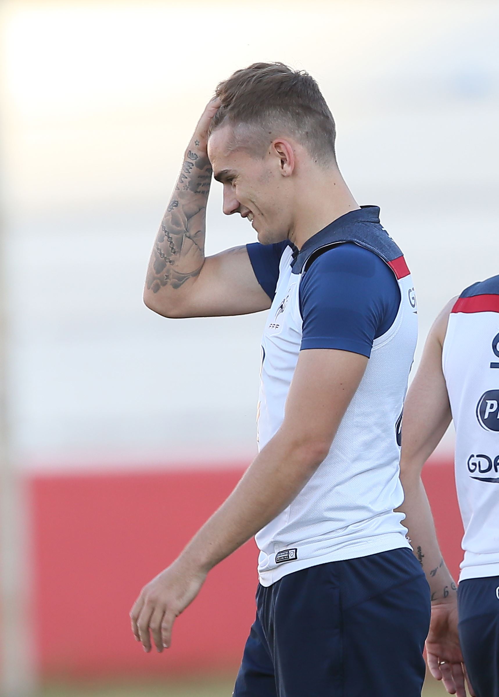
The finger marks are small, but they finish the look. Each one works like a little graphic. Their shapes are easy to pick out, and gaps between them keep the hand from reading as one blurred band.
Simple letters, numbers, or symbols tend to hold up better on fingers than detailed pictures. Griezmann’s marks show how a few small shapes can feel distinctive when they share a line weight. They don’t need to be large to stay memorable.
These sharp marks also balance the softer portraits. The faces carry emotion; the finger tattoos are crisp and graphic. That change in style gives the collection some lightness.
Ask your artist about touch-ups before choosing finger ink. The skin can be unpredictable, and lines may soften sooner than on an upper arm. Clear spacing and a good stencil help keep the shapes legible. More detail isn’t always better.
How the collection holds together
The tattoos have a loose order. Portraits anchor the upper arm, darker shapes give the sleeve its structure, and the hands add smaller marks that remain visible day to day. Each area has a different role, so the designs don’t become one repeated pattern.
Black-and-gray shading is the thread between them. The portraits are softer, the lettering sharper, and the small symbols almost act like punctuation. Different subjects can sit together when the contrast has a consistent feel.
A collection can change with its owner. New designs can add a reference, another layer, or a different texture without wiping out what was there before. Leave room around the focal pieces and let the body’s shape help determine where another tattoo could go.
Ideas to borrow without copying Griezmann’s ink
If this style appeals to you, choose one image that matters to you and then think about placement. A portrait needs width, lettering needs breathing room, and small symbols need clear spacing. Build the design around the body part instead of forcing it into a spot that can’t support it.
You could also mix softer and more graphic work. Pair a portrait with a short phrase or a few simple symbols. Use shading to link them, but leave some skin open; a sleeve doesn’t need to cover every inch to feel finished.
A celebrity tattoo is a reference, not a stencil. Bring your artist the mood or placement you like, then adapt the image to your own story, body, and preferences.