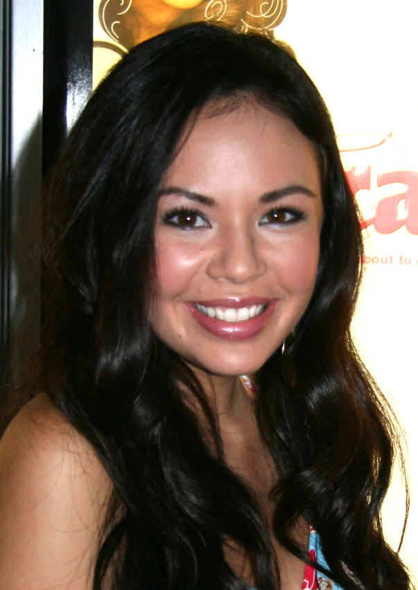
Janel Parrish tattoos are easy to read as a collection of memories. She has small symbols, fine script, lettering tied to her family, and pieces that connect back to the people and places that matter to her. Some are tucked away on the feet or fingers. Others sit right at the nape of her neck or run along an arm where they show up in photos. Together, they feel personal without looking overly planned.
Parrish has also been open about the fact that many of her tattoos mean something specific. Her ink includes references to Hawaii, family, music, her Pretty Little Liars character, and the loss of loved ones. That mix gives the collection a warm, lived-in quality. The most useful thing to borrow from Janel Parrish’s tattoo style is the sense that every small mark can carry a real story.
The close-up photos below focus on actual pieces rather than general celebrity portraits. That matters when you are comparing line weight and placement. A moon looks different when it is built from clean fine lines and small blossoms. A deer at the nape needs a different approach from a word on the bicep. Parrish’s collection offers plenty of ideas if you like tattoos that are meaningful, delicate, and easy to make your own.
Janel Parrish’s moon tattoo turns a family memory into a fine-line piece
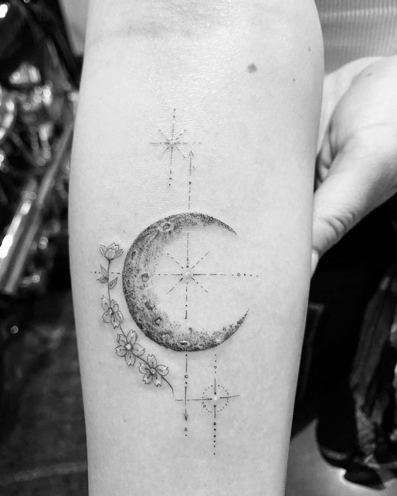
The moon on Parrish’s forearm is one of the clearest examples of her personal approach. It is a crescent with a soft, textured edge, surrounded by a small arrangement of flowers and fine geometric marks. The design feels delicate at first glance, but there is enough detail in the moon and blossoms to make it hold attention. It is not just a tiny outline floating on the skin.
Parrish has explained that the moon connects to her grandmother’s middle name and nickname. That gives the piece a quiet memorial quality without turning it into a heavy or sombre image. The flowers add a little softness, while the open space around the crescent keeps the whole composition light. It is a good example of how a memorial tattoo can feel gentle rather than overly literal.
For a similar idea, think about the shape that carries the memory first. It could be a moon, a star, a plant, or another object with a private connection. Then add only the details that help the image feel like yours. Parrish’s tattoo works because the flowers and marks support the moon instead of competing with it. A forearm gives the artist room to keep the lines crisp, but the same idea could be scaled down for a wrist or upper arm.
The deer tattoo at her nape is small but impossible to miss
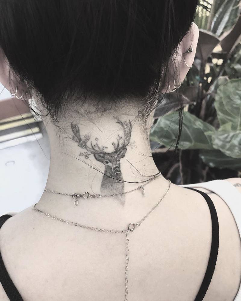
The deer at the back of Parrish’s neck has a very different mood. It is a small black-and-grey head with branching antlers, placed right below the hairline. That location makes the tattoo easy to hide with a longer hairstyle, but it becomes an immediate focal point when the hair is tied back. The nape is a narrow area, so the compact shape suits it well.
There is a calm, watchful feeling to the image. The eyes and antlers give the deer presence, while the fine shading keeps it from becoming a solid block of black. Good nape tattoos usually need a strong silhouette first and tiny details second. From a distance, you should still be able to understand the shape. Up close, the shading and linework can add the personality.
If you are considering an animal at the nape, bring references that show both the full shape and the amount of detail you like. Ask your artist how the image will follow the curve of the neck and how it may look when your head turns. A little breathing room around the antlers can help the tattoo age cleanly. You can also move the same idea to the upper back if you want a larger, more detailed version.
Her Pretty Little Liars finger tattoos keep the meaning close at hand
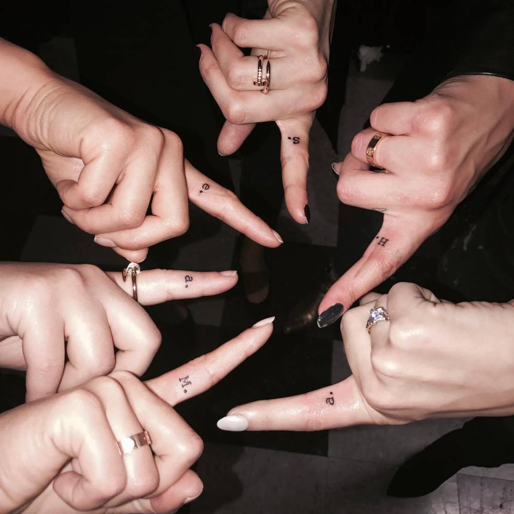
Parrish’s finger tattoos are tied to one of the most recognizable parts of her career. The Pretty Little Liars cast got character initials on the inside of the index finger, matching the shushing gesture from the show’s opening. Parrish received an M for Mona. The group idea gives the tiny letters a shared story, but the placement still makes each mark feel personal.
Finger tattoos are small, visible, and a little unpredictable, which is part of their appeal. The skin gets plenty of movement and friction, so simple lettering tends to work better than a detailed drawing. In the close-up, the letters are compact and easy to understand. They do not need extra decoration because the meaning is already doing the heavy lifting.
If you want a finger initial, ask your artist about orientation before the stencil goes on. A letter can face you, face outward, or follow the way your hand moves during a gesture. It is also smart to accept that finger ink may soften or fade faster than a piece on the forearm. Keep the shape clear, choose a size that will not crowd the skin, and plan for a future touch-up if needed.
The butterfly tattoo shows how tiny symbols stay light
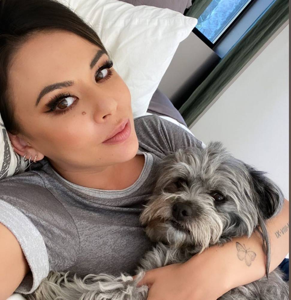
The butterfly on Parrish’s forearm is a much smaller, softer piece than the deer at her nape. In the portrait, it sits close to the lower arm and reads as a fine outline with just enough detail to show the wings. It is the kind of tattoo that can disappear under a sleeve, then show up when the arm turns toward the camera.
Butterflies are familiar, but placement and linework can keep one from feeling generic. Parrish’s version has an airy shape and plenty of open skin inside the wings. That open space is what helps a tiny butterfly stay readable instead of becoming a dark little blur. A small symbol like this can mark change, freedom, or a personal memory without needing a large explanation.
If you want a similar piece, look at the wing shape before you choose the size. Very fine interior lines may need a little extra room, especially on skin that gets sun. A wrist, forearm, shoulder, or ankle can all work. Keep the outline clean and let the artist decide how much detail will still look good once the tattoo has healed.
A wider look at the deer tattoo shows why placement matters
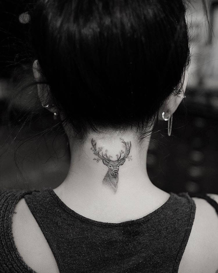
A second view of the deer gives a better sense of how the image sits below the hairline. From farther back, the antlers follow the curve of the neck and the head stays centred above the shoulders. That balance is important because a nape tattoo is seen in motion, not only in a straight-on close-up.
The wider photo also shows why the design does not need a large background. The deer already has a strong outline, and the dark hair around it creates natural contrast. A good placement can do some of the visual work for you. Instead of adding extra leaves, stars, or shading, the artist can let the shape of the neck frame the image.
If you are planning a piece in the same area, ask to see the stencil from several angles. Turn your head, relax your shoulders, and check how the image moves with you. A design that looks balanced while standing still should also feel comfortable when you walk, tie your hair up, or wear a lower neckline.
How the collection hangs together
Parrish’s collection has variety, but it does not feel scattered. The common thread is meaning. A moon can hold a family memory. A deer can mark a personal chapter. A finger initial can preserve a cast friendship. A phrase can act as a daily reminder. Even the balloon and its later cover-up show how the story can keep moving.
The visual thread is fine linework with carefully chosen areas of darker shading. The smaller marks do not need to match exactly because they share a light touch. Her lettering is allowed to look like lettering, while the moon and deer get enough shape to read as images. That balance makes the collection feel collected instead of overly coordinated.
If you want to build a similar group, start by listing the memories you would actually like to carry. Then decide which ones belong as words, which belong as symbols, and which need a larger image. You can let the pieces arrive gradually. A collection built over time often feels more natural than trying to fill every available space in one appointment.
Simple ideas you can borrow from her style
There are a few practical lessons in Parrish’s choices. Use a small symbol when the meaning is strong enough to stand alone. Give a phrase the room it needs instead of shrinking it until the letters blur. Put an image at the nape when you like the option of showing it or covering it. Keep finger lettering simple. These choices are not flashy, but they make the tattoos easier to live with.
Placement can also change the mood of a familiar idea. A moon on the wrist feels casual and visible. The same crescent on the ribs becomes more private. A deer on the neck has presence, while a tiny animal on the ankle can feel almost hidden. Think about when you want to see the tattoo yourself, not only when other people might notice it.
Finally, do not skip the boring parts of planning. Check the spelling. Ask how the lines will age. Look at healed work from the artist, not only fresh photos. Make sure the design has enough room and that the placement fits your daily life. Those small decisions are what help a meaningful tattoo stay readable and comfortable for years.
Why her choices feel personal
Janel Parrish’s tattoos work because they are connected to real parts of her life. The collection is not built around one trend or one visual gimmick. It moves between family, friendship, Hawaii, music, work, memory, and simple reminders about how she wants to live. That gives even the smallest letters a reason to be there.
The result is a style that feels warm rather than intimidating. You can like the moon without copying the exact flowers. You can take the idea of a character initial and use a letter that belongs to your own story. You can choose a deer, a phrase, or a tiny balloon because it says something to you. The point is not to recreate Parrish’s collection. It is to notice how naturally personal details can become good visual choices.
That is why her close-up images are useful inspiration. They show how a tattoo can be small and still have a clear identity. They also show that a collection can change. An old piece can be softened, covered, or joined by something new. There is room for the story to keep developing.
Final thoughts
Janel Parrish tattoos have a soft, thoughtful quality, but they are not all the same. The moon and flowers carry a family memory. The deer gives the nape a strong focal point. The Pretty Little Liars initial keeps a career friendship close. The French phrase offers a quiet reminder, and the balloon shows how a piece can evolve into something else.
If you are saving ideas, focus on the parts that make each piece work: clear shapes, open spacing, readable lettering, and a placement that matches the meaning. A tattoo does not need to be huge or complicated to stay with you. Sometimes a single letter, a small crescent, or a few careful words can do the job.