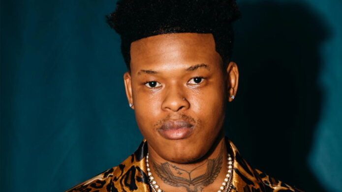
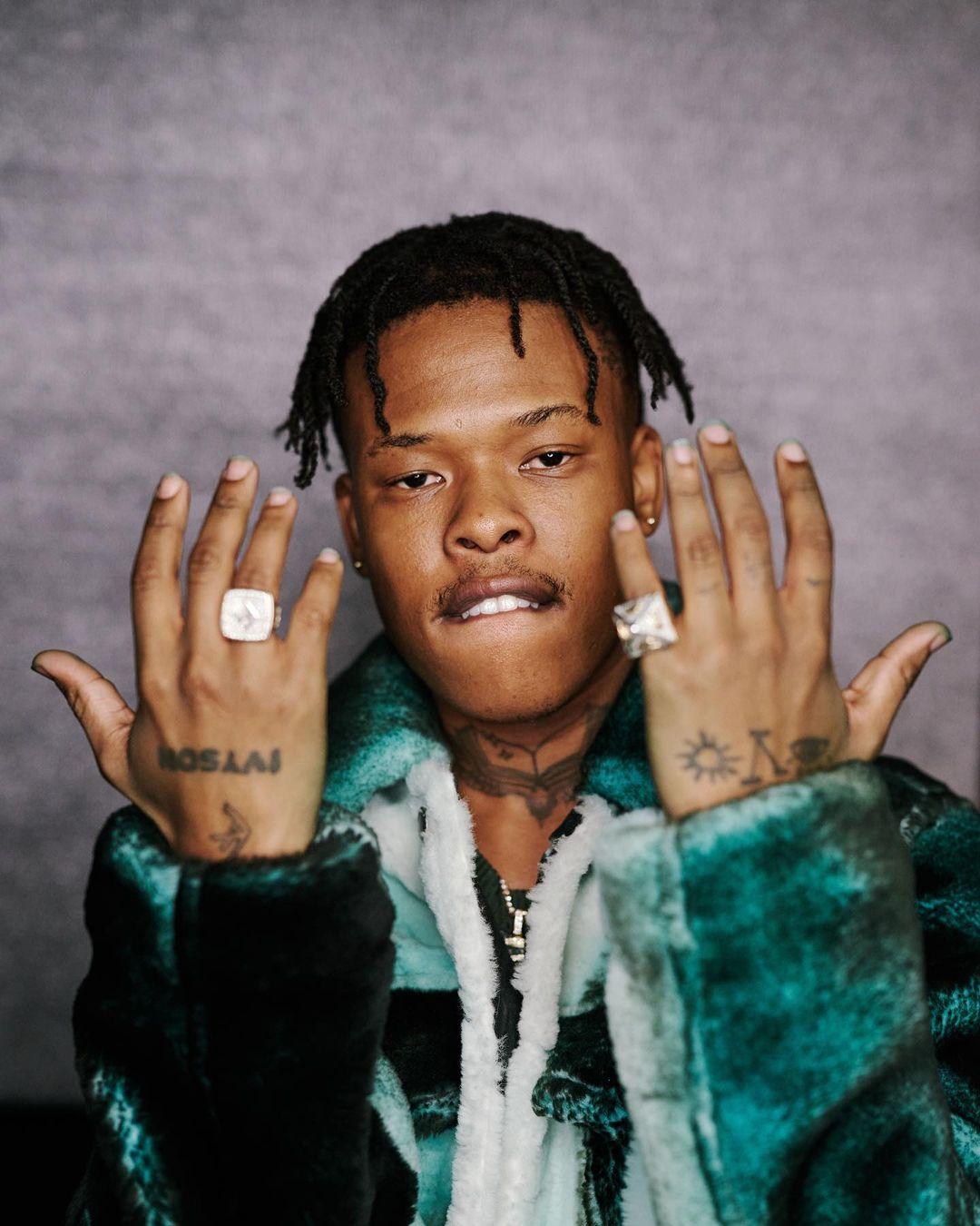
Nasty C’s tattoos show up with his chains, under a collar, across his arms and on his hands when he lifts them toward the camera. The designs reward a closer look, but their placement also makes the collection easy to read in a full portrait.
Nasty C tattoos offer ideas if you like personal symbols, black-and-grey work, visible hand ink and a mix of small and large pieces. The marks don’t all compete for attention: some are fine and private, while larger chest and arm designs establish the main shapes.
His photos show how much the setting changes the look. A studio portrait opens up the chest and shoulders; a jacket brings the neck and hands forward; a fashion shoot puts his tattooed arms into the colour of the image. The ink stays the same, but the overall mood shifts.
This guide looks at his chest, hands, arms and neck, then draws practical ideas from their scale and placement. You don’t need to copy Nasty C’s symbols to see how personal meaning and layout can work together.
Nasty C chest tattoos give the collection a strong center

The chest gives Nasty C’s collection room to come together. Larger shapes sit near the centre, with smaller marks and shoulder pieces spreading outward. There’s space for the main image to stand out without running to every edge.
A chest piece can stay covered under a shirt, but it changes how an open jacket looks and how a chain falls. In Nasty C’s portraits, the jewelry runs down the middle of the chest, with the tattoos adding another line beneath it. The two can work together without matching.
A strong chest layout usually has one main image, name or phrase. Smaller tattoos can follow the pec, collarbone or ribs. If each mark is equally bold, the eye has nowhere to settle.
Choose the main chest piece before you plan the filler. Check its stencil standing, sitting and taking a deep breath. The chest expands and folds with movement, so the spacing should work on your body, not only on a flat drawing.
Open skin is part of the composition. Space around a larger tattoo keeps its edges clear and leaves room for later work. You don’t need to fill the chest to make the design feel complete; contrast can help the main image read more cleanly.
Nasty C hand tattoos make the close-up portraits personal
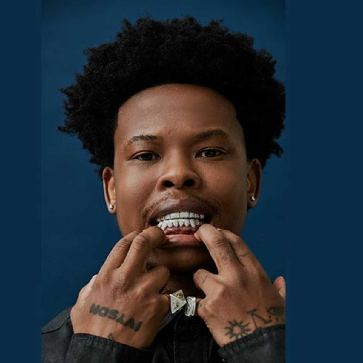
In close-up portraits, Nasty C’s hand tattoos move into the centre of the frame when he touches his face, shows his grill or lifts his fingers toward the camera. The marks become part of the gesture, rather than sitting quietly on the body.
Short lettering on the back of the hand can read from a distance, while smaller wrist and finger symbols show up closer in. Different scales give the hand a focal point without making every mark compete. Jewelry can add to the look without covering all the ink.
Hands bend, get washed and catch sunlight. Simple shapes and clear spacing tend to stay more legible than fine detail. If you want a small sun, eye, letter or emblem, ask how it will look with your fingers curled and wrist relaxed.
Test the design in the gestures you make every day. Hold a phone, open a door, lift a cup and rest your chin on your hand. A posed photo may look perfect, but the tattoo has to work when you’re not posing. Nasty C’s photos show the same marks in several natural positions.
Hand ink can carry a personal message without a long explanation. A word on the knuckles or a small emblem by the thumb may be enough. Keep the idea direct; a clean symbol is easier to read over time than a cluster of tiny lines.
Nasty C arm tattoos mix symbols, portraits and text
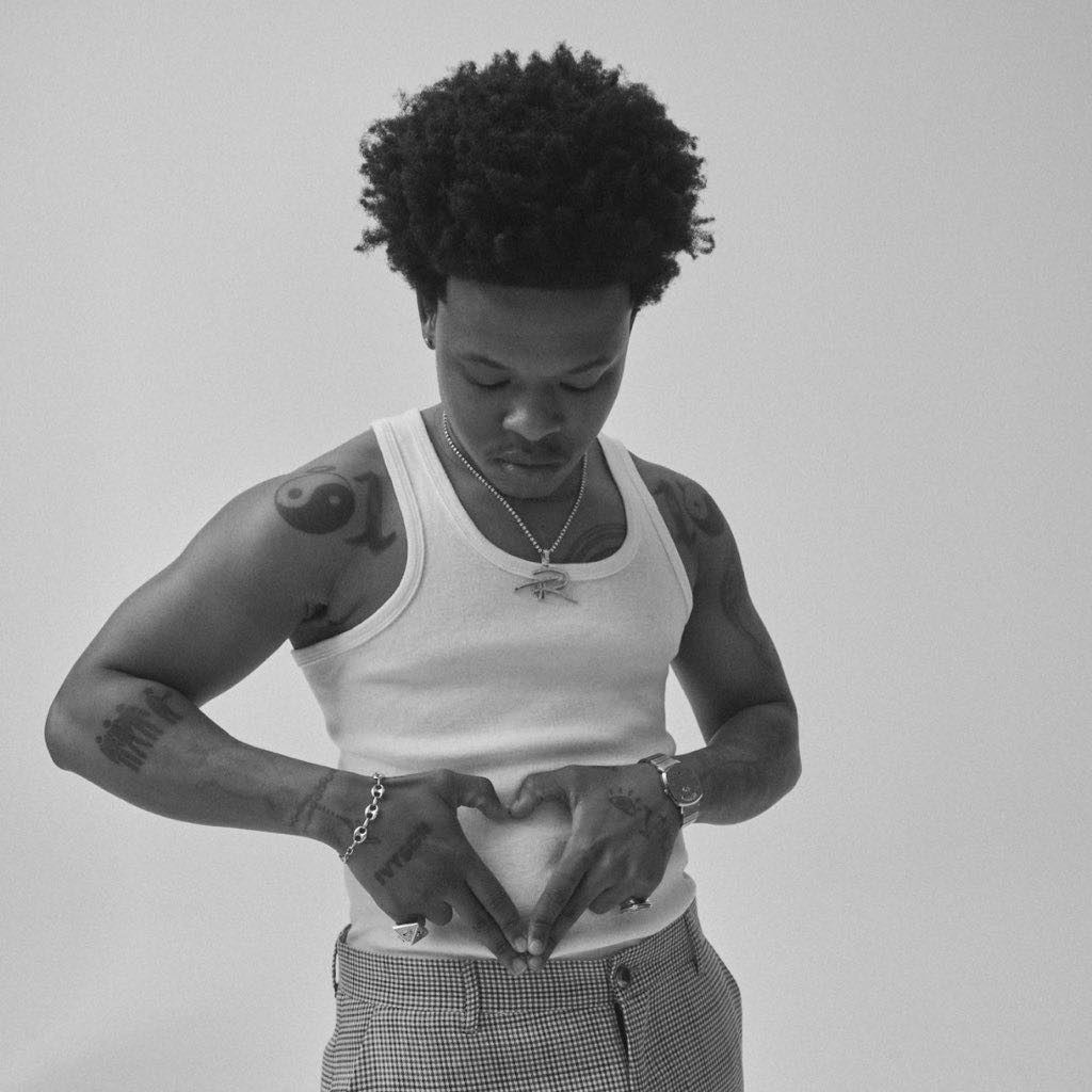
Nasty C’s arm tattoos mix graphic symbols, portrait-style details, words and smaller marks that follow the muscle. The subjects vary, but black ink gives the pieces a shared visual weight.
The upper arm and forearm each have their uses. The upper arm can hold a larger shaded image and stay partly covered; the forearm is easier to show, so people may notice it first. A repeated shape, similar line direction or open patch of skin can help the two areas meet without looking split at the elbow.
Clothes change which tattoos are visible. A sleeveless top shows the shoulder and upper arm; rolled sleeves bring out the forearm; a jacket may leave only the wrist and hand. Nasty C’s fashion portraits make the ink part of the outfit without turning it into a logo.
Give each arm a job instead of forcing perfect symmetry. One side can hold the larger image and the other smaller symbols or text. The sides can relate without matching line for line; a little imbalance can make the collection feel like it grew over time.
Before committing, check the stencil with your arm hanging naturally and bent. A portrait on the bicep may shift as the elbow closes. Let text follow the body’s lines so it reads when you move through an ordinary day.
Nasty C neck tattoos connect the face to the body
Nasty C’s neck tattoos connect the face to the rest of the collection. They sit near the jaw, chain and collar, so a small piece can change the whole portrait. A shirt may cover it; an open neckline can bring it into view.
A neck tattoo can make a strong mark without taking much space. A word, cross, line or symbol can link the head and chest. Leave some skin around it so the design stays distinct; filling every inch can make the neck feel heavier.
His portraits show how clothes and light affect the look. In one, the tattoo sits under a chain like another pendant; in another, it outlines his head against a dark shirt. The setting changes, though the placement doesn’t.
Check a neck design from the front, side and three-quarter angle. A stencil that looks centred straight on may sit too high or turn when you move your head. Have the artist place it while your shoulders are relaxed and check small angle changes.
Neck ink is a visible commitment, so choose a design you can live with after a photo shoot or concert. Nasty C’s tattoos fit the image he presents through music and fashion; the reason for your own piece can stay personal.
How to plan a Nasty C inspired tattoo layout
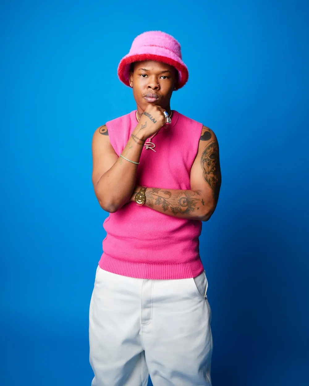
To plan a Nasty C-inspired layout, start with what you want the tattoo to mean, then decide how visible it should be. The chest has room for a main image, the hands for a word or small symbol, the arms for a larger composition and the neck for a link between face and torso.
Choose a placement you can live with day to day. Hand and neck tattoos can affect work and ordinary interactions more than chest or upper-arm pieces. If you like the direct look but want more flexibility, use the forearm or shoulder as the visible anchor and keep a private design under clothing.
Think about jewelry too. A chain runs down the chest, a watch frames the wrist and rings sit beside hand lettering. Nasty C’s portraits show how these pieces add up without needing to match exactly.
Leave space for the collection to change. You don’t need to plan a full sleeve or chest at once. Open skin leaves room for later designs and new experiences; the tattoos can record different periods instead of pretending they all came together.
Choose an artist who understands the contrast you want. Bring references for size, detail and placement, not just one celebrity photo to copy. A good design can keep the attitude you like while fitting your skin, movement and story.
Nasty C’s tattoos use different scales while keeping a clear point of view. The chest has space around the main designs, the hands bring the ink close in portraits, and the arms carry symbols, faces and text. Neck tattoos bring the eye back toward his face.
If you’re using Nasty C tattoos as inspiration, study the arrangement more than the exact graphics. Look at which piece catches your eye, how the hand marks move with a gesture, and what changes when he wears a jacket or sleeveless top. Those details show how placement shapes the whole collection.
Here’s Nasty C talking about music, collaborations and the inspiration behind some of his tattoos: