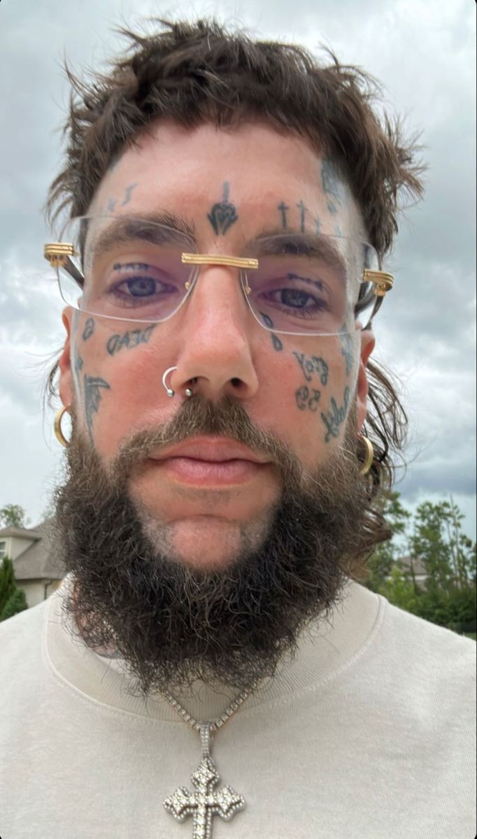
Scrim’s face tattoos show before the chains, hair or clothes. The words and symbols on his hands are visible whenever he raises them toward the camera. There is also a larger collection across his chest, shoulders, arms and torso.
Scrim tattoos are easier to read as a whole than as separate marks. Face pieces are small but prominent; letters, symbols and a rose-like design cover the hands; and the body gives larger lettering, faces and shaded shapes more room. Each area has its own role.
His look shifts with the setting. In black-and-white portraits, facial lettering feels stark. Live shots bring the arm tattoos into motion, while shirtless images show the coverage across his chest and stomach. The dark, rough style connects the different areas.
The photos below show the collection from several angles: face close-ups, hands beside the cheeks, chest pieces running toward the shoulders and tattoos in performance. Together they give a better sense of the layout than a single cropped portrait.
Scrim’s face tattoos make the whole portrait feel direct
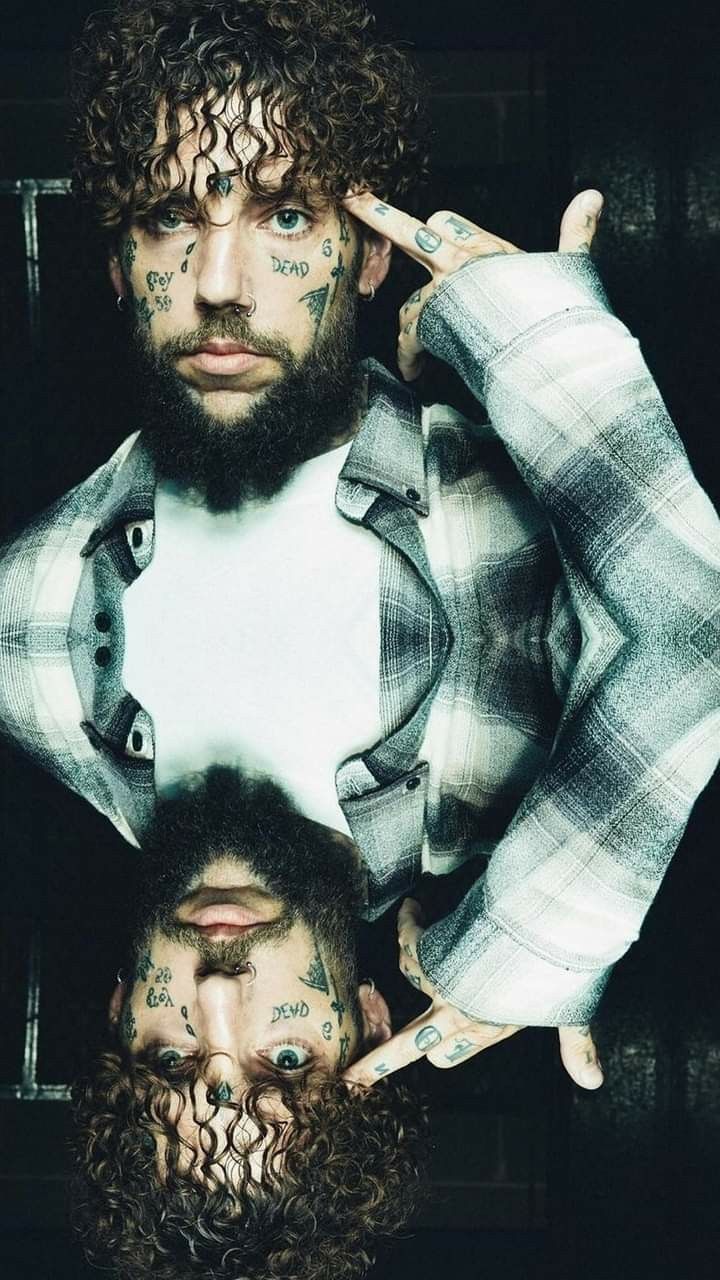
Words such as “DEAD” and smaller marks around Scrim’s eyes and cheeks cover parts of his face without taking up all the skin. Their placement follows the natural lines of his face, so the tattoos change how a portrait reads.
Face tattoos can’t be hidden from view. A small mark near the eye can draw more attention than a larger chest piece simply because it sits in the middle of the face. Scrim’s hair, beard and jewelry frame the ink without covering it.
The designs vary in size. A larger word can anchor the layout, with numbers and symbols around it. That gives the eye a few places to land and makes the face look less like a grid of equal-sized marks.
Start with the expression you want to change if you’re considering a face tattoo. A mark under the eye feels different from one above the brow or beside the mouth. Try a temporary stencil and photograph yourself in ordinary light. Smiling, squinting and turning your head can all change how it looks.
The open skin between Scrim’s tattoos also helps keep each mark distinct. You don’t have to fill every gap for a design to feel bold. Leaving one word or symbol on its own may be the clearer choice.
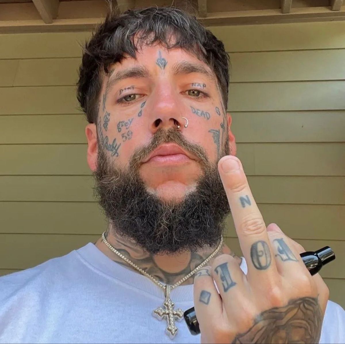
Hand and finger tattoos add a second layer of detail
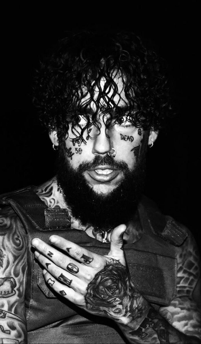
When Scrim raises a hand to his chest or face, the letters across his hands and fingers become part of the pose. His hands aren’t just carrying ink; they shape the photograph. A flat palm, curled fingers or a hand against the cheek shows a different part of the collection.
Finger skin bends constantly. Letters that look evenly spaced when a hand is open can bunch together when the fingers close. Scrim’s marks have enough weight to remain visible through that movement. From farther away they read as a group; a close crop shows the individual designs.
The back of the hand can hold a main symbol, with short letters or smaller marks on the fingers. That gives the layout a centre and helps the details feel connected instead of scattered.
Test the design while your hand is doing something normal. Hold a phone, lift a cup, touch your forehead and make a gesture you use often. Check the stencil with the hand moving, not only flat for a photo. Ask your artist to look from the palm and back sides.
Hands get more friction and sun than covered skin, and fine details can soften near the knuckles. Give the design clear spacing and a strong outline. Those simple shapes help Scrim’s hand marks stand out in busy photos.
Chest and arm tattoos create the larger canvas
The chest and arms give Scrim’s tattoos more room than the face pieces can. Shirtless performance photos show lettering, images and shading across the chest, shoulders and forearms. Different outlines and directions keep the coverage from reading as one solid block.
A large tattooed area needs some change in scale. Dark shapes can sit beside lighter ones; portraits on the arms can balance words across the chest, with smaller marks between them. That variation makes the layout easier to follow than repeating one pattern.
The shoulders connect the chest to the arms. If a tattoo stops abruptly, the sleeve can look separate from the body piece. Curved lines, flame-like shapes or repeated shading can link the areas, even when the tattoos have different subjects.
Give the largest piece a clear job in a chest or arm layout. It might be a name, portrait, phrase or image with personal meaning. Once you know what should catch the eye first, the other pieces can sit around it without competing.
Check the design while moving: raise your arms, twist your shoulders and lean forward. Skin shifts around the chest and elbow. Scrim’s live photos show how stage lighting and movement can make the same tattoo look different from a quiet studio portrait.
G59 tattoos keep the dark style personal
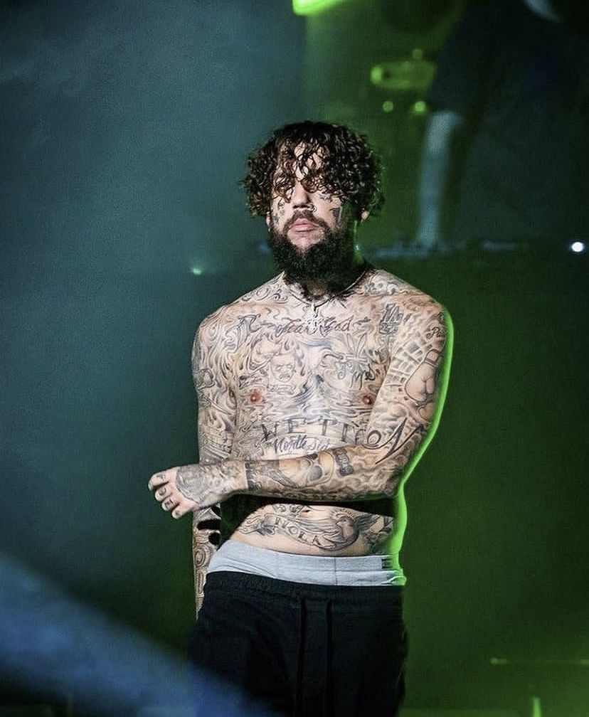
G59 and $uicideboy$ references give Scrim’s tattoos a personal frame. They appear in words, symbols, clothing and recurring visual details. The rest of the collection doesn’t have to spell out that identity; its dark palette and mix of religious, gothic and street imagery carry the same feel.
A personal reference can be more than a logo. A number might point to a place, a phrase to a period in life, or a symbol to a memory only you understand. Copying a musician’s exact tattoo may leave out the reason it matters to them.
Scrim’s face and body work also let tattoos from different periods remain visible. Some older marks may be changed or surrounded by newer ones. The result looks less like a planned grid and more like a record of choices made over time.
Choose the story before you choose the graphic. For a G59-inspired piece, think about what the music, city or community means to you. A small number, private phrase or original symbol may say more than a copied logo. Bring the idea to your tattoo artist and develop it into something of your own.
Think about the photos you use for reference, too. Black clothes and silver jewelry can make black-and-grey ink feel darker; bright light reveals faded lines and small details. Include dramatic portraits and ordinary photos so you can judge the tattoos outside a styled shoot.
How to plan a Scrim inspired tattoo layout
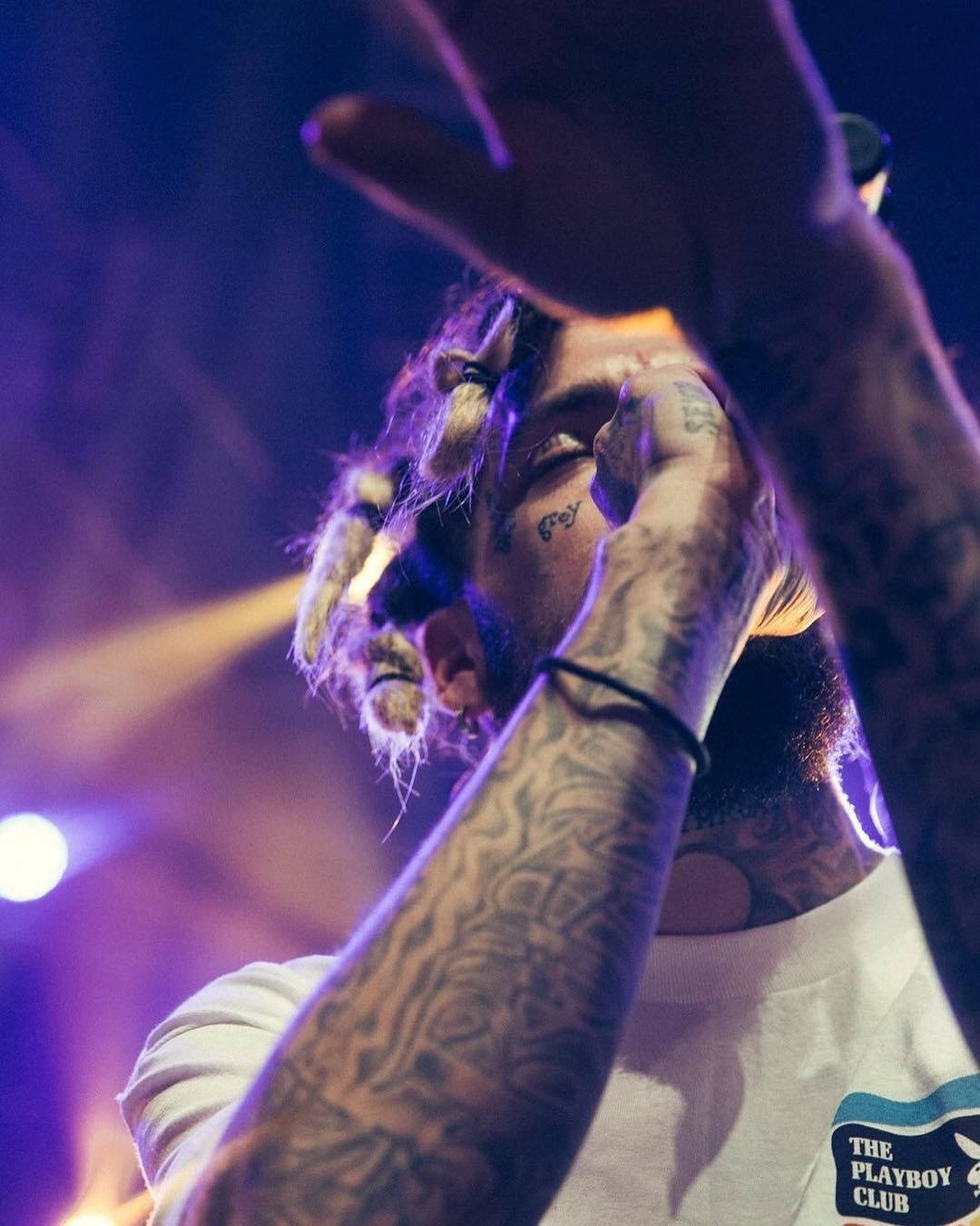
Think of a Scrim-inspired layout in layers: the face makes the first impression, the hands add details that show in motion, and the chest and arms carry the larger designs. You can use that structure without copying the same words, symbols or portraits.
Start with an area you’re comfortable showing. Face and hand tattoos affect work, family and daily interactions differently from an arm or chest piece. If you like the direct look but want more privacy, use the forearm or upper arm as the main visible area.
Plan around movement. Faces turn, fingers curl, elbows bend and chests expand with each breath. Place the stencil in several positions and take photos from normal eye level. If the design still reads clearly, it is more likely to work outside the tattoo chair.
Leave room for the collection to grow. Scrim’s tattoos look like a history rather than a matching set. Open skin gives later pieces space and keeps the main marks from getting lost. It also lets the artist connect designs without filling every gap.
Be honest about the style you want to live with. Heavy blackwork, visible text and face symbols make a strong impression. That may be the point, but the choice should be yours. Use Scrim’s collection to think about scale, contrast and placement, then adapt those ideas to your body and your life.
Scrim’s collection shares a dark visual attitude without making every tattoo alike. Face ink changes the portrait; hand designs appear with gestures; and the chest and arms give the tattoos room to spread. G59 references and darker imagery tie the pieces together.
If you’re looking at Scrim tattoos for ideas, pay attention to the layout more than the exact symbols. Notice what catches your eye first, how the hand marks move during a gesture and how the larger pieces sit beside the facial details. Those choices give the collection its character.
Here’s a $uicideboy$ interview with Scrim and Ruby da Cherry: