Sonakshi Sinha and Zaheer Iqbal have gone for the kind of couple idea that doesn’t need a giant flourish to land. Their latest matching tattoo is split between them, so the full image only makes sense when their hands are together. It’s a clean line, a small finishing mark, and a surprisingly sweet way to turn a relationship into something visual without making it feel staged.
The appeal is pretty obvious. A matching tattoo can be loud, elaborate, and impossible to miss, but it can also be deliberately quiet. Sonakshi and Zaheer chose the second route. Their piece is simple enough to disappear under a sleeve, yet personal enough to work as a private reminder. On its own, each half looks incomplete. Side by side, the line connects.
The matching tattoo is one line, split in two
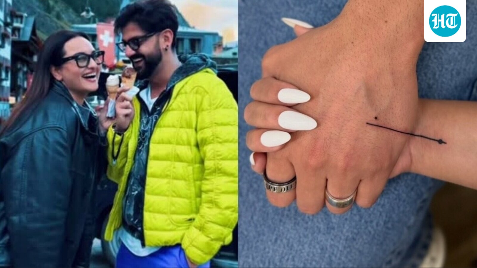
The image shared by Hindustan Times shows the couple holding their hands together while the new mark runs across both of them. One section is on Zaheer’s hand and the other is on Sonakshi’s. The line stays very fine and mostly straight, then finishes with a small arrow-like point and an infinity-style detail. It isn’t a shaded piece or a busy illustration. The whole idea depends on the gap between the two people being closed.
Sonakshi described the meaning with the phrase “each other’s lifeline.” That makes the visual work harder than a generic matching symbol would. The line isn’t just duplicated on two bodies. It’s designed to meet. The message is about connection, but the layout keeps it grounded. You can see exactly how the two pieces become one when they sit next to each other.
There is also something refreshing about the scale. The design does not compete with clothes, jewelry, or a red-carpet look. It sits low-key on the hand and reads almost like a tiny piece of punctuation. That restraint fits the couple’s public presentation: the tattoo is visible in close photographs, yet it does not become a costume or a headline separate from the people wearing it.
Sonakshi Sinha’s Budapest ankle tattoo
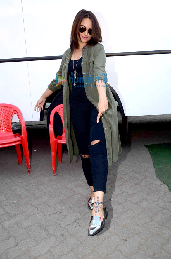
A separate piece documented in earlier coverage sits around Sonakshi’s left ankle and extends toward the foot in an anklet-like arrangement. The published event photograph shows the dark linework as a banded, decorative mark around the ankle, making it visually different from the fine matching line shared with Zaheer Iqbal.
Hindustan Times described the design as an anklet tattoo, while Republic World linked its origin to a Budapest visit. The placement and repeated ornamental lines are the defining visible details in the available photograph; the image does not support adding extra symbols or an invented meaning.
A tiny mark with a big job
The couple’s wedding photos help explain why this choice feels so natural for them. Their public style has usually leaned toward polished but warm, with a lot of attention paid to fabric, family details, and the mood of the occasion. A thin line fits that world. It has a little elegance, but it isn’t trying to look expensive or dramatic.
That doesn’t mean the mark is bland. Minimal work has to be placed and drawn carefully because there is nowhere for weak linework to hide. The spacing matters. The end point matters. Even the way the piece crosses the hand changes how it reads when the fingers are relaxed versus when the couple is holding hands. With a design this small, the tattooer has to make every millimeter earn its place.
It also gives the pair visual flexibility. Rings, bracelets, watches, and formal clothing do not overwhelm the symbol. In photographs, the meaning appears most clearly when their hands meet; in separate portraits, the mark remains a small personal detail. That balance is part of the tattoo’s story because the same line can read as a private sign or as a shared image depending on the couple’s pose.
Why the photos matter
Sonakshi and Zaheer have shared plenty of public moments, but the strongest part of this idea is that the picture does not need a long explanation. You see two hands, a single line, and the way the two sections line up. The photo is doing the same job as the tattoo itself: it shows the relationship through connection rather than through a loud symbol.
The photograph also clarifies the tattoo’s unusual structure. It is not two identical images and it is not a phrase divided at an arbitrary point. The line becomes visually complete only when Sonakshi and Zaheer are together, which gives the couple a natural reason to place their hands next to each other. The design’s meaning is carried by the meeting point. The gesture is part of the tattoo’s documented identity, not an instruction for interpreting every matching tattoo.
It also avoids one of the common problems with couple tattoos. When both people get exactly the same image, one person can end up feeling like they’re wearing a copy. A split composition feels more shared. Each person gets a real part of the concept, and the full meaning only appears when both are present.
The couple’s style is understated
The choice makes sense next to Sonakshi’s broader style. She can go full glamour for an awards event, but she also knows how to keep a look clean and centered. This line is similar. It has a clear idea, a limited amount of detail, and no unnecessary decoration added just to make it photograph better.
Zaheer’s side follows the same rule. The matching quality is obvious without turning the piece into a logo. The line has enough movement to feel made rather than stamped, and the small finish gives it an endpoint. That little detail is important because it helps the two halves look intentional instead of like a random line that happens to cross two hands.
The split composition also explains why the photographs matter. A line that looks ordinary on one hand becomes directional when the two hands are joined, and the small finish gives the meeting point a definite endpoint. The design therefore depends on movement as well as stillness: separated hands show two modest marks, while joined hands reveal the visual sentence that Sonakshi and Zaheer chose to carry between them.
The visual logic of the split composition
Sonakshi and Zaheer’s line is defined by an action rather than by a standalone emblem. The hands supply the missing context: separated, the pieces are fine-line marks; together, they form a connected route with a small arrow-like and infinity-style finish. That structure keeps the tattoo tied to the couple’s photographs and prevents the design from being reduced to a generic symbol.
The public explanation is equally specific. Sonakshi described the line as representing “each other’s lifeline,” a phrase that gives the fine mark emotional direction without turning it into a large pictorial scene. The tattoo is therefore both literal and relational: its two halves remain separate objects, but the wording and the joined photograph establish why they belong together.
Placement is central to the documented design. The hands are visible in the couple’s shared photographs, so the two pieces can be read as a pair without an elaborate reveal. The location also makes the composition intimate: the tattoo sits where a hand can be held, rather than on a distant body area that would separate the visual mark from the gesture that completes it.
The complete image may be the point, but each person carries a distinct section. Sonakshi’s and Zaheer’s halves are recognizable on their own, yet neither is presented as the whole design in the published photographs. That balance keeps the matching tattoo from becoming a duplicate logo. It remains a pair of individual marks whose shared meaning appears when the couple’s hands touch.
A simple finish
Sonakshi Sinha and Zaheer Iqbal’s matching piece works because it doesn’t over-explain itself. The two halves are modest, the line is easy to read, and the meaning comes from the space between them. When their hands meet, the image becomes complete. When they don’t, each person carries a small reminder of the connection.
The couple’s tattoo is specific without being elaborate. The line is clean, the endpoint is distinctive, and the hand placement gives the design a reason to exist beyond decoration. Its scale keeps the photograph focused on Sonakshi and Zaheer rather than on a large image competing with them. The result is a documented piece whose narrative comes from connection, not excess detail.
Fine-line details in the published photographs
There is a technical quality to the visible mark as well. The line remains light against the hand, while the arrow-like point and infinity-style finish give it enough contrast to read in a close photograph. No heavy shading or dense illustration interrupts the composition. The fine-line treatment supports the meaning Sonakshi supplied: a lifeline can be understood as a continuous route, and the tattoo’s narrow shape keeps that route visually intact.
Sonakshi and Zaheer’s choice has an everyday quality in the available images. It appears in a close-up when the couple joins hands, yet it does not turn every outfit or public appearance into a statement about the relationship. That quietness is part of the documented visual identity: the tattoo can sit inside a formal photograph, a casual image, or a close view of the hands without changing its basic shape.
The emotional side is just as important as the technical side. A shared design doesn’t have to prove anything to anyone else. It can be a private checkpoint for the two people wearing it. That is why a connected composition can be more satisfying than an identical picture. The mark has a built-in reminder that the meaning comes from both sides, not from the symbol alone.
The emotional side is as important as the technical side in the couple’s own explanation. A shared design does not need a loud symbol to communicate its role. The mark acts as a private checkpoint for the two people wearing it, while the public photograph makes the connection legible to viewers. That is why the split composition carries more meaning than an identical picture would: the relationship is represented by the space between the two halves.