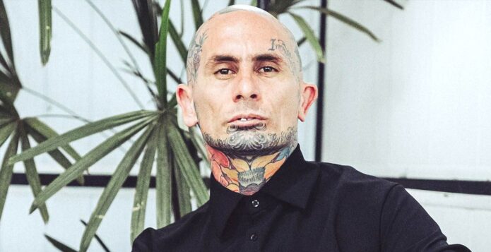
Emanuel Noir’s tattoos are impossible to miss, but they’re more interesting than a quick look at the full coverage might suggest. The Ke Personajes singer has built up ink across his head, face, neck, hands, and body, yet the collection doesn’t read like one perfectly planned sleeve. It feels layered. Some pieces are colorful and botanical, some are words, and some sit so close together that the skin starts to look like a moving sketchbook.
That history matters because Noir has talked about tattoos as something connected to different moments in his life. He also said his first tattoo happened when he was just 11, made with neighborhood friends and the same homemade machine. That detail gives the later work a different context. The tattoos aren’t only part of his stage image; they grew alongside him, with older marks sitting underneath newer ideas. Time is part of the design.
The clearest public reports point to a few designs that can be described with confidence: floral and hummingbird work on the head, “Blessed” and “By God” lettering, the word “Incrollabile” above his left eyebrow, and a flower across the throat. Other parts of the collection are visible in photographs but haven’t been explained in a way that supports a firm meaning. The useful approach is to separate what the camera shows from what people might be tempted to guess.
Emanuel Noir’s face tattoos
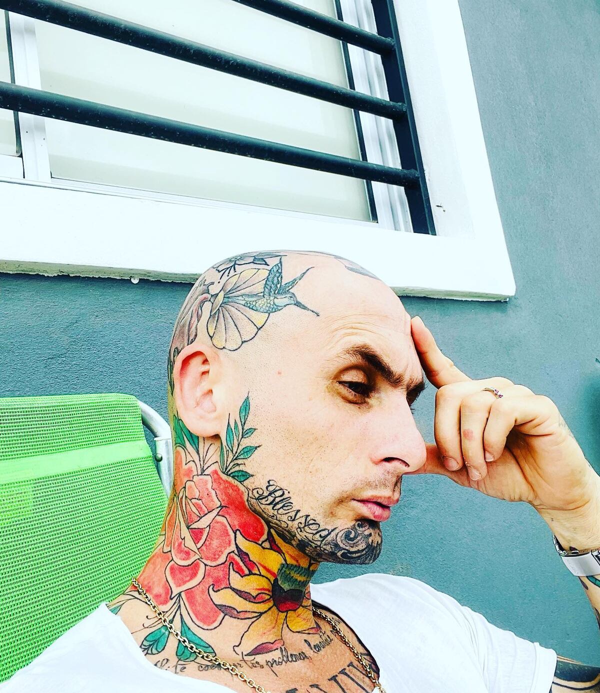
The face tattoos are the first thing most people notice. In the clearest close view, fine lettering runs across the lower face while the sides of the head carry a mix of leaves, flowers, and smaller linework. The placement is dense without being completely blacked out. There’s still skin between the designs, which lets the individual shapes remain readable even when they sit close together.
On the left side of his face, “Incrollabile” is placed above the eyebrow. The Italian word means unbreakable, and it has become one of the easiest pieces to identify in photographs. It’s a strong example of how Noir mixes text with illustrative work. The word is compact and horizontal, while the botanical designs around it move in softer directions. That contrast keeps the upper face from looking like one flat block of ink.
The head work has a looser feel. A hummingbird and floral shapes have been reported around the scalp, with leaves and petals extending toward the ear and neck. Because the designs follow the curve of the skull, they change shape depending on the angle of the photograph. A front-facing portrait makes the eyebrow lettering stand out. A profile brings the bird and flowers into view.
The photographed angles document why head and face placement changes with movement. A design can look balanced in one frame and behave differently when Noir turns, talks, or changes expression. His work is a clear example of tattoos placed on a living, moving surface rather than a flat page.
The tattoos around his jaw and throat
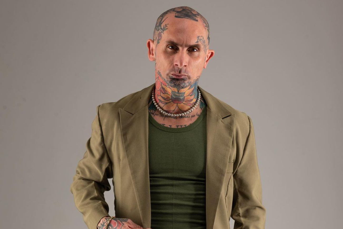
The area under Noir’s jaw and across his throat carries some of the collection’s most recognizable color. A large flower sits at the front of the neck, with warm reds and oranges that stand apart from the darker lettering around his chin. The shape spreads across the throat instead of staying in one small central emblem, so it becomes part of his silhouette whenever he wears an open collar.
Noir has described the throat tattoo as a flower, which is one of the few direct explanations attached to a specific design. The image supports that description: broad petals and layered color create the main form, while darker lines help separate it from the surrounding work. It isn’t a tiny symbol hidden under the jaw. It’s a deliberate focal point.
The jaw area also shows how older and newer tattoos can overlap. Lettering, shading, and floral edges meet around the chin, and the lines don’t all have the same age or weight. That makes the collection feel more personal than a matching set of flash pieces. The throat flower works as an anchor, giving the busy lower face a shape that the eye can recognize quickly.
Neck tattoos are visible in almost every outfit, and Noir’s throat flower works with the movement of the jaw and the curve of the collar. Its position keeps the color central to his silhouette without separating it from the darker lettering around the chin.
Incrollabile and the ideas behind the ink
Words are a major part of Noir’s tattoo language. “Incrollabile” is the clearest example, but the reported “Blessed” and “By God” lettering adds another layer. These aren’t decorative marks chosen only for their shape. They introduce a direct voice into a collection that otherwise leans heavily on flowers, birds, and color.
It’s tempting to turn each word into a complete biography, but the public reporting doesn’t give every piece a full explanation. The safer reading is that the lettering reflects ideas Noir wants close to him: resilience, faith, and a sense of being protected or guided. That interpretation fits the words themselves, but it should still be described as a reading rather than a confirmed statement about every tattoo.
Lettering also behaves differently from pictures as the body changes. A flower can be expanded, shaded, or connected to another shape. A word has to keep its proportions and remain legible. That makes the placement above the eyebrow especially striking. There isn’t much room for the letters, yet the word is large enough to register in a portrait.
The lettering section of Noir’s collection stays visually restrained. A short word in a meaningful script can occupy the forearm, ribs, chest, or neck, but the documented pieces keep the emphasis on language rather than decoration. The best-known lettering tattoos are simple on purpose and do not need extra ornament to make their point.
Color in the photographed collection
Noir’s tattoos aren’t limited to black ink. The neck flower brings reds, oranges, and yellows into the center of the look, while the head and face pieces include softer greens and shaded outlines. The color gives the work a slightly old-school feeling, even when the subject matter is arranged in a more crowded, contemporary way.
Color also helps the tattoos stay readable when several designs overlap. A dark script line can disappear beside another dark line, but a warm petal or green leaf gives the eye a clear stopping point. In photographs, that matters even more under stage lighting. Red and blue lights can flatten skin, so strong color blocks help the shapes survive the distance between the performer and the crowd.
The color is part of the collection’s chronology. Noir’s pieces appear to have accumulated gradually, so the colors do not form one uniform palette. That unevenness gives the photographed work a lived-in quality rather than the appearance of a single afternoon’s design.
How Ke Personajes built a live identity
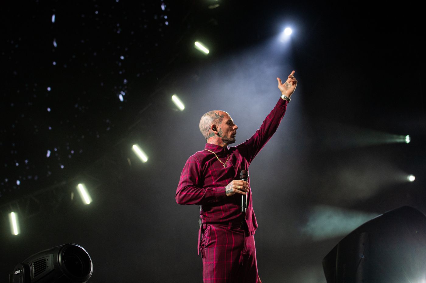
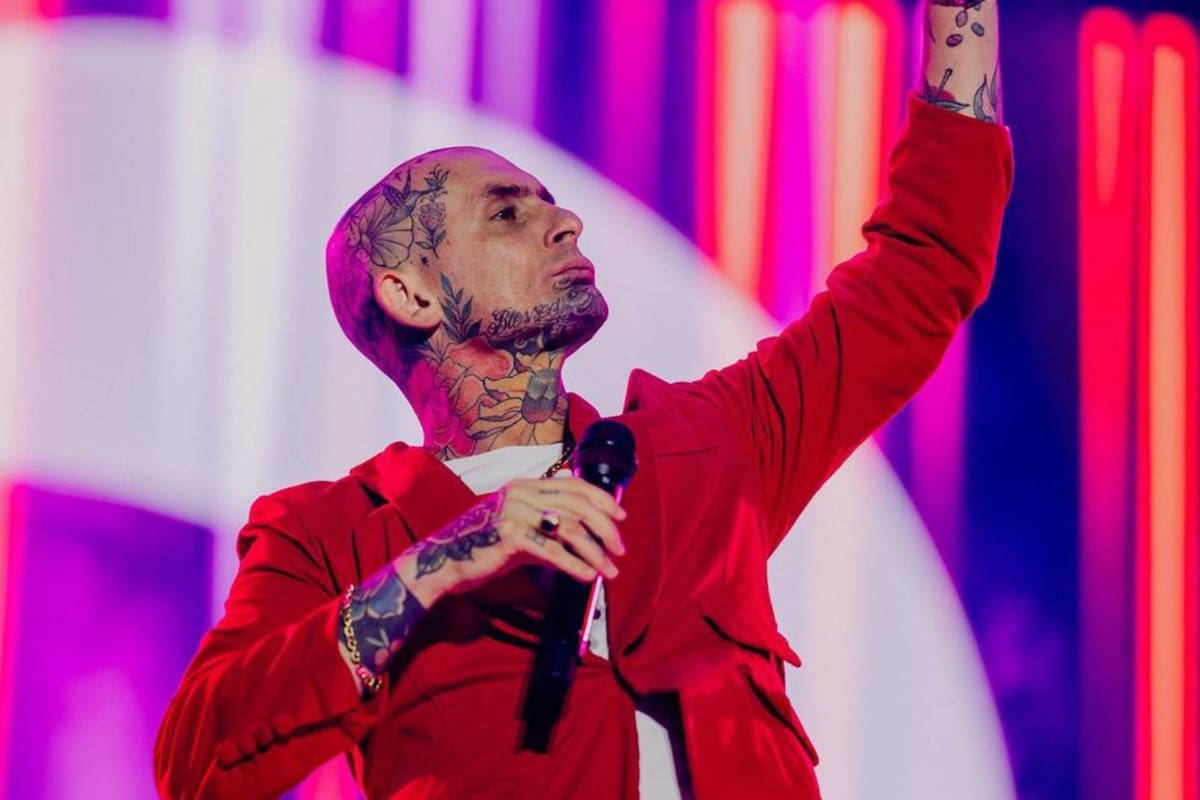
When Noir is performing with Ke Personajes, the tattoos become part of a much bigger visual language. The shaved head, bold clothing, jewelry, and intense stage presence all work with the ink. A live photograph doesn’t show every design clearly, but it shows how the tattoos change the outline of the performer from a distance.
The wide stage view is useful for that reason. The head and neck pieces read as part of a silhouette rather than as one word or flower in isolation. The hand tattoos appear when he raises the microphone, and the side of the head catches light when he turns. The audience reads the collection in flashes, alongside costume and gesture.
That doesn’t mean the tattoos were created as branding. The timeline is more complicated. Noir has described an early, improvised start and later spoken about ink as cathartic. A personal tattoo collection can become part of a public identity without having been planned as marketing. The stage simply makes the private history visible.
The road from a neighborhood machine to a full collection
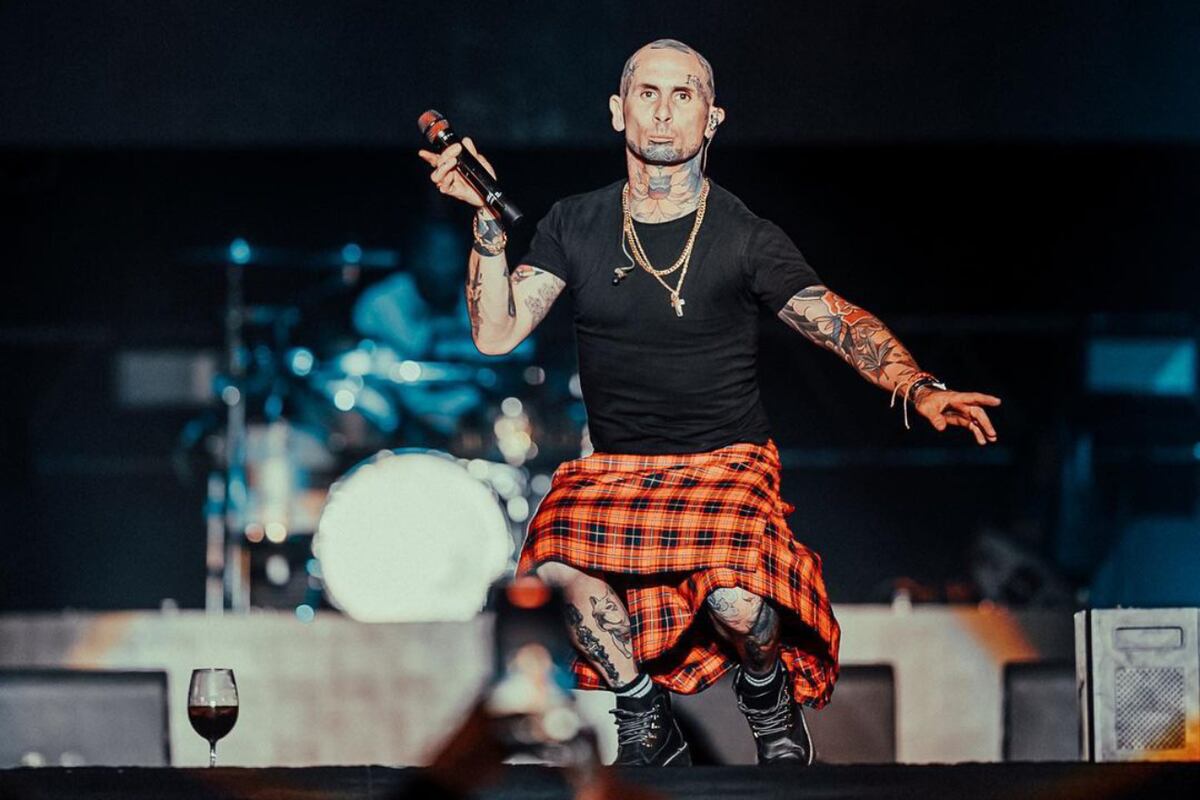
Noir’s story about his first tattoo is one of the most revealing details in the reporting. He said he was around 11 and that a group of friends used the same homemade machine. He also recalled buying temporary tattoo sheets before eventually making some of those ideas real. That childhood fascination helps explain why tattoos seem to occupy such a large place in his adult identity.
There’s a huge difference between an improvised neighborhood tattoo and professional work on the face, throat, or scalp. The early experience wasn’t safe or polished by modern studio standards, and it shouldn’t be treated as advice. What it does show is how long the interest has been there. By the time Noir became known for Ke Personajes, tattooing wasn’t a sudden styling decision. It was already part of his history.
The older-first, newer-later pattern also explains why the collection has so much movement. Designs don’t all share one line weight or one subject. Some may have been covered, layered, or expanded as his taste changed. That kind of evolution is normal when someone keeps getting tattooed for years. A full-body collection often says as much about time as it does about style.
How the photographed angles frame the subject
Noir uses the most visible areas of the body with confidence. The eyebrow, cheek, jaw, throat, and head all sit in the frame of a portrait. They’re not places chosen for a discreet first experiment. At the same time, the designs don’t all compete for attention. The eyebrow lettering is compact, the neck flower is broad, and the head work fills the spaces between them.
The spacing between Noir’s visible pieces is part of the composition. His face tattoo does not cover every available inch: compact eyebrow lettering, a broad neck flower, and head work occupy separate visual zones, leaving small gaps that keep the individual shapes readable.
Placement also changes the emotional temperature of a tattoo. “Incrollabile” feels direct because it sits above the eye. A flower on the throat feels more dramatic because it moves with the voice and breath. A small design on the hand enters conversations when the wearer gestures. The same image would feel different on the calf or upper arm.
The photographed style in context
The collection’s visual identity comes from contrast: short lettering, botanical shapes, and areas of saturated color. The face placement and throat flower are specific to Noir’s documented appearance, while the photographed pieces interact through scale, line weight, and the movement of the body.
The lettering also carries meaning inside Noir’s biography. “Incrollabile” is presented as part of his visible identity, and the religious phrases reported alongside it are tied to the language and imagery that recur through his public performances. The collection is therefore read through both its visual arrangement and its stated personal context.
The documented photographs do not establish every date, tattooist, or private reason behind the pieces. They do establish a body of work that combines lettering, flowers, birds, and color across the face, throat, head, hands, and torso.
Why the photographs vary
Photographs of Noir can make the collection look different from one day to the next. A portrait may capture the face and throat in full. A concert image may catch only the side of the head and a tattooed hand. A shirt collar can hide the flower, while stage light can make the color look more intense than it does in daylight.
That is why the close photographs matter. They document the actual shape, color, and placement. Wider images remain useful because they reveal how the ink works with his clothes and performance style, but they cannot establish details the camera has not captured.
The result is a collection that feels active rather than finished. It carries early memories, personal words, flowers, birds, and a public life that keeps moving between small rooms and huge stages. “The tattoo is for me,” is the kind of idea that sits behind the whole look, even when the ink is visible to thousands of people.
Emanuel Noir’s tattoos are most legible when the photographs are read together. The placement, contrast between lettering and flowers, color around the throat, and changing silhouette all belong to the documented collection and its public history.