
Blackwork that hits as hard as her voice
Rachel Aspe’s tattoos are hard to miss. Dense blackwork runs from her neck across her chest and shoulders, with larger pieces on her arms and smaller marks on her hands and face. In photos, the shapes have a rough, graphic edge that suits Cage Fight’s sound, though the collection isn’t just a stage look.
Aspe is also a tattoo artist in London. In a 2026 interview, she spoke about working freely instead of forcing every design into a tidy structure; the photos showed her tattooing a client. Her own ink has that same sense of movement, with heavy shading and open skin sharing space.
The clearest views show the neck-to-chest work, packed sleeves and smaller hand and face tattoos. She has also described a piece for her grandparents: a quail with a pipe, tied to the names and memories associated with them. That family detail sits comfortably beside the darker imagery.
The sections below stick to what can be seen or what Aspe has discussed publicly. They also look at how the placement and contrast work, without treating every visible mark as if its meaning were known.
The blackwork neck and chest piece

The largest visible piece climbs from beneath Aspe’s jaw, spreads across her neck and shoulders, then reaches over the upper chest. Its dark areas give it weight, while the edges shift between body surfaces instead of stopping at the neckline. From a distance, the coverage can read like armour; closer photos show more variation in the shading.
Louder described the blackwork as arching high up the neck, over the shoulders and down across the chest. That gives a sense of its scale: it crosses several planes, so its outline changes when Aspe turns her head or moves her shoulders.
The design also links areas that could otherwise feel separate. The neck gives it a starting point, while the chest and shoulders carry the forms outward. The available photographs show the overall reach more clearly than every small line.
For a neck-to-chest piece, the useful question is how it sits when you move. Ask the artist where the dark areas should end, where skin can stay open and how the work will meet the shoulder or sternum. A stencil viewed only with the head straight won’t show the whole composition.
Her sleeves mix dark shapes with lighter detail

Aspe’s sleeves combine bold outlines and black-and-grey shading with lighter gaps. The photos show larger forms from shoulder toward forearm and hand, but not every detail is clear enough to name. The overall effect comes from texture and contrast more than one central image.
That contrast helps the work read in band photos. Coloured lights, motion and distance can swallow fine lines; larger shapes still register from the crowd, while close views reveal softer shading. The arms have both.
Blackwork covers more than solid black fill. It can use linework, abstract or ornamental shapes and negative space, too. Aspe’s sleeves mix those approaches, letting darker patches anchor the design without turning the whole arm into one flat area.
If you’re planning a sleeve, decide where you want the strongest darks and where the eye needs room to rest. That gives later pieces a place to fit. It matters more than making every tattoo depict the same subject.
Face tattoos and sharp little details

Small marks around Aspe’s eyes, cheek and the side of her face are less prominent than the neck piece, but they carry the same graphic feel. They don’t form a mirrored arrangement, and photos don’t make every symbol equally clear.
The images establish that she has face tattoos; they don’t provide a public explanation for each one. There’s no need to assign a meaning to a mark just because it’s visible. Unless Aspe has explained it, its story remains hers.
Scale does a lot of the work here. The smaller marks sit between the face and the larger neck coverage without competing with it. A small tattoo can create a pause between larger areas, but only if its size and placement suit the person’s features.
Face ink is difficult to hide and will sit alongside glasses, makeup, facial hair or future changes in style. Anyone considering it should look at the placement on their own face first, then decide whether the reference still makes sense there.
Band photos show how the tattoos move
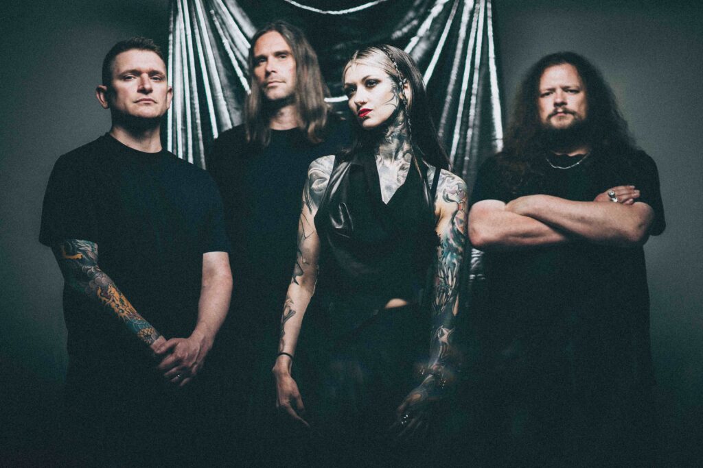
Band photos show the tattoos on a moving body. The neck work shifts with Aspe’s posture, arm pieces bend at the elbows and the hand marks appear as she gestures. That view adds context a straight-on portrait can’t provide.
The same tattoo can look different across photographs. Lighting changes how the black and grey read; a vest may cover the centre of the chest, while a sleeveless top shows more of the shoulder. One image can foreground her face and neck, another the sleeves.
That’s useful when planning a large tattoo. Think about how it will look while walking, reaching or performing, not only when the arm is held still. A design that follows the body can change naturally with it.
Wide photos are best for seeing placement and how pieces relate; close-ups help with texture. Neither view confirms every detail. Aspe’s collection can be understood as a whole even where a small mark is too blurred to identify.
The hand and finger ink

The tattoos on Aspe’s hands extend the coverage past the sleeves. They’re smaller than the arm pieces, but the dark, direct shapes keep the same visual character. Hands are exposed in daily life and constantly move, so simple forms tend to read more clearly than intricate ones.
The hand work also helps the arm coverage continue toward the fingers instead of ending in a hard line at the wrist. Photos show the placement, though they don’t clearly identify every small design.
Finger and hand tattoos can soften with time and friction. If you’re considering one, ask the artist how the lines are likely to age and whether the design will remain legible at that size. A clear silhouette has more room to hold up than a tiny, crowded drawing.
Leaving some skin open can help, too. The goal doesn’t have to be filling every gap. Negative space can separate the marks and keep a small area from turning into one dark patch.
The artist behind the look
Aspe’s work as a tattoo artist gives another angle on her collection. She has described tattooing as one of her creative outlets alongside music, drawing and sport. Her own tattoos show an interest in shape and movement, but that doesn’t mean each one was planned as part of a single composition.
In an interview about Cage Fight, she said she turns down tattoo work when she isn’t behind the design. It offers context for how she approaches the job: the client’s idea and the artist’s own judgment both matter.
One tattoo she has discussed is a quail with a pipe, made for her grandparents and connected to the names and memories she associates with them. It’s a personal, slightly playful image, a different register from the heavy blackwork around it.
That contrast says more than a simple genre label would. Aspe’s collection includes dark and abstract work, but also a family tribute with a specific story. Not every tattoo has to match the mood of the others.
Why the collection feels so cohesive
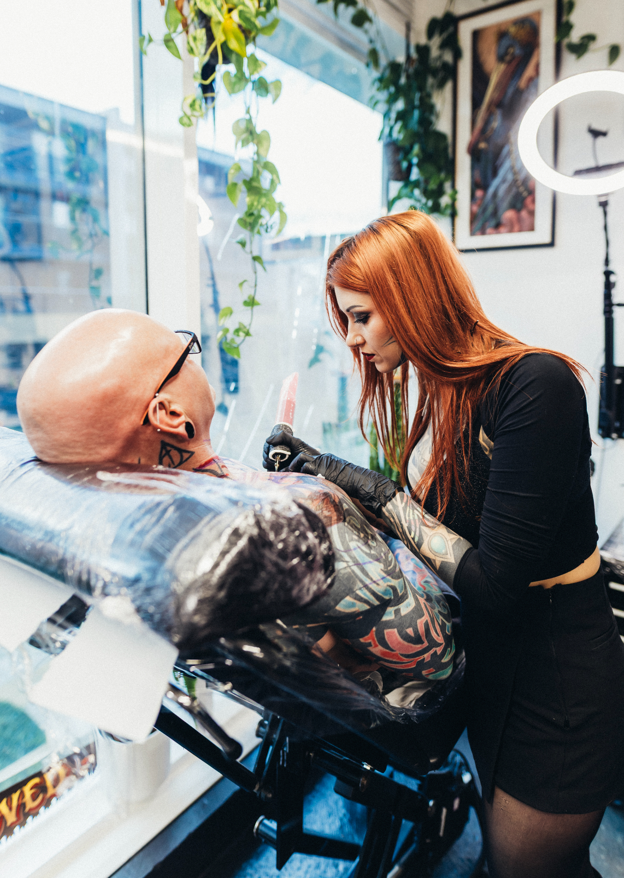
The collection spans music, tattooing and family, and the photographs show pieces added across different areas of her body. What links them visually is a repeated use of black ink, heavy shapes and open skin—not evidence that every design was planned together.
Placement helps the separate areas relate. The neck and chest hold the centre, the sleeves extend outward and the hand tattoos carry the coverage toward the fingers. The face pieces draw attention back upward, though each tattoo can still be read on its own.
There’s a difference between a collection that shares a visual language and one built from a single plan. Aspe’s photos suggest the former: contrast and blackwork recur, while the designs and their personal contexts vary.
If you want several tattoos to sit well together, choose a few preferences you can explain—such as mostly black ink or a particular balance of filled and open areas. You don’t need to decide every future design now; a clear starting point gives an artist room to work.
What to borrow from Rachel Aspe’s style
Aspe’s style is less about one image to copy than about how she uses placement and contrast. The neck, hands and face are prominent choices, while varied shapes keep the dense coverage from reading as a single block.
Start with what you actually want on your own body. If you like blackwork, decide whether you prefer solid fills, abstract lines, ornamental forms or a mix. If the personal detail matters most, look for a symbol tied to your own life instead of borrowing the quail or another person’s memorial design.
Choose an artist whose portfolio shows the kind of work you want. Someone skilled in portraits may not specialize in abstract blackwork, and a fine-line artist may not be the right fit for a large neck-to-chest piece. Ask to see healed work in the same style before committing.
Aspe’s tattoos show how dark coverage can hold personal details and different kinds of imagery at once. The family piece has its own story; the rest don’t need an explanation added where she hasn’t given one.