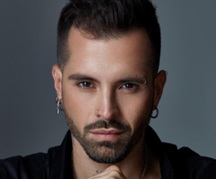
Mike Bahía’s tattoos make a lot more sense when you get close enough to see the individual pieces. A stage photograph can turn his arms into a blur of dark ink. Up close, there’s a whale with sweeping lines under its jaw, a tiger with a bright eye, an owl tucked along a forearm and tiny lettering beneath his throat. The scale changes completely as you move around his body.
The Colombian singer has spoken about several of those choices himself. His love of the sea runs through the collection, while family and the words he wants to live by explain some of the smaller designs. Still, the photographs are worth spending time with on their own. His collection mixes large animal portraits with very spare personal marks, and the contrast keeps it interesting.
The whale tattoo that started his collection
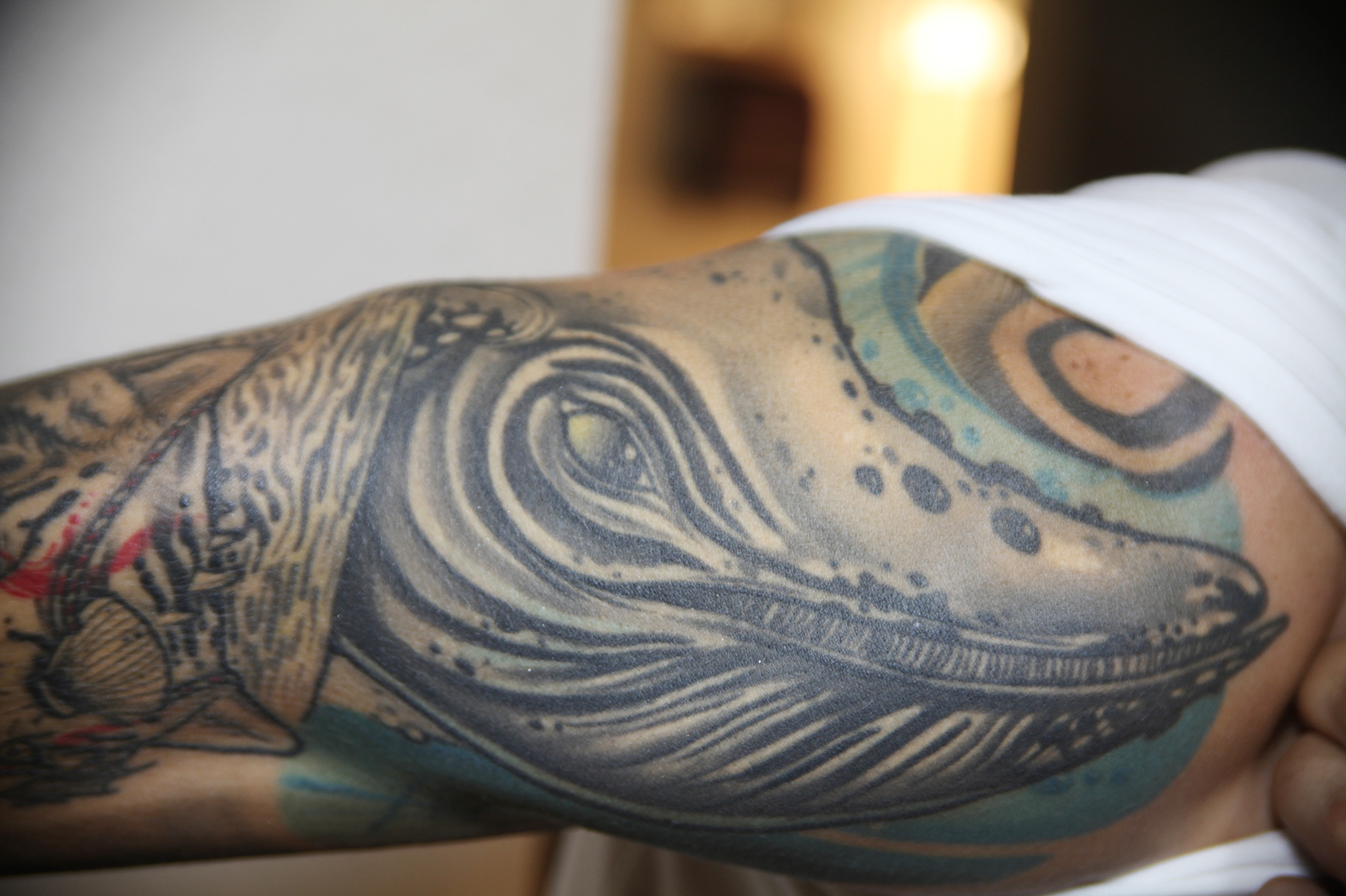
The whale is a lovely place to start. Radio Moda reported that it was Mike’s first tattoo, chosen because he loves marine animals and wants to spend his later years near the sea. That gives the design a specific connection to him without needing to borrow a standard list of whale meanings.
Visually, the head does most of the work. Long, pale channels sweep underneath the jaw, and the small eye sits inside a much larger curve. The blue around the lower edge gives the animal a watery setting, while dark outlines keep it readable against the neighboring ink. It feels substantial, even though the photograph only shows part of the arm.
If you’re drawn to this piece, look at the spacing as much as the subject. The lighter lines give your eye a route through all that shading. Filling every one of those spaces would make the head much harder to pick out.
The tiger tattoo beside the whale
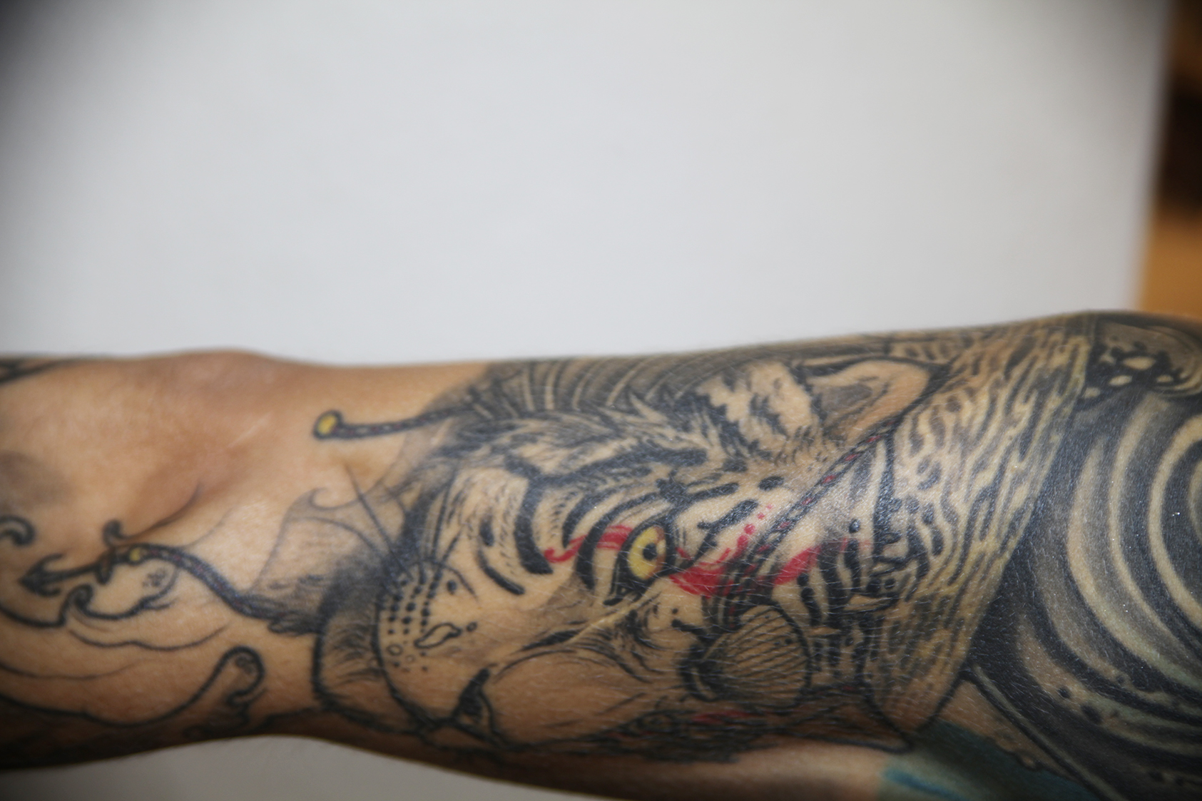
A striped face sits beside the whale, with a yellow eye and a red accent cutting across the surrounding black and grey. The muzzle points along the arm. Dark stripes curve away toward the edge, while small dots and lighter patches break up the face. There’s a lot happening in a fairly tight area.
Univision’s 2018 dressing-room interview described Mike adding sea-related details around this tiger. You can see why it belongs with the whale even before reading that explanation: the pieces sit close together, and their outlines overlap visually as the arm turns.
The little burst of color changes the whole expression. Your eye lands on that yellow spot before it follows the stripes. That’s a useful detail for anyone who likes mostly shaded work but wants one small feature to hold attention. The image doesn’t need a fully colored animal to feel lively.
The owl stretched along his forearm
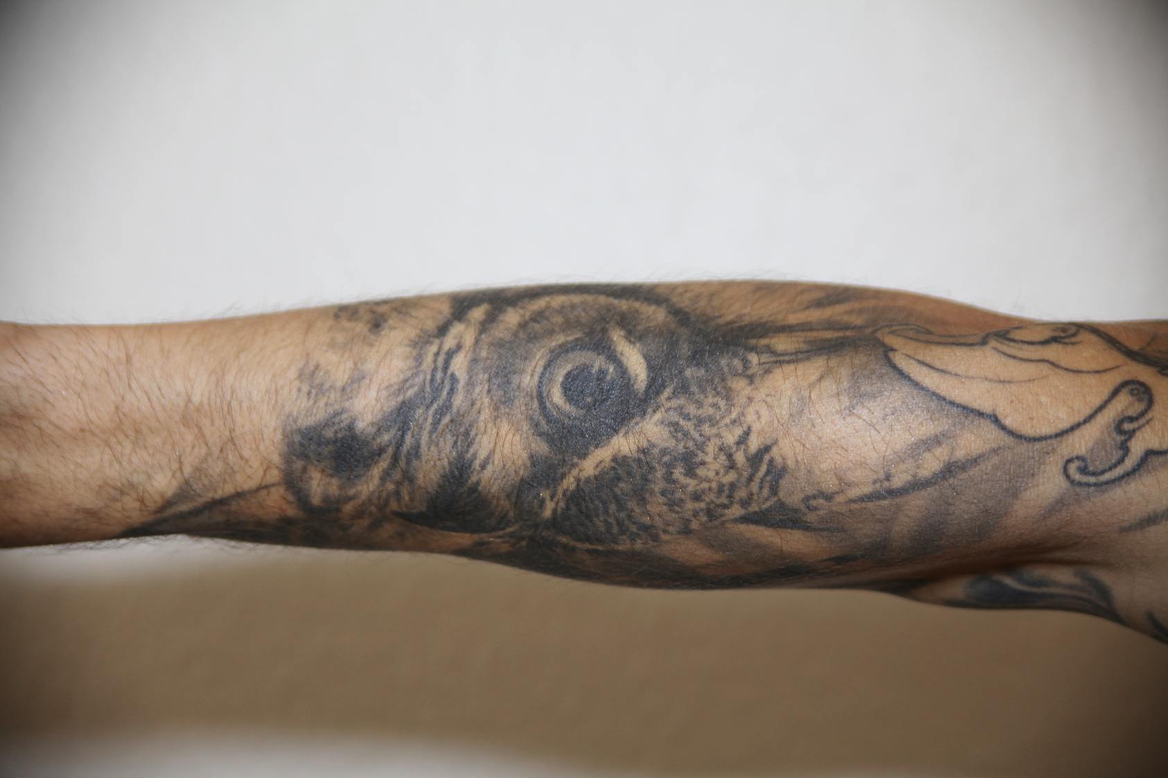
The owl has a completely different rhythm. Its round eye is the obvious starting point, surrounded by rings of shading that spread out into a softer feather texture. The beak drops into the darker center of the face. A curved outline from another design sits nearby, so the owl reads as part of an arm that’s already busy.
In the 2018 Univision interview, Mike connected his interest in animals with his family’s circus background. The owl is one of the animals he showed during that conversation. That personal explanation is more useful here than automatically attaching wisdom or protection to every owl someone wears.
What makes this one work visually is how the face fits the long surface of the forearm. The eye is broad enough to catch attention, but the rest of the head narrows with the available space. It’s a good reminder to judge an animal tattoo on the body, not just as a flat drawing.
The lion on his inner forearm
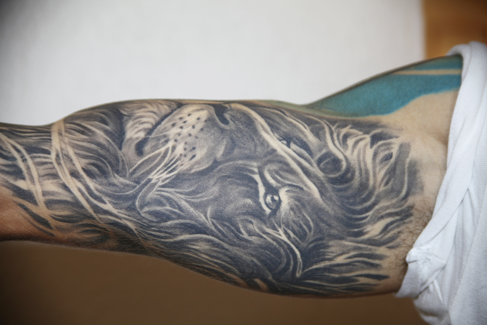
Mike’s lion takes up a generous patch of his inner forearm. The pale muzzle and long whiskers stand out against a much darker face. Around it, the mane breaks into flowing strands, with open skin separating the heavier sections. The close-up catches the piece sideways, which makes those long curves especially easy to follow.
Univision identified the artist for this piece by the Colombian city of Pereira, without supplying a name in the gallery. There’s no need to guess one. The photograph already gives us plenty to look at, particularly the way the mane follows the arm instead of stopping at a neat square border.
The lion feels softer than the striped tiger nearby. Whiskers, fur and open highlights give each animal its own texture. That distinction matters in a collection with several faces: you can enjoy the same general subject without making every piece look interchangeable.
A second tiger tattoo with a green eye
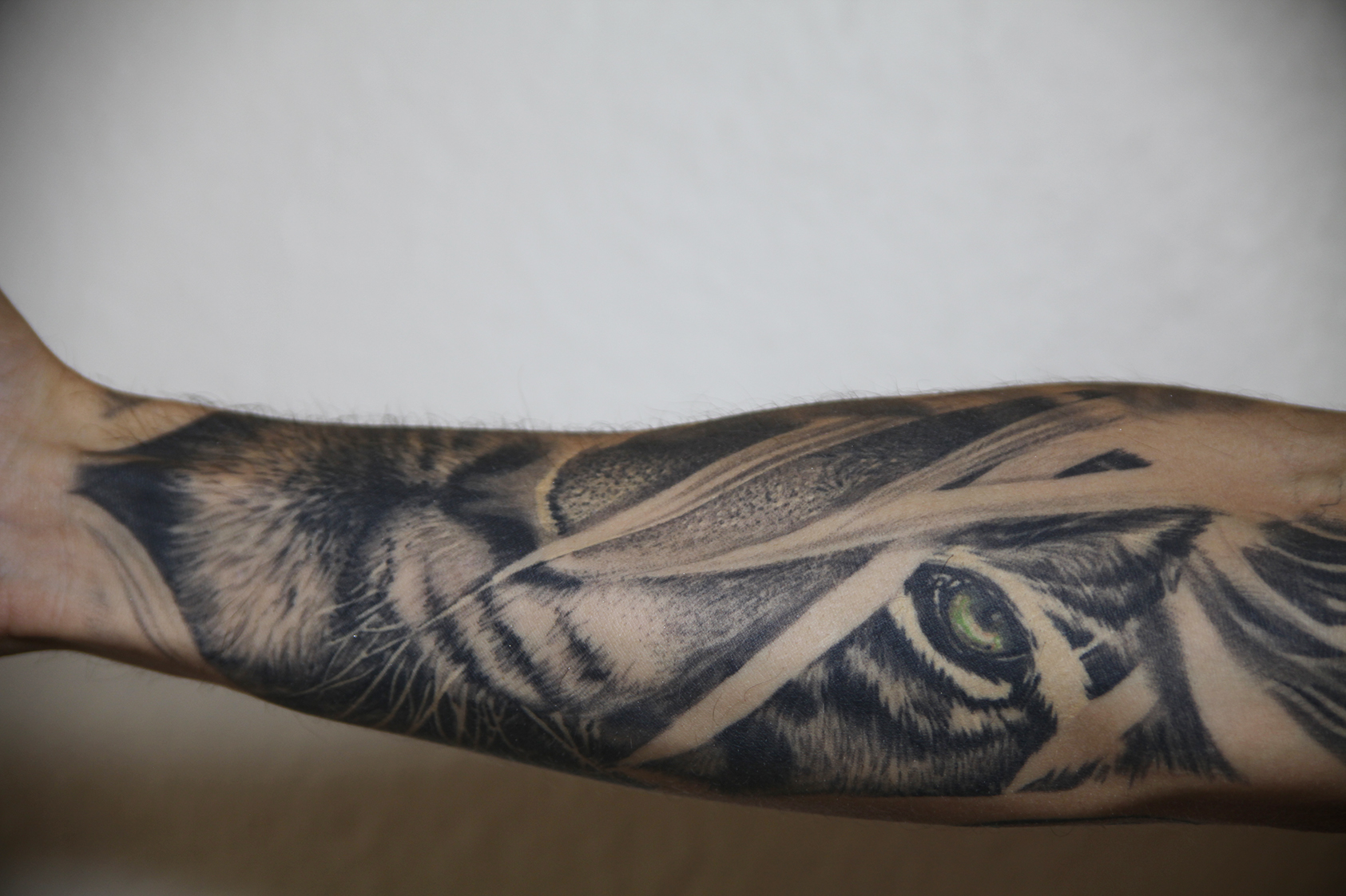
This is a separate tiger design, not another crop of the yellow-eyed animal. A green eye appears between pale diagonal shapes, while the nose and whiskers sit farther along the forearm. The black stripes are broad, and the fur around the muzzle is much softer. Both textures stay visible in the close-up.
Mike told Univision that he returned to the Pereira artist for another tiger because he liked the way that artist handled big cats. The pair make an interesting comparison. One pulls attention toward a warm-colored eye; this one places a cooler eye inside a more broken-up arrangement.
Those light diagonal areas are worth noticing. They interrupt the portrait without making the animal disappear. If you’re planning a large animal piece, that kind of interruption can be more engaging than filling the entire area with an uninterrupted face. You still recognize the subject straight away, but your eye has to move.
The small palm tree on his hand
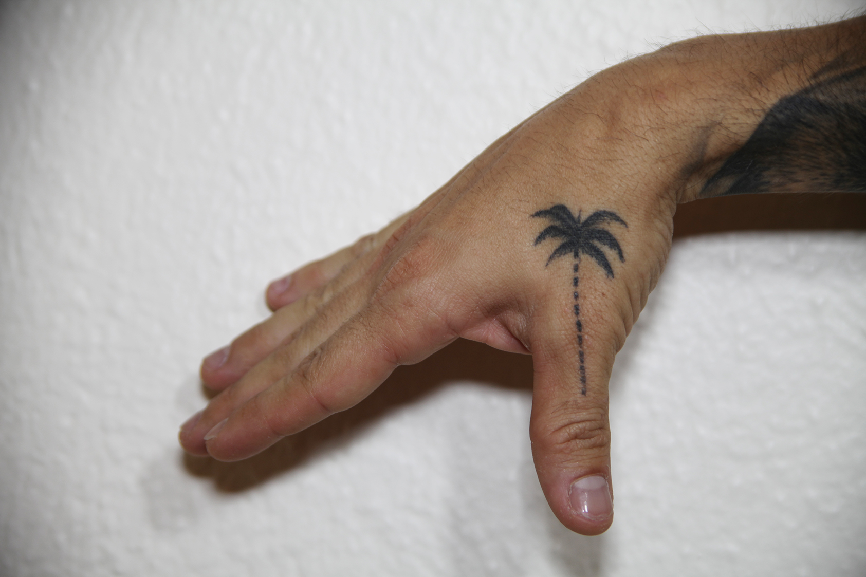
After the dense animal work, the palm tree feels almost tiny. Dark fronds spread out over the side of the hand near the thumb, and a narrow, segmented trunk runs down toward the thumb joint. There’s plenty of bare skin around it. You can take in the whole design in a second.
Mike explained to Radio Moda in 2017 that the palm was connected with Los Angeles and the plans surrounding Amantes, his collaboration with Greeicy. Later reporting also connected their matching palms with a shared wish to live near the beach. Those explanations fit comfortably together: a place and a song can become part of a bigger shared plan.
As a design, its appeal is straightforward. The fronds create a recognizable silhouette, while the slim trunk follows the hand’s shape. It doesn’t try to squeeze a whole beach scene into a small space. The palm alone is enough.
What ARENA on Mike Bahía’s neck means
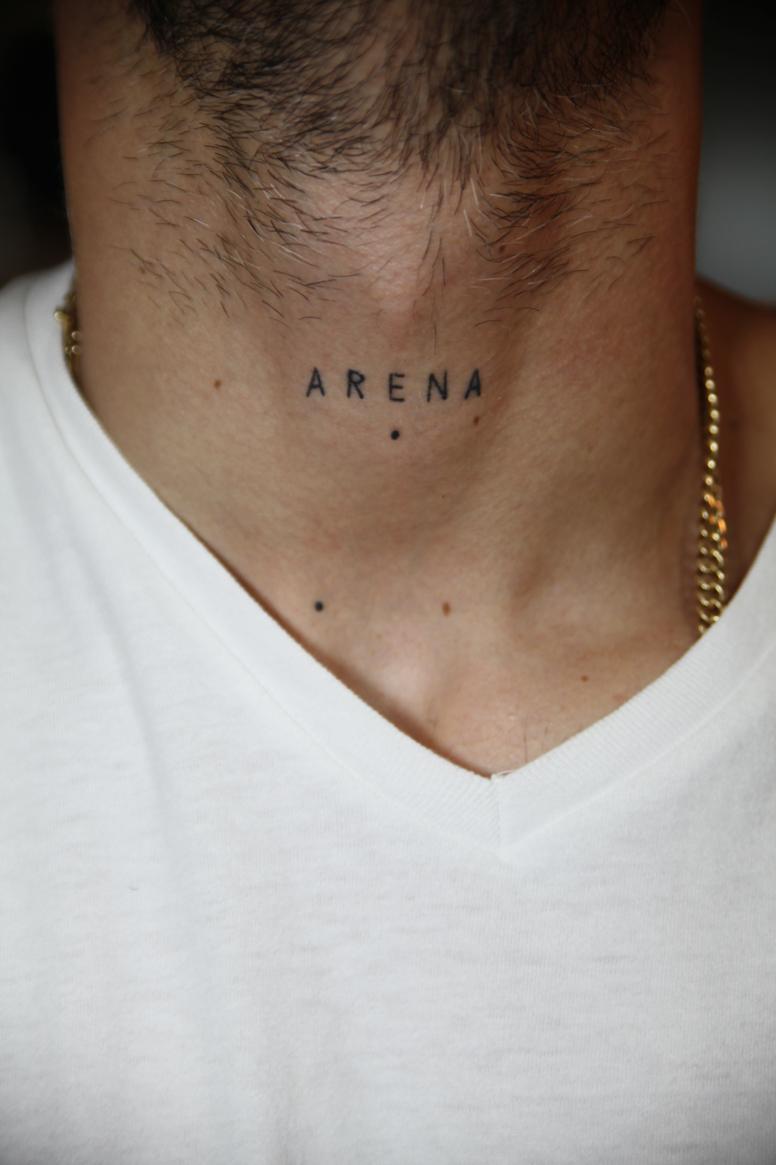
ARENA is one of his simplest tattoos and one of the most personal. Five small capitals sit across the front of his neck, with noticeable space between each letter. In the close-up, the word sits well above the V of his white shirt. The lettering has none of the elaborate flourishes seen on his ribs.
When he discussed it with Radio Moda in 2017, Arena was the name he wanted for a future daughter. He also explained the placement: anything he sang or said might be heard by her one day. The throat position gave that thought a physical home.
That explanation belongs to the time he gave it. It shouldn’t be rewritten as proof that he had a daughter named Arena. Infobae later reported that Mike and Greeicy became parents to their son Kai in April 2022. The earlier tattoo records something he was thinking about before becoming a father.
The Stevens memorial tattoos behind his ear
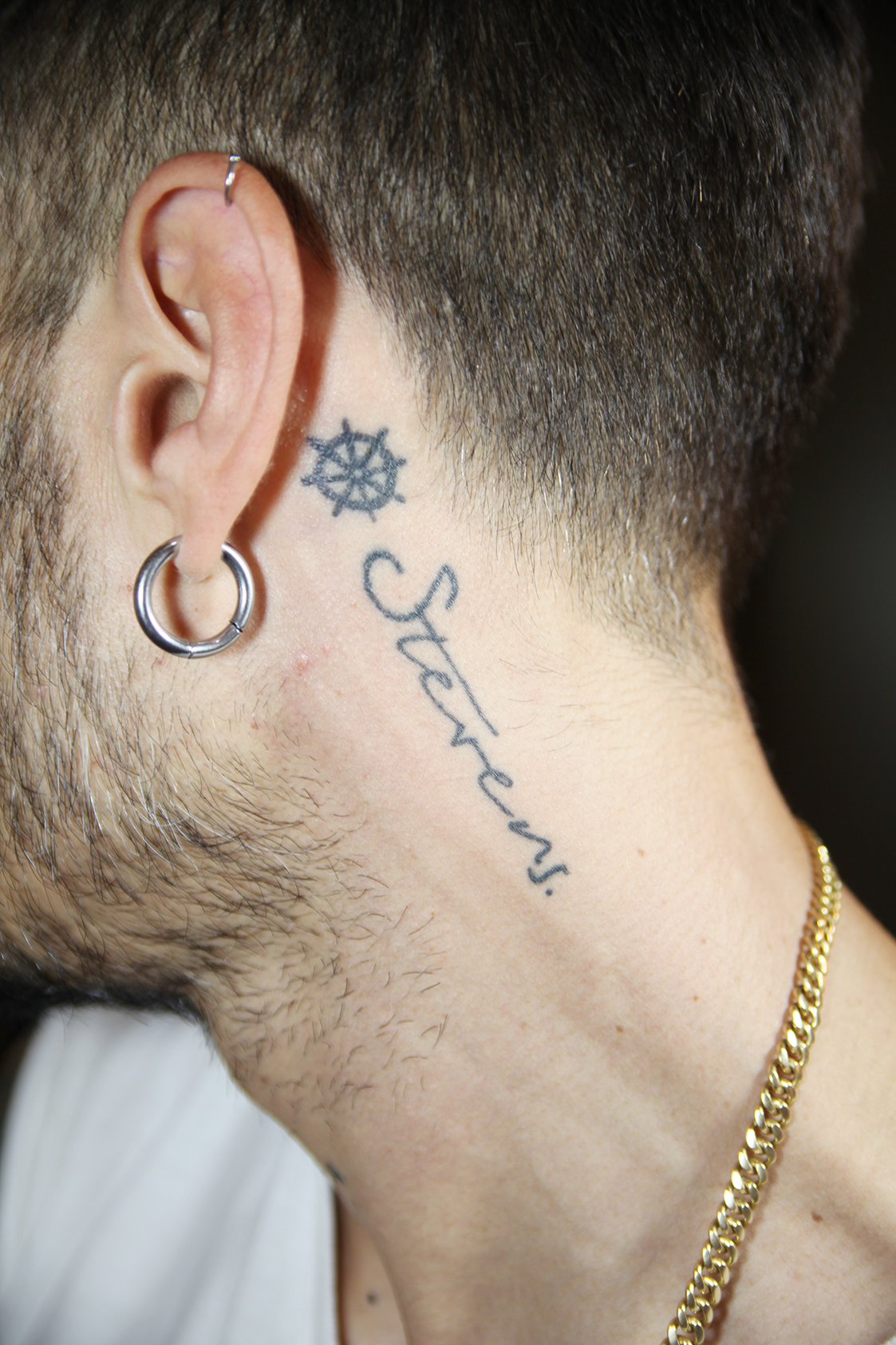
Behind his ear, a small ship’s wheel sits above the handwritten name Stevens. The wheel is compact and dark, with short spokes extending around its outside. The name runs diagonally down the neck in much lighter-looking, open script. A hoop earring is close by, but the two tattoos remain easy to separate.
Mike explained in his Univision interview that Stevens was his brother, who died at birth. He associated the name and the sea with figures of protection in his life. That makes the name a family memorial with a specific person behind it.
The scale suits the placement. A large portrait here would have a very different effect; the small wheel and loose handwriting leave room around each other. The eye can register the symbol first and then read the name. It’s quiet work compared with the animal pieces, and it deserves that closer look.
VERDAD repeated across his stomach
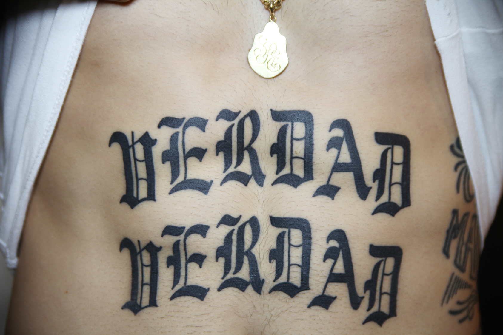
The word Verdad, Spanish for truth, appears twice across Mike’s stomach. Both lines use substantial blackletter-style capitals. Tall vertical strokes, pointed edges and broad dark sections give the lettering weight, while the open centers keep the letters recognizable. This is text meant to occupy space.
In the 2018 gallery interview, Mike linked the word to honesty, including being honest with yourself. The repetition is plainly visible in the photograph. You don’t have to treat the second line as a separate slogan or hunt for a hidden message to appreciate its effect.
Compared with ARENA, the difference is striking. Both are short words, but the stomach piece gets its impact through size and density. The lettering style changes how the message feels before you even read it. Anyone choosing between delicate text and bold lettering can learn something just by putting those two pieces side by side.
The sailor phrase tattoo covering his ribs
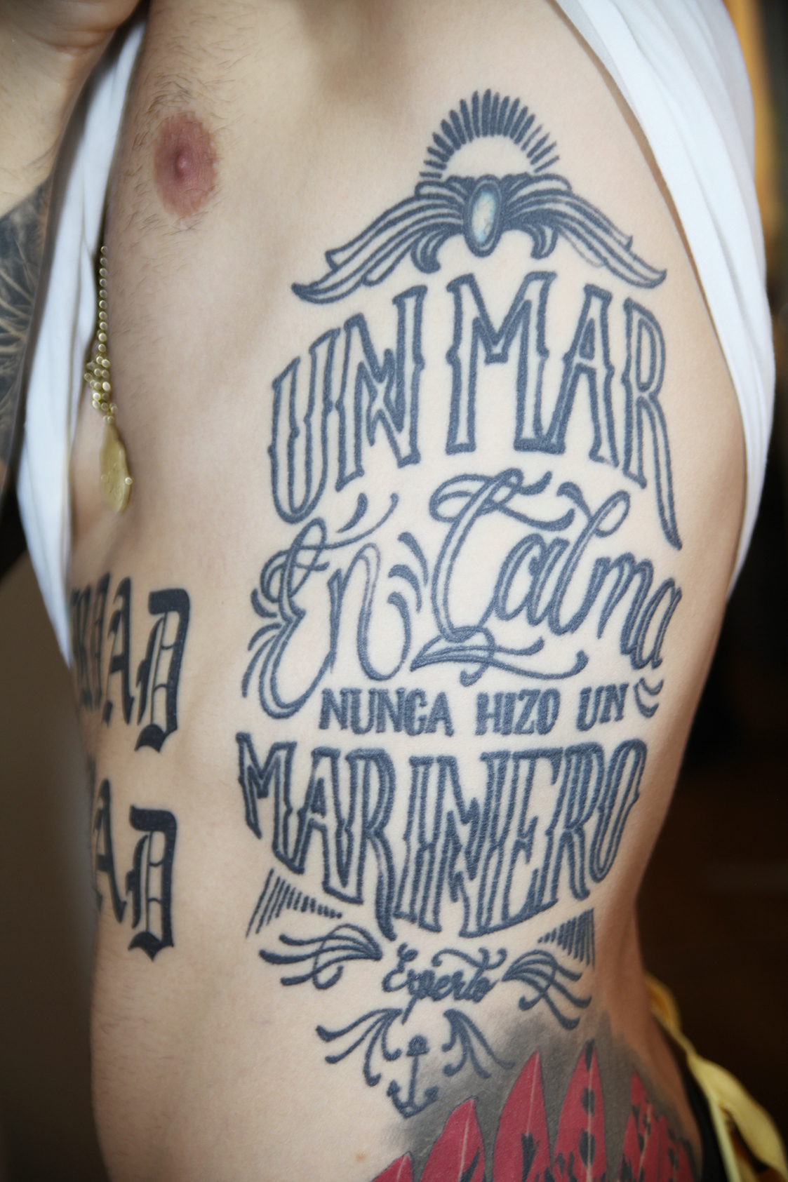
The rib piece reads Un mar en calma nunca hizo un marinero experto, meaning that a calm sea never made an expert sailor. The photograph includes the final word, experto, beneath the much larger marinero. It’s a long phrase given enough room to become a full composition.
The lettering changes as you move down. Tall outlined capitals sit above flowing script, then a small block of words leads into the oversized lower line. Curved ornaments frame the top and bottom. Those changes stop a long sentence from looking like a plain paragraph placed on skin.
The idea fits the sea imagery elsewhere on his body, but the design also works as a lesson in arranging text. Some words need to carry the composition; others can act as connectors. Here, the larger lines keep the phrase balanced across the ribs while the smaller words remain part of the reading order.
Watch Mike’s Telemundo conversation
The close-ups give you time to notice the details, but Mike’s own delivery adds something photographs can’t. Telemundo’s tattoo interview lets him talk through his collection in person. It’s a good place to finish after looking at the lettering, the little palm and those large animal faces.