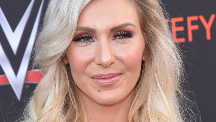
Charlotte Flair’s tattoos are easy to miss when she’s making an entrance. There’s a robe to look at, an outfit catching the light and a whole arena reacting to her. The smaller details get a lot less attention. Look closer, though, and one piece has a very clear place in her life: the cross on her right side, dedicated to her brother Reid.
It’s a personal memorial with an actual name and dates worked into the design. Charlotte has explained who it remembers and why her family chose it. That matters, because a cross on its own can invite all sorts of guesses. Here, the most useful explanation comes from the person wearing it. The shape is familiar; the connection belongs to her.
The Reider memorial cross tattoo
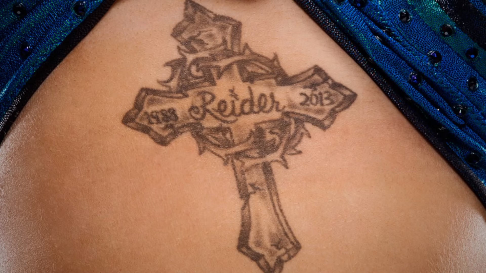
The close-up gives you a much better look than a moving wrestling shot. Reider runs across the middle of the cross, with 1988 on one side and 2013 on the other. The nickname is written in curling lettering, while the cross has heavier outlines and shaded sections. A circular, thorn-like element wraps around its center. There’s quite a bit happening in a fairly compact space.
The ends of the cross have pointed, angular edges, and the lower stem extends beneath the central lettering. Those darker edges help keep the overall shape readable. Inside them, the shading is softer and a little uneven in the way healed tattoo shading can appear in a close photograph. It isn’t a flat black silhouette, and calling it minimalist would miss most of its character.
Charlotte discussed the piece on WWE’s Superstar Ink with Corey Graves. Reid had a cross on his back, and after his death, Charlotte and other people close to him got versions of that tattoo in his memory. The family connection explains why this particular cross matters. It wasn’t simply a design chosen because crosses are common memorial imagery.
Her account also included a very human detail: Reid had wanted a cross connected to Guns N’ Roses, but the result turned out to be a more generic cross. A tattoo that the family had once teased him about became something they shared. That little imperfection makes the tribute feel especially personal. The reference didn’t have to be perfect for the memory to be worth keeping.
Remembering Reid in her own way
A nickname changes the feel of a memorial. Reider is more intimate than a formal inscription, and it occupies the spot your eye goes to first. The years sit beside it rather than competing with it. You can read the basic structure quickly: a person, the years of his life and a shape associated with him. You don’t need a complicated explanation of every curl to understand why it matters.
The tribute is to Reid, Charlotte’s younger brother, who died in 2013. It’s reasonable to talk about remembrance here because she has made that connection herself. It would be a stretch to assign a separate spiritual meaning to every point or shaded patch. Some parts of a tattoo are there because they’re part of the design being remembered.
There’s also something quietly powerful about relatives wearing related pieces without needing them to be identical in every detail. Placement, size and the name inside can change while the shared reference stays intact. With Charlotte’s version, Reider makes the relationship unmistakable. The tattoo points back to a specific person rather than asking the viewer to supply a general meaning.
For anyone thinking about a family tribute, that’s the useful part to take away. The detail that matters most might be a nickname, an imperfect old drawing or something everyone remembers laughing about. You don’t have to borrow Charlotte’s cross to borrow that approach. Start with what actually brings the person to mind, then let the artwork fit that memory.
The presence she brings to a photograph

Charlotte’s fashion photographs have their own energy. In the red look from her Flaunt shoot, she stands square to the camera against an orange-red backdrop. The outfit, boots and wall are close enough in color that the pose does much of the work. It’s a bold image with a very controlled silhouette, and it makes sense as a photograph of someone used to holding an audience’s attention.
This is a different way of seeing her than the memorial close-up. The full-length photograph is about styling and presence. The cross photograph brings one small area into focus. Both can be useful when you’re looking at a celebrity’s overall appearance, but they answer different questions. A fashion image can show how an outfit sits on the body without giving you a readable view of a tattoo.
The distinction is especially useful with side pieces. A front-facing pose can hide a tattoo that becomes obvious when someone turns. Clothing can cover the same area completely in another photograph. A tattoo disappearing from one angle doesn’t establish that it’s been removed. Sometimes all you’ve learned is that you’re looking at a different angle.
A quieter look in white

The white outfit in the same editorial changes the mood immediately. Charlotte is reclining rather than standing, and the pale background leaves much more empty space around her. Her jacket, straight blonde hair and printed boots give the photograph a different rhythm. It’s clearly a separate setup, rather than a tighter crop of the red standing pose.
That change is a good reminder of how much photographs can influence our impression of someone’s style. One image feels commanding; another feels relaxed and polished. Neither has to explain every part of the person in it. A tattoo can be deeply personal even when the photograph around it is entirely about clothes, lighting and the way a pose fills the frame.
It’s tempting to make every styling choice into a clue about someone’s private life. Usually, you don’t need to. Here, the clothes can just be clothes. The documented memorial already has a clear explanation, and a white jacket doesn’t add a new chapter to it. Letting those things exist separately makes it easier to appreciate both the portrait and the tattoo without inventing a connection.
The athlete beneath the performance

Another red-outfit photograph catches Charlotte with one elbow lifted overhead and her weight shifted through her legs. The same clothes now produce a different outline. You can see why pose matters so much in editorial photography: the lines of the body alter the whole composition, even before the photographer changes a lens or the stylist changes an accessory.
In her Flaunt interview, Charlotte spoke about playing several sports growing up, including volleyball, before she became a wrestler. She also described dedicating her career to Reid after his death. Those two parts of her background help explain why a conversation about her can move between athletic performance and family so naturally. The physical skill is visible; the personal motivation takes a conversation to understand.
That doesn’t mean a photograph can tell you how she’s feeling. The raised elbow and turned head are elements of a pose, not proof of a mood. What they do give you is a clearer sense of the work involved in presenting an image. A wrestler’s visual presence isn’t limited to a match. It carries into a fashion shoot, where small changes in posture have a big effect.
Charlotte and Ashley

The seated white-outfit photograph is another distinct composition, with Charlotte facing the camera and one knee raised. The printed boots take up a good part of the foreground. It’s polished and direct, but it also leaves room to think about the difference between a public character and the person doing the job. Fans see a finished image; they don’t see everything that went into the day around it.
Charlotte has addressed that distinction herself. In a 2022 TV Source interview, she discussed learning to separate criticism of Charlotte, the character, from Ashley, the person. She connected her forearm inscription Worthy with remembering her own value and staying true to herself. That’s a specific explanation of her intention, rather than a meaning that needs to be guessed from a single word.
It’s a useful bit of context when looking at her body art as a whole. Some pieces remember another person. Others can act as a reminder to the wearer. Those meanings can sit alongside each other without becoming one neat theme. A collection can develop in stages, with different choices serving different purposes at different points in someone’s life.
What makes the memorial feel personal
The strongest part of the Reider piece is its specificity. You can recognize the cross at a glance, then move closer to read the name and years. The lettering softens the angular shape around it. The darker outlines frame the memorial details without swallowing them. Even without knowing the family history, you can see that the inscription is the center of the design.
Once you know the history, the choice becomes much less abstract. This was a reference to something Reid wore, carried forward by people who loved him. That relationship is enough. There’s no need to turn it into a claim that the tattoo explains every career decision Charlotte has ever made, or that one piece of body art can sum up grief.
If you’re drawn to memorial tattoos, pay attention to that balance between recognizable form and private reference. Someone else might choose a different shape entirely and keep the same emphasis on a name. Another person might leave the name out and use a detail only their family recognizes. The useful question is whether the finished piece feels connected to the person you’re remembering.
Charlotte’s cross gives that question a very concrete answer: Reider, the years and a shared family reference. For a lighter glimpse of Charlotte away from the usual entrance and match footage, her conversation with Corey Graves about their secret handshake is below.