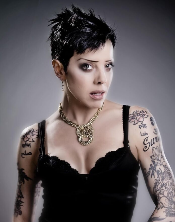
Bif Naked has never treated tattoos like decoration that gets added when the rest of the outfit needs something extra. Her ink has been part of the outfit, the stage presence, and the private record underneath it for decades. Look closely at the photographs and you don’t see one tidy style repeated over and over. You see spiritual symbols, lettering, old blackwork, playful shapes, flowers, figures, and pieces that sit together because they belong to the same life.
That mix is what makes Bif Naked’s tattoos worth looking at. They’re not a polished, colour-matched sleeve built around one trend. They’re closer to a scrapbook on skin. Some pieces are crisp and easy to read. Others have softened with time. Some are tied to belief, some to survival, some to people or animals she loved, and some seem to exist because she wanted them there. The result feels personal in a way that a perfectly coordinated collection often doesn’t.
The available interviews are unusually helpful too. Bif has spoken about getting her first tattoo, the spiritual ideas behind older work, the way tattoos can act as armour, and the practical limits of having less and less unmarked space. That gives us more than a set of photographs. It gives the visible pieces a little context without pretending every mark has a neatly documented explanation.
Bif Naked’s Eye of Horus tattoo
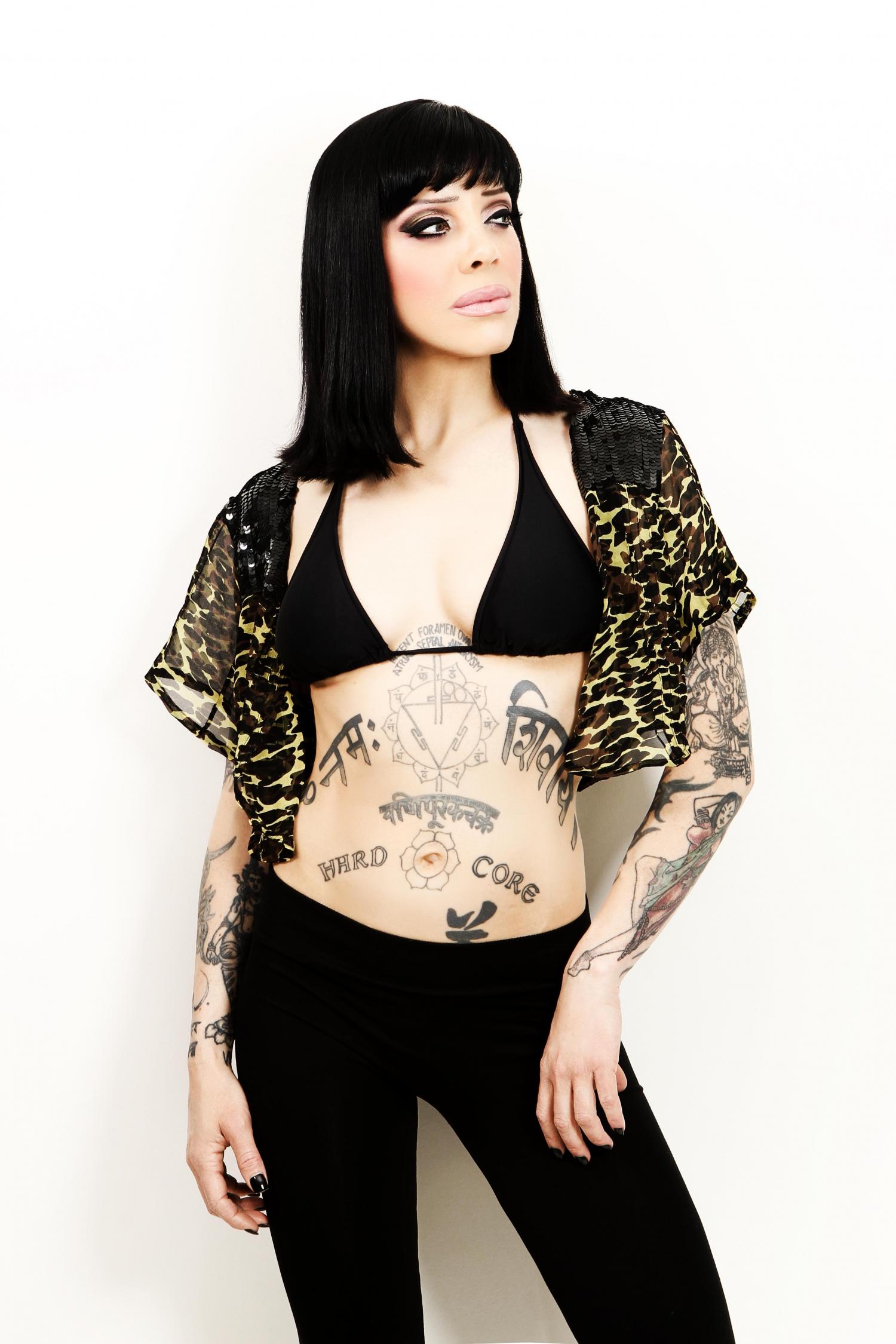
The Eye of Horus is the clearest starting point because Bif has identified it as her first tattoo. In an interview with Punk Globe, she described the symbol as an all-seeing eye and a sign of protection. She got it more than twenty-five years before that conversation, at a point when protection wasn’t an abstract idea for her. It was something she wanted close.
Visually, the Eye of Horus has the kind of immediate outline that works well as an early tattoo. The shape is recognisable at a glance, with a strong central eye and graphic lines that don’t depend on soft shading to make sense. It also fits the mood Bif has carried through her music and public image: a little mysterious, a little confrontational, and still grounded in a real symbol rather than a random piece of flash.
Time matters here. Older tattoos rarely stay frozen. Lines spread, black fills lose their punch, and the skin around them changes. Bif has been open about that reality, even saying that one of her favourite pieces has become less clear with age. That honesty makes the Eye of Horus more interesting, not less. It is not being presented as a showroom sample. It is an old, meaningful mark that has kept its place while everything around it has changed.
The Ganesha tattoo on her left arm
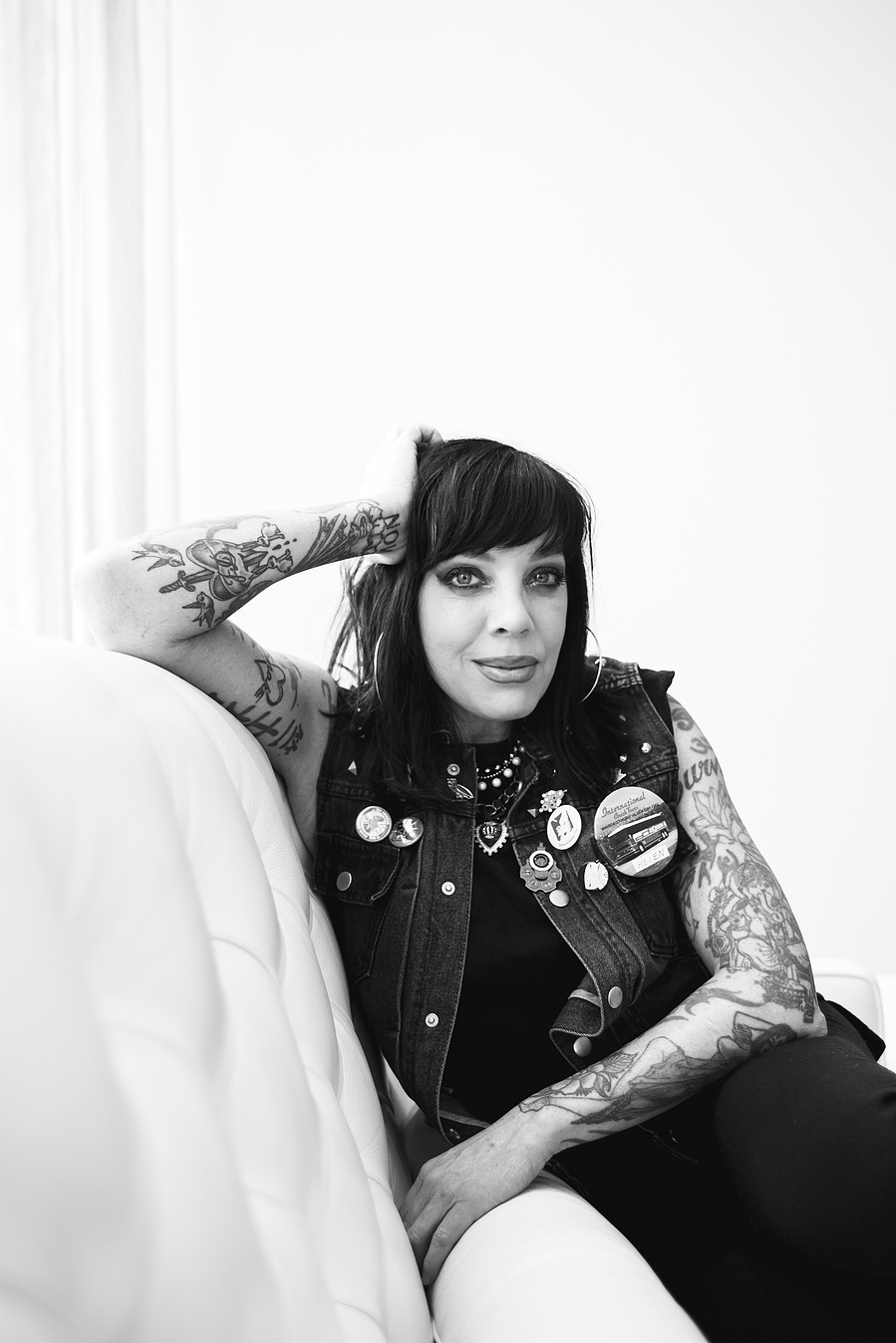
Bif has also singled out the Ganesha tattoo on her left arm as one of the pieces that matters most to her. In an interview with The Seeker, she explained that Ganesha represented the removal of obstacles and good luck. She got it when she needed that idea, and the meaning stayed with her even as the ink itself aged.
That is a useful distinction. The tattoo isn’t interesting just because it depicts a recognisable figure. It has a job in Bif’s own history. She has described tattoos as a kind of armour and as a way of carrying an emotional story on the body. The Ganesha fits that description better than a generic “celebrity tattoo” label ever could. It is a spiritual image, but it is also a practical reminder of what she needed at a particular time.
In the wider photographs, the Ganesha sits among other pieces rather than floating on a blank arm. That crowded setting changes how you read it. The eye moves between shapes, lettering, and different levels of detail, so the arm feels lived-in instead of designed in one sitting. The older work has its own texture, and the newer work doesn’t erase it. Bif’s collection makes room for both.
Lettering, script, and the “Hard Core” tattoo
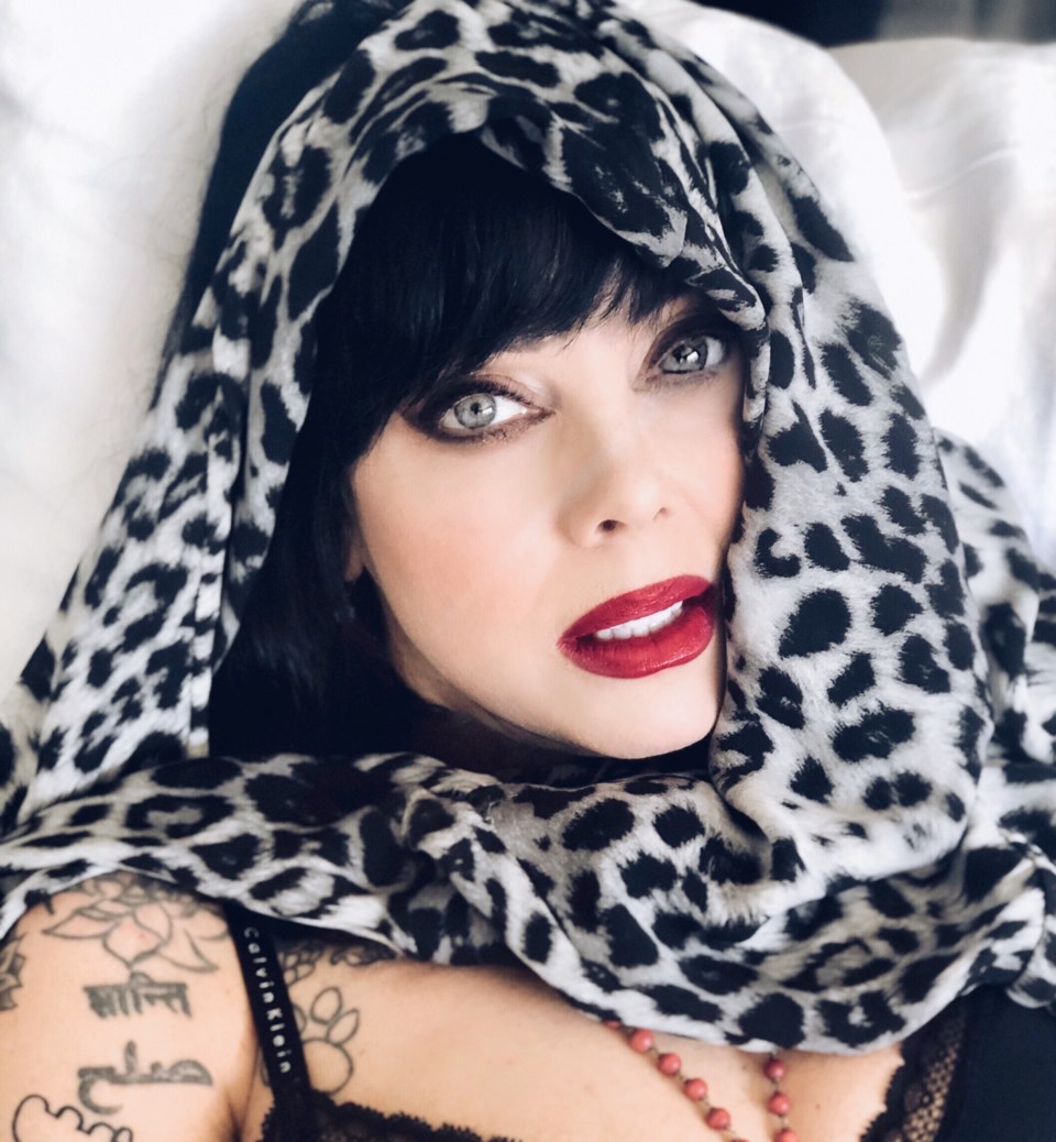
Lettering is a big part of the visual language in Bif Naked’s tattoos. Across her torso and arms, words and short pieces of script sit beside symbols and illustrative designs. The phrase “Hard Core” across her stomach is one of the most immediately readable examples. It has a blunt, almost hand-painted feel, which suits the directness of the words.
Her lettering doesn’t always look like it came from the same font or the same plan. Some marks are compact and dark. Others are longer, looser, or placed where the body changes direction. That variation keeps the collection from feeling like a logo system. You can read the words, but you also notice the way each one occupies space.
There are practical lessons in that. Strong lettering needs enough room to breathe, especially when it is placed on a moving part of the body. A phrase that looks clean in a fresh photograph can become harder to read as lines settle and soften. Bif’s older pieces show exactly why scale, spacing, and placement matter. The bold shapes still carry, while the finer details ask you to look a little closer.
Flowers, figures, and dense arm coverage
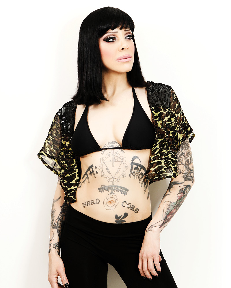
The arm photographs show how broad Bif’s collection really is. Floral shapes, figures, small symbols, and darker sections sit alongside the larger spiritual imagery. From a distance, the arms read as dense sleeves. Up close, they break into separate decisions. There are gaps, overlaps, changes in line weight, and areas where a design follows the shape of the arm instead of fighting it.
That density is part of the appeal, but it isn’t something to copy casually. A heavily tattooed arm works because the individual pieces have accumulated over time. They carry different moods and different visual ages. If someone tried to reproduce the look by packing unrelated flash into one appointment, the result could feel busy without feeling personal. Personal history is doing as much work here as the linework.
Bif’s photographs also show why a tattoo collection can look different under different lighting. Black ink can look soft in a bright portrait, while a darker image makes the same lines merge into a larger shape. Colour pieces catch the eye in one frame and disappear into the sleeve in another. None of those views is the whole collection. They are snapshots of a body that moves, bends, and changes with clothes, light, and time.
Body tattoos and the meaning of “Naked”
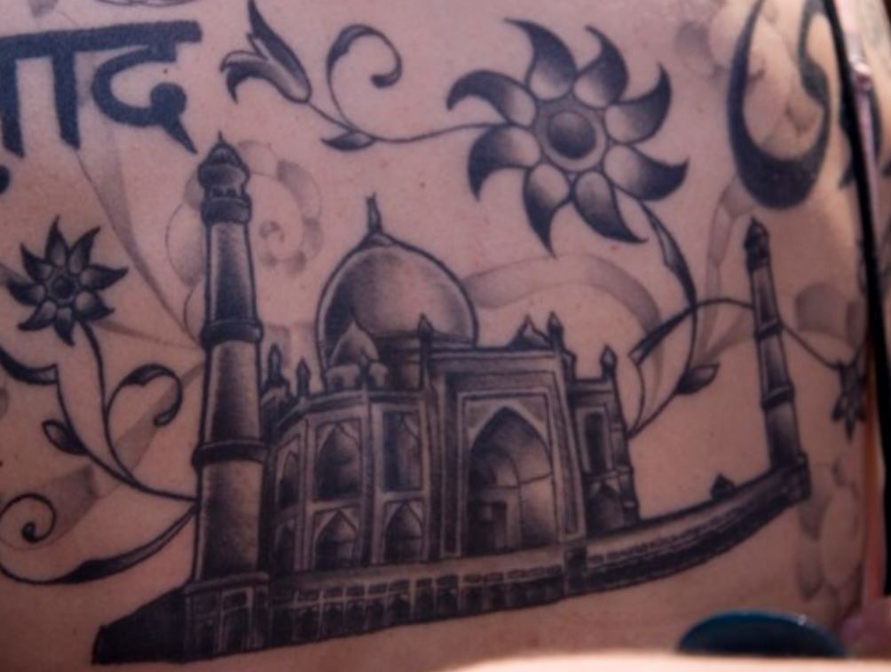
Bif Naked’s torso work gives the collection another visual rhythm. The centre of the body holds large lettering, symbols, and ornamental shapes, while the surrounding pieces follow the ribs, stomach, and lower torso. Some of the placement is deliberately hard to miss. Some of it only appears when clothing or a pose makes room for it.
The word “Naked” across her lower back is one of the most obvious examples of Bif turning her own stage name into a physical mark. She has said she got it because she wanted to. That answer is almost funny in its simplicity, and it is a good reminder that not every tattoo needs a dramatic explanation. Sometimes the reason is the reason: the word felt right, the placement made sense, and she liked the idea enough to live with it.
There is a nice contrast between that direct piece and the more layered spiritual work. One points straight at the name people know. The other pieces reach outward into symbols, faith, luck, protection, and personal history. Together they make the collection feel more like a person than a brand. Bif can be serious about meaning without making every tattoo sound like a solemn mission statement.
The collection keeps changing
Bif has talked about adding her dog’s name to newer tattoos and about having to cross out the names of former husbands. That detail says a lot about the way her collection has developed. Tattoos don’t only preserve the past. They also record revisions. A piece can begin as one thing, then be covered, altered, crossed out, or surrounded by new work when life takes a different turn.
The crossed-out names are especially revealing because they refuse the usual idea that a tattoo has to remain a perfect monument to its first meaning. A relationship changes, the skin changes with it, and the design changes too. That can be messy, but mess is sometimes the honest part. Bif’s tattoos leave room for edits instead of pretending the original version of her life is still current.
Her comments about running out of room add another layer. In a 2009 interview, she joked that there wasn’t much blank skin left and explained that chemotherapy had changed how she thought about new tattoos for a while. That isn’t a reason to speculate about pieces that aren’t visible. It is simply useful context for understanding why her collection has periods of expansion, pauses, and later additions.
Why this collection still works
The easy answer is that Bif has a lot of tattoos. The better answer is that the collection has a clear emotional logic even when the visual styles don’t match. Symbols sit next to lettering. Spiritual imagery shares space with jokes, names, and flowers. Older lines stay visible beside newer work. The whole thing feels assembled rather than manufactured.
That makes Bif Naked a strong reference for anyone who likes a tattoo collection with history in it. You don’t need to copy the exact Eye of Horus or the exact Ganesha to take something useful from the approach. You can think about whether a symbol has a reason to stay with you, whether lettering is large enough to age well, and whether a new piece adds something instead of simply filling an empty patch. “The collection keeps changing” is a better way to read it than searching for one permanent final version.
It also helps to be realistic about what photographs can prove. A close-up is useful for reading a symbol or a word. A wider portrait shows how the tattoos sit on the body. Older images may show pieces before later additions or changes. Those views belong together, but they aren’t interchangeable. The most honest reading comes from comparing them without pretending every detail is perfectly documented.
Bif Naked’s tattoos work because they don’t look like they were chosen to satisfy one audience. They hold spiritual ideas, private memories, visible scars from change, and a bit of punk stubbornness. Some are bold. Some are faded. Some are easy to explain, while others are simply part of the map. That is why the collection remains so compelling: it looks like a real life kept moving, with the ink keeping pace.