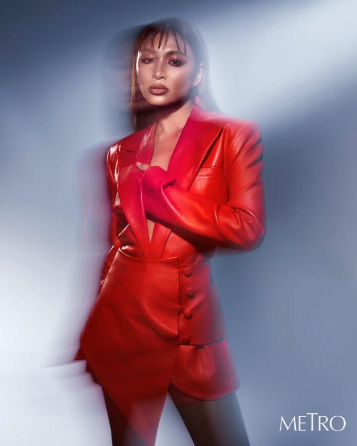
Nadine Lustre’s tattoos have never felt like random decoration. She has described them as works of art and as little notes to herself, which fits the collection pretty well. Some pieces are tiny enough to disappear under a bracelet. Others, like the dragon on her right shoulder and upper arm, take up real space and change the way a sleeveless outfit reads.
What makes Nadine’s ink interesting is the mix. There are personal lyrics, flowers, a moon, Japanese characters, minimalist leg lettering and friendship designs. A few meanings come directly from her own interviews, while other pieces are simply visible in photographs. The useful approach is to keep those two things separate: describe what the camera shows, then use Nadine’s own explanation where she has given one.
The Tadhana Lyric on Her Forearm
One of Nadine’s most personal tattoos is the small line of text on her inner forearm. It reads “Nakayapak at Nahihiwagaan,” a lyric from Up Dharma Down’s song Tadhana. Nadine said the song was a favorite of her late brother, and that she had the words tattooed around the anniversary of his death. She has connected the lyric with a sense of childlike innocence, so the design carries more weight than its neat lettering might suggest.
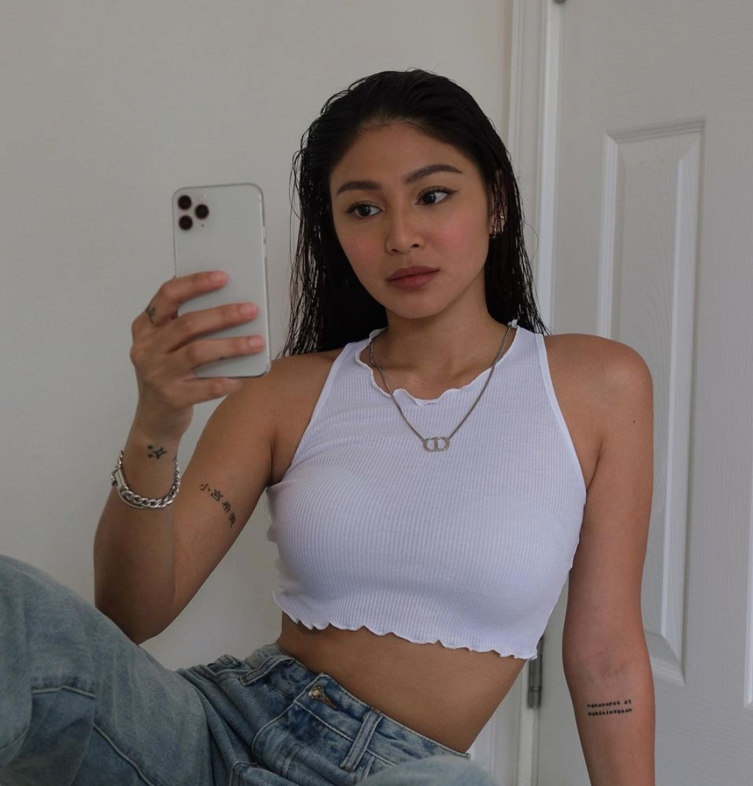
The photograph makes the placement easy to understand. It sits on the inner forearm, where she can see it without needing a mirror. That is a recurring idea in Nadine’s collection. Many of her tattoos are on her arms because she likes being able to look at them during ordinary parts of the day. The words are small, black and understated. There is no heavy border or ornament trying to make the phrase louder than the memory behind it. The placement is part of the meaning.
It is also a good example of why tattoo descriptions should avoid rushing. A quick image search might reduce the piece to “small script tattoo,” but the confirmed story is more specific. It is a lyric, it is tied to her brother, and she chose it for a particular emotional reason. That gives the design a clear identity without pretending the photo reveals every private detail.
The Lotus on Her Upper Arm
The lotus is one of the clearest larger designs in Nadine’s older tattoo collection. In her conversation with Dr. Aivee Teo, she compared the flower’s growth through mud and water with the experience of moving through difficult periods and eventually finding light. The meaning is unusually direct because Nadine explained it herself: the flower represents rising above trials and continuing toward a brighter place.
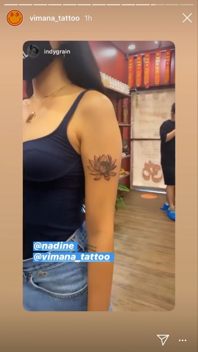
Visually, the tattoo is a shaded lotus placed high on the upper arm. The petals spread outward in layers, with darker lines giving the centre some depth. It has a soft, slightly smoky look rather than the hard outline of a traditional flash flower. The shoulder placement lets the design sit naturally under a tank top, but it also means the tattoo can disappear when her arm is covered.
That balance between visibility and privacy shows up across her ink. Nadine has plenty of tattoos, but they aren’t arranged as one giant sleeve that has to be seen all at once. The lotus can stand on its own. It works as a small composition on the shoulder, and its meaning doesn’t depend on adding more pieces around it. If you like floral tattoos with a personal angle, the placement is worth studying as much as the petals.
The Rose and Her Smaller Wrist Ink
The rose on Nadine’s wrist was one of her first tattoos. She has described it as an act of self-love, almost like giving herself a flower whenever she was struggling to love herself. That explanation makes the piece feel less like a generic rose reference and more like a small daily reminder. It is close enough to her hand that she can notice it while working, holding a phone or getting ready.
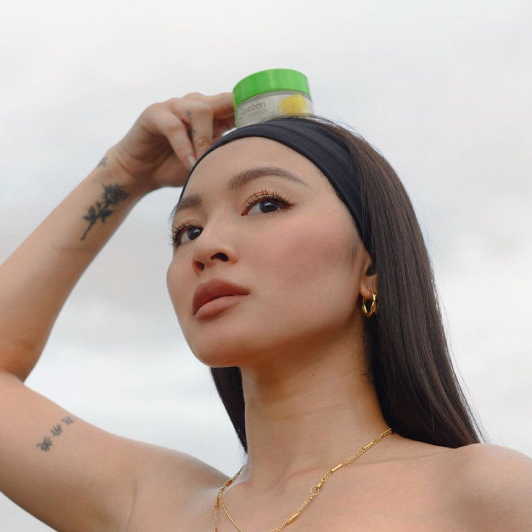
In the photograph, the flower sits among several small marks on her arms. The image is not a perfect studio close-up, so the rose changes slightly with perspective and light. That is normal. A tattoo that looks crisp in a close crop can look softer in a casual selfie, especially when the skin is angled toward the camera. The important point is that the same subject and placement line up with the published descriptions.
The rose also shows how Nadine’s collection moves between bold meaning and quiet design. The dragon is the piece people notice first because of its size. The rose is smaller, but it may be more intimate because she has attached such a clear personal reason to it. Neither approach is more valid. They simply do different jobs on the body. Small doesn’t mean slight.
The Crescent Moon Wrist Tattoo and Japanese Name
Nadine’s crescent moon appears on the opposite wrist from the rose. She has connected it with the lyrics of Coldplay’s Everglow and with remembering people close to her who have passed away. The design is simple, but the placement gives it an almost jewellery-like quality. It sits where a watch or bracelet might normally draw the eye, only the mark stays with her all the time.
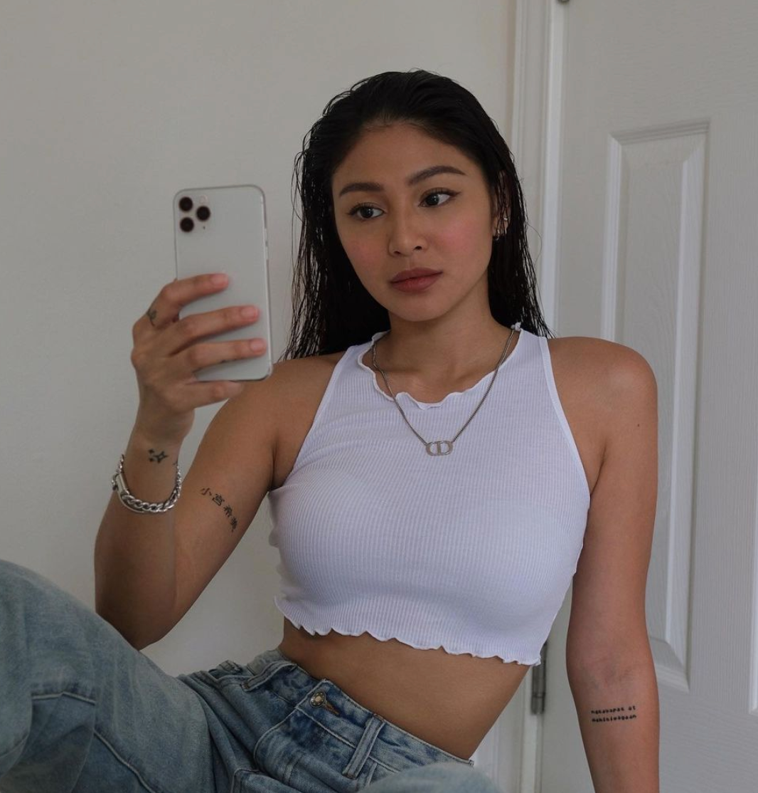
Other small tattoos are visible in the same kind of relaxed portrait, including lettering on her arm and marks on her fingers. Nadine has explained that the Japanese characters refer to “Nozomi Komiya,” a Japanese name connected to her family history. She said “nozomi” has the same meaning as her own name, hope, while “Komiya” relates to the family name her great-great-grandfather carried before it changed.
The combination creates a nice contrast. The moon is a quiet symbol, the Japanese lettering is more specific, and the lyric tattoo is tied to a song and a family memory. They occupy small spaces, but they don’t all mean the same thing. That is useful reference material for anyone who wants several small tattoos without making every piece look like part of one matching set. The placements are easy to see without turning every design into a statement piece.
How the Rest of the Collection Fits Together
In 2021, Nadine added two minimalist phrases to her calves: “That’s it” on one leg and “It is what it is” on the other. The lettering is tiny, clean and deliberately plain. There is no decorative frame around either phrase. The point is the sentence itself, and the small scale keeps the tattoos feeling personal rather than performative.
Nadine later explained that “that’s it” came from a meaningful trip to La Union with a close friend she considers like a brother. The trip happened while she was recording her album Wait for Me, and the tattoo became a reminder of what they learned together. “It is what it is” has a broader message: bad things happen, some situations are out of your control, and acceptance can be healthier than fighting every fact.
The pair is a smart example of how text tattoos can work as a set without being identical. Both phrases use the same small scale and straightforward type, but they carry different shades of meaning. One points back to a shared experience. The other acts more like a rule for getting through difficult days. Together, they read like two short notes written on opposite legs.
Nadine Lustre’s Dragon Tattoo
The dragon is the most dramatic piece associated with Nadine Lustre’s collection. PhilSTAR Life reported that the design runs from her right shoulder toward her upper elbow, making it her first large, obvious tattoo. Vimana Tattoo shared images from the session, including the stencil and the placement process. The published coverage confirms the design, the artist Indygrain and the general location. It doesn’t give a confirmed private explanation for why Nadine chose a dragon.
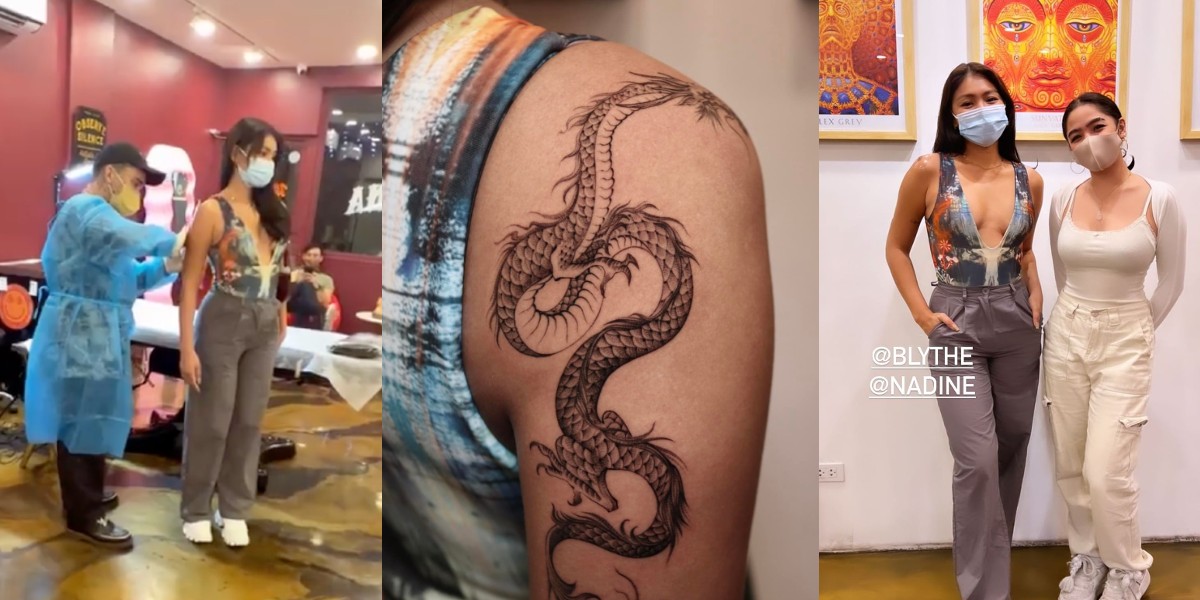
That distinction matters because large tattoos invite people to fill in the blanks. A dragon can suggest strength, protection, transformation or any number of ideas, but those are possibilities rather than facts about Nadine’s choice. The safest description is visual: a long, detailed dragon follows the curve of the upper arm and shoulder, standing apart from her smaller fine-line pieces.
The scale changes the balance of her collection. Before the dragon, most of the documented designs were compact and easy to hide. This one has a stronger silhouette and can be seen from a distance. It still fits her preference for tattoos with a story, but it gives the body art a new centre of gravity. A shoulder-to-upper-arm design can frame the arm without turning the whole limb into a solid sleeve.
Why the Smaller Pieces Still Matter
It would be easy to build an article around the dragon and treat the rest as a footnote. That would miss what makes Nadine’s tattoos feel like a collection rather than a single statement. The lyric, lotus, rose, moon and calf lettering all occupy different spaces and carry different kinds of memory. Some are about family. Some are about grief. One is about self-love, and another is about accepting what cannot be changed.
There is also a practical lesson in the way the pieces are placed. Small tattoos on the wrist, finger and forearm can be checked easily during the day. The upper-arm designs can be shown when she wants them visible and covered when she doesn’t. The calf lettering is private until she chooses shorts or a shorter hem. Even the larger dragon follows the natural line of her shoulder instead of fighting the shape of the body.
That makes the collection useful reference material for someone planning several tattoos. You don’t need every design to have the same style. You can use one larger focal piece, then let smaller scripts and symbols sit around your life rather than forcing them into a single sleeve. The main thing is to choose placement deliberately and leave enough space for each tattoo to stay readable as it ages.
What Nadine’s Photos Can Actually Confirm
The available photographs confirm a collection that includes the lotus, rose, crescent moon, forearm lyric, Japanese-name lettering, paired calf phrases and a large dragon. Nadine has also spoken about friendship tattoos and other small marks. Some photos show several designs at once, while others isolate one piece clearly. That makes it possible to discuss the confirmed tattoos without turning every shadow or tiny mark into a separate entry.
The photographs also show why different views matter. A mirror selfie gives a better look at the wrist and arm placements. A close crop makes small lettering easier to inspect. A casual portrait shows how the tattoos sit when Nadine is not posing specifically for a tattoo article. Those views are genuinely different photographs, not one image stretched into several claims.
What remains uncertain is just as important. The dragon’s personal meaning has not been confirmed in the sources checked here. Some tiny tattoos may have changed or been softened by time, and newer removal coverage suggests that Nadine has thought about how older, thicker lines age. That doesn’t erase the designs from the record. It simply means a careful guide should use “documented” and “visible” where a permanent count would be too strong.
Seeing the Collection in Motion
Nadine’s conversation with Dr. Aivee Teo is useful because she talks about the meanings in her own words. She describes tattoos as art and as stories connected to the person wearing them. That idea comes through in the designs: the ink isn’t presented as a trend list, even when the pieces are tiny. They work as reminders she can carry into normal life.
The video also gives the smaller tattoos a little more context than a gallery can. You can hear Nadine explain the lotus, rose, moon and forearm lyric, then compare those explanations with the photographs. That is a better way to use celebrity tattoo references. Start with the image, check the placement, listen for the confirmed meaning and leave room for the parts the wearer hasn’t explained.
If you like fine-line symbols, meaningful script or a larger arm piece with movement, Nadine’s collection offers several directions without pretending they all belong to one style. The rose and moon are tiny reminders. The calf phrases are short and blunt. The lotus is softer. The dragon is the boldest choice. Put together, they show how a tattoo collection can grow in chapters while still feeling personal.