A heavily marked rugby life
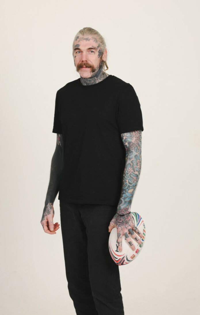
Close photos from Ryan Caldwell’s Guardian interview show tattoos across his hands, face, neck and arms. He says most of his body is tattooed, but he hasn’t given a full inventory or meaning for every design.
Caldwell has explained a few pieces directly: Carefree across his fingers, No Love above an eyebrow, and a Sanskrit tattoo he described as “strength.” The sleeves are clear in photos; their individual motifs aren’t all identified.
The useful reference is both the bold lettering and the way the collection has changed with him. The photos show real placement and scale, not a catalogue of confirmed stories.
Carefree across the fingers
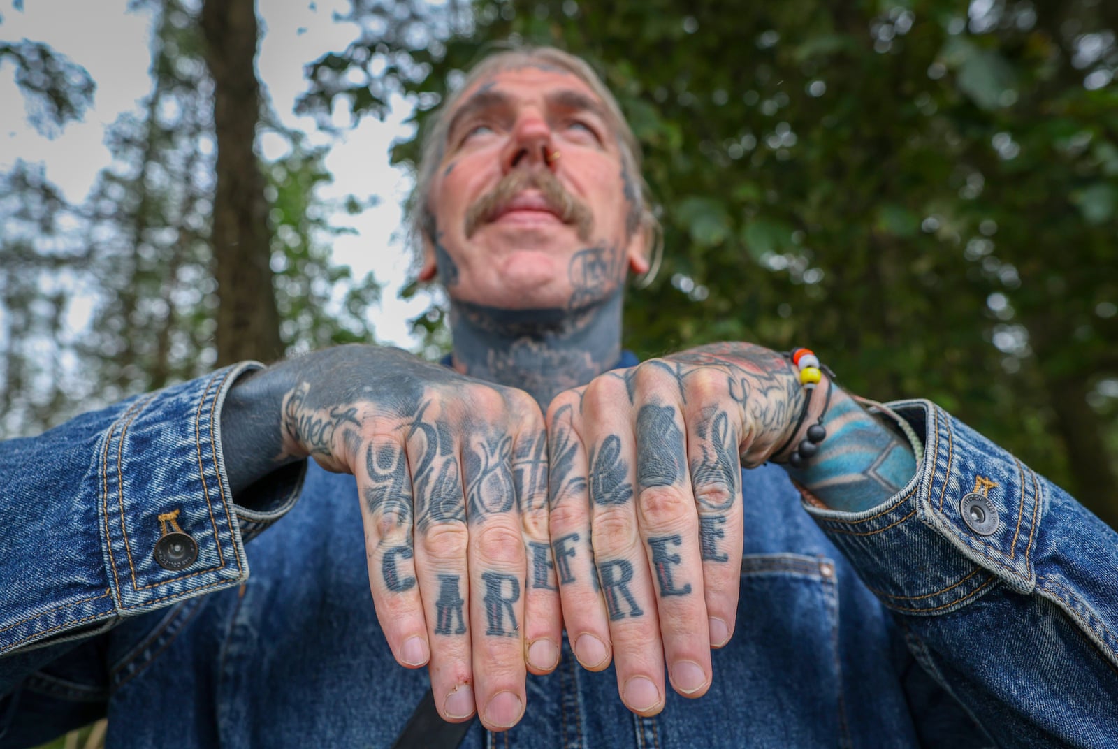
Carefree is written across Caldwell’s fingers. In the close view, the dark, traditional lettering sits among other hand tattoos and reads as part of a larger collection.
He told the Guardian the word felt almost at odds with difficult periods in his life. Caldwell has spoken about addiction, depression, prison and rebuilding; the contrast gives the simple phrase its weight.
Finger lettering moves across knuckles as the hand opens and closes. The straight-on photo shows the word clearly, but the spacing also has to work when the hands relax.
The face lettering and the limits of a photograph
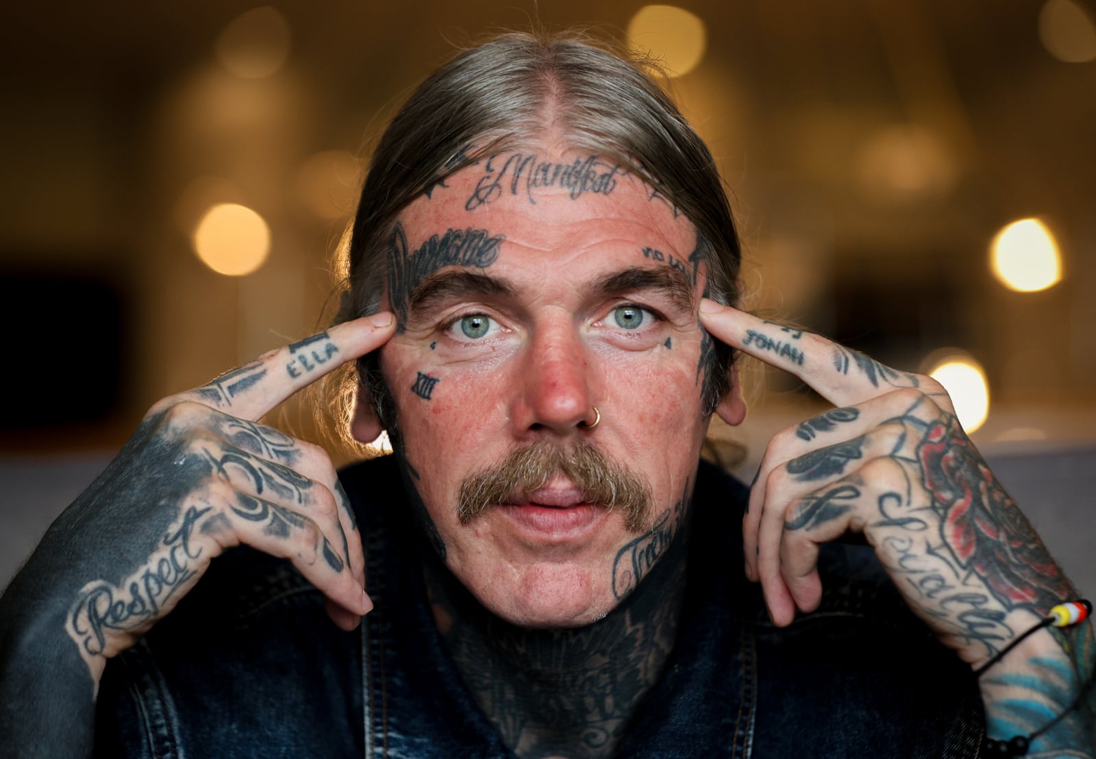
Caldwell has No Love tattooed above an eyebrow. He explained that it came from a time when he felt he had no love for himself; that context comes from him, not from a guess based on the words.
The close portrait also shows small marks around the eyes and forehead and heavier work down the side of his face and neck. The interview doesn’t explain each detail, so they remain visual descriptions.
Unlike an arm tattoo, the eyebrow lettering can’t be covered by a sleeve. It stays in view in portraits and daily conversation, a visible choice Caldwell has discussed in the context of his past.
The early years
Caldwell told the Guardian his first tattoo, at 18, was Sanskrit for “strength.” The interview doesn’t give its exact placement or lettering, so the photographs can’t be used to identify it.
He connects the word to his life and rugby career. It’s a personal account, not a meaning inferred from an unidentified patch of ink.
If you’re considering lettering in Sanskrit or another language, check the spelling and script with a qualified source before tattooing it. The same care applies to any permanent text.
The sleeves that came through in rugby photographs
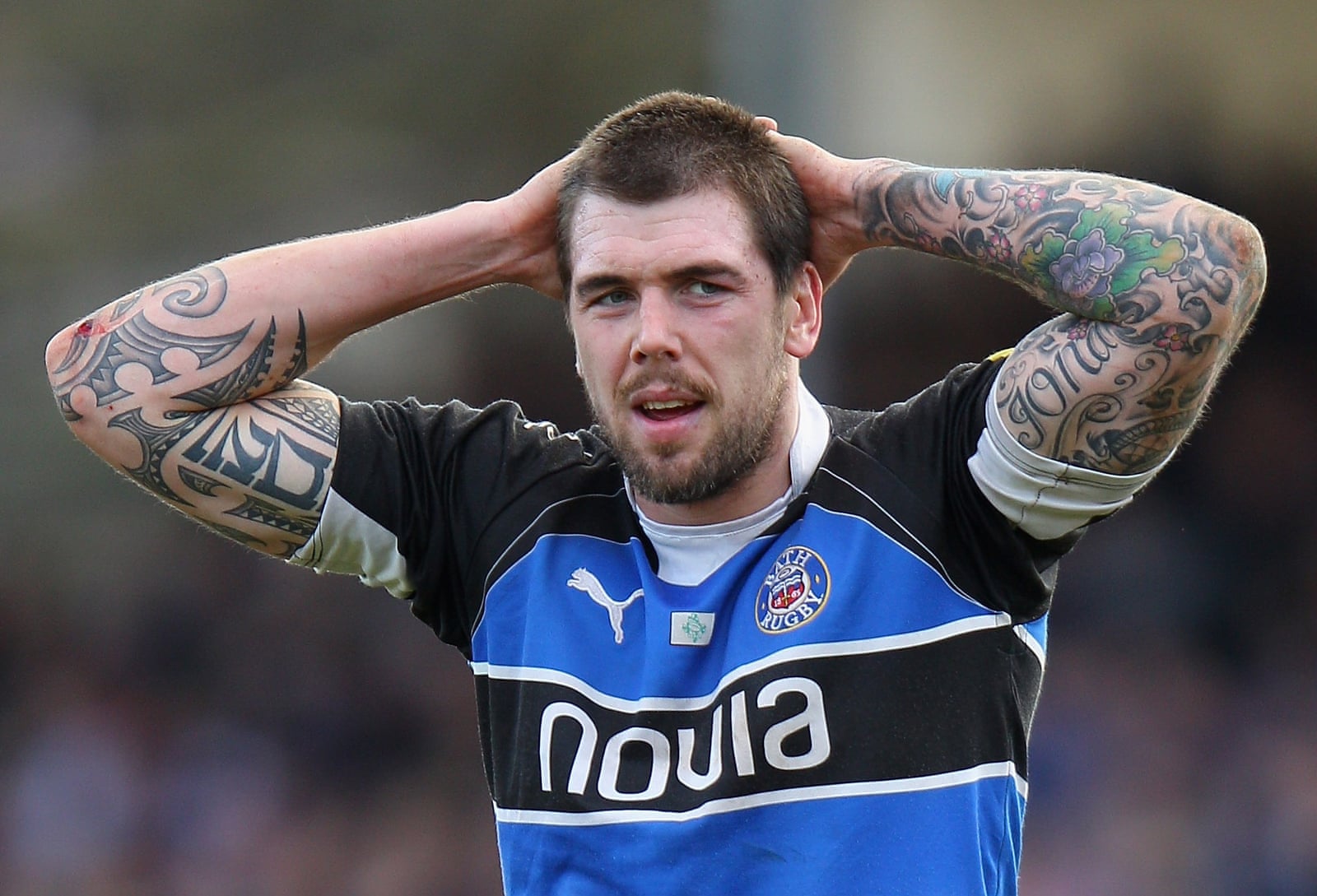
Older rugby photos show dense, colourful sleeves from upper arm to forearm, with black outlines, ornamental shapes and larger illustrative sections. The work varies instead of following one uniform pattern.
The collection appears to have accumulated over time. Some sections are darker and fuller; others leave more skin visible, with later designs meeting earlier ones.
In match photos, jerseys, movement and changing light make details harder to read. Those images show the scale of the sleeves; the close Guardian portrait is better for the finger lettering.
A wider look at the body ink
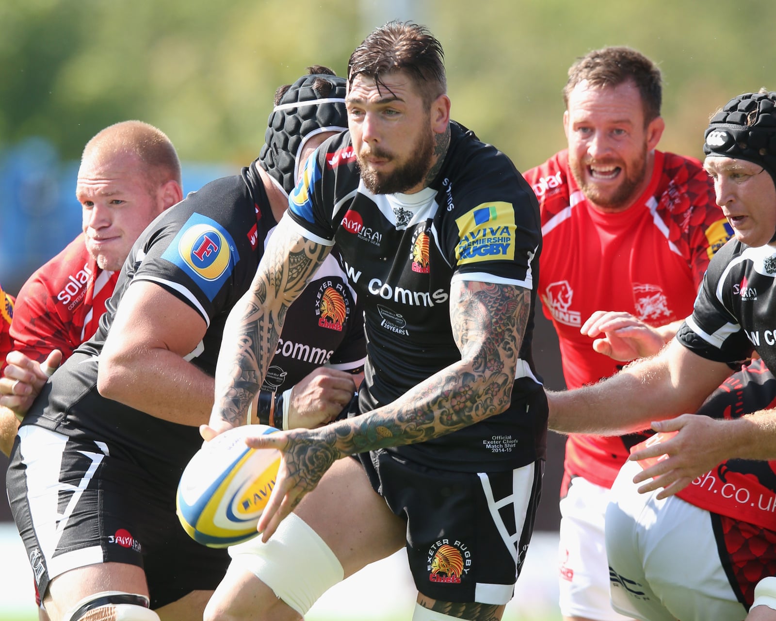
An Exeter photograph with Caldwell’s arms raised shows the sleeves across both sides and how the designs break into panels as his body bends. It confirms the extent of the arm work, not every individual tattoo.
A sleeve has to read from more than one angle. Elbows crease and muscles flex; the larger shapes carry the image at a distance, while smaller details add texture up close.
Caldwell describes the tattoos as part of his life, not a finished matching set. A sleeve can grow and age while still feeling connected through its coverage and darker outlines.
A wider setting
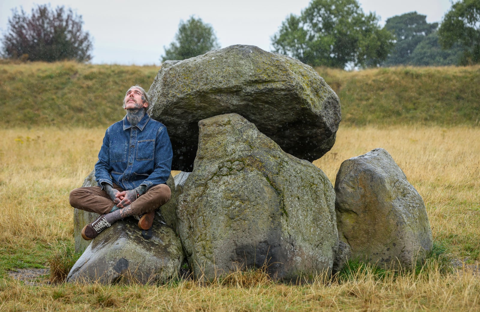
The Giant’s Ring portrait is outdoors and shows ink on his hands, neck and lower arms. It adds a sense of setting and of Caldwell after rugby, rather than a close view of any one tattoo.
That distinction keeps the evidence clear. The image shows he is heavily tattooed, but it doesn’t establish a symbol’s meaning or reveal details hidden by distance.
The strongest confirmed descriptions remain Carefree, No Love and the reported Sanskrit word for strength. The remaining work can be described by placement and style until a clearer source adds more.
The takeaway
Finger and face lettering are prominent placements; the sleeves carry their impact through dense colour and repeated outlines. The designs needn’t match for the collection to feel cohesive.
Caldwell’s own explanations establish the meaning of a few pieces. Photos add what those words can’t: the weight of the lettering, sleeve colour and how the ink sits in sport and portrait settings.
For your own tattoo, be clear about whether you’re choosing a phrase for its meaning or a design for its look. Placement, contrast and how the ink moves matter either way; there’s no need to invent a story.
Caldwell’s collection spans difficult periods, rugby and life after the sport. What’s clearly documented is the finger lettering, eyebrow phrase and broad sleeves; the rest of the private meanings stay his to explain.