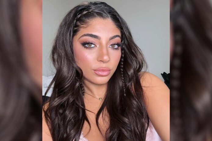
The small script on Milania Giudice’s inner wrist reads “Baby V”, a tribute to her late friend Victoria Zardoya. Its handwritten look keeps the message close and personal without a frame or extra ornament.
Small lettering leaves little room for error. The spacing, letter shapes, line weight and placement all affect readability. Milania’s wrist photo shows how a short phrase can fit while leaving enough open space around it.
The Baby V wrist piece
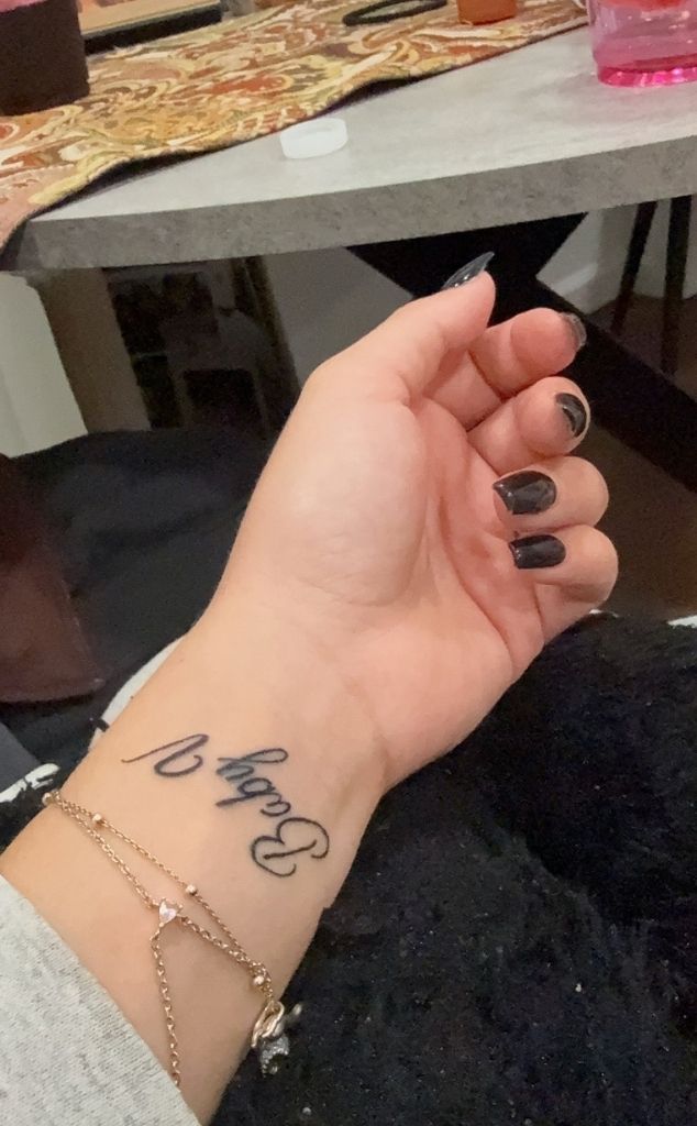
The tattoo sits on the inside of her wrist and uses loose, handwritten script rather than formal calligraphy. The words aren’t stretched across the arm, and nothing decorative competes with them.
Milania shared the image after Victoria’s death. Reports describe Victoria as a longtime friend and identify the wrist tattoo as a memorial; Milania captioned the reveal, “Always my baby V.” That context explains why the phrase carries the tribute without a date, portrait or longer quote.
As a reference, the useful detail is the scale: a short name or nickname can fit on the wrist if the lettering stays clear and has room around it.
The friendship behind the words
Memorial tattoos can become hard to read when names, dates, symbols, flowers, initials and long phrases all compete for space. Milania’s piece keeps the message short and lets the friendship supply its meaning.
A small tribute can still show personality through the handwriting. Rounded letters, a slightly uneven line or the choice of the inner wrist can make it feel like a note. The placement keeps it in view for Milania while making it easy to cover when she wants privacy.
“Baby V” is short enough to read at a glance. With small script, the artist needs to leave enough space between letters so they remain legible as the tattoo heals and ages.
A collection built around small placements
Bravo reported that Milania has an inner-lip tattoo reading “F–k off” and an ankle tattoo reading “I love you” with a heart, after a friend wrote out the message for her. The same report described a matching rib tattoo shared with her sisters.
The reported designs use different locations: the inner lip is hidden, the ankle message can stay discreet, and the rib tattoo is shared with her sisters. The new wrist lettering is easier to see, but remains small.
Placement changes how a tattoo feels. Before choosing a spot, consider whether you want the design mostly for yourself, easy to show, or shared with someone else. The artwork doesn’t need to be large to make that choice matter.
Copying a celebrity tattoo word for word can miss what makes it personal. “Baby V” has a specific connection to Milania’s life. Someone else might choose different words, a symbol or another placement that reflects their own relationship.
Public-style reference photos

The public photos show Milania in dressed-up, casual and relaxed settings. A small wrist tattoo can sit alongside jewelry without becoming the focus of every look.
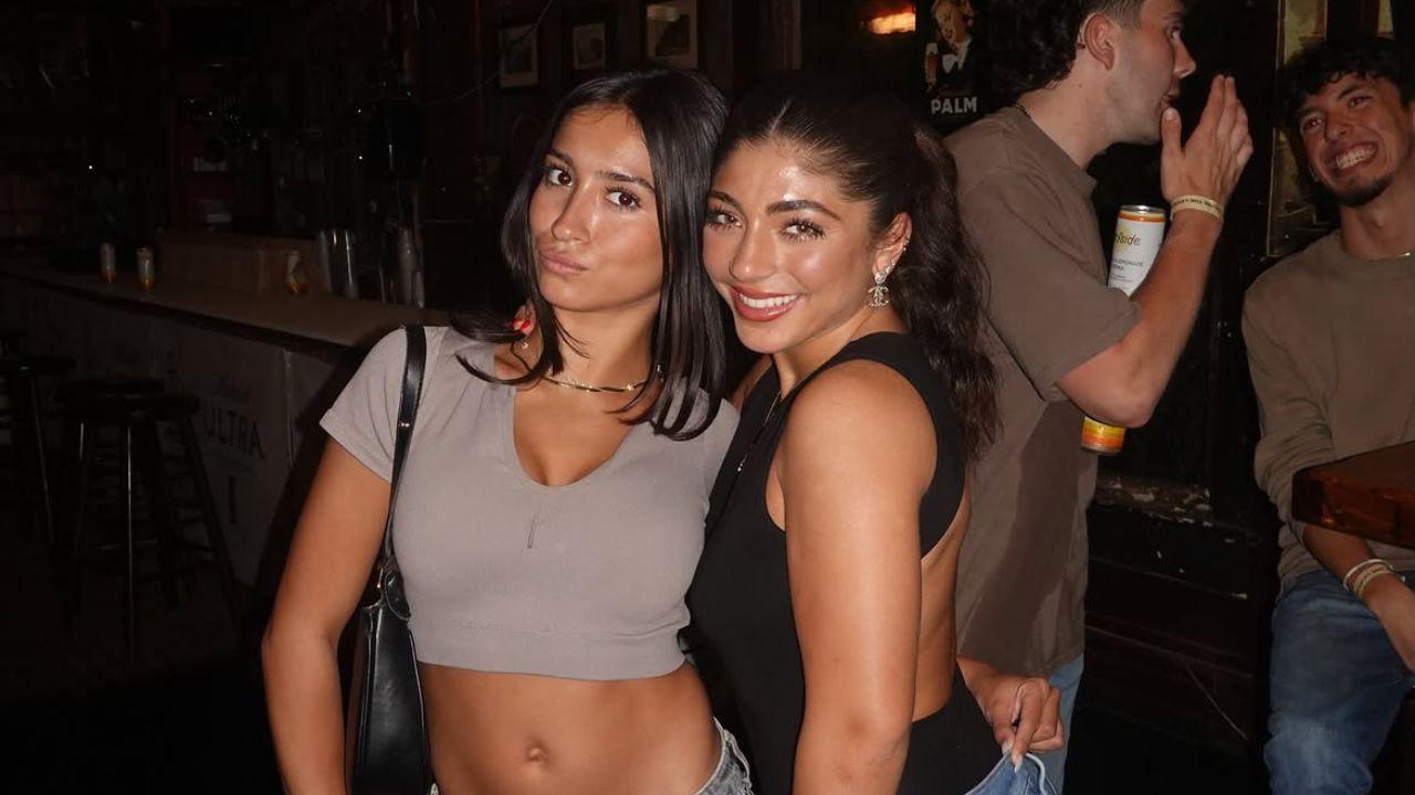
Fine script may disappear beneath stacked bracelets and show again when the wrist is bare. That makes it easy to wear with a watch or rings without building every outfit around the tattoo.
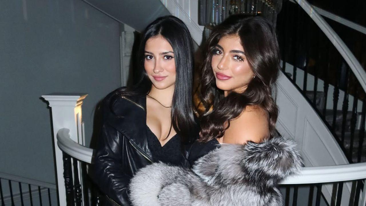

A regular event photo doesn’t confirm a small tattoo when the wrist is out of frame or obscured by clothing, jewelry, lighting or angle. A close-up is more useful for studying the lettering.
What makes the lettering work
The letters move naturally but still have space around them. That matters on a wrist, where the skin curves and the hand is often moving. The phrase reads as one thought, with the words carrying the weight.
If you like this style, write your phrase by hand a few times. Try a fine pen and a softer marker, then notice how the letters connect. An artist can refine your draft into a stencil while keeping its personal feel.
Check the smallest letters before settling on a size. An uppercase initial can dominate a short phrase, while lowercase script may need extra room for its loops and joins. The right scale depends on the words, your skin and how visible you want the tattoo to be.
Think about how the phrase will read from different angles. It can face you when your arm is down or face outward for others to see; the choice depends on whether it’s mainly a private reminder.
Choosing a personal tribute without overloading it
Milania’s short phrase identifies Victoria in a way their friends would understand. Adding symbols just to fill the space could make the design busier without making it more personal.
A tribute might use an initial, a small flower, a familiar object or a date tucked into the lettering. Someone else may prefer a full name or a small drawing. Let the relationship guide the choice rather than trying to make the tattoo look impressive in a photograph.
A memorial tattoo doesn’t have to look somber. A bright color, familiar nickname or playful handwriting can hold affection and grief together. It can reflect how someone is remembered, not only that they’re gone. Meaning comes before decoration.
Before booking, tell the artist what the words mean to you and what feeling you want the lettering to have. That context can guide whether it should look gentle, bold, private or direct.
Placement, aging, and the practical side
Wrist lettering needs room to stay readable. The area is washed, rubbed, exposed to sun and moved often; very fine lines can soften, and tiny gaps may close. An artist may recommend a larger size or simpler lettering.
Follow the artist’s aftercare instructions: keep the fresh tattoo clean, don’t pick at the skin, and limit friction while it heals. The first few days can include redness, swelling and peeling, so wait until the tattoo settles before judging the final lines.
Once healed, protect the tattoo from prolonged sun exposure if you want the fine lines to stay clear. An artist may also recommend a slightly heavier line than the fresh reference appears to show.
The simple idea worth taking away
Milania’s “Baby V” tattoo keeps the words close, gives the script room to read and leaves the emotional meaning in the phrase. Her other reported pieces also use personal placements rather than one large, coordinated design.
If you’re planning a meaningful tattoo, start with the memory, words or symbol you want to keep close. Then choose a style and placement that support that idea; a simple design can still matter deeply.
Use the details that make the idea yours: the wording, handwriting, space around the letters and how the placement feels in daily life. Those choices are a better starting point than copying someone else’s tribute.
2 thoughts on “Milania Giudice Tattoos: Baby V Wrist Tribute and More”