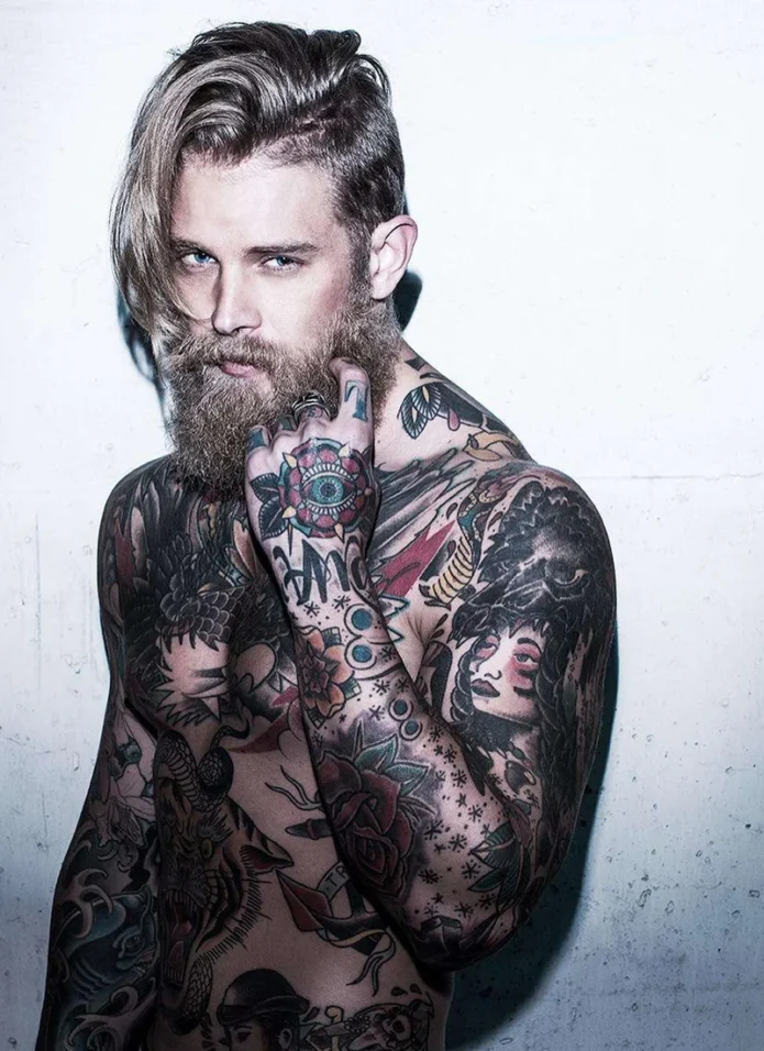
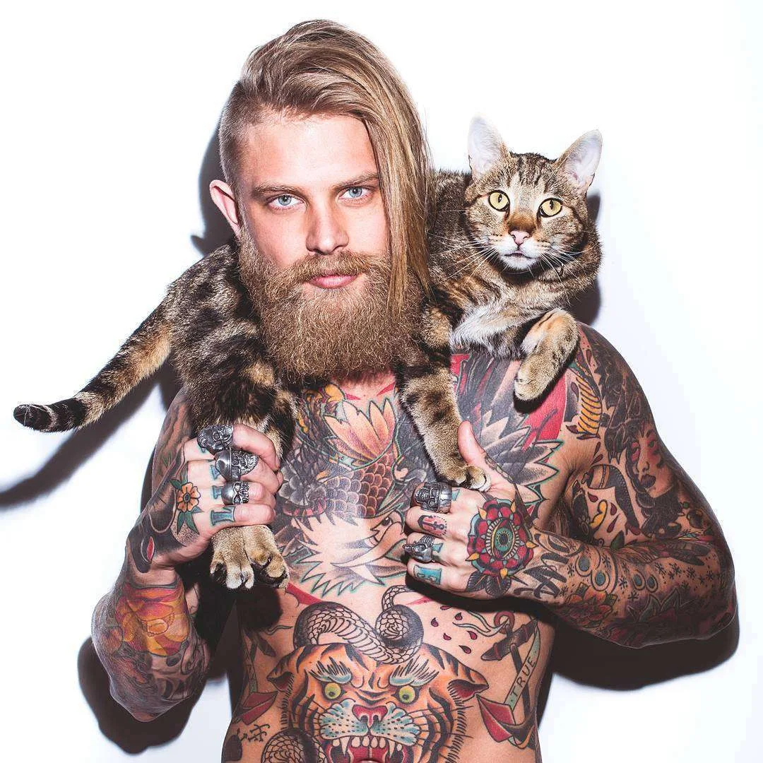
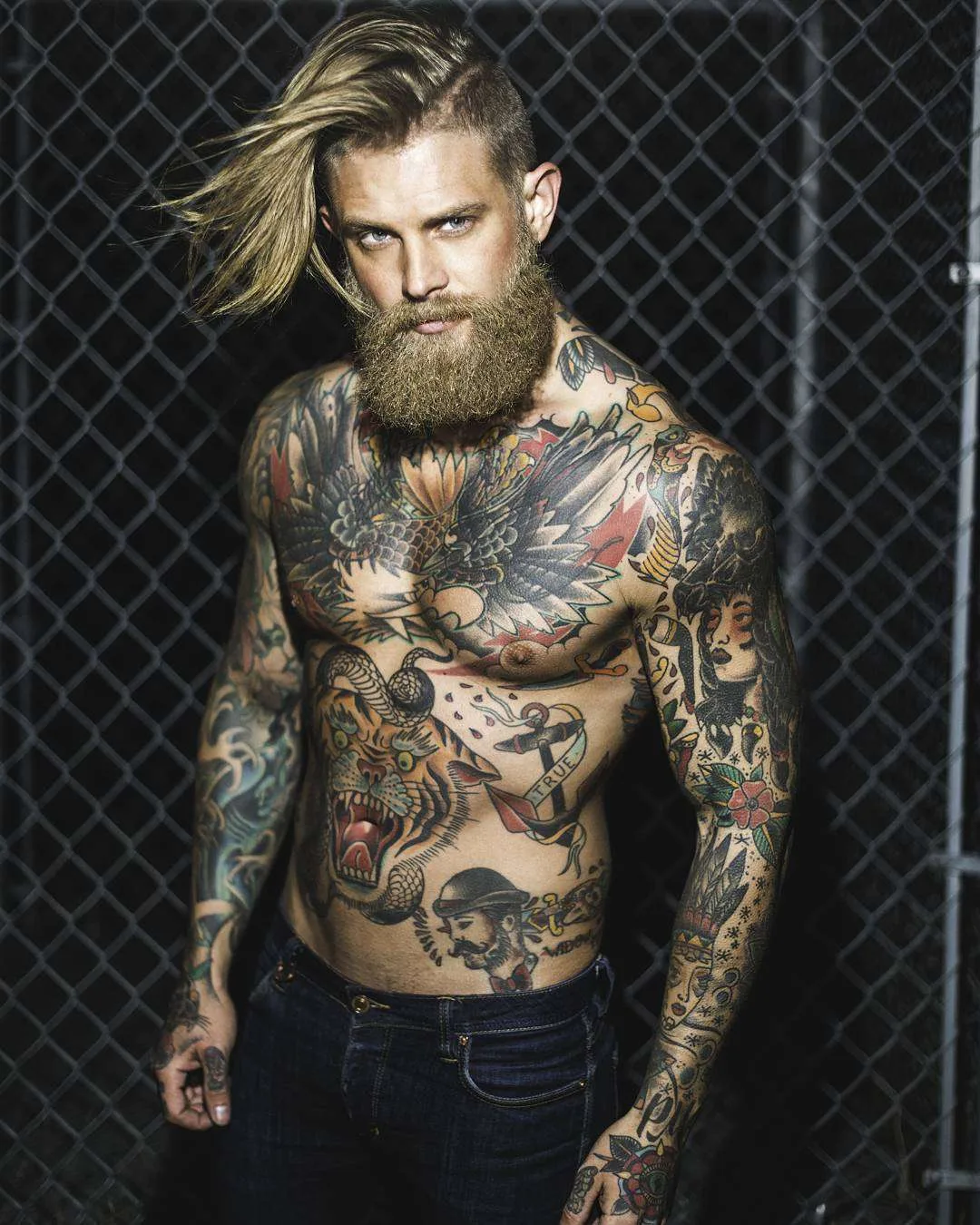
Josh Mario John’s tattoos have a lot going on, but they’re easy to enjoy without a map. There’s a big eagle across his chest, a snarling tiger on his stomach, a snake curled around it, and colourful illustrated pieces running down his arms. Flowers, faces and smaller symbols fill out the spaces between them. The beard might be the first thing you notice in a portrait, but the ink gives you plenty to look at after that.
The Canadian model, also known online as spizoiky, wears a collection with a strong traditional feel. You’ll see thick outlines, broad patches of red and green, dark shading and shapes that stay recognisable even when you step back. His tattoos aren’t all the same size or subject. What connects them is the way the pictures are drawn, with enough contrast to keep the main shapes clear.
John’s own take on meaning is refreshingly relaxed. In his BASIC Magazine interview, he says he mostly enjoys the look of his tattoos, though a few small ones matter deeply to him. So there’s no need to turn every flower or animal into a secret message. Some pieces can be personal, some can simply be designs he likes, and both can belong in the same collection.
That makes his ink a fun reference if you like colourful work but don’t want every appointment to start with a grand life story. A design can earn its place by looking right. The useful question is how it sits beside the pieces already there. With John, the chest and stomach each have a clear centrepiece, while the smaller work around them adds movement without hiding those big subjects.
Josh Mario John eagle chest tattoo
The eagle takes up most of John’s upper chest. Its wings spread out toward the shoulders, with rows of dark feathers giving the design weight. A flower sits above the bird near the middle, while red shapes and lighter gaps frame the outside. It’s a wide design for a wide part of the body, so the placement makes sense before you even start picking out the details.
The feather tips form a jagged outer edge rather than a neat oval. That gives the chest piece some energy. Your eye travels from one wing to the other, then comes back toward the bird’s head and the centre of the chest. There’s a lot of black in the wings, but the gaps between feather shapes keep them from turning into one flat patch.
What works especially well is the difference between the eagle’s dark body and the lighter skin around it. The red accents help too. They add colour without taking over the bird, which remains the strongest shape. The flower above it makes the upper edge feel less abrupt, particularly where the chest meets the neck.
If you like this layout, the idea to take away is width before tiny detail. A chest tattoo needs a shape that fits the space when you’re standing normally. Feather texture comes after that. John’s example shows how a large bird can sit comfortably across the front while still leaving the shoulders room for their own pictures.
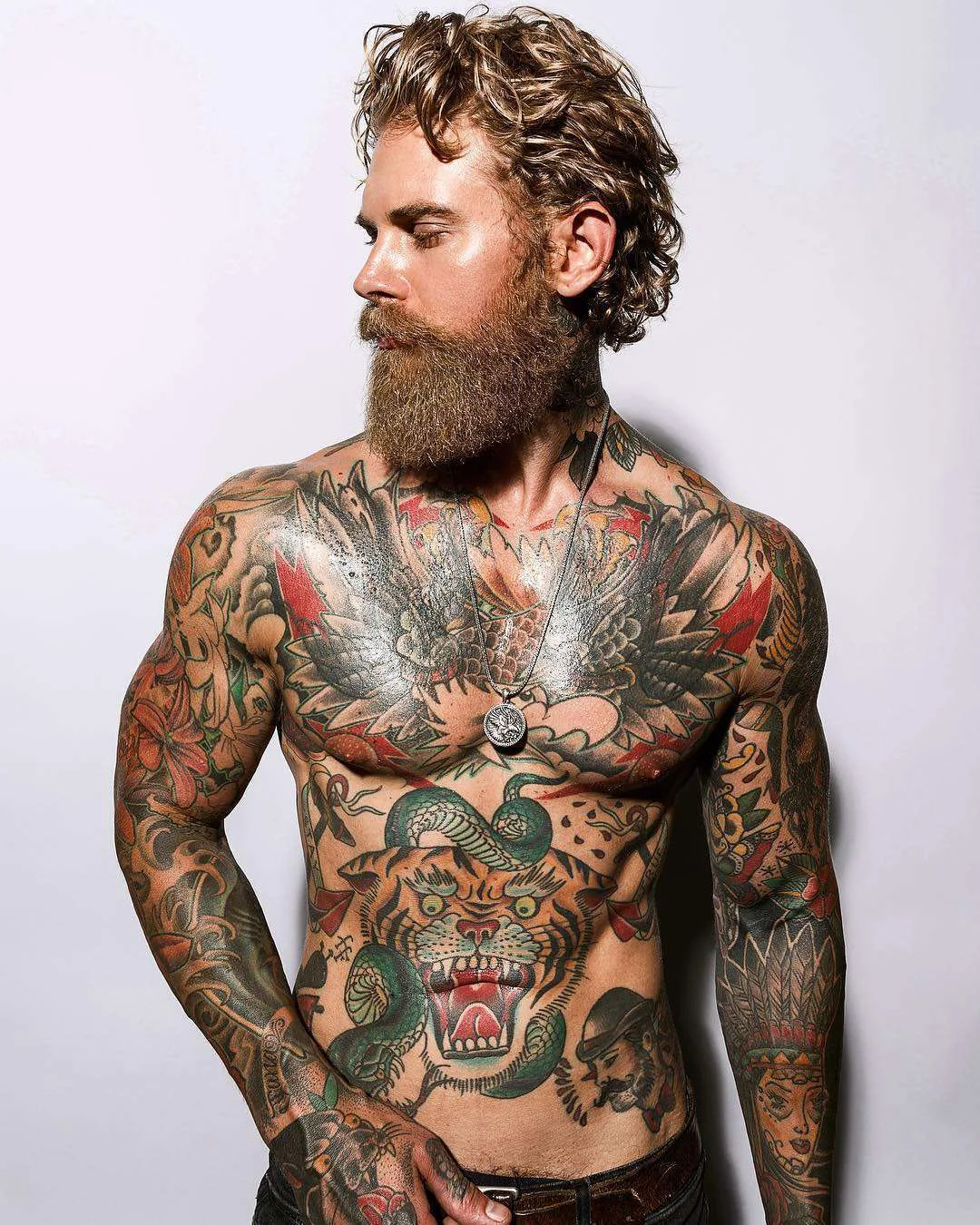
Josh Mario John tiger and snake stomach tattoos
Below the eagle, the tiger changes the mood. Its mouth is open, the teeth are bright, and the eyes sit under heavy brows. Orange and yellow tones make the face stand out against the darker outlines. A green snake loops over and around the head, bringing a second animal into the same big stomach design.
The tiger is drawn head-on, so it gives the lower torso a strong centre. The open mouth creates a dark area with pale teeth around it, a simple contrast that makes the expression readable. Stripes spread out toward the cheeks, but they don’t bury the eyes or nose. Those few features do most of the work when you glance at the tattoo.
The snake adds a different kind of movement. Where the tiger feels solid and planted, the curved body winds around it. The repeated scale marks give the snake texture, and the green separates it from the orange face. You can follow the loops without losing track of the main subject underneath.
There’s no confirmed personal story for this pairing in the interviews used here, so it’s best enjoyed as a striking animal composition. The colour contrast carries the design: orange tiger, green snake, black outlines and pale highlights. That combination makes two busy subjects feel connected while keeping each one readable. It also stops the large chest piece from being the only thing your eye lands on.
Josh Mario John woman and wolf-head sleeve tattoos
One of John’s most noticeable arm pieces pairs an illustrated woman’s face with a dark, wolf-like animal head above her. The woman has dark hair, defined lips and coloured marks on her cheeks. Flowers and feather shapes continue below and around the portrait. It’s a different kind of image from the tiger, but the strong outline and broad shading keep it at home in the collection.
The face gives you a calm point to focus on inside an arm full of detail. The animal head adds a heavier shape over it, while the long forms below draw your eye down the arm. That up-and-down arrangement suits a sleeve. It uses the length of the limb without making every subject stretch into the same narrow shape.
It would be easy to guess a specific person or cultural story from the styling, but John’s identity for this figure isn’t established here. The clear description is enough: a woman portrait, an animal-head element, feathers and flowers. You can appreciate the way those forms fit together without assigning a name or personal meaning that he hasn’t given.
The surrounding sleeve mixes little decorative marks with larger areas of dark ink. Some spots are packed, while others have more open skin. Different sizes give the sleeve a rhythm. If every image had the same weight, the arm would be harder to read. Here, the portrait anchors the upper area and the smaller details help connect it to the forearm.
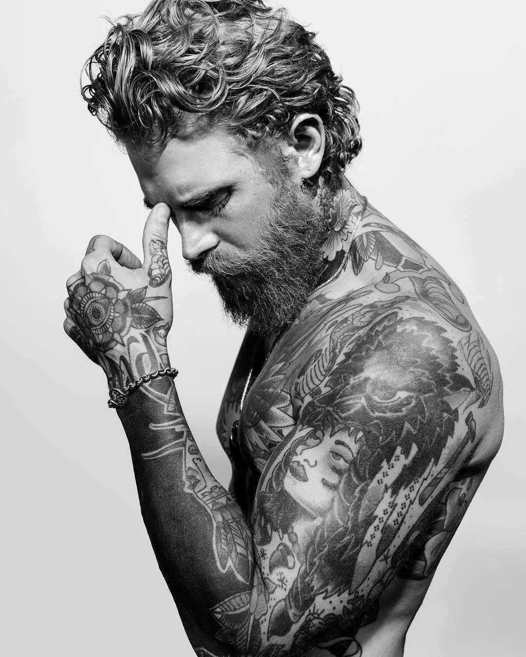
Josh Mario John eye and flower hand tattoos
The eye inside a flower is a small design compared with the chest eagle, but it gets plenty of attention. It sits on the back of the hand, with a round eye at the centre and petal shapes around the outside. Red, green and darker outlines echo colours used elsewhere, so it feels like part of the same collection even though it occupies a much smaller space.
The circular shape is a good fit for the broad part of the hand. The centre stays clear, and the petals create a border you can follow without needing to read a line of text. In photos where John raises his hand near his face or holds something, that eye becomes a little focal point of its own.
His fingers carry smaller marks and lettering alongside rings. Those details add to the overall look, but some letters are obscured by jewellery or the angle of the hand. There’s no reason to turn a partial view into a complete phrase. The flower-and-eye design is the clearest hand subject, and it does enough on its own.
This part of the collection also shows how a repeated colour palette connects separate placements. The eye piece doesn’t need to touch the tiger or the eagle to feel related to them. Its red petals and green details do that job. Against the darker forearm shapes, the round flower creates a neat change of pace as the sleeve reaches the hand.
Josh Mario John anchor and sailor torso tattoos
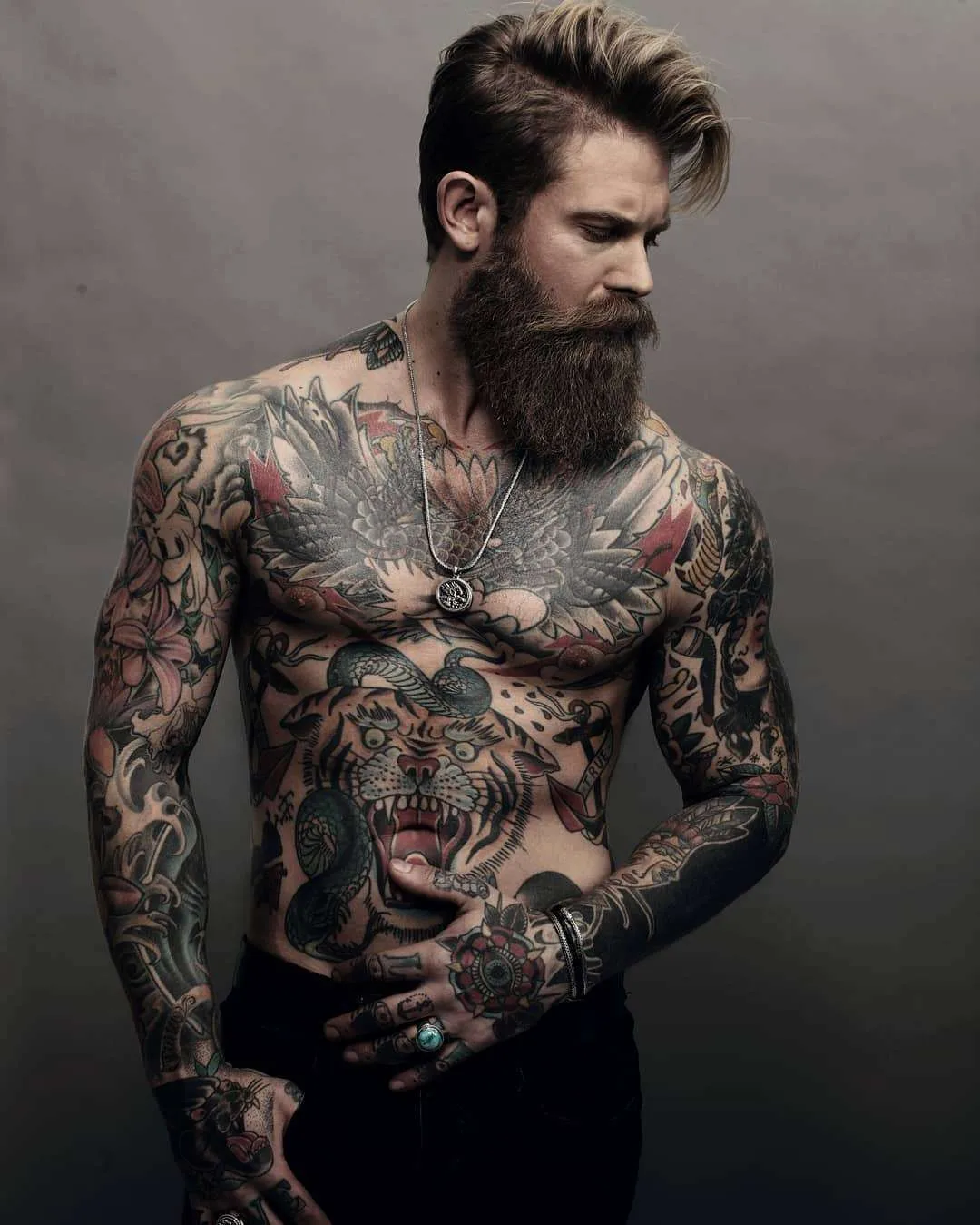
The smaller torso pieces bring an old-school sailor feel around the big animals. An anchor sits to one side with a ribbon carrying the word TRUE. Lower down, there’s a bearded face in a cap, drawn in the same bold illustrated style. These pieces are easier to miss at first because the tiger occupies so much of the middle.
The anchor uses a long vertical shape, while the ribbon bends across it. That helps it fit into the space beside the tiger without looking like another big central panel. The red folds in the ribbon add a small burst of colour, and the lettering gives the eye a different kind of detail to pick out among the animal shapes.
The sailor-style portrait sits closer to the waist. The cap, moustache and beard make the face recognisable as a character without needing a lot of room. Small marks around it help fill the area, but the head remains the part you notice. There isn’t enough evidence to name the person or claim that the face represents a particular relative.
These little subjects explain a lot about how the collection hangs together. The eagle and tiger do the heavy lifting, while anchors, flowers and faces make the space around them interesting. If you enjoy that mix, Ricki Hall’s tattoos offer another model’s take on bold traditional pieces across the chest, arms and hands. Comparing the placements is more useful than copying either man’s exact designs.
What makes the whole collection work?
John’s collection feels busy because it is busy. Still, it has a few clear rules: big subjects in the broad spaces, long compositions down the arms, and smaller pieces fitted around them. Black outlines and recurring colours make very different pictures feel related. You don’t have to love every individual subject to see why the overall arrangement holds together.
The mix is also a reminder that heavily tattooed skin doesn’t have to mean one continuous mural. You can build a collection from separate pictures and let the gaps remain part of it. On John, open areas around the abdomen make the tiger’s outline stand out, while smaller torso pieces use those spaces without erasing the boundaries between designs.
His comments about the experience are just as down to earth as his approach to meaning. He told BASIC that he dislikes being tattooed and enjoys the finished result. That’s a useful distinction if you love the look but don’t romanticise the appointment. You can admire the artwork while being honest about the patience involved in collecting it.
The nicest thing to borrow is that freedom to choose what you like. A bold animal, a flower, a face or a tiny personal mark can all make sense together when the drawing and placement work. John’s ink gives each scale a job, from the broad wings on his chest to the little eye on his hand. It’s colourful, detailed and full of personality without needing a made-up explanation for every inch.