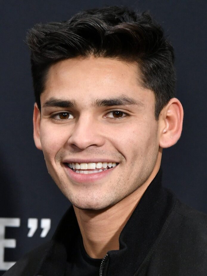
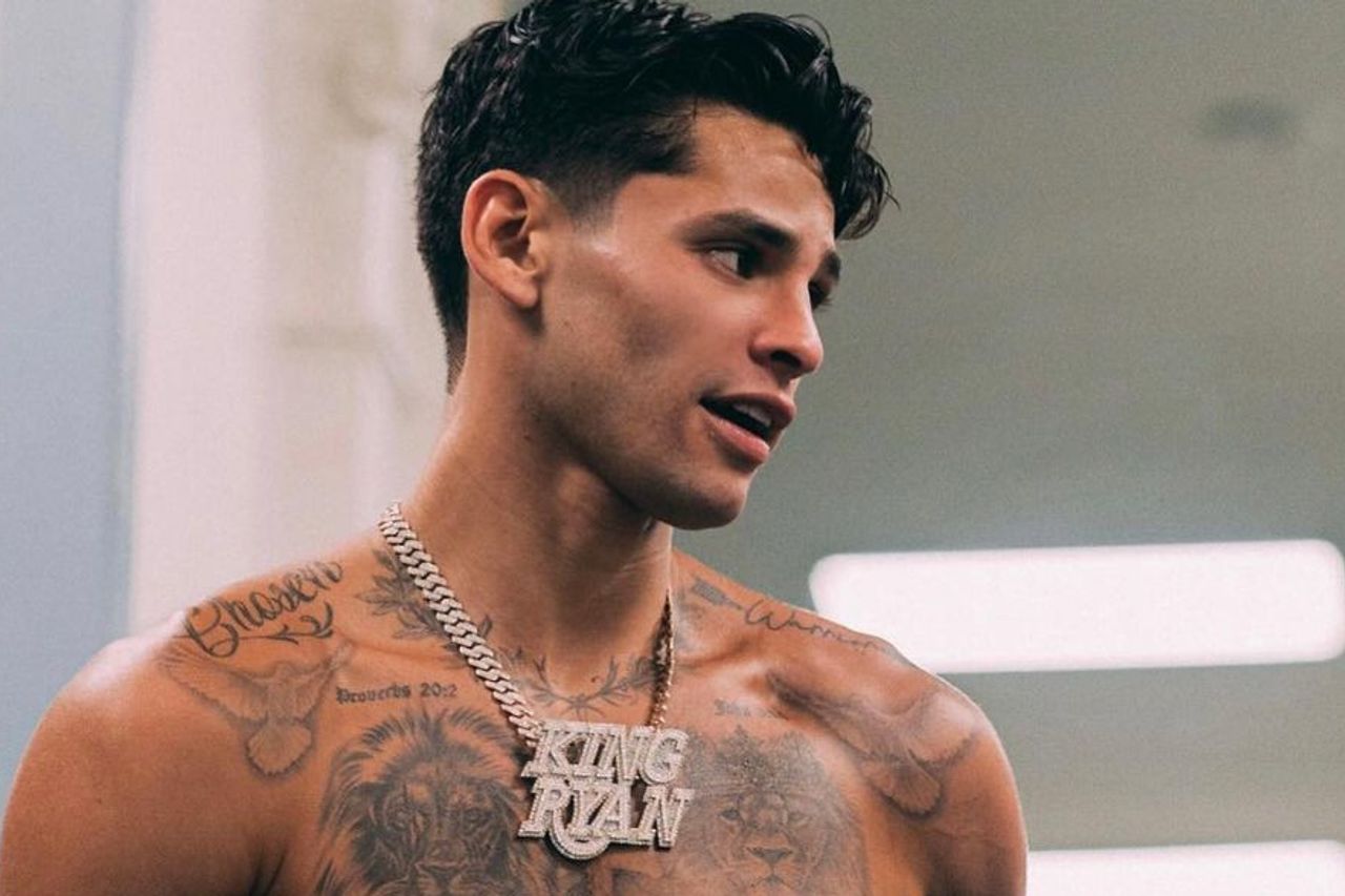
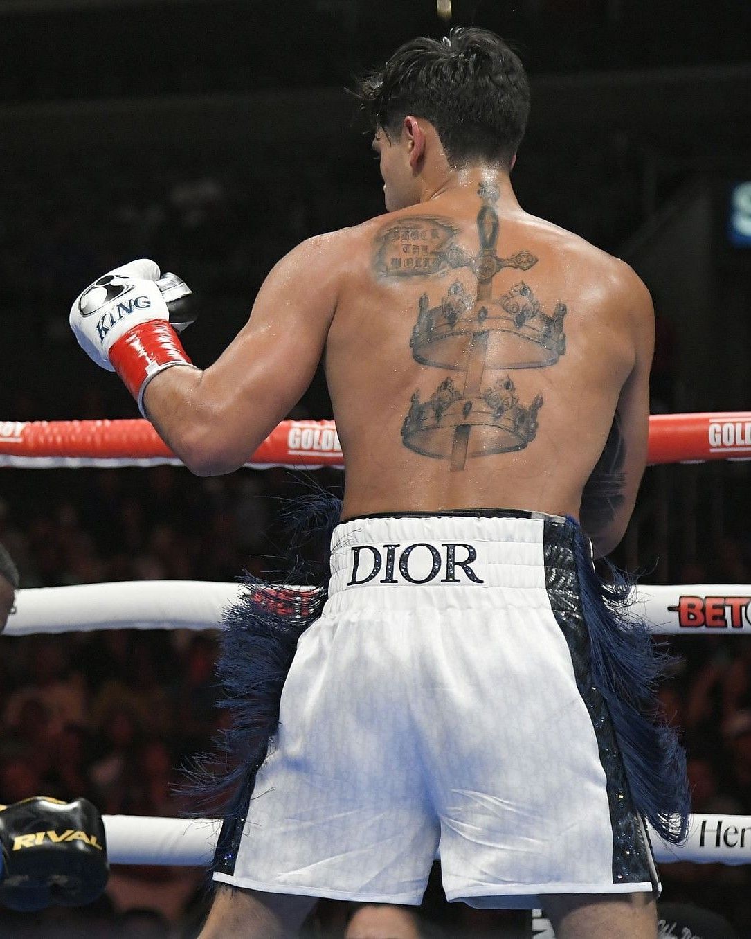
Ryan Garcia’s tattoos include twin lions across the chest, script near the shoulders, and a large back piece built around a sword and crowns. The collection also has smaller references to faith and boxing. His chest and back hold the largest designs, while the shoulders and upper arms carry lettering and other details.
The tattoos have grown over time. Earlier pieces were more separate; later work filled the chest, shoulders, arms, and back. Across the photos, the larger images remain easiest to identify, while the smaller marks add detail around them.
Placement is a big part of how the collection reads. A chest design has to work across the pectorals, and a back piece follows the spine and shoulder blades. The images below show different parts of the layout.
Ryan Garcia lion chest tattoos
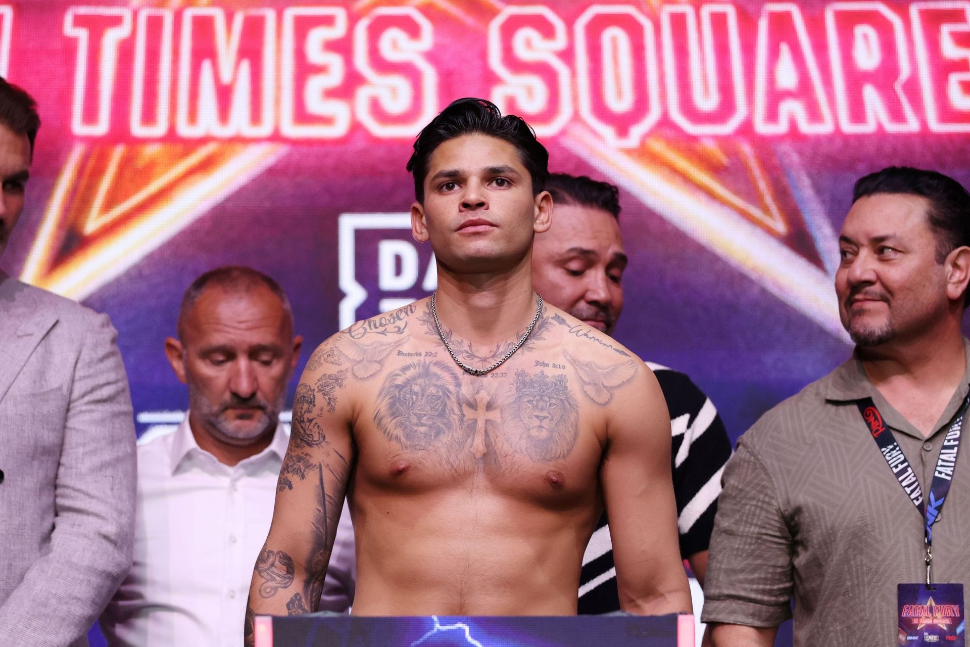
The twin lion portraits sit across the chest, one on each side, with a cross and short scripture references between them. The faces are large enough to read from a distance, while their shading is clearer in close photos.
The two lions can be read as one chest composition, with the cross connecting them. The central symbol and script sit between the faces without taking over the design. The portraits need room around their features so the shading and outlines remain clear.
Ryan Garcia shoulder script and collarbone ink
Script runs along Garcia’s upper shoulder, with leaves, dates, and short Bible references near the top edge of the chest design. These smaller details frame the lions rather than compete with them.
Short lettering can fit along the curve of the collarbone without turning into a solid band of text. The phrase needs to be sized for the space and remain readable when the shoulder is relaxed. The body’s curve is part of the placement.
A line of script can also connect work done at different times. The letter style and spacing can relate to an existing chest piece while still giving the shoulder its own detail.
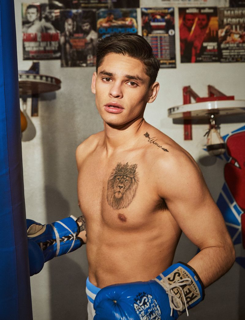
Ryan Garcia chest and shoulder layout
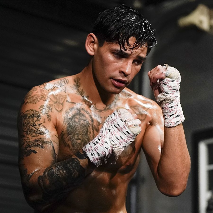
From the front, the collection includes more than the lion portraits. Script and ornamental details sit on the shoulders, darker ink covers the upper arms, and religious imagery and shading fill the space between the larger chest designs.
The mix of large faces and smaller marks keeps the chest from reading as one uninterrupted block. When tattoos are added over time, matching every line isn’t necessary; a shared black-and-grey finish or related lettering can help them sit together. Open skin around the collarbones and upper arms helps separate the designs.
Photos taken with the arms relaxed, raised, or turned show how the shapes shift across the chest and shoulders. A layout should look balanced in ordinary posture as well as in a flexed pose.
Ryan Garcia script and faith references
Short phrases and Bible references appear around Garcia’s chest and shoulders. They add a personal element beside the larger portraits, though the photos alone can’t explain what each line means to him.
For lettering, the wording should still matter to you years later. A short phrase, date, or reference can fit more easily than a long quote. Shorter text also gives the artist more room to adjust the size and placement.
Think about whether the words should be immediately readable to other people or mainly serve as a private reminder. That choice affects how large they need to be and where they sit.
Ryan Garcia crowns and sword back tattoo
Garcia’s back piece is built around a sword running down the centre, with crowns across the upper and middle back. Above them, the words “SHOCK THE WORLD” sit near the shoulders. From a distance the design reads as one tall shape; closer photos show more of the lettering and crown details.
The sword gives the layout a central line, while the crowns spread it across the shoulder blades. A large back piece needs a clear outline and careful spacing so its main shape stays visible as the body moves.
Back work can take several sessions. Looking at an artist’s healed pieces and settling the main silhouette before adding small details can help keep the design coherent if shoulder or rib work is added later.
Making the layout your own
Garcia’s chest portraits, shoulder script, and back piece have different roles, but the bold black-and-grey shading gives them a shared look. The front holds the lions and lettering; the back carries a vertical design across the shoulder blades.
You can take the same approach to planning without copying the images. Start with a subject that matters to you, then add supporting symbols that fit alongside it. A family portrait, a hometown reference, or a short phrase can take the place of a lion, crown, or scripture line.
Bring clear references and consider which pieces you want visible in everyday clothes. Ask the artist to map the placement and explain how the lines may age. Leave room for future work if you want to add to the collection later.
One thought on “Ryan Garcia Tattoos: Lions, Crowns, Script and Boxing Ink”