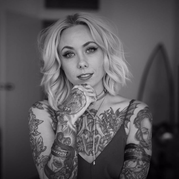
Megan Massacre’s tattoos have always felt like part of the outfit, but they’re much more than decoration. The artist, model and TV personality wears a dense mix of color, black linework, portraits, animals and little symbols that all seem to come from the same slightly spooky, slightly playful world. Her ink is bold without looking stiff, and it has plenty of personality even when the details are small.
That’s what makes Megan Massacre tattoos so useful for inspiration. The collection isn’t built around one trend or one neat sleeve template. It looks like it grew over time, with different artists and ideas joining the party as her style changed. The common thread is attitude: bright color, strong outlines and images that feel a little weird in the best possible way.
Some designs are easy to identify from photographs, while the story behind individual pieces isn’t always public. So this guide sticks to the ink that can actually be seen and focuses on the practical design lessons: how to build a colorful sleeve, mix cute and creepy imagery, handle hand tattoos and keep a busy collection from turning into visual noise.
Her chest tattoos set the colorful, neo-traditional mood
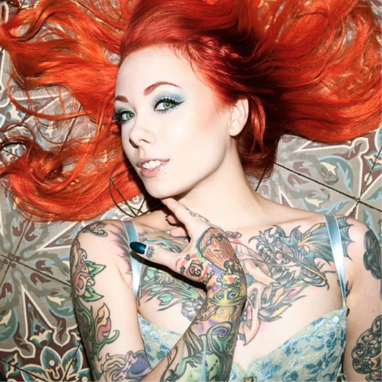
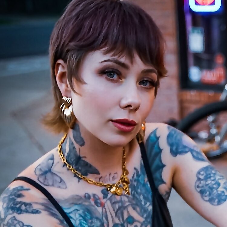
The chest is the first place to study if you like Megan’s style. Her upper-body work uses large, readable shapes rather than hiding every inch under tiny detail. Flowers, faces, leaves, dark outlines and bright fills sit beside each other, creating the feeling of a full illustration even when the designs were added at different times.
A chest piece like this needs a clear anchor. Megan’s work often has a strong central image or a dark line that gives the eye somewhere to land. Around it, smaller designs can move toward the shoulders and collarbones without making the whole area look like a sticker sheet. That’s a smart approach for anyone planning a first large tattoo because it leaves room for future additions.
The color choices matter just as much as the subject matter. Warm reds, greens, yellows and muted blues give the collection a vintage flash feel, while heavy black outlines stop the palette from becoming too soft. “Creepy but cute” is a useful shorthand for the balance, but the real trick is contrast. A sweet flower looks more interesting beside a skull, bat or strange little character than it does surrounded by more flowers.
If you’re planning chest work, start with the shape of your body instead of picking five unrelated flash drawings. Ask your artist where the sternum, collarbone and pectoral curve will pull the lines. Megan’s chest ink shows how separate motifs can still read as one composition when the scale and spacing are planned before the appointment.
The sleeves mix portraits, animals and bright illustrative linework
Megan’s arms are where the collection gets busiest. The sleeves combine portrait-style faces, animals, florals and graphic shapes with enough open skin to keep the designs readable. From a distance, the arms look like a strong block of color. Up close, there are lots of small decisions in the line weight, background texture and way each figure turns around the arm.
Portraits are especially useful in a sleeve because they create a visual pause. A face has a natural focal point, so it can hold one section of the arm while smaller images fill the space above and below. The same idea works with a favorite animal, a doll or a character if realistic portrait work isn’t your thing.
One reason this style ages well is that the main silhouettes are clear. Even when color softens, you can still tell where the face, wing, flower or creature begins. Good sleeve planning is less about squeezing in more art and more about giving every major image a readable outline. The gaps are doing useful work too. They stop all the dark marks from merging into one muddy band.
For a Megan-inspired sleeve, pick one mood before you pick the exact images. Do you want old-school candy colors, darker horror references or a blend of both? Once that choice is made, your artist can repeat the same line weight and background treatment across pieces that are different in subject. That’s how a mixed sleeve starts to feel intentional.
Hand and finger tattoos bring the details right into the frame

Hand tattoos show up constantly in Megan’s photos because they’re impossible to hide when she’s working, posing or holding a tattoo machine. The fingers carry tiny lettering and symbols, while the backs of the hands connect into the heavier work on the wrists and forearms. It’s a high-visibility area, but the designs still feel playful rather than overly serious.
Small finger tattoos need a different kind of planning from a chest piece. There isn’t much room for detail, and the skin gets washed, bent and exposed every day. Megan’s hand work leans into simple shapes and compact marks that can still read when the fingers are moving. That’s a better reference than copying a delicate image that only looks good in a tightly cropped studio photo.
The hand designs also help the sleeves feel finished. When a tattoo stops suddenly at the wrist, it can look like an unfinished border. Small marks on the fingers and hand create a softer transition into the arm. That little bit of visual echo is enough to make a scattered collection feel connected.
There’s no need to rush into hand ink just because it looks cool on an artist whose career is built around tattoos. Think about work, sun exposure and how much you care about perfect lines. Finger tattoos often fade or need touching up. If you like the idea but want less commitment, try the same symbol on the wrist or the side of the forearm first.
Animal tattoos and darker motifs keep the collection from feeling too sweet
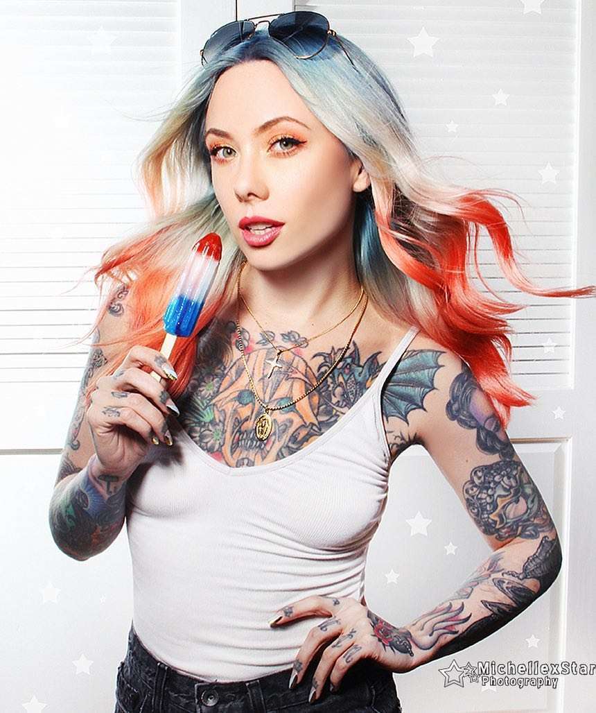
The darker side of Megan’s tattoos keeps the colorful pieces from becoming overly polished. Bats, skulls, spider imagery, snakes and other gothic shapes appear alongside flowers and cartoon-like details. The result is lively instead of gloomy because the color palette keeps the horror references from taking over.
Animal tattoos are a good way to build that kind of contrast. A raven, cat, bat or snake can act as a strong black shape, then smaller flowers or decorative marks can soften the edges. Megan’s collection shows that a dark image doesn’t need to be rendered in solid black to feel bold. Sometimes the attitude comes from the eyes, the pose or the way the shape cuts across the body.
The same idea works for a cover-up. A busy, illustrative subject gives an artist more options than a tiny fine-line flower. When an old tattoo needs to disappear, look for a design with movement, strong shadow and enough color to carry the new shape. Don’t force a cover-up to be smaller than the tattoo underneath it. The better design usually wins by being larger and more confident.
If you like the creepy-cute mix, make a short list of subjects you’d still enjoy after the novelty wears off. A smiling skull, a pretty moth or a cartoon animal can hold both moods at once. Keep the main silhouette simple, then let the color and small details do the personality work.
Full-body tattoos and placement make the collection feel like a living sketchbook
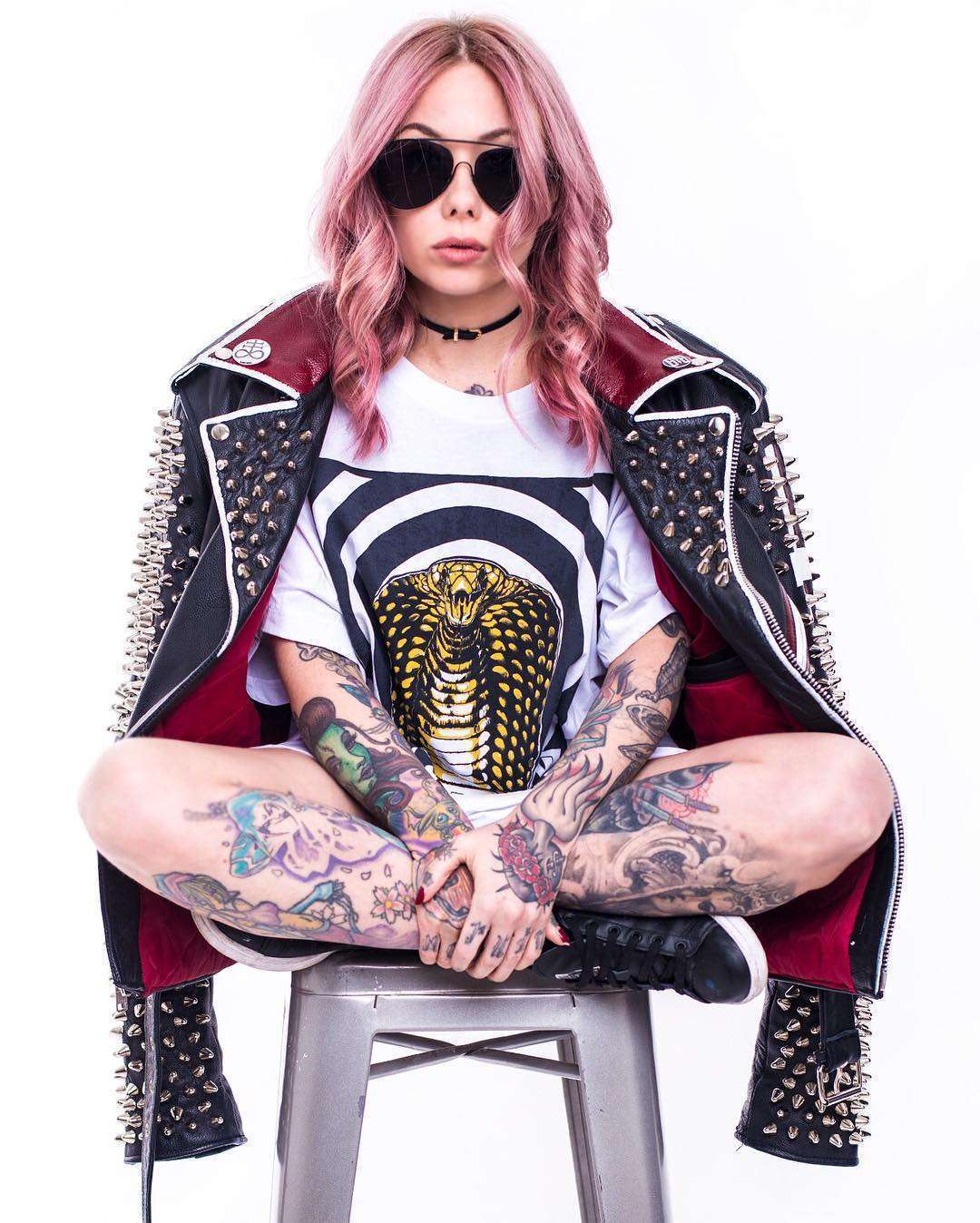
Megan’s tattoos don’t stop at the chest and arms. Photos show ink moving down the legs and across smaller areas of the body, which gives the collection a less formal, more sketchbook-like feel. A full-body set doesn’t need every section to match. It just needs repeated choices in color, outline and attitude.
This is where her collection offers a useful lesson for people who don’t want a traditional full suit. You can build a body map slowly. Start with the areas you most want to see every day, then use smaller pieces to connect the visual language later. A leg can carry a larger standalone image while the ankle or knee gets something compact and graphic.
Busy collections also benefit from a few quiet areas. Leaving skin open around a large tattoo makes the piece feel bigger and gives the eye a break. If every inch is filled at once, even beautiful work can lose its impact. Space isn’t empty when it helps the next tattoo stand out.
The best takeaway from Megan Massacre’s tattoos is that consistency doesn’t mean repetition. Her pieces can be cute, macabre, realistic, decorative or a little silly, yet they still belong together because the linework stays confident and the colors feel chosen. Build around your own strange mix instead of chasing someone else’s exact sleeve. Pick images that make you smile, give the important pieces enough room and let the collection grow at a pace you can actually live with.
Before you book a large project, bring your artist a few references and explain what you want the finished set to feel like. Talk about color, contrast, healing and how much empty skin you want to keep. Megan’s tattoos look spontaneous, but the strongest parts still have enough structure to age well. A little planning gives the weird ideas room to stay weird without losing their shape.
2 thoughts on “Megan Massacre Tattoos: Colorful Sleeves, Chest Ink and Creepy-Cute Details”