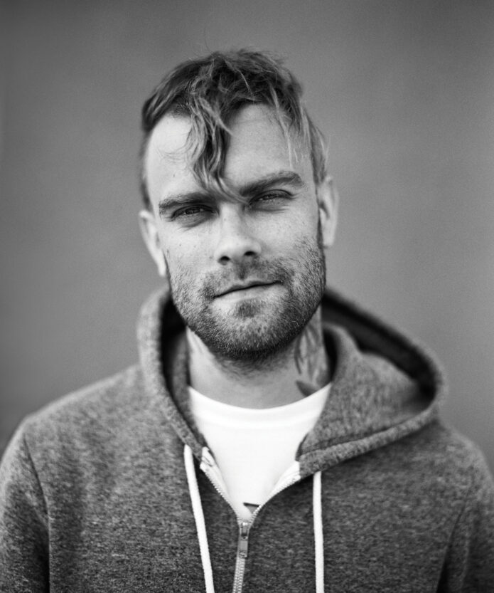
Bert McCracken’s tattoos are impossible to separate from the way he performs. The Used singer has the kind of ink that looks lived in, with bold neck work, packed arms, hand tattoos and strange little details that feel more like diary pages than a matching set. Some pieces are easy to spot from the stage. Others only show up when he lifts a hand to the mic or wears a sleeveless shirt.
That mix is what makes Bert’s collection useful for tattoo inspiration. It is not built around one polished trend. There are old-school shapes, lettering, rough color, personal symbols and tattoos that look as if they were added during different chapters of his life. The overall effect is messy in a deliberate way, with enough repeated black ink to hold the whole thing together.
Several designs have been discussed over the years, including the LOVE lettering on his neck and hand, musical notes, a bat on the lower abdomen and the phrase “I WISH I WERE A GHOST.” The exact story behind every mark is not public, so it is better to separate what can be clearly seen from what is only fan guesswork. Here’s a relaxed look at the main Bert McCracken tattoos and the design lessons they offer.
The LOVE lettering makes his neck tattoo the first thing you notice
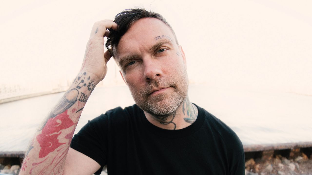
The neck is where Bert McCracken’s tattoo style announces itself. The bold LOVE lettering is one of the clearest pieces in his collection, and it reads quickly even in a stage photo. Neck lettering has to survive movement, sweat, changing light and the distance between a singer and the crowd, so the simple blocky approach makes sense.
LOVE is also a strong word for the placement. It is direct without needing a long quote or a complicated illustration. The word sits close to the face and voice, which gives it a little extra weight for a frontman whose songs spend a lot of time inside messy emotions. That does not mean every fan needs to copy the word. The useful part is the decision to choose a short phrase that still feels true when it is seen every day.
The spider-like neck image that appears in later photographs changes the mood. It gives the upper design a darker, more chaotic edge, while the lettering keeps the area readable. That contrast is a good reminder that a tattoo can be both rough and graphic at the same time. You do not have to choose between clean lettering and a more distressed surrounding image if the artist leaves enough separation.
Neck tattoos are high-commitment pieces, so placement should be tested from every angle before the needle starts. Ask your artist to show the stencil while your head is turned, tilted and held naturally. A word that looks straight in a front-facing mockup can bend around the throat when you move. Bert’s ink works because the designs follow the shape of the neck instead of treating it like a flat rectangle.
If you want a similar feeling without using LOVE, think about one short word that has survived several versions of your life. Keep the lettering large enough to age well, avoid stuffing the whole neck with tiny detail and decide whether the design should be easy to read from far away. Bert’s neck tattoos show how a simple word can become the anchor for a much bigger collection.
Hand and finger tattoos bring the collection into every performance
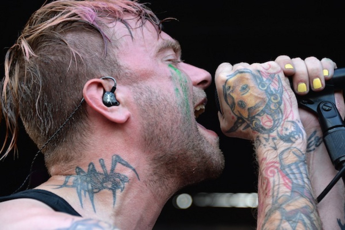
Bert’s hands are covered with the kind of expressive ink that becomes part of a performance. When he grips a microphone, the tattoos move into the foreground. The knuckles, fingers and backs of the hands carry color and linework that make an ordinary gesture look instantly recognisable. This is a big reason the tattoos feel connected to his stage identity rather than hidden personal decoration.
Hand tattoos also force a person to accept a little imperfection. The skin gets washed, rubbed and exposed constantly, and fingers bend every time you play an instrument, hold a phone or reach for a door handle. Lines soften. Small gaps appear. A design that looks slightly rough from the beginning can age more naturally than a hyper-fine drawing that depends on perfect edges.
In Bert’s case, the hand work helps bridge the neck and sleeve. The pieces do not look like a separate accessory added at the end. They continue the same mood of dark symbols, rough shading and compact marks. That visual handoff is a smart way to make scattered tattoos feel like one personality without forcing every design into the same style.
His hand tattoos also show why scale matters. The best designs are clear enough to read when the fingers are apart, but they still leave skin visible between shapes. If you are planning hand ink, ask for a version that works both close up and at normal speaking distance. Your artist should explain how the lines will settle and whether a touch-up is likely.
There is a practical point here too. Hand tattoos can affect work, family situations and how strangers read you, so the decision needs more than a cool reference photo. Bert’s career has always been public and physical, which makes the placement part of the story. For someone with a different job or a more private life, the same idea may work better on the wrist or forearm.
The spider, chest mark and dark symbols give the sleeve its edge
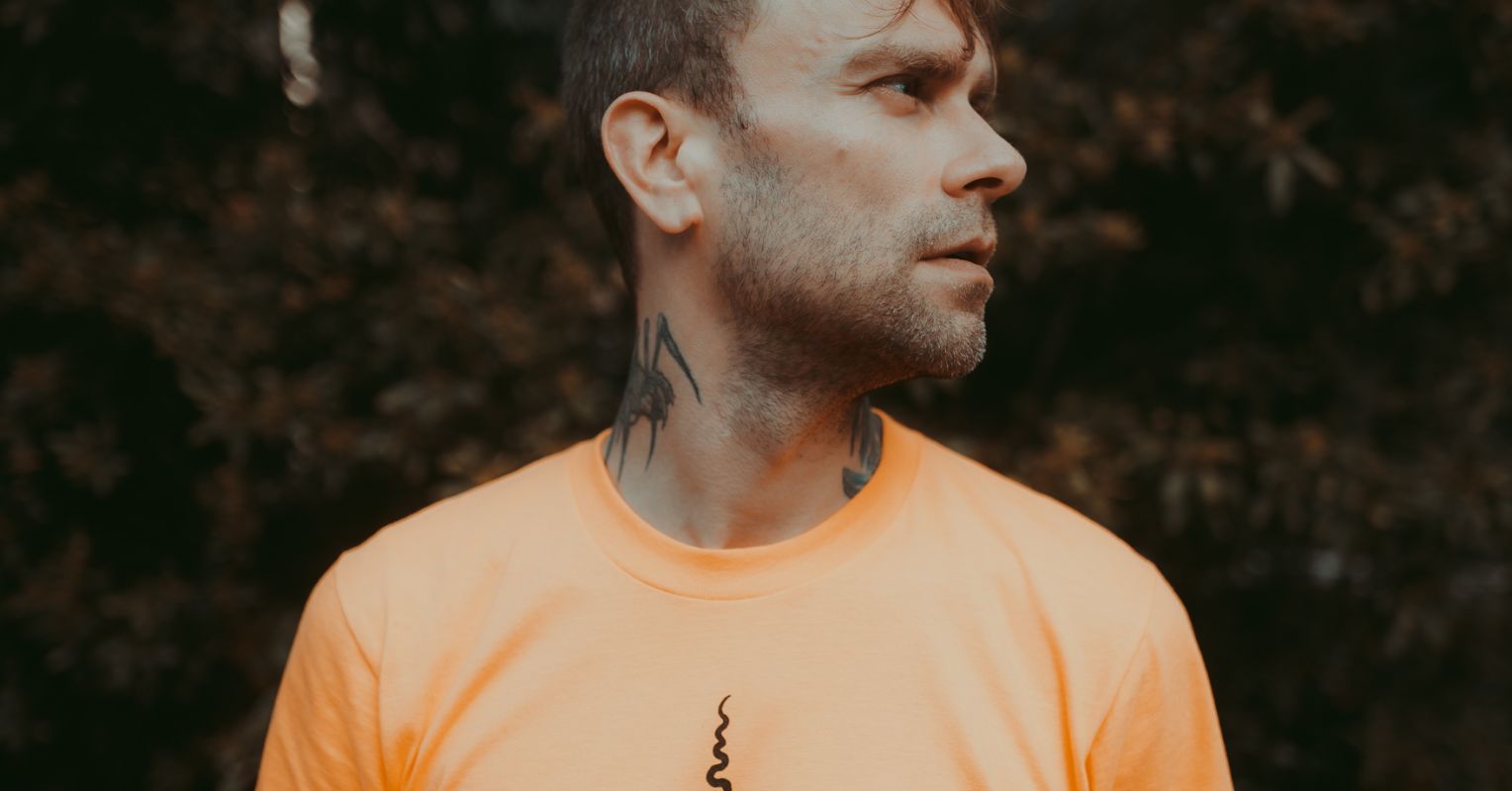
The darker symbols around Bert’s neck and upper body make the collection feel closer to punk and emo visual language than to a neat traditional sleeve. The spider image is especially effective because the legs create movement across the skin. It looks sharp from a distance, but the shape is simple enough to remain readable when the light is bad or the singer is moving.
His central chest marks add another kind of structure. Instead of filling every inch with one giant image, the designs sit as separate symbols that can be seen through an open shirt or a stretched tee. That spacing keeps the torso from becoming a single dark block. It also gives each tattoo a little room to keep its own identity.
A lot of people want a sleeve that looks intense but worry that blackwork will become visually heavy. Bert’s placement offers an answer: use strong dark shapes, then leave deliberate skin breaks around them. The eye needs somewhere to pause. Negative space is doing as much work as the ink in these photographs. Even a rough collection can look balanced when the artist pays attention to the empty areas.
The spider motif is also a good example of choosing an image for its outline. You can recognise it without needing a photorealistic finish. That makes it a useful starting point for anyone who likes gothic or creature tattoos but wants something that will still read after years of wear. Bold legs, a clear body and an intentional angle will usually age better than a crowded web of micro-detail.
If you like this part of Bert’s style, build around one strong silhouette first. A bat, moth, snake, crow or small demon can fill a tricky gap while still leaving room for future work. Keep the supporting marks smaller and decide whether you want the final mood to feel playful, threatening or mournful. The image can stay simple if the placement and line weight are right.
Face and temple marks make the look feel raw instead of polished
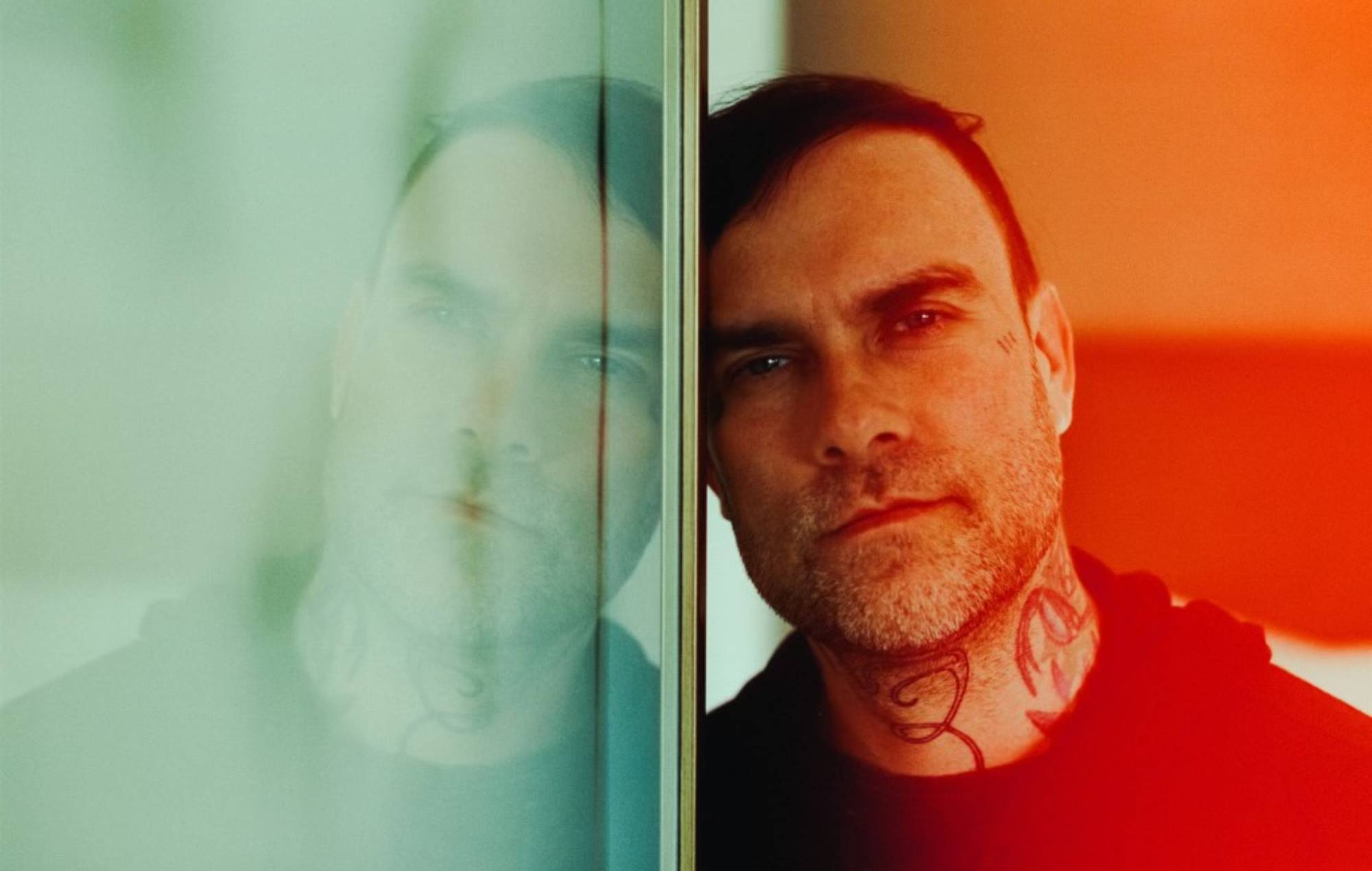
Some of Bert’s later photos show small marks around the face and temples. They are not the largest designs on his body, but they change the whole impression of the collection. Face tattoos create an immediate sense of commitment because they stay visible in every interview, photograph and ordinary conversation. In a close-up, even a tiny mark can pull the eye away from the hairstyle and toward the expression.
The lighter facial details work because they do not try to become a full mask. They sit beside the features rather than covering them. That restraint matters. A small symbol near the temple can be personal and still leave the face recognisable. If you are considering a similar placement, start by living with the design in a temporary marker or a digital mockup. Look at it in daylight, on video calls and in photos taken from the side.
Face ink is also where style and timing become impossible to ignore. What feels right at twenty-five may feel different later, and there is no sleeve or collar that can hide the decision. Bert’s marks fit the rest of his visual history, but that does not make the placement casual. They read like a choice made with a clear understanding that the tattoo would become part of his public face.
For a lower-risk version of the same mood, try a small mark at the hairline, behind the ear or high on the neck. Those placements can still feel bold without putting the design directly in the centre of the face. Ask your artist about fading, sun exposure and how the lines may change. Face tattoos often need realistic expectations more than they need an elaborate concept.
The main design lesson is not to chase shock value. It is to make sure a visible tattoo belongs with the person wearing it. Bert’s face marks work in photographs because they are part of the same rough, emotional world as the neck and hand ink. A tiny shape with the right attitude can say more than a random collection of trendy symbols.
The bat, wrist lettering and full arms turn separate memories into a sleeve

Bert’s arms show the collection at its busiest. The visible pieces include lettering, music-related marks, colored sections and heavier black shapes that run from the upper arm toward the wrist. His tattoo list also includes a bat on the lower abdomen and the phrase “I WISH I WERE A GHOST” around the wrist, designs that add a more vulnerable and strange side to the tougher stage image.
The phrase is especially interesting as a tattoo idea because it has room for more than one reading. It can suggest wanting to disappear, needing a break from attention or simply being drawn to ghost imagery. Unless Bert has explained a specific meaning, it is better not to turn the line into a firm biography. The lettering is still useful inspiration because it shows how a sentence can wrap around a small area and become part of the body’s movement.
The musical notes around the wrist make a quieter reference to his work. They are a good example of a small tattoo that does not need to compete with a full sleeve. A few notes can mark a song, a band or a memory without announcing the explanation to everyone else. They also suit the wrist because the curved line can follow the joint and remain visible when the hand turns.
The bat on the lower abdomen brings in a different placement and a more playful gothic image. It is not sitting beside the face or on a microphone hand, so it feels more private. That split between public ink and hidden ink is worth thinking about when you plan a collection. Not every tattoo needs to be visible for it to shape the way the whole set feels.
Looking at Bert McCracken’s tattoos as a group, the biggest lesson is that a sleeve can grow through different moods and still feel honest. The dark neck work, rough hand tattoos, symbols, lettering and body pieces do not look like they came from one catalogue. They look like a record of a person who kept choosing images that matched the moment.
If you want to borrow that approach, start with one tattoo you would still explain proudly ten years from now. Give it room, choose an artist who understands the placement and let the next piece arrive naturally. A good collection does not need to be perfectly coordinated. It needs to feel like it belongs to you, which is exactly why Bert’s ink continues to stand out.
One thought on “Bert McCracken Tattoos: Neck Ink, LOVE Lettering and The Used’s Dark Sleeve”