
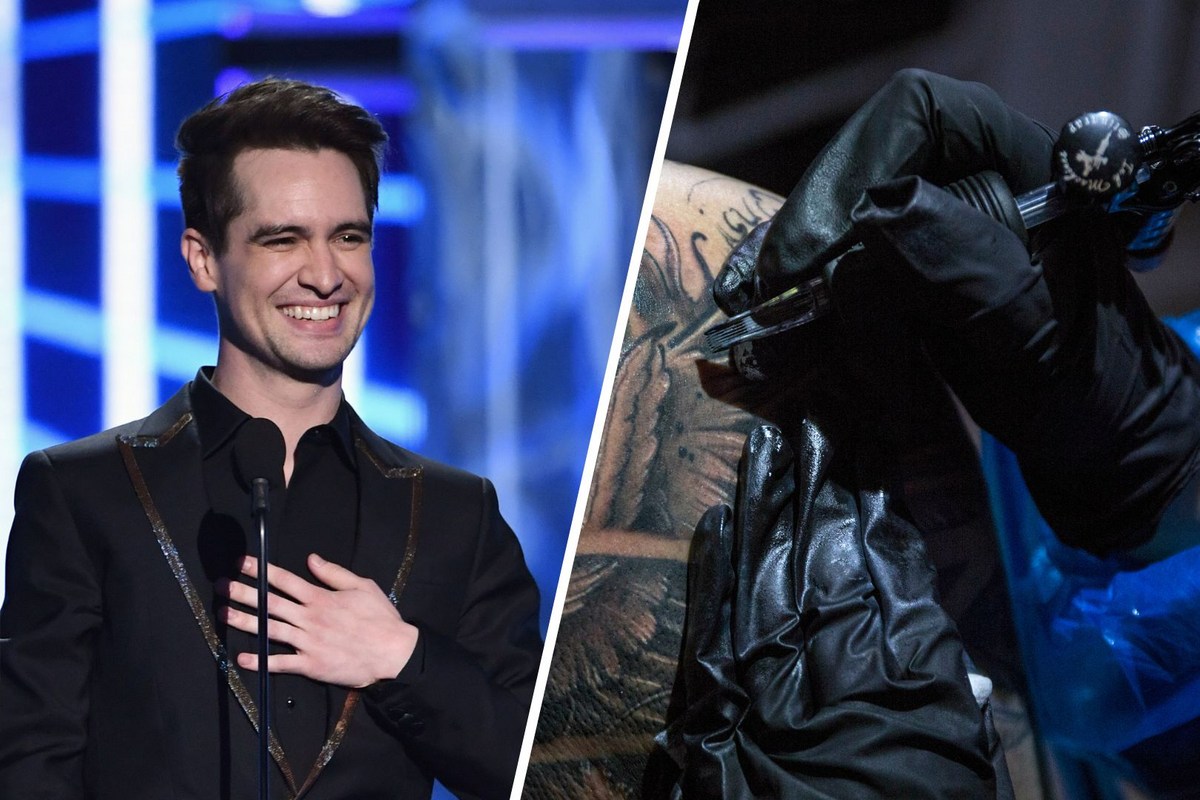
Brendon Urie’s tattoos are a pretty good match for his music: theatrical, personal and a little bit all over the place in the best way. The former Panic! at the Disco frontman has built a colorful sleeve around the things he loves, from old-school singers to family memories and the records that shaped him. It isn’t one flat block of black ink. You can spot piano keys, tropical flowers, portraits, tour symbols and small pieces that only make sense when you know the story behind them.
The collection also shows how a sleeve can grow without losing its personality. Urie’s arm has a clear visual rhythm, but it still feels like a scrapbook instead of a matching wallpaper pattern. That is useful inspiration if you want a colorful arm that can keep changing over time. Start with one subject that really matters, give it room, then let the next idea answer it rather than forcing every tattoo into the same style.
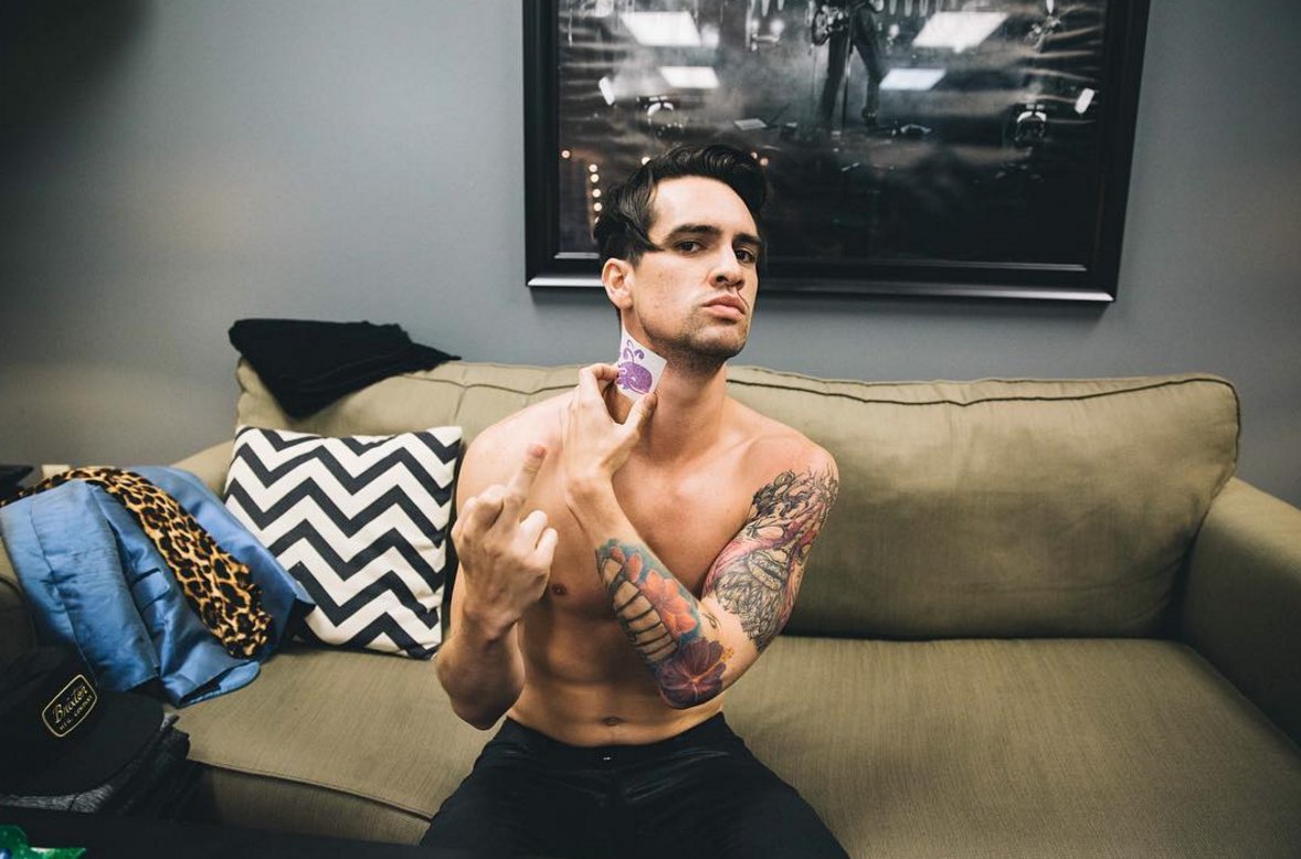
Several of the best-known pieces have a music connection. He has a large Frank Sinatra portrait, a newer Freddie Mercury portrait, piano keys, flowers tied to his mother’s Hawaiian heritage and designs connected to Panic! tours. He has also talked about his love of classic singers and the albums that made him want to perform. Here’s a relaxed look at the main Brendon Urie tattoos and what makes each part of the sleeve work.
The piano keys and flowers give the sleeve its musical base
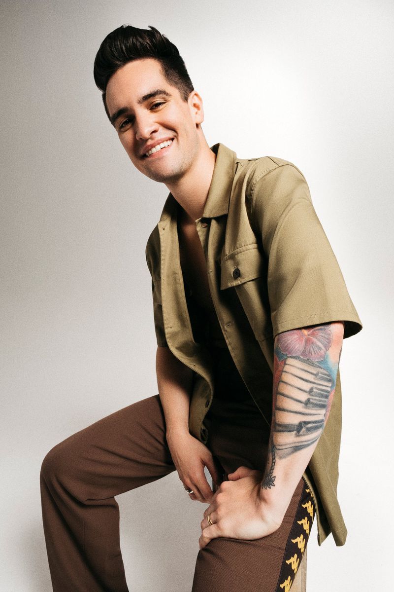
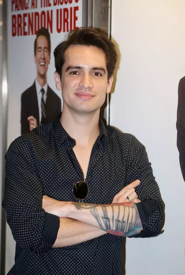
The piano keys are one of the easiest Brendon Urie tattoos to recognise. They run across his forearm as a strong black-and-gray band, with the keys broken up by the colorful flowers and other pieces around them. The design is simple enough to read from across a room, but it has enough shape to keep the arm from looking like a plain strip of text.
Urie has connected the piano to his early relationship with music. It is not just a random instrument picked because it looks good in a flash book. The keys make the sleeve feel like it belongs to a singer and songwriter, and they work as a visual bridge between the portraits above and the smaller symbols below. If you want a music tattoo without copying a band logo, an instrument can say a lot while staying open to your own story.
The flowers around the keys matter just as much. Hibiscus and plumeria have been described as a nod to his mother’s Hawaiian heritage, so the color is doing emotional work as well as decorative work. The blooms soften the hard geometry of the keyboard. That contrast between straight lines and loose petals is what keeps the forearm lively. A sleeve built entirely from portraits can feel heavy, while a few bright flowers give the eye somewhere to rest.
Placement is worth stealing here, even if the exact design is not. Piano keys follow the length of the forearm naturally, and the horizontal bars give the artist a clean measurement to work from. The floral pieces can then wrap around the edges instead of fighting the arm’s shape. Ask to see the stencil with your arm relaxed and bent before you approve it. A design that looks perfect while the skin is stretched may shift once you lower your wrist.
For a similar idea, keep the musical reference clear but leave space for the supporting images. You might use guitar strings, a drum rim, a microphone or a short line of handwritten lyrics. The main lesson from Urie’s piano tattoo is balance. The central image is recognizable, and the flowers make it feel like part of a living collection rather than a logo placed on top of the skin.
Frank Sinatra turns an idol into a serious forearm portrait
Frank Sinatra is probably the most talked-about of the Brendon Urie tattoos. The portrait sits on his left forearm and reflects the singer’s long-running admiration for Sinatra’s voice, stage presence and old-school sense of showmanship. Urie has explained that his appreciation for Sinatra grew as he got older, especially after spending more time with the classic live records.
A portrait like this needs a little more planning than a small symbol. Faces depend on proportion, light and expression, so the artist has to build the image with enough contrast to survive the movement of the arm. Urie’s portrait is placed where it can be seen when he performs or lifts a microphone. That makes it feel like an active part of his identity rather than a private image hidden under a sleeve.
The design also gives the rest of the arm a focal point. Look at the sleeve as a whole and the eye goes to the face first, then travels into the piano keys and flowers. One strong portrait can organise a busy arm without making every other piece compete with it. If you are planning a portrait tattoo, think about what you want people to notice first. A clear focal point will make later additions easier to place.
There is a useful emotional detail in the choice of subject. This is not a portrait picked because Sinatra is a safe vintage reference. It connects to the kind of vocalist Urie wanted to become and to the way he talks about performance. That makes it a good reminder that a portrait should represent a relationship, not just a face you happen to like. The reason will still matter after the celebrity trend has moved on.
Forearm portraits can be very visible, especially when you wear short sleeves or perform with your hands in front of you. Give the piece enough breathing room and avoid squeezing it between tiny text tattoos. A portrait needs a clean edge, a readable expression and room for the shading to settle as it ages. Urie’s surrounding color also shows how a serious black-and-gray face can sit comfortably beside brighter traditional flowers.
Freddie Mercury adds a newer tribute below the Sinatra portrait
Urie added a Freddie Mercury portrait below the Sinatra tattoo in 2022. The piece shows Mercury in his familiar stage posture, holding a microphone and wearing a bright yellow jacket. The placement creates a small line-up of vocal heroes on the forearm, with two very different performers sharing the same visual territory.
The choice makes sense for a singer who likes big voices and dramatic live performance. Sinatra represents control, phrasing and a classic lounge-era presence. Mercury brings movement, theatrical risk and a rock frontman’s physical energy. Putting the two images near each other turns the arm into a quick map of Urie’s influences. You can borrow that idea with your own heroes, whether they are musicians, actors, athletes or people from your family.
Fresh tribute tattoos often look different from older work because artists change and the wearer’s taste changes too. The Freddie piece has a brighter, more graphic feel than the older portrait. That difference is not a problem. A collection can show the year it was made without pretending every tattoo came from one appointment. Matching styles are nice, but matching memories are not always necessary.
The spot below an existing portrait is also a smart use of space. It lets the two faces read as a pair while keeping the rest of the sleeve open for flowers, symbols and smaller designs. If you are adding a second portrait, look at the first one from different angles and decide whether the new image should echo the line weight or deliberately bring in a new mood.
Mercury’s bright jacket also demonstrates why one strong color detail can wake up a mostly neutral sleeve. You do not need every inch to be saturated. A yellow jacket, red rose or blue background can act like a visual high note. The surrounding skin becomes part of the design, giving the color somewhere to stand out instead of making the whole arm feel crowded.
The eye, roses and personal symbols keep the sleeve close to home
Not every Brendon Urie tattoo is about a famous musician. One of the more personal designs is an eye connected with his wife, set inside or around a yellow rose. The image shifts the focus from public influence to private memory. It is also a good example of how a familiar tattoo symbol can become specific when the surrounding story is personal.
Eyes and roses are common starting points, but they do not have to feel generic. The artist can change the angle of the gaze, the petal shape, the amount of color or the way the image wraps around the arm. Urie’s version sits among the music references, so the sleeve feels like a portrait of a life rather than a fan wall devoted only to records.
Yellow is a useful choice here because it links the rose to the bright colors in the rest of the sleeve. It can also make the piece feel warmer than a heavy black-and-red rose. If you are working with a meaningful flower, pick the color for a reason. Maybe it was part of a wedding, a family garden or a place you remember. The explanation does not have to be obvious to everyone else to make the tattoo worthwhile.
The personal symbols also help the collection breathe. A sleeve becomes easier to live with when every image does not have to make a loud public statement. A small eye, a tour date or a simple mark can carry more weight for the wearer than a large illustration that photographs better. Leave a little quiet skin around those pieces so they can be read as separate memories.
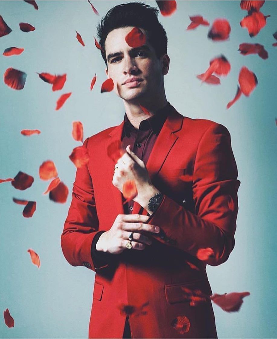
Urie’s hand and wrist details add another layer too. Small lettering and linework can be hard to see in a full-body photo, but they change the way the arm looks when he plays piano or holds a microphone. Those spots are very visible, so they deserve the same thought as the large pieces. Test the size, check how the design looks when your hand is moving and remember that fine lines need room to age.
Panic! tour tattoos and band references finish the arm story
Urie’s sleeve also carries designs tied to Panic! at the Disco, including symbols connected to different tours and the band’s visual language. These pieces are smaller than the portraits, but they give the arm a timeline. A tour mark can capture the period when an album was written, performed and shared with fans. It is a compact way to remember a whole chapter.
Band tattoos can be direct, like a logo or album title, or more private, like a symbol only the people in the group understand. Urie’s collection leans toward both. The larger music portraits show his influences, while the smaller tour designs point back to the work he made himself. That combination stops the sleeve from feeling like a collection of borrowed references.
There is a practical lesson in the way the small marks sit around the larger images. They fill gaps, but they do not try to erase every patch of skin. Leaving breathing room can make a sleeve look finished long before it is technically full. It also gives you the option to add another meaningful mark later instead of rushing into filler because one corner feels empty.
If you are thinking about a band tattoo, be honest about what you want to remember. A logo may be perfect if it has followed you for years. A tour date might be better if one particular show changed your life. You can also borrow the feeling without using the exact artwork: a stage light, a set-list line, a ticket stub or a tiny symbol from the album era can all work.
That is what makes the full Brendon Urie tattoos collection interesting. It brings together performance heroes, family, instruments, flowers, band history and small personal details without forcing one explanation over everything else. The best idea to take away is not a specific Sinatra portrait or piano design. It is the permission to build slowly, choose images that still matter and let the sleeve show the different parts of your life.
For a Brendon-inspired approach, start with one clear subject and one placement that suits it. Use color where it adds feeling, keep small details readable and let the next tattoo arrive when you actually have a reason for it. A good sleeve does not need to look planned from the first day. It just needs to keep making sense to the person wearing it.
One thought on “Brendon Urie Tattoos: Sinatra, Freddie Mercury and Piano Keys”