
A look at Rachel Daly tattoos shows a collection built from family memories, football milestones, a Leeds tribute, and smaller pieces that don’t all share one style. Her arm ink is easy to spot in match photos, while close views show its mix of dark shading, fine script, small symbols, and open skin.
The best-known piece quotes Leeds United’s “Marching On Together”, a tribute to her late father Martyn. Daly has also spoken about a Euro 2022 trophy and lioness design she created with her tattoo artist, and a teddy bear for her nephew. She and Millie Bright share matching “1/2” tattoos on their hands, a small design tied to their friendship.
This guide sticks to what the photographs show and what Daly has said about the tattoos. It may help if you’re looking at an arm collection, meaningful script, a sports tribute, or several small pieces that don’t need to match. The placement can connect tattoos added at different times.
Rachel Daly’s Leeds tribute script sits inside a busy forearm collection
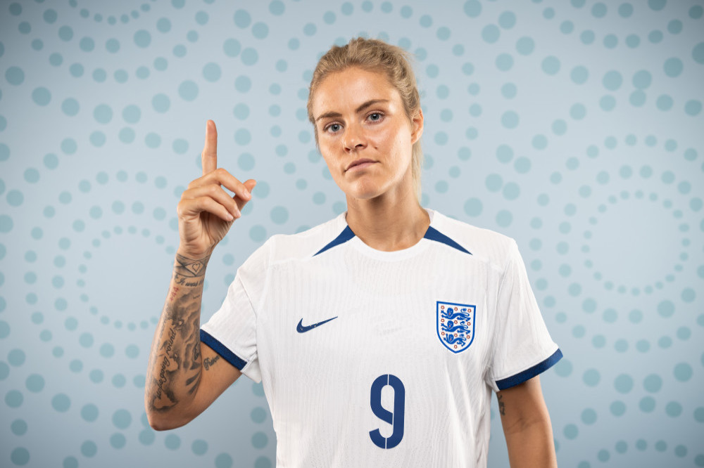
The Leeds tribute is one of Daly’s clearest tattoos. The words “at least until the world stops going round” run along her forearm in large script. Daly has explained that the line comes from the Leeds anthem and became especially meaningful after her father’s death. Its place in the collection comes from that connection, not only from how the lettering looks.
A forearm gives a long line of script room to travel. The lettering follows the arm’s length, and the nearby pieces frame it without taking over. Smaller marks sit around it, but the words remain the first thing you notice. That clear hierarchy is what keeps a busy arm from turning into visual noise.
If you’re thinking about a quote, start with its shape. A short line might sit across the wrist or inside the arm; a longer one could run vertically or wrap around the forearm. Decide whether it should be easy to read or more private. Daly’s is visible, but still placed like a personal reminder.
Other tattoos can be added around script later, as long as they leave the main line room. A soft shadow, small symbol, or open gap can help separate the lettering from nearby work. Meaning gives the tattoo its reason, while spacing gives it its shape.
Rachel Daly’s forearm tattoo stays readable while she is in motion
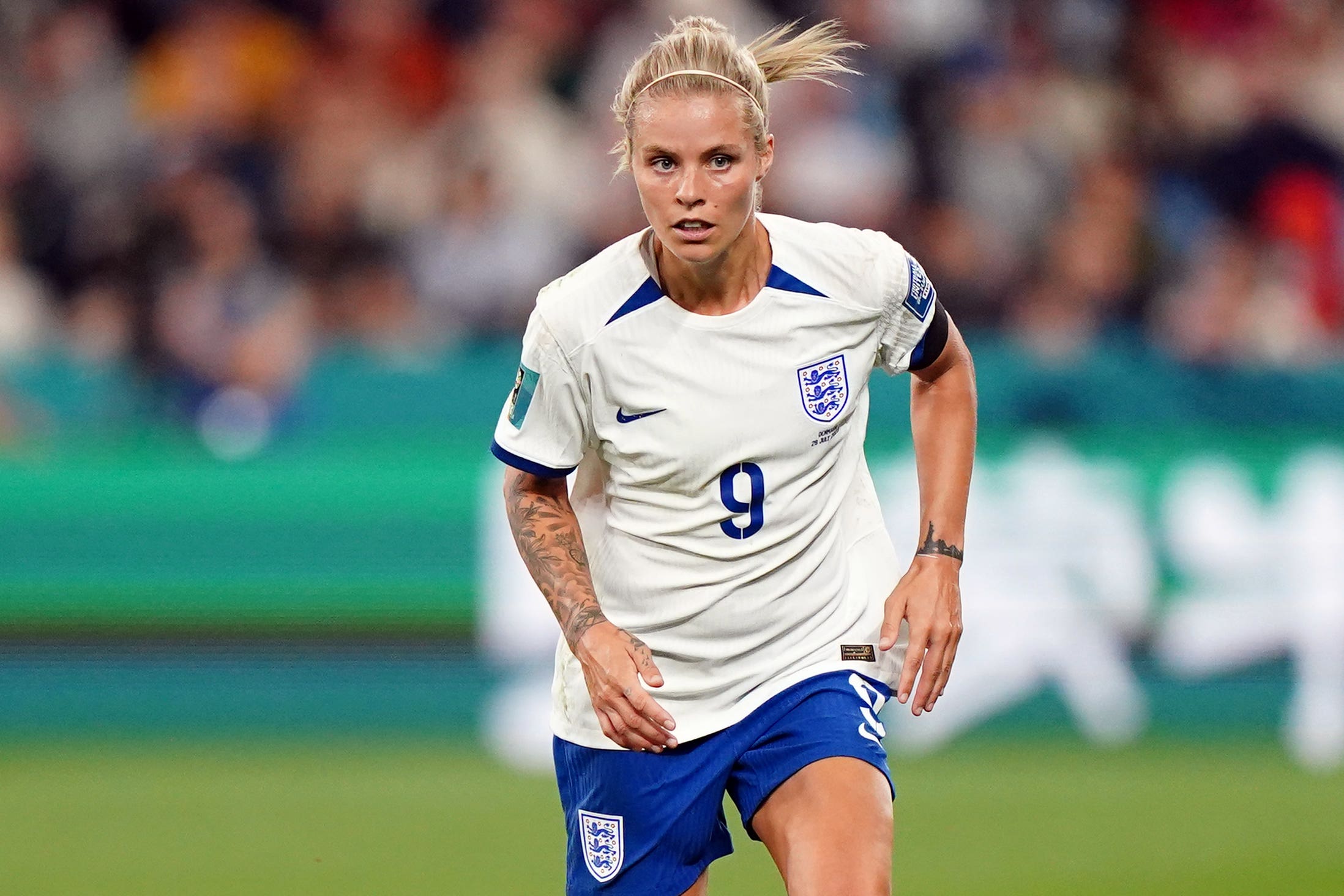
Action photos show how Daly’s tattoos look while she’s running, pointing, or challenging for the ball. Her forearm is often bent or turned toward the camera, but the larger shapes remain visible as the skin moves. The design doesn’t depend on a single posed angle.
The arm balances dense black and grey areas with lighter spaces, so smaller details don’t get lost. A good arm tattoo does not have to fill every inch to feel complete. Breaks between pieces give the darker areas more definition, even in stadium light or a quick photograph.
Anyone who plays sport, works out, or uses their hands throughout the day knows that skin moves. Wrists turn and elbows fold. Ask your artist to check a stencil with the arm relaxed and moving, especially if a line of script or long floral shape needs to follow the limb.
Daly’s pieces also show how an arm collection can build over time. They don’t all look as if they came from one flash sheet; their placement and visual weight help them sit together. Plan the broader route first: choose where the boldest piece will go, then give later additions room around it.
An Aston Villa action photo shows how the arm tattoos sit with a short sleeve

In a short-sleeved football kit, Daly’s forearm is the most visible part of her collection. Her shirt covers some of the upper arm while the lower tattoos remain on show as she walks, warms up, or talks with teammates. The ink is part of her everyday look; it doesn’t rely on a face or neck tattoo to stand out.
The photo also shows why the inner and outer arm can be planned together. One side can hold a larger image while the other has script, smaller marks, or lighter shading. As the arm turns, the view changes. That change of view is one of the best ways to make a sleeve feel lived-in rather than flat.
Athletes also have to consider kit sleeves and wrist tape. Daly’s tattoos continue below the shirt line without looking as if they were placed only for a photograph. If you wear a uniform or fitted work clothes, decide how much ink you want visible on an ordinary day. Planning those edges early can help a tattoo feel comfortable in a professional setting.
Smaller pieces soften the transition between the forearm work and the shirt sleeve. If you like several subjects, use size and spacing to make them neighbours. They don’t need to share a theme; a repeated line weight, shade, or deliberate gap can tie them together.
The longer forearm piece gives Rachel Daly’s collection its strongest visual weight
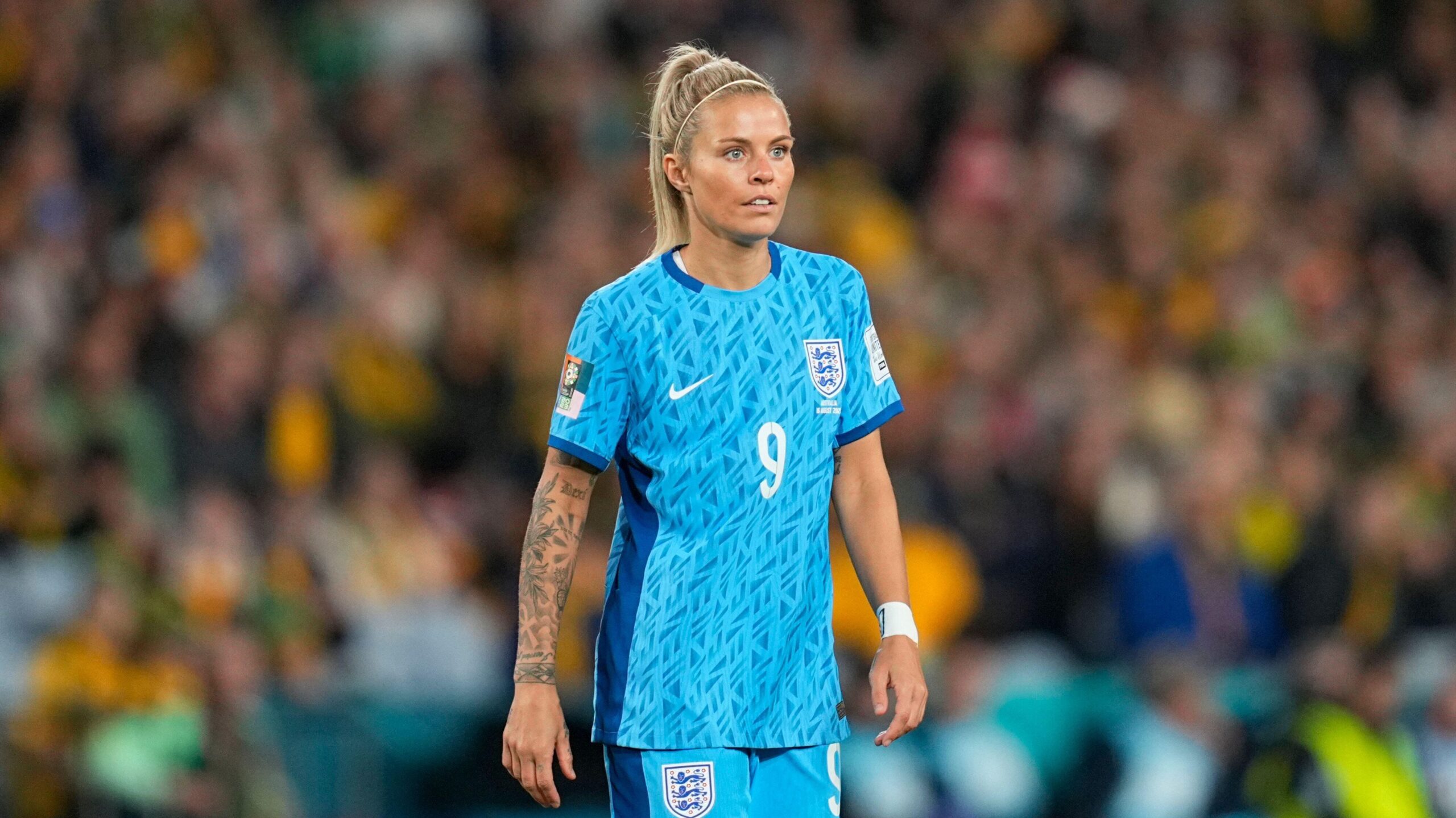
A longer view of Daly’s arm shows how the lines guide the eye from elbow toward wrist. That direction follows the arm’s natural length. Individual designs remain easy to pick out instead of looking like a row of separate stickers.
Daly has described the teddy bear as a favourite piece and connected it to her nephew. It brings a softer note beside the football and family tributes. Not every tattoo needs to look tough, dark, or serious to belong beside stronger work.
Changes in scale help balance an arm with several tattoos. A large line of script may sit better beside a quieter image; a dark section can have open skin around it. The bear adds a different mood before the eye moves to the heavier shading. Daly’s collection doesn’t force every idea into one polished theme.
If you’re building a sleeve, think about the memories you want close. Start with the story that matters most and leave room for pieces about other people, places, and moments. Your artist can help with the visual links, but each tattoo should have a reason for being there. The strongest sleeve is often a timeline, not a matching set.
A close view makes the script and small marks easier to study

The close photo shows details that are easy to miss in a full-body match shot: the large script beside smaller symbols and lettering near the wrist. Some pieces look crisp and dark; others are softer and more faded. Together, they have the look of a collection added over time.
Daly and Millie Bright’s matching half tattoo is another approach. The small hand design marks a friendship, not a career milestone. A small tattoo can carry a huge meaning when the placement and story are clear. Its simple shape also leaves room beside the larger arm work.
The Euro trophy and lioness design marks a team achievement, but Daly and her artist shaped the tattoo themselves. For a sports tribute, you don’t have to copy a club logo. A trophy, date, animal, or small symbol can keep the memory while leaving room for your own style.
Daly’s arm holds sentimental script, family references, a bear, football milestones, and smaller details. The placement gives those different ideas room to sit together. Choose one main area, keep the strongest piece easy to see, and let later tattoos come when their stories matter to you.
The video below features Rachel Daly and Millie Bright in a lighter team setting, alongside the tattoo details.