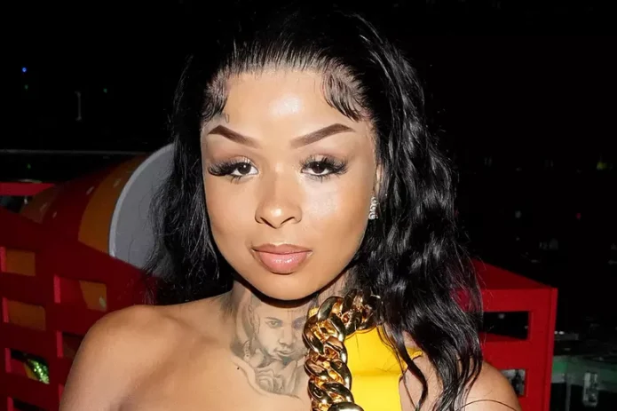
Chrisean Rock tattoos are hard to miss because they sit right in the middle of her look. Her collection leans bold, personal and very visible, with face work, neck ink, hand lettering and large portrait designs all sharing the same rough black-and-grey feel. These are not tiny tattoos that disappear under a sleeve. They change the whole mood of an outfit.
What makes her ink interesting is the contrast between delicate lettering and heavy portrait shading. One piece can look soft and handwritten, while the next has a deep black shadow that reads almost like a photograph. She also uses placement in a very direct way. The face and neck pieces frame her features, while the hand and body work keeps the style connected below the neckline.
A lot of tattoo inspiration gets flattened into one generic celebrity photo. That does not help much. Chrisean’s tattoos make more sense when you look at close views of the neck, cheekbone, face portrait and side profile separately. Here is the useful breakdown, with design ideas you can actually take to a tattoo artist.
The neck tattoo creates a dark frame under the jaw
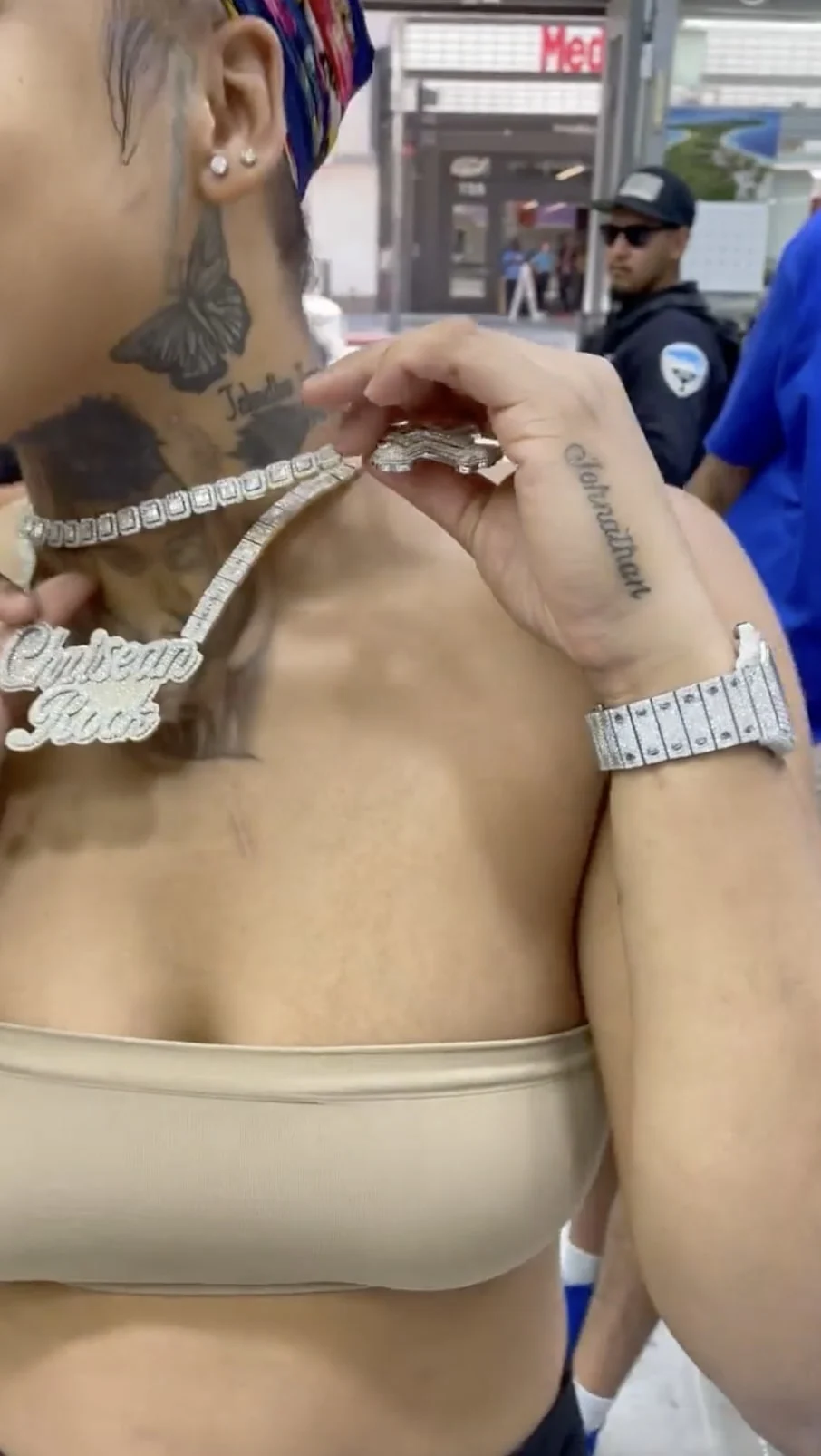
The neck is one of the strongest parts of Chrisean Rock’s tattoo style. A dark, layered design rises from the upper chest toward the jaw and side of the neck, giving the area a solid visual weight. It is easy to see why this placement became a signature part of her look. Even when the rest of an outfit is simple, the neck ink fills the gap between clothing and face.
The shading is not timid. Large black areas give the tattoo a soft edge in some places and a dense, almost charcoal look in others. That can be useful if you like the idea of a neck tattoo but do not want a thin outline that gets lost against the natural shadows of the body. A good artist would need to plan the piece around the curve of the neck, especially where the skin turns toward the collarbone.
There is also a nice lesson in scale here. The design does not stop at a tiny central symbol. It takes up enough space to feel intentional, but the edges still leave some breathing room. If you want a smaller version, keep one strong focal shape and let the shading fade outward instead of trying to copy every dark patch.
The cheekbone ink makes the face portrait feel built in
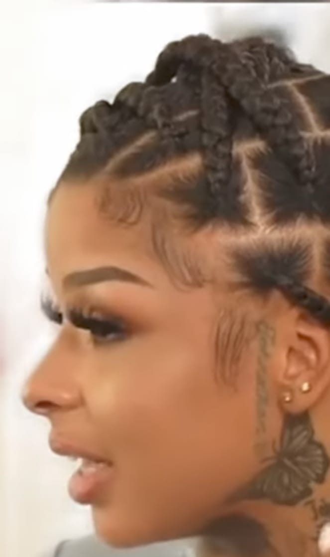
Chrisean has also shown ink running along the cheekbone and beside the ear. This placement is more subtle than the large face portrait, but it still changes the balance of the face. The lines sit close to the hairline and jaw, so they can look different depending on the hairstyle, makeup and angle of the photo.
Side-of-face tattoos need a steady hand and a clear plan. There is very little room for a design to drift without changing the expression of the face. The cheekbone area also moves constantly when you smile or talk, so a tattoo artist has to think about how the shape will sit at rest and in motion. Fine lettering can work there, but it needs enough spacing to stay readable as it settles.
If you like this placement but want something less intense, a small botanical sprig, star group or single word can follow the cheekbone without filling the whole side of the face. The main idea is the direction. Lines that follow the cheek and ear usually feel more natural than a design that floats in the middle of the skin.
The Blueface portrait is the collection’s biggest statement
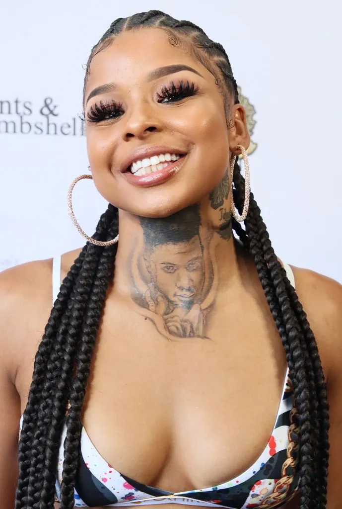
The large Blueface portrait is the piece most people notice first. It covers a broad area on the side of the face and uses heavy black shading, a strong outline and realistic facial details. It is a huge commitment, both visually and emotionally. The tattoo is not just an image placed on the skin. It becomes part of how the face is read.
Portrait tattoos live or die on the eyes, nose and mouth. If those features are slightly off, the whole piece can look strange. Chrisean’s portrait has enough contrast to read from a distance, while the darker sections help the image hold its shape in photos. The surrounding hairline lettering and small marks add more texture without competing with the face at the center.
For anyone thinking about a portrait, this is a reminder to bring a genuinely strong reference photo. A tattoo artist cannot fix a blurry or badly lit reference with magic. Pick an image with clear facial planes, decide how much of the portrait should be shaded, and think about how the design will look in profile. A half-face portrait can feel more natural than forcing a full rectangle onto the cheek.
The face tattoo looks different in a close crop
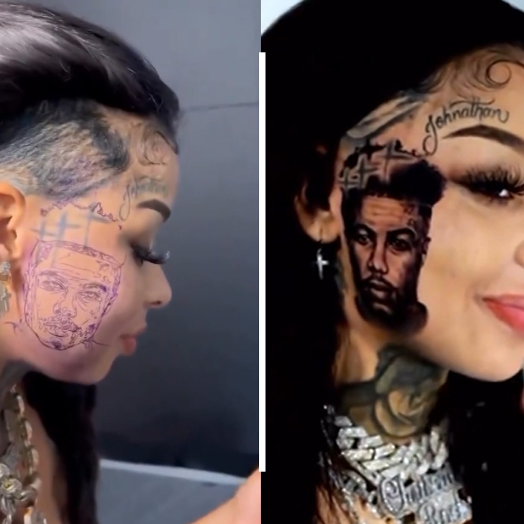
A close crop shows why the face portrait has so much impact. You can see the dotwork, soft gradients and small line details that disappear in a full-body photograph. The upper edge of the portrait sits close to the hairline, while the darker lower section follows the cheek and jaw. That makes the image feel attached to the structure of the face instead of pasted on top.
This kind of work needs careful contrast. Too much solid black can turn the portrait into one flat block after healing, but too little contrast can make it vanish when the lighting changes. The best balance usually comes from leaving small areas of skin tone between the darkest shadows and the mid-tone grey. It keeps the face readable without relying on a perfect camera angle.
The surrounding lettering is worth noticing too. Chrisean’s face ink mixes portrait work with script, which gives the design a more personal and layered feeling. If you like the idea but do not want a full portrait, a short name or phrase near the temple can create a similar rhythm with much less commitment.
The side profile shows how the face and neck ink connect
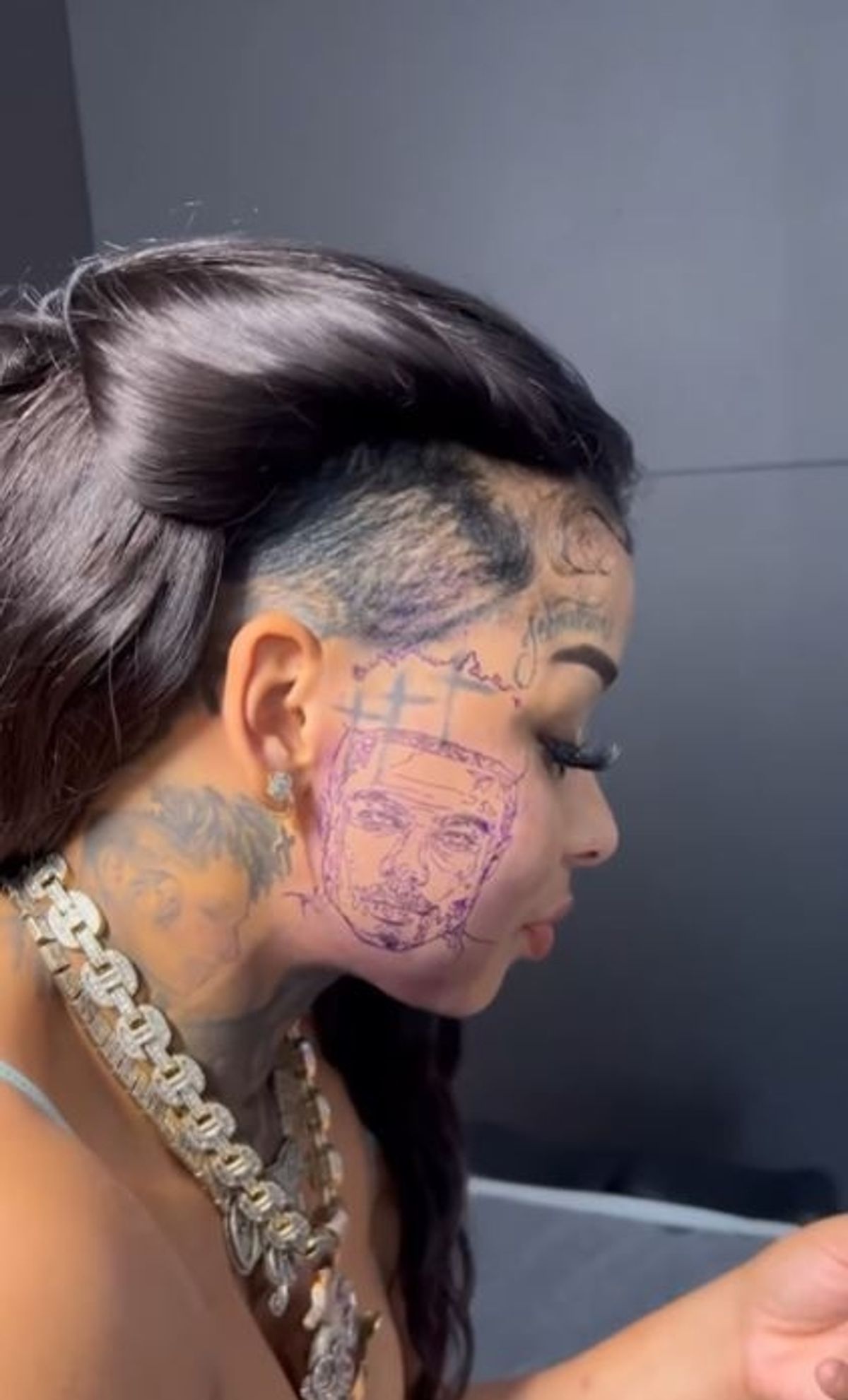
A side profile is useful because it shows the portrait, cheek lettering and neck tattoo in one line. The placement flows from the temple toward the jaw and then drops into the neck, so the design reads as one connected panel even though it contains several separate ideas. This is the kind of view that helps when you are planning a tattoo around a curved area.
It also shows how much the angle changes the tattoo. From the front, the portrait is the main event. From the side, the neck shading and the lettering near the hairline become just as important. If you are working on a large piece, ask for reference photos from more than one angle before you commit. A design that looks great straight on can feel cramped when the skin turns.
The hand lettering is another part of Chrisean’s wider style, even when it is not in this side crop. Small words on the hand bring the same personal feeling to a lower-commitment placement. Keep that kind of detail simple, give the letters room to heal and check how it looks with your hand relaxed instead of stretched flat.
How the collection works together
Chrisean’s collection has a clear visual language: black and grey shading, strong outlines, personal names or portraits and placements that are hard to hide. The face and neck sit in high-visibility areas, while hand lettering adds a smaller detail that people notice only when they are close.
There is also a useful balance between large focal pieces and supporting marks. The portrait carries the most visual weight. The neck and cheekbone ink guide the eye around it, while script adds rhythm and personality. That is a smart way to build a collection. One or two big designs can lead, and the smaller tattoos can fill the spaces without fighting for attention.
You do not need to choose the same placements to get a similar effect. You can use a portrait on the upper arm, keep a short phrase near the collarbone and add a small wrist symbol later. The trick is to repeat one or two ideas, such as black shading, script or a limited palette, so the collection still feels like it belongs together.
What to borrow from Chrisean Rock’s style
The first lesson is confidence in placement. Face and neck tattoos are not background details, so they work best when the design has a clear purpose. The second is contrast. Her darker pieces show why a tattoo needs strong values if it has to read in ordinary indoor light, phone photos and moving video.
The third lesson is to separate a personal reference from a trendy design. A portrait, name or phrase carries more weight than a random flash symbol. If you are choosing something permanent, ask yourself what will still matter when the trend has passed. That question is especially important for hand, neck and face tattoos because they become part of your everyday presentation.
Finally, plan the collection instead of rushing it. Start with the design that means the most, leave space for future work and let each new tattoo settle into the larger picture. Chrisean’s ink is bold because it is visible, but it is also memorable because the strongest pieces have a clear story behind them.
At the bottom of this guide is a relevant video look at the face portrait and removal conversation. It adds useful context, but the design details are easiest to understand when you study each tattoo placement on its own.