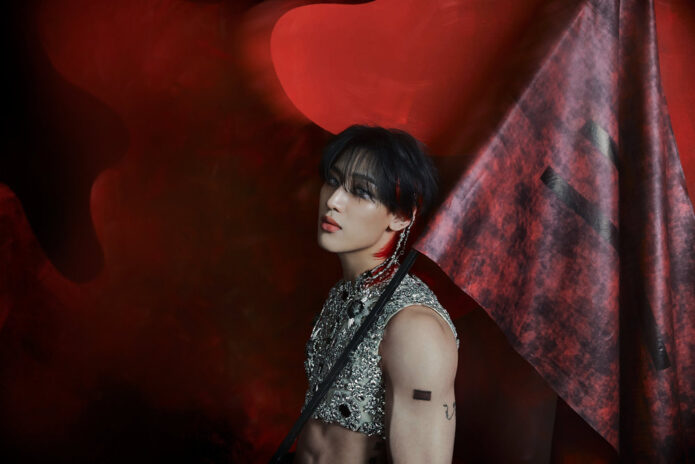
BamBam’s tattoos reflect his time with GOT7, his solo work and the playful way he presents himself. There’s bold lettering on his ribs, fine-line work on his arm, small marks by his ear and script that only shows when he shifts a collar. Together, they feel like a collection built over time, not one matching set.
Some tattoos point straight to GOT7. The number 7 on his upper back is shared with the group’s name and its seven members. Other pieces invite a closer look: the three faces on his arm, for instance, and chest ink caught briefly in stage photos. The 7 is easy to place; the faces and glimpses of chest ink leave more questions.
The sections below look at those designs in place and separate what BamBam has explained from what fans have inferred. They also offer a few practical details for anyone drawn to fine-line tattoos, script, small symbols or a collection that can grow gradually.
The matching 7 tattoo turns friendship into a simple back piece
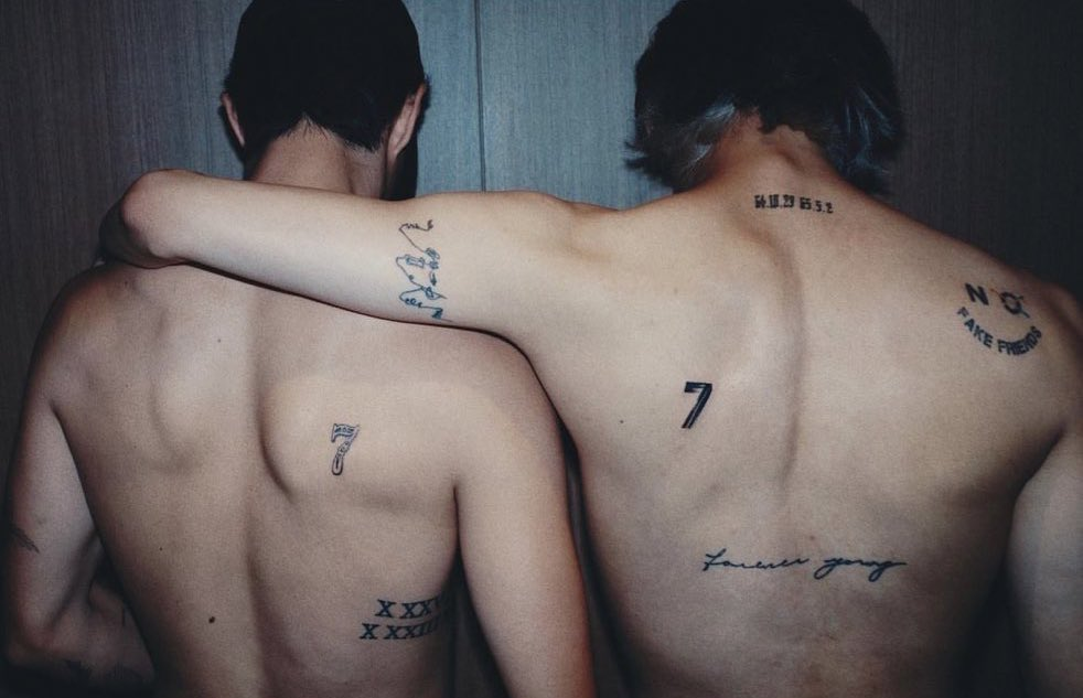
The clearest GOT7 reference is the matching 7 that BamBam and Mark Tuan showed on their upper backs. It sits between the shoulder blades, easy to see when they turn away from the camera. The shape is simple, but it has room there to stand on its own. It isn’t tucked on a wrist or partly hidden by a sleeve.
For BamBam, the number connects both to GOT7 and to the friendship among the members, which continued after the group left its original label. It makes the point without a long quote or a detailed image; fans who know the group will recognise it.
The photo shows how much a clean shape can do. The black 7 is easy to pick out, while the smaller lettering and date details add a personal touch. BamBam’s surrounding marks don’t copy Mark’s exactly. They share the central idea, and that’s enough.
A friendship tattoo is easier to recognise when its main symbol reads from a distance. If you’re considering one, start with a number, sign or small shape that’s part of your relationship. Then settle on a placement that feels right for you instead of tracing someone else’s tattoo.
The GODBLESS cross sits in a small but visible spot
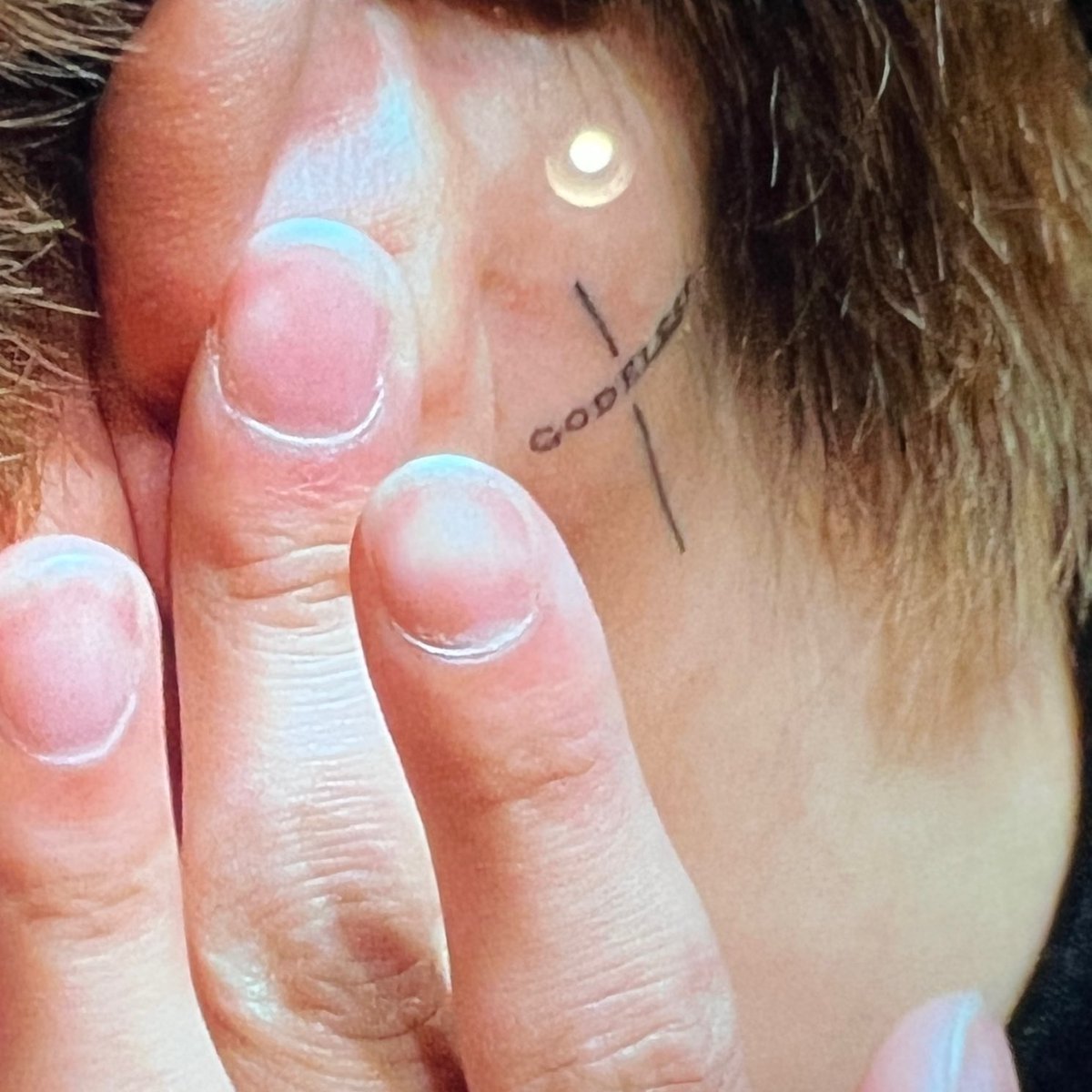
The cross behind BamBam’s ear shows how a small tattoo can still catch the eye. It pairs a simple cross with GODBLESS running through it. Just above the jaw, it appears when his hair shifts or he turns his head. It’s visible without taking over his face.
The close-up makes the lines easier to see: the cross stays compact, and the lettering follows its shape instead of spreading into a block. In such a small space, leaving some air between the lines helps keep the design legible.
Hair changes how much of it shows. A short cut leaves it in view; longer hair can cover it. That gives the wearer some choice about when the tattoo is on display.
A small tattoo still has to read when you move and when the light changes. Ask the artist to show the stencil from the front, side and three-quarter angle. Those are all ways people will see it, not only straight on in a mirror.
The three faces are one of BamBam’s most recognisable arm tattoos
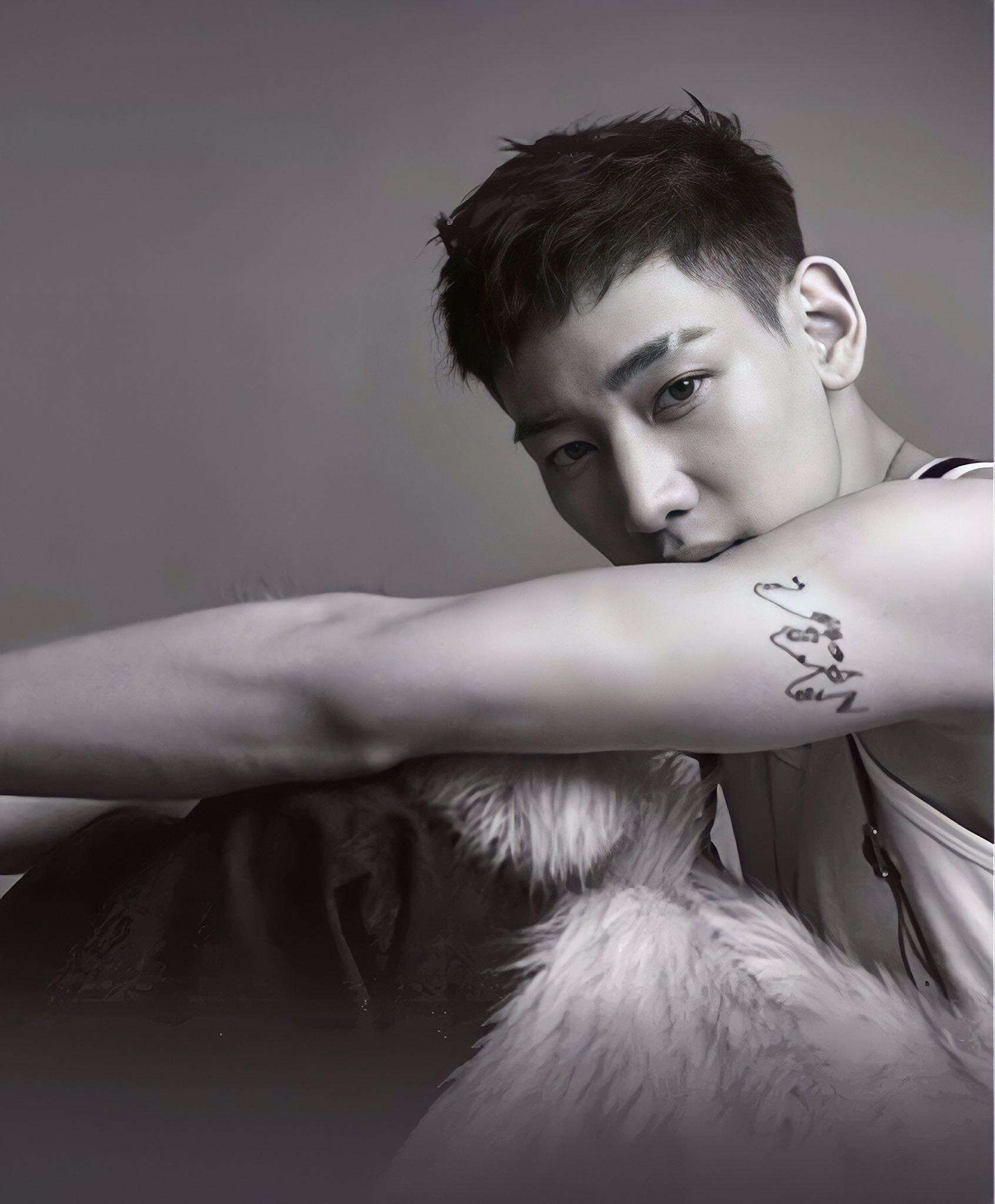
The fine-line piece on BamBam’s upper arm, often read as three faces drawn with a few flowing strokes, is one of his most recognisable tattoos. Its light, overlapping lines make a different impression from the solid 7 on his back. It comes into focus when you look closely.
Some fans read the faces as different sides of BamBam: the person away from the stage, the performer and the private self between them. He hasn’t given a fixed explanation, so that remains a fan interpretation rather than a confirmed meaning.
The spare lines leave room for a personal reading without spelling out the whole story. The upper arm also suits the shape: it curves with the muscle and can be seen from the front or side.
For a faces tattoo, the reference needs to be clear even if the final drawing is loose. The artist still has to decide how the eyes, jaw and profile will read. Minimal work still takes care. With fewer lines, each one carries more of the image.
His lettering tattoos keep the collection personal and a little playful
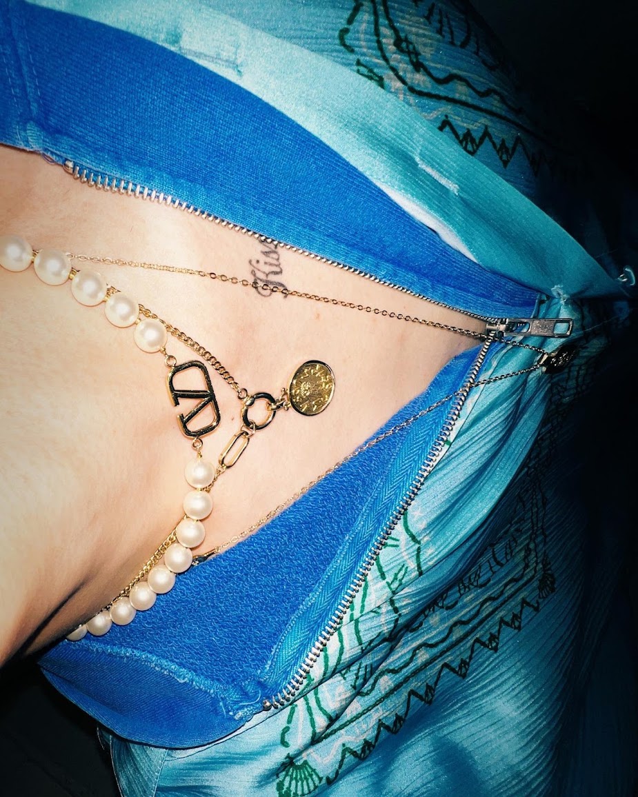
The script by BamBam’s collarbone reads “Kissin’ On My Tattoos,” a phrase that fits his humour and stage style. It sits close to the chest and comes into view when he opens a shirt or shifts the neckline. The placement lets the words show as part of the outfit without making them a large chest panel.
With script, the feel comes from the spacing and the way the letters flow. BamBam’s tattoo uses loose handwriting rather than a rigid block font, so the phrase moves along the collarbone.
He also has “forever young” written across his back. The two pieces show how lettering can change the mood: one is cheeky and close to the skin, the other more like a private reminder.
Before settling on a quote, try it in a few styles and read it from across the room. Words that look clear on a phone can be harder to follow when curved over a shoulder or rib. Leave enough space for each word to breathe. That’s especially helpful where the tattoo moves with the chest or back.
The ROCKSTAR, 97 and small number tattoos show different eras
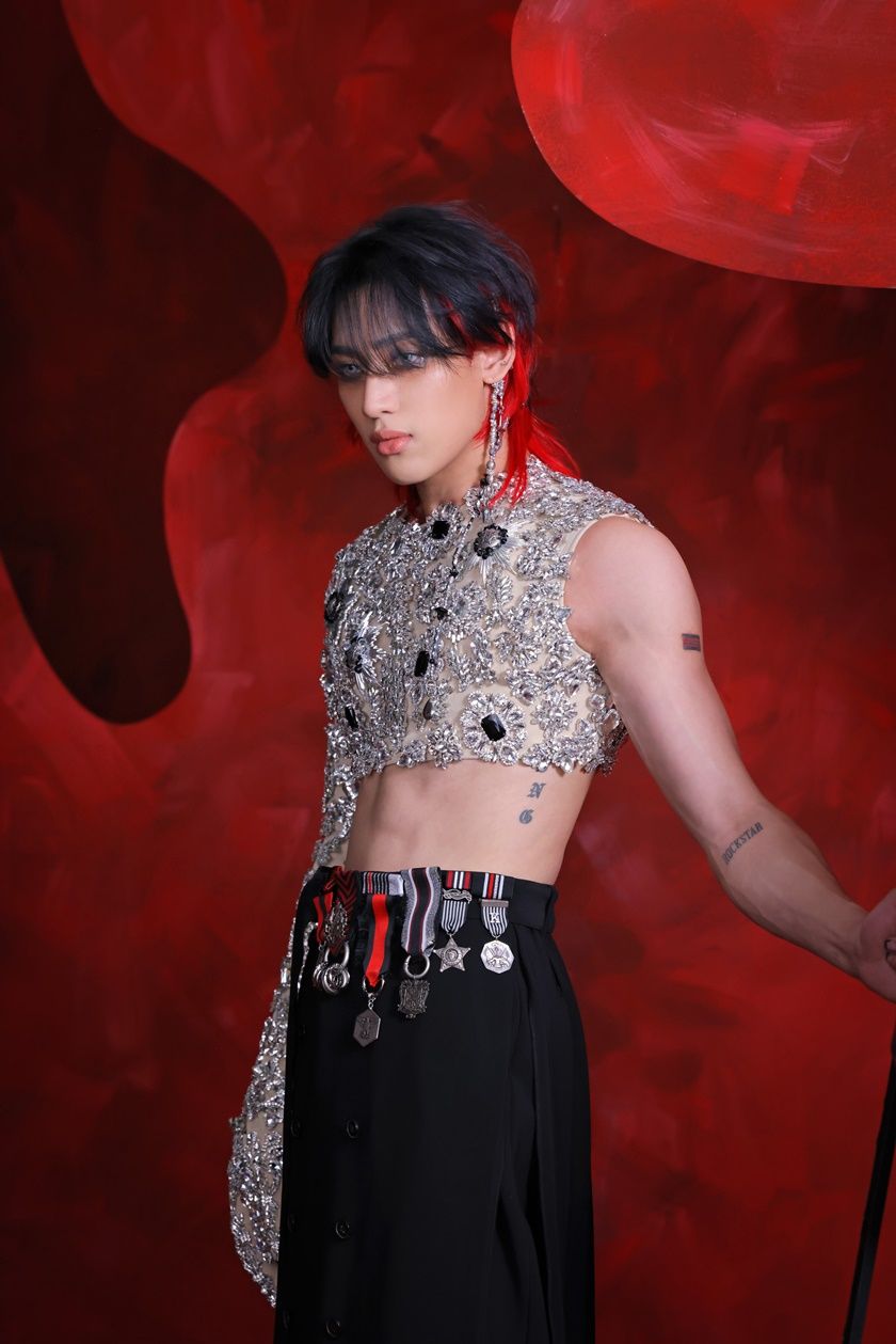
BamBam has added smaller designs around the larger pieces. He showed ROCKSTAR as a new black tattoo on his arm and said he likes the idea of becoming a rockstar or living like one. It’s a direct word, almost a label he chose for himself.
His birth year appears in more than one style. The number 97 points to 1997, while Roman numerals give the same date a more decorative look. A personal number can stay plain, or take the form of Roman lettering or a symbol whose meaning is mostly for the wearer.
The stage photo shows how the smaller tattoos sit together: a number on the arm, a word near the forearm and lettering along the side. They add detail without filling every open patch of skin; there’s still space between them.
If you’re building a group of tattoos, there’s no need to plan the whole set at once. Pieces can mark separate moments as they happen. Leave some room for a later idea. The newer tattoos sit alongside older ones, rather than forcing them into a single style.
Why BamBam’s tattoos feel connected without matching perfectly
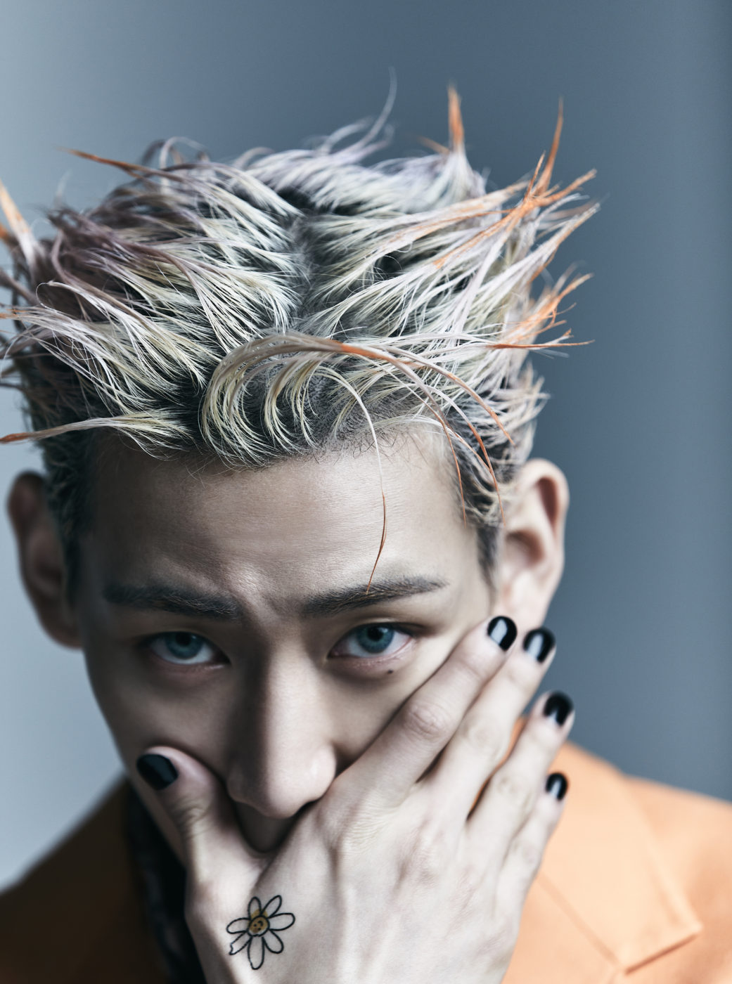
Across the collection, you see lettering, small black symbols, fine-line faces and a few bolder shapes. The subjects and sizes vary, but the open spacing and the way the designs follow the body’s lines give them some common ground.
The back 7 is the boldest piece. The three faces and collarbone script draw you closer; the cross by the ear and the smaller numbers reward a close-up. You notice the 7 from across the room, while smaller details become clear in a close-up.
You don’t need one theme or a full sleeve planned from the start. Choose a first design that matters to you, leave breathing room around it and let later tattoos respond to the space. Scale, spacing and tone can tie the collection together.
A partly hidden tattoo can stay with you as much as a large back piece. Not every photo needs to show everything at once. A phrase under a collar or a small cross behind the ear can feel like part of everyday life rather than a display.
BamBam’s collection brings together GOT7, solo work, playful lettering and fine-line images whose meaning is left open. The matching 7 gives it the clearest group connection; the cross, faces, script and ROCKSTAR word add other details. If this style appeals to you, choose symbols that matter, give lettering room and check how a design sits when you move.
One thought on “BamBam Tattoos: GOT7 7 Ink, Fine Line Faces and More”