
Central Cee’s tattoos are hard to miss. The London rapper has built up a dense collection across his chest, neck, arms, stomach and hands, mixing bold lettering with dragons, script, symbols and smaller marks.
It doesn’t look like one carefully matched flash sheet. Some pieces read from across a crowd; others come into focus in close-up photos. The larger chest work gives his outline weight, while smaller writing and hand tattoos fill in the spaces around it.
He has talked about getting tattoos regularly, almost as if each one were another part of his wardrobe. In his XXL ABCs appearance, he explained the meaning behind details such as the words under his chin and the loyalty behind some of his lettering. The collection feels worn in, as though it has grown alongside his music rather than appearing all at once.
Older script sits beside newer symbols. The styles don’t line up perfectly, but that unevenness feels natural. Different parts reflect his taste, his influences or the point he was at in his career when he chose them.
Here’s a closer look at the main designs, what the photos show and how the large chest pieces and smaller script work together.
The Trapstar chest lettering gives his upper body its first focal point
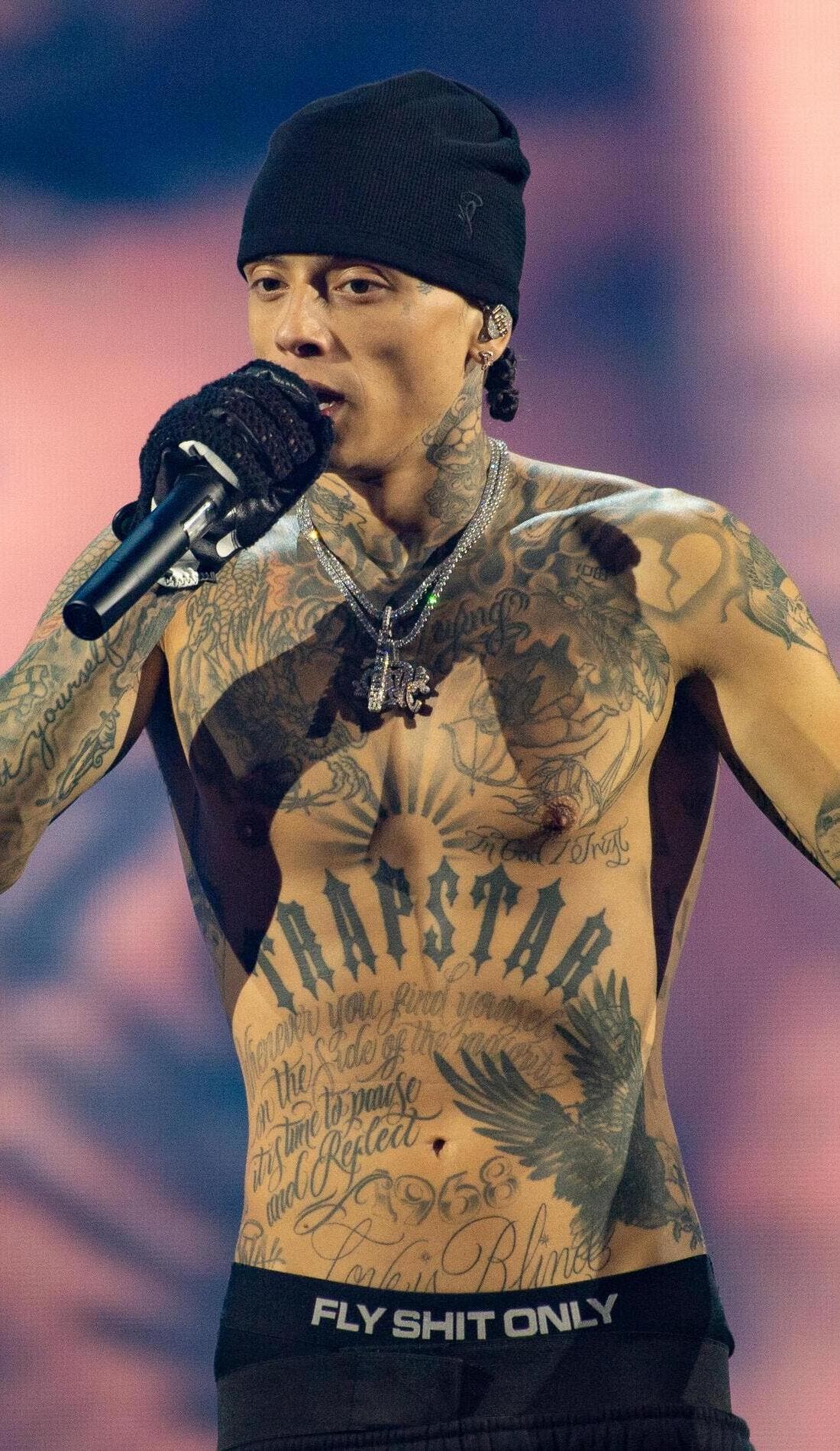
Trapstar is one of the first tattoos people notice on Central Cee’s chest. The large, dark letters stretch across the centre of his torso, so they stay readable under stage lights and while he’s moving. Their width also gives his upper body a strong horizontal line.
There’s a lot more ink around the word: layered drawings, curved lines and shaded shapes make the chest look full. The lettering catches the eye first; the smaller details come into view after.
That’s a useful way to plan a large chest tattoo. A central word or symbol can hold the design together, while the surrounding lines and images follow the curve of the pectorals instead of looking like text on a flat panel.
Chest lettering needs enough room around each letter. Squeeze a phrase into too little space and the open parts can close up, making it hard to read. Central Cee keeps the main word bold and lets the designs around it add detail more quietly.
The dragon across his chest adds movement to the lettering
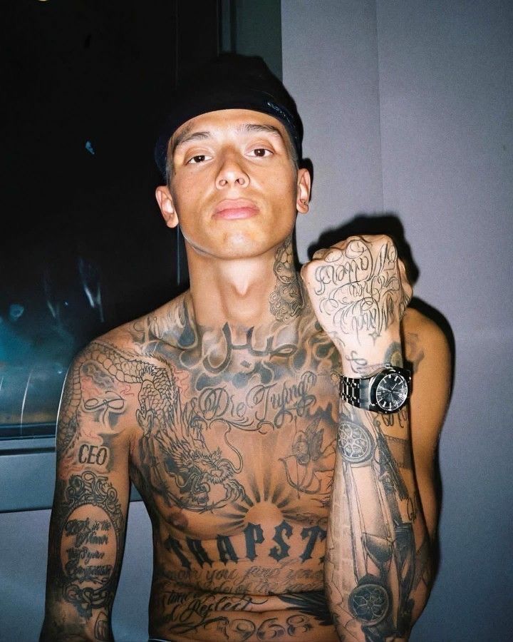
The dragon is one of the clearest images in Central Cee’s upper-body collection. Its long body and curling lines cross the chest, while the head gives the design a livelier shape than the block lettering around it. That movement keeps the chest from becoming a wall of straight words.
It also brings a different texture. Script uses repeated strokes and smooth curves; a dragon relies on scales, claws, teeth and a strong outline. The contrast helps each part stand out, and gives the eye somewhere to move beyond the lettering.
In closer photos, the dragon sits among other black-and-grey pieces instead of floating by itself. A large image needs a little space to read. If every gap has the same weight of ink, the main subject can disappear. The different marks across Central Cee’s chest give the dragon room to hold its shape.
For a large animal tattoo, settle on a readable pose before adding the small details. A dragon can twist around the body or stretch across the ribs, but its outline should still make sense from a distance. Shading can add depth once that basic shape is clear.
The neck work makes his tattoo style visible from every angle
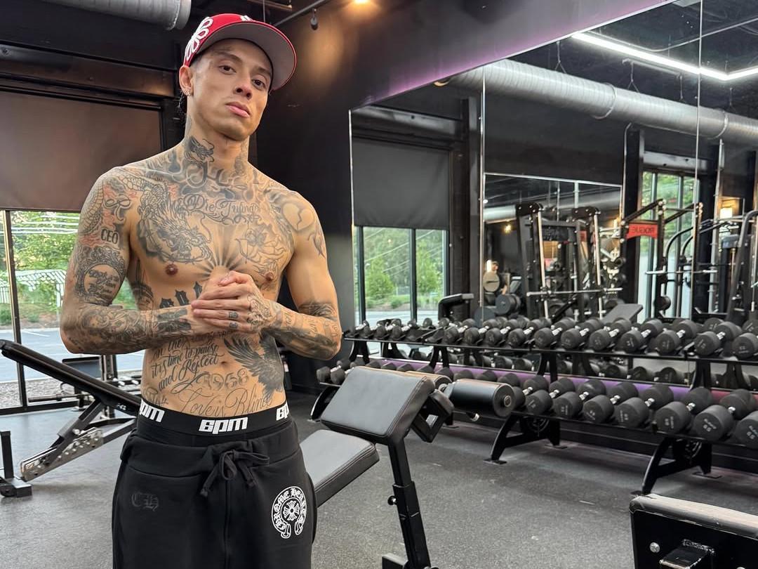
Central Cee’s neck is covered with dark shapes, lettering and smaller lines. It’s nearly always visible in a vest or open shirt, so the ink there has become part of his public image in a way a tattoo on his back or thigh wouldn’t.
The designs follow the curve from his collar toward his jaw rather than sitting like one separate stamp. That gives the area a connected look. A side view also shows how the ink wraps around his neck instead of stopping at the front.
Neck tattoos take careful planning. The skin shifts when someone turns their head, and the design is seen from the front, side and three-quarter angles. A phrase that looks right on a straight stencil can feel cramped once it bends around the neck. Shading and open gaps help the work keep its shape.
A visible tattoo doesn’t need to be one huge image. Several smaller marks can have the same impact when their line weight works together. Consistent spacing makes a busy neck look intentional.
The script on his stomach gives the collection a more personal tone
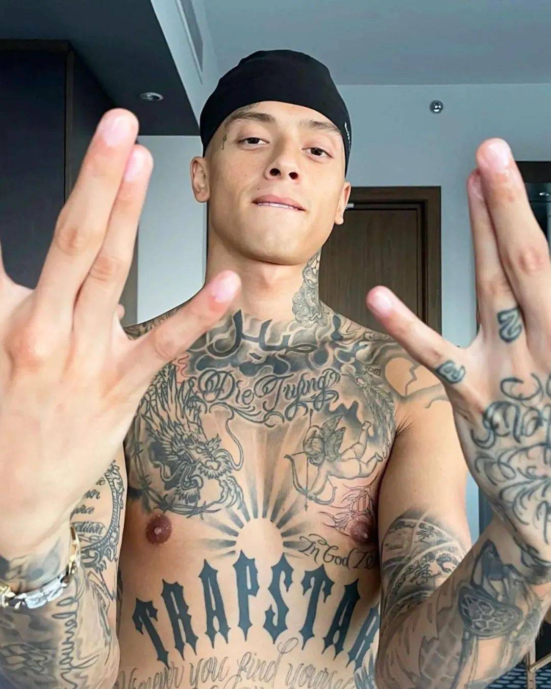
Below the chest lettering, Central Cee has a broad stretch of script across his stomach. The words follow the torso and soften the heavier Trapstar letters above. From a distance, the writing reads as a dark band; up close, the loops and changes in scale are easier to see.
Script suits an area that moves constantly. The letters can follow the stomach’s curve, and their long strokes shift as the wearer bends or twists. Fine writing can blur over time, though, especially when the lines are crowded.
Central Cee’s script isn’t treated like a small secret. It takes up space and sits alongside the chest and arm work, while bringing a more reflective tone than the large word above it.
If you’re considering script, look at the phrase at the size you’d actually wear it. Check the spacing, line weight and how it follows the body. A meaningful sentence still needs a clean layout. The words matter, and so does how they’ll look after years of movement and sun.
His arm and hand tattoos fill the smaller gaps with detail

The tattoos on Central Cee’s arms supply much of the collection’s smaller detail. Writing, symbols, shaded shapes and compact images run from the shoulders toward the wrists. They can look different from photo to photo as he moves onstage.
His hands carry the same mix in a tighter space. Short words and small marks sit across his fingers and the backs of his hands, where each line has to be placed carefully. They’re easy to spot in interviews because he gestures while he speaks, so the tattoos become part of that movement.
One well-known phrase beneath his chin reads “Death Before Dishonor.” In his XXL ABCs appearance, he said the saying appeals to him, while acknowledging that real life is more complicated than a slogan. That admission gives the words more context than treating them as a tough-looking design.
The smaller pieces also show why a little bare skin helps. Each finger tattoo, line of script or symbol needs space around it so its shape doesn’t disappear into the arm. A busy collection can still be easy to read.
Central Cee’s tattoos work on different scales. The chest gives a broad first impression, the neck makes the style clear in a close portrait, and the arms and hands reward a longer look. The dragon adds movement, the script brings a personal note and the small marks keep the collection open to change.
If you like his ink, you don’t need to copy the Trapstar lettering or choose the same dragon. Start with the part of your own story that deserves the most space, then let smaller designs support it. Several styles can sit together when placement, scale and line weight are planned as a whole. Good placement turns separate ideas into one readable collection.