Josh Dun’s tattoos pair a bright tree-and-roots sleeve with smaller symbols, lettering and stage-era details. Photos from daylight, backstage and Twenty One Pilots shows catch different parts of the ink: some show the colour clearly; others show how it wraps around his arm as he plays.
Not every meaning has been made public. Dun has kept some details private, so I’ll stick to what’s visible and keep interpretation separate. The photos show placement, colour, scale and linework; they don’t tell us why he chose every mark. This guide to Josh Dun tattoos focuses on the designs and the ideas someone might use in their own work, without filling gaps with guesses.
The tree and roots sleeve is Josh Dun’s most recognisable tattoo
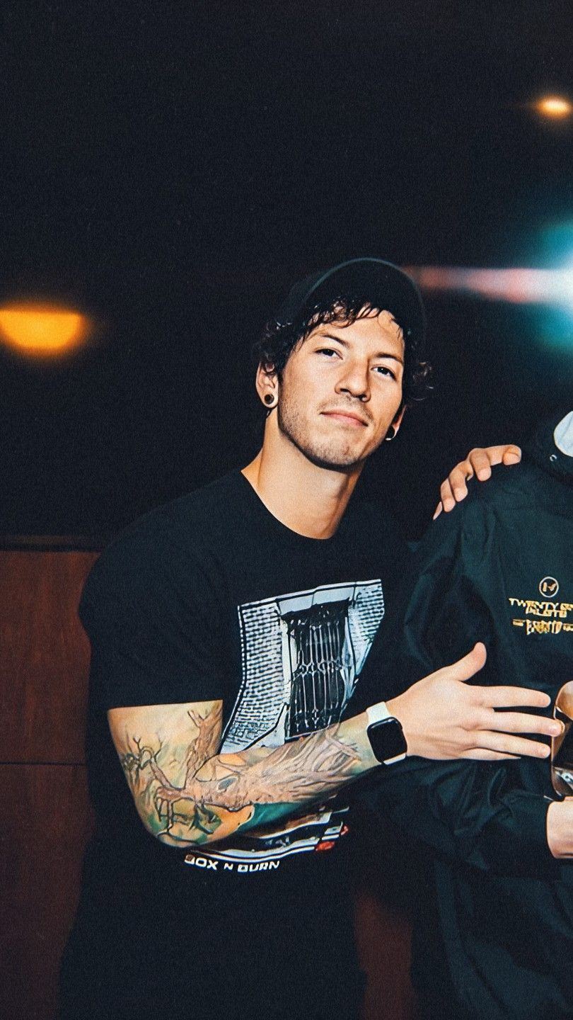
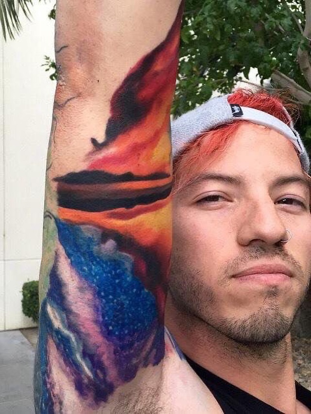
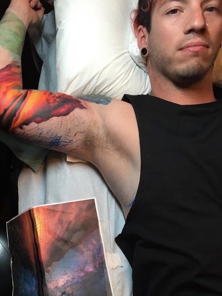
Dun’s colourful arm sleeve is the piece people tend to recognise first. It’s colourful and full of detail, and it shows clearly when he wears a sleeveless top. A tree, its roots and a bright circular burst near the shoulder form the main image. Colour runs from the upper arm toward the forearm, so the design reads as one composition rather than a stack of separate tattoos.
The design feels connected to his arm instead of like a piece of flash sitting on its own. Dun has said some of his tattoos are personal, but he hasn’t explained every detail in public. It makes sense to stay with what the pictures show: the trunk, branches and roots, without assigning a meaning to each leaf or line.
Roots spread across the lower arm rather than stopping in a straight band. From farther away, the sleeve has the look of a colourful landscape; up close, the dark outlines and smaller marks make it read more like an illustration built in layers.
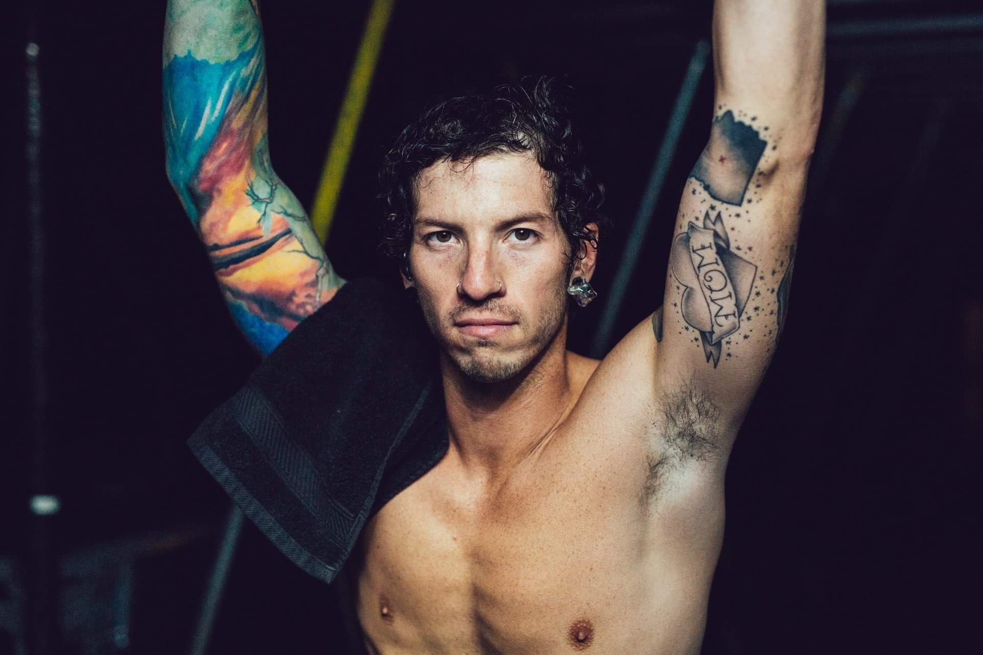
Colour gathers around the shoulder and gives the eye a place to land. In the close portrait, Dun’s arm turns toward the camera, showing the change from the bright upper section to the tree and root detail below it.
For a nature sleeve, the useful part is its clear subject and scale. The tree carries the idea while movement and colour fill out the arm. A design built around a landscape or roots can feel personal without covering every inch in heavy black ink.
His tattoo sleeve changes character under concert lights
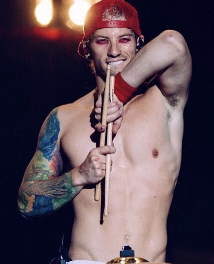
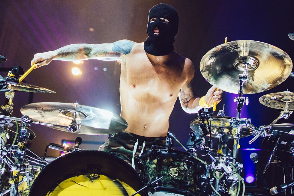
Concert lighting changes what a tattoo photo shows. In daylight, the sleeve’s colours separate and the branches are easier to pick out; under stage lights, it can look darker or flatter. The performance photo catches his arm as he reaches toward the drums.
Dun’s arms are constantly moving when he plays. The tree and bands of colour travel across the image as his sticks blur around them, making the tattoo part of the performance shot. It also means a photo may show only one part of the full design.
His clothes can cover parts of the ink: he’s played in sleeveless tops, shirts with wide armholes and costumes with sleeves. A photo may confirm a tattoo while hiding where it ends. It’s safer to describe what’s visible than to guess at a covered section.
Bright colour gives the sleeve a playful edge, while the dark outlines hold the shapes in place. Together, they lean toward a punk and alternative look without losing definition from a distance.
If you’re planning a tattoo, start with one image that reads quickly and build smaller texture around it. Dun’s tree is clear in both close-ups and concert photos; the lighting shifts, but its overall outline stays recognisable.
His other arm adds smaller symbols and lettering to the collection
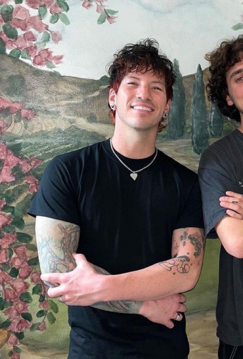
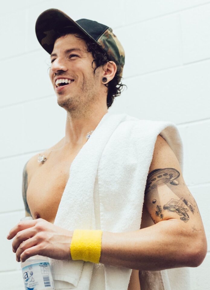
His other arm isn’t built around one colourful scene, so the smaller pieces stand out more. Photos show separate marks on the upper arm and forearm, including darker linework, lettering and compact symbols. Open skin between them keeps them from reading as one solid sleeve.
That difference gives the collection two distinct rhythms: the tree and roots on one arm, and smaller pieces you can take in one by one on the other. A wide shot can make the second arm look like a pattern; a close photo shows the spaces between the marks and their different levels of shading.
Lettering needs room to stay legible. Crowded words can blur as a tattoo ages. In the photos, the separate marks have space around them, and the skin between them helps each one read.
Some of the designs are graphic rather than realistic. Simple icons and dark outlines sit beside the larger work without competing for attention. A mixed collection doesn’t need one matching style; thoughtful placement gives the eye a path between pieces.
The exact meaning of each mark on this arm isn’t consistently documented. The photos still let us describe the placement and how the pieces fit together; they don’t need to serve as a biography.
His stage tattoos became part of the Twenty One Pilots look
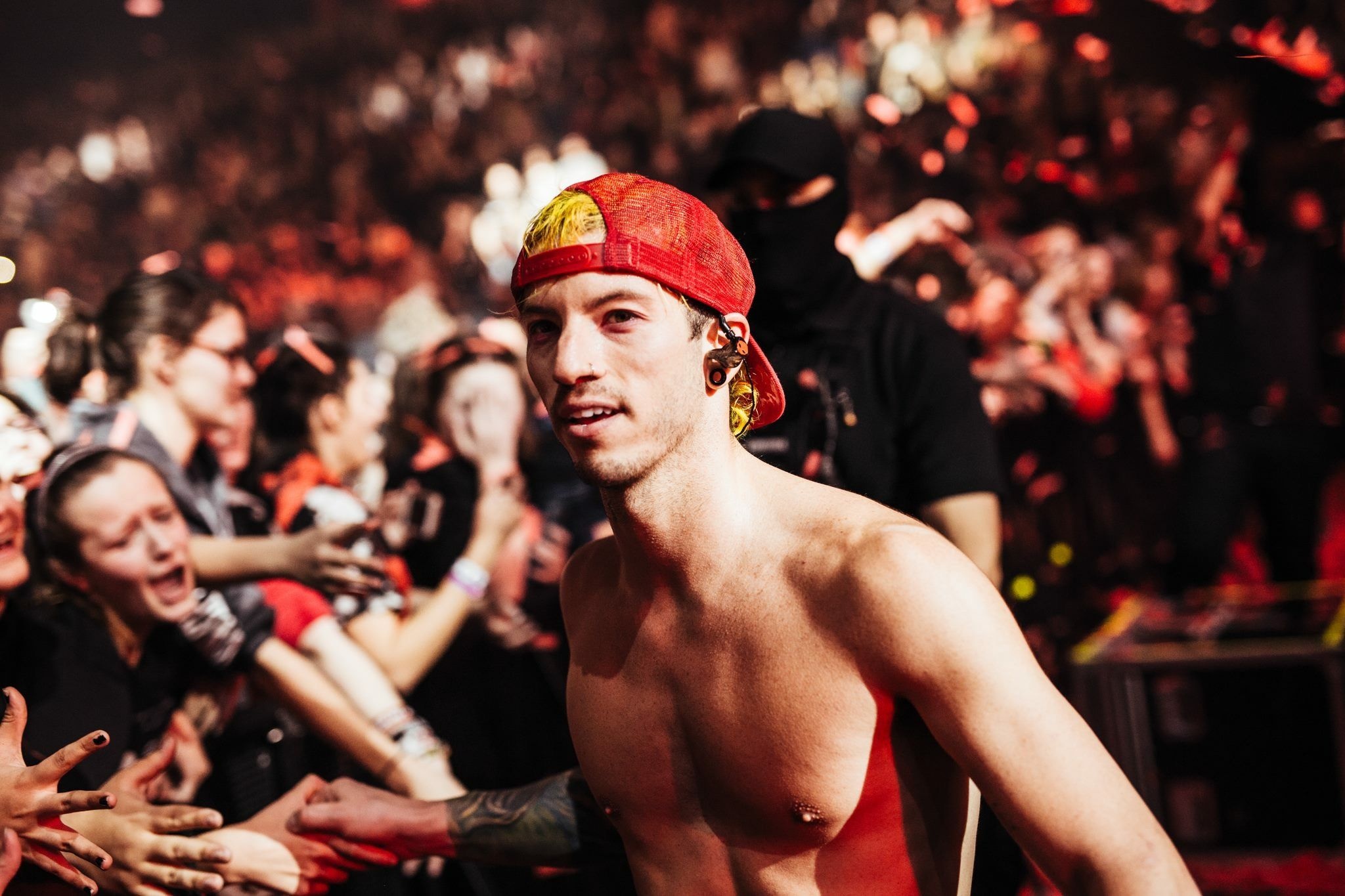
Dun’s tattoos are part of the visual impression of Twenty One Pilots on stage. The band’s shows have used colour, masks, uniforms and strong visual themes over the years. His ink is personal, but it also enters the picture when he performs in a sleeveless or shirtless outfit.
The masked performance shots make that contrast clear: even with his face covered, the colourful arm remains visible. It becomes one of the details fans recognise, alongside the drums, cap or sticks. If you want a tattoo to stand out across different outfits, placement is part of that decision.
Live photos also show why an arm design needs to work on a moving body. The elbow bends, the shoulder turns, and drum hardware can hide parts of it. A sketch can look clean on a flat page, but it’s the way the tree and roots follow Dun’s arm that keeps the main lines visible while he plays.
These images show colour, coverage and how the ink sits beside joints and muscles. They can’t confirm personal stories Dun hasn’t shared; the visible details are enough to discuss the design.
There’s also the band’s connection with tattoos. Dun and Tyler Joseph have used ink in their connection with Twenty One Pilots fans, including the well-known X symbol associated with the Clique. Dun’s wider collection goes beyond that one mark, but the shared reference helps explain why fans look closely at the tattoos.
What Josh Dun’s tattoo choices suggest for your own design
Dun’s tattoos show that one arm doesn’t have to follow a single style from shoulder to wrist. The coloured tree, darker graphic pieces and lettering sit together because each has its own space. Their moods differ, but they aren’t competing for the same patch of skin.
If you’re drawn to the nature sleeve, begin with a subject: a tree, roots, branches or a landscape. Choose whether it should face inward or outward, then plan for the arm’s bend. A design that follows the body’s shape tends to read more naturally than a rectangular image laid across it.
For smaller pieces, decide on spacing before settling every symbol. Gaps can keep tiny tattoos crisp; too many words, dates and icons in a narrow area can crowd them. Plan the arm as a whole, even if you add the pieces over time.
Colour needs the same thought. Dun’s sleeve holds its shape in busy stage photos because strong outlines break up the saturated areas. An artist can help decide where colour should lead and where open skin might keep the image from feeling muddy.
Don’t copy the artwork itself. Take the broader ideas—a nature subject, a sleeve built around movement, a few strong colours and space between smaller marks—and make them your own.
The collection has a clear focal point: the tree sleeve catches the eye first, while the smaller arm tattoos add detail. That balance can work in a personal design too, with one main piece carrying the theme and smaller references filling the surrounding space.
Reference photos should show the roots, smaller lettering and edge of the sleeve, not only confirm that he has tattoos. A close-up reveals the detail; a wider image shows how the pieces sit on the body. Each view answers a different question.
Look for images where the main arm design is unobstructed, with enough skin around it to judge scale. Clear photos also make it easier to distinguish a tattoo from shadow, jewelry or a stage mark. The line matters before its meaning: “Read the shape first, then chase the meaning.”
Browse the musician tattoo guides to see how other performers use colour, lettering and placement. The point is to notice what makes a design readable and discuss those choices with your own artist, not copy a celebrity’s tattoo.
The live performance embedded below shows how Dun’s arms turn and stretch while he plays, and how parts of a tattoo can disappear behind the drums. That movement is part of the design’s look, especially where it crosses a joint or follows a muscle.
Fan-made visual guide
This compilation compares photographs of Josh Dun’s tattoos. The meanings discussed in the commentary are fan interpretations.
More photographs of Josh Dun’s tattoos