
Kid Rock’s tattoos suit the rough edge of his music. The most familiar piece sits high on his arm, while photos also show ink over both forearms and across his upper back. Bold lettering, classic rock imagery and larger dark shapes keep the collection readable under stage lights.
Kid Rock tattoos are a useful reference if you like old-school placements with a biker or outlaw feel. His ink isn’t a matching sleeve. Some pieces show from across a room; others appear only when he is shirtless or leaning into a microphone. Together they look worn in, rather than arranged for a single photo.
The useful lesson is to plan for the body and the way you live. A strong word on the upper arm can lead the eye, while denser forearm work adds detail. Kid Rock’s photos also show how the same ink can change in daylight, coloured concert light or under a shirt.
Kid Rock’s upper-arm lettering is the clearest starting point

The word PAUL on Kid Rock’s upper arm is one of the easiest tattoos to recognise. Its dark block letters have enough space between them to stay readable as the arm turns. The design is plain, but its shape holds up in a quick performance shot and from farther away.
The placement helps. The word sits on the outer upper arm, framed by the shoulder above and bicep below. A tank top leaves it visible, while a short sleeve can cover it. That lets a prominent tattoo show when he wants it to.
If you’re choosing a name or phrase, settle on the words before choosing a font. Test the stencil around the arm, not just on a flat screen. When the message matters, clear lettering can do more than decoration.
His shirtless stage photos show his tattoo scale
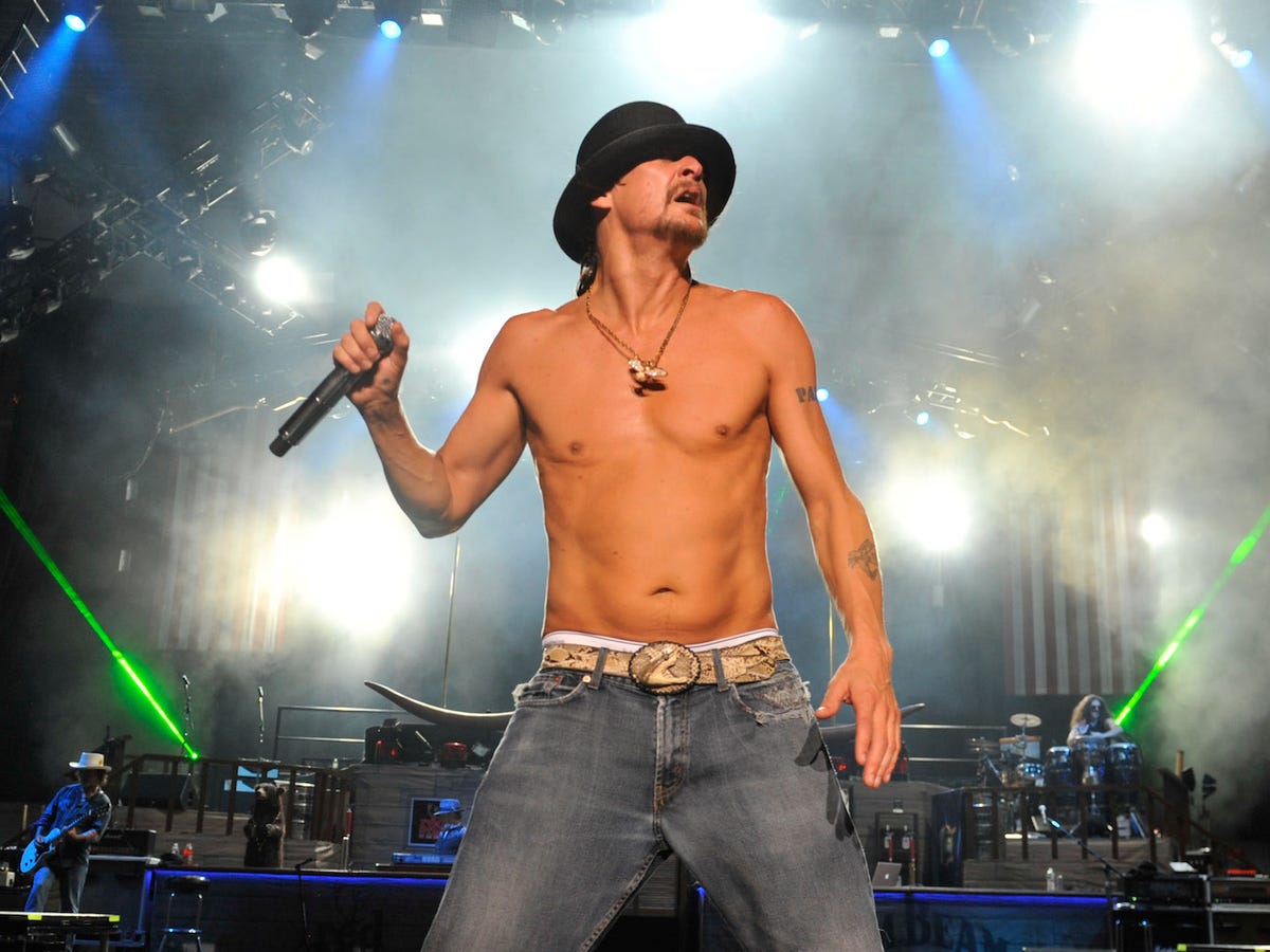
When Kid Rock performs shirtless, the upper-arm word appears alongside smaller tattoos on both forearms. The pieces vary in size and colour, but dark outlines and familiar rock imagery give the eye a steady path. The larger lettering catches you first; the forearms reward a closer look.
Stage photos show the ink in motion. Bright lights can flatten details, while smoke and shadow make them look heavier. The main shapes remain visible, and the smaller pieces become texture without vanishing completely.
Plan for ordinary settings as well as a perfect studio photo. Think about how the tattoo looks with your usual clothes, indoors and from the side. A small forearm piece can be enough if it sits where the arm naturally turns toward people; a full sleeve isn’t required for a collection to feel intentional.
The spacing is part of the effect. The PAUL lettering has room around it, and the forearm designs don’t crowd the centre of the chest. A little open skin keeps each major piece distinct. If you’re adding several tattoos, leave space around the largest ones so their outlines remain clear.
The PAUL tattoo follows the shape of the upper arm

A side-stage photo shows how the PAUL lettering follows the upper arm. It sits on the rounded section rather than too close to the shoulder joint. The thick characters hold their shape, with open skin around the word keeping the area from feeling cramped.
That breathing room can matter as the ink ages. Closely packed outlines may merge, while a simple design with a clear edge can keep reading when the arm bends or turns away. Here, the word has its own space.
Bring photos of your arm in different positions when planning a similar placement. A word that looks centred at rest may shift when you lift your arm. The artist can adjust its baseline to follow the muscle without making the lettering look crooked.
Different angles reveal the same tattoo in new ways

The same upper-arm tattoo looks different when the lights and camera angle change. Red and blue stage light soften the black letters at the edges, and the bent elbow brings the forearm into view. It is a good reason to judge placement while the body is moving, not only in a mirror.
The smaller forearm ink adds another layer when the arm is raised, but it doesn’t compete with PAUL. That hierarchy helps the collection feel calm: one tattoo leads, another supports, and the rest can stay quieter.
If you already have a large word or symbol, resist filling every gap straight away. Later you may find a small flash piece, a little colour or a fine-line mark that works as a bridge. Good spacing leaves future tattoos room to breathe.
His forearm tattoos carry more detail than the big lettering
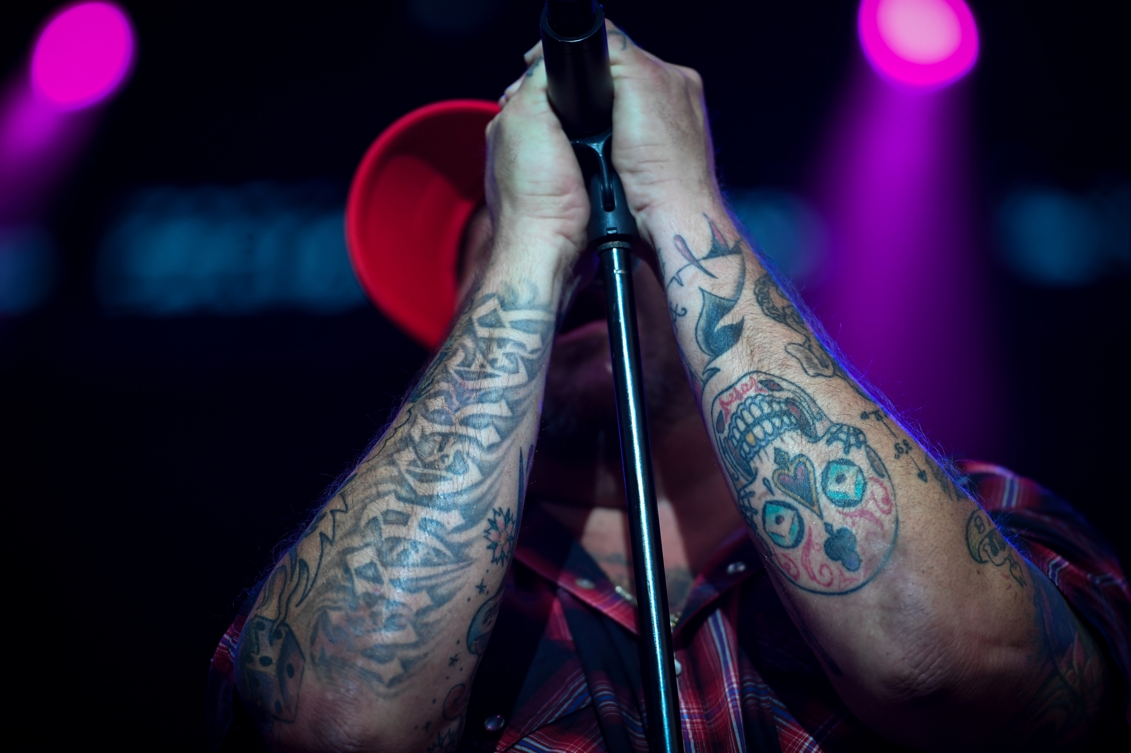
A close view of Kid Rock’s forearms shows the collection at its busiest: shaded faces, stars, symbols and touches of colour sit among larger shapes. From a distance it reads as a dark sleeve; up close, the separate edges and details become easier to see.
A forearm has limited room, so each new tattoo has to work beside the pieces already there. Contrast helps: solid black next to open skin, colour beside grey shading, and small marks beside a larger focal shape. Those changes stop the arm from becoming one flat patch.
Before booking several sessions, sketch the whole arm. Mark what should stay open, choose the piece that needs to show from the outside, and check how the work will meet near the wrist and elbow. A full collection can still read clearly when you choose the main shapes first.
How to build a Kid Rock-inspired tattoo collection

A closer performance portrait shows how Kid Rock’s arm ink appears with most of his body covered. The tattoos come into view as he holds a microphone or moves his arm; they don’t depend on a shirtless photo to make an impression.
If you wear shirts or jackets most of the time, choose a spot that suits that routine. An upper arm is easy to cover, a forearm is more direct, and a shoulder can become the start of a larger piece. You can borrow the attitude without copying the words or symbols.
A few repeated choices can tie different tattoos together. You might use thick black outlines, traditional shading, a limited palette or lettering with personal weight. The pieces don’t need to match; they just need enough shared structure to feel like your collection.
There is no need to plan the whole arm in one go. Start with the placement you care about most, let it settle, then decide what belongs beside it. A slower approach lets you see how the lines, colour and spacing work on your skin before you add more.
Kid Rock’s tattoos are clear and visible, with enough roughness to suit his style. The upper-arm lettering gives the collection a focal point, the forearms add detail, and the photos show how the ink shifts with movement and light. A good place to start is a location that fits your life and leaves each design room to read.
Kid Rock talks about his music, life and career in the interview below.